
You know that moment when you fall in love with a piece of furniture in the store… and then you get it home and it’s giving totally different person? Like it looked cute under the showroom spotlight, but in your living room it suddenly feels too red, too orange, too dark, too “why is my rug mad at it?”
Yeah. That’s mahogany.
Mahogany is basically the “looks amazing in the dressing room” of wood. It’s always living somewhere in the reddish brown family, but the undertones can swing warm, cool-ish, or right down the middle and that’s usually the real reason a room feels a little… unsettled.
Let’s make your mahogany behave.
First: Are you sure it’s actually mahogany?
Before we blame your wall color (or your life choices), let’s acknowledge that wood has a whole witness protection program. Half the stuff labeled “mahogany” is more like “mahogany-ish vibes.”
Two common real deal categories you’ll run into:
- Honduran mahogany (the classic): richer brown red, pretty consistent, fine even grain. On flatter surfaces you may notice tiny little slit/ripple marks in tidy rows.
- African mahogany: often lighter and a bit pinker, sometimes with stronger striping and a ribbon-y sheen, especially on quarter sawn pieces.
Do you need to become a wood botanist? No. But it helps to know that “mahogany” can mean a few things and that’s why matching gets spicy.
Also: if the piece is a heavy stain job, that can muddy the waters. (I once bought a “mahogany” side table online that arrived looking like it had been dipped in barbecue sauce. Undertones? Ma’am, I had trauma.)
The usual suspects: woods that fool you
If you’re staring at a reddish brown piece and thinking, “Is this mahogany or am I being lied to?” here are the most common imposters:
- Walnut: cooler brown, sometimes a little grayish, more matte. Next to mahogany it can look like it forgot to warm up.
- Cherry: cleaner red, tends to darken faster, and often has little dark “gum spots.” Over time cherry can go very red red.
- Teak: warm like mahogany, but more golden/yellow. Teak is the friend who always looks like they just got back from vacation.
- Rosewood: much darker, heavier grain, sometimes purple black. If you’re mixing this up with mahogany, your lighting is either tragic or haunted.
If you’re trying to match something in your home, bring a sample (or a good photo in natural light). “Close enough” is exactly how you end up with a room that looks nice… but feels wrong.
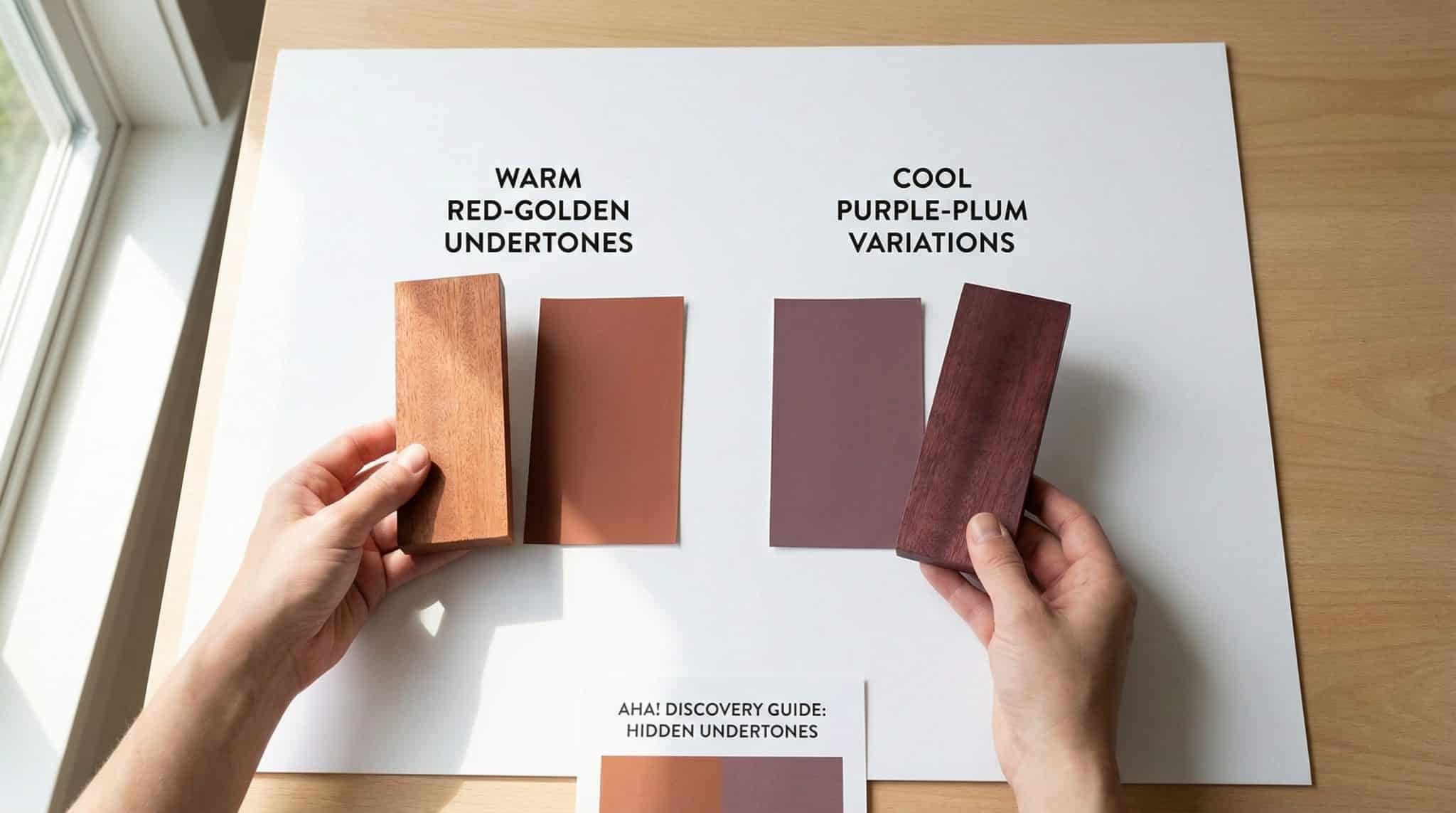
The three undertone “personalities” mahogany can have
Here’s the part that fixes the room. Because “mahogany” isn’t one color it’s a mahogany color undertones guide.
1) Warm mahogany
This is the classic: red brown with copper/golden/orange-y energy. It can look sunlit, rich, and a little dramatic (in a good way). In bright light it may pull more orange than you expected.
2) Cool leaning mahogany
Still technically warm (mahogany doesn’t go full icy), but it has a plum/violet/wine tint that can read more muted. This undertone is weirdly helpful if your house leans cooler think blue grays, black metal, more modern vibes.
3) Balanced mahogany
The peacekeeper. More even red brown without screaming orange or leaning purple. If you’re mixing finishes, mixing woods, mixing styles this one usually plays nicest.
Match the undertone, and suddenly the room stops arguing with itself.
My 3 super quick undertone tests (no trench coat required)
You don’t need fancy tools. You need two things:
- decent daylight
- willingness to look at your furniture like it owes you money
Test #1: The “hold it to white paper” test
Take a sheet of bright white printer paper and hold your sample next to it in natural daylight.
- If you see golden/honey/orange red = warm leaning
- If it looks muted, slightly wine/plum = cool leaning
- If it’s just straight red brown without a loud side = balanced
If it suddenly looks grayish and sad next to white, you might not be dealing with mahogany at all or it’s a very weird stain situation.
Test #2: The “does it glow?” test
Real mahogany often has a subtle depth/reflectiveness (even unfinished). It’s not shiny like plastic. It’s more like… inner glow. (Yes, I just gave wood a skincare routine.)
Walnut, for example, tends to look flatter next to it.
Test #3: The “lighting is a liar” test
Try a lighting comparison test:
- cool daylight (north facing window or morning light)
- direct daylight (midday is best)
- your actual evening lighting (warm bulbs change everything)
Mahogany often looks lighter in daylight and deeper/burgundy at night. If it goes weirdly purple or dull under your lamps, that’s useful information because you live under your lights, not the store’s spotlight circus.
Okay, now let’s style your room so it looks intentional
Mahogany is like that friend who picks the restaurant and somehow everyone just goes along with it. It sets the tone. So instead of fighting it, you build around it on purpose.
1) Other woods: keep it to 2-3 tones
Personally, I like mahogany with other warm woods maple, hickory, cherry because it feels cohesive and cozy.
If you want contrast, walnut can work as a bridge, especially if you’re also using cooler elements (black metal, blue gray paint, etc.). Just don’t make your room a wood flooring showroom. Two to three wood tones is plenty. More than that and your eye doesn’t know where to rest.
2) Paint: use calm colors that don’t pick a fight
Mahogany is warm and saturated, so it loves a wall color that steadies the ship.
Paint colors I genuinely think work beautifully:
- Soft blues / blue grays (they calm the warmth)
- Sage green + creamy whites (natural, lived in, not trendy in a panicky way)
- Charcoal (if you want drama, mahogany looks amazing against deep, moody walls)
What I’d avoid:
- flat beige that makes everything look vaguely dingy
- certain grays that make mahogany look even louder and redder (this is a common “why does my wood look angry?” moment)
3) Metals: decide your vibe
- Brass/copper/oil rubbed bronze = warmer, traditional, glowy
- Chrome/brushed nickel/matte black = cleaner contrast, more modern edge
Both work. Just don’t mix every metal finish like you’re building a hardware store sampler platter.
One more thing: your mahogany will change over time (surprise!)
Mahogany tends to deepen as it ages. Newer pieces can start out a little pinker or lighter than you expect, then slowly shift toward richer amber/burgundy tones with exposure to light and air.
So if you buy a new mahogany piece and it doesn’t match the older one on day one: breathe. Give it some months. It usually gets closer.
(Unless one is true mahogany and the other is “mahogany colored optimism.” Then… good luck and Godspeed.)
The three mistakes that make a room feel weird
If you want the quick “don’t do this” list:
- Undertone mismatch
Everything is technically “nice,” but together it feels off. That’s usually undertones fighting. - Ignoring lighting
Store lighting is basically propaganda. Test at home, always. - Matching by color only
Wood species, grain, and finish matter. Don’t trust your gut in aisle 12 when your eyes are tired and you’ve been staring at brown rectangles for 47 minutes.
Do this today (yes, today) and your room will instantly make more sense
Grab your mahogany sample (or take a removable drawer, shelf, scrap whatever you can safely move). Hold it up to white paper in daylight. Then look at it in your evening lighting.
Name what you see: warm, cool leaning, or balanced.
Once you know that, picking paint, metals, and companion woods gets so much easier because you’re not guessing anymore. You’re matching on purpose.
Now go. Hold the wood up to the paper. Make the room stop arguing.