

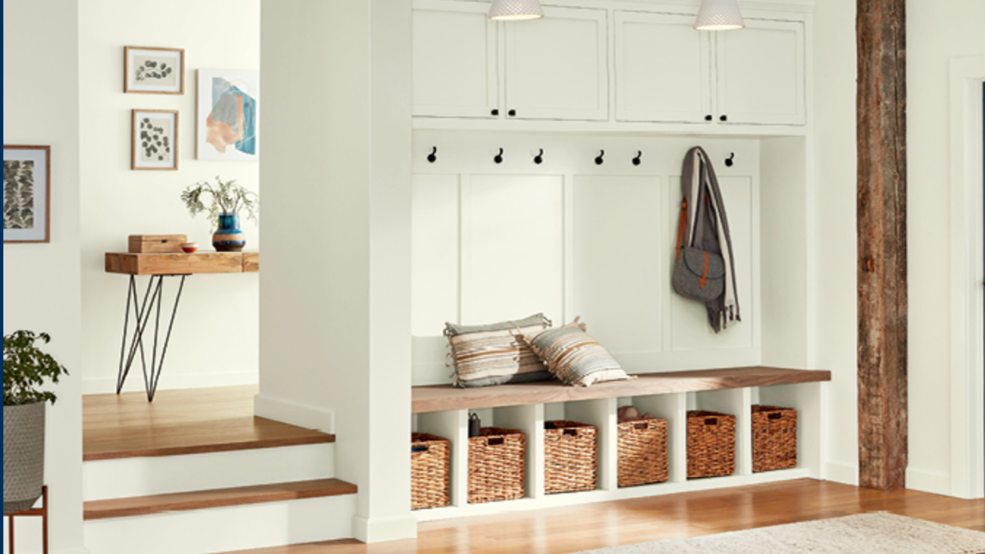
Let’s face it – your mudroom does all the dirty work but gets none of the glory. While the rest of your home shines with carefully chosen decor, this hardworking space often gets left out of the style conversation completely!
A drab, disconnected mudroom can bring down the vibe of your entire home. But don’t worry, we have the solution.
This guide offers perfect color ideas that not only handle the mess but also connect seamlessly with your home’s theme.
The right shade transforms your mudroom from a forgotten utility space to a stylish extension of your home’s personality. Let’s make your mudroom count!
What Does a Mudroom Do, Anyway?
Your mudroom is like the gatekeeper of your home. It’s where the outside world stops and your cozy indoor life begins.
This transition space keeps the outside grime contained and gives you a spot to drop all those things you don’t want trailing through your house.
It catches dirt before it reaches your living spaces while providing organized storage for shoes, coats, bags, and even pet supplies. This practical buffer between outdoors and in makes daily coming and going smoother for everyone in your household.
What Kind of Colors Work Best in Mudrooms?
When picking colors for your mudroom, think about what the space needs to handle. Since mudrooms see lots of traffic (and actual mud!), your color choice should be:
- Practical enough to hide some dirt
- Bright enough if your space lacks natural light
- Connected to the rest of your home’s color story
- Able to make you smile when you walk through the door
Earthy tones like soft greens and warm taupes naturally hide dirt while creating a welcoming vibe. Blues and greens connect your space to the outdoors.
Dark colors like navy or charcoal hide scuffs but might make a small space feel cramped. Light neutrals open up tight spaces but show every mark.
Let’s move on to color palettes that work for the mudroom and a list of possible color ideas.
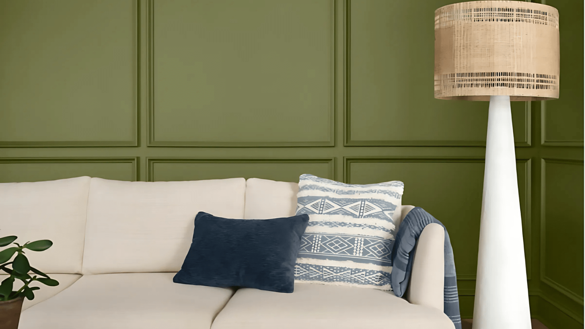
Earthy Tones
These nature-inspired hues ground your space and create a seamless transition from outside to inside. They work particularly well in homes with lots of natural materials or those backing up to wooded areas.
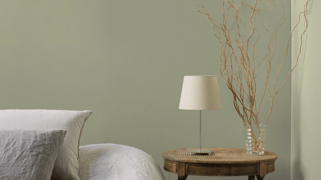
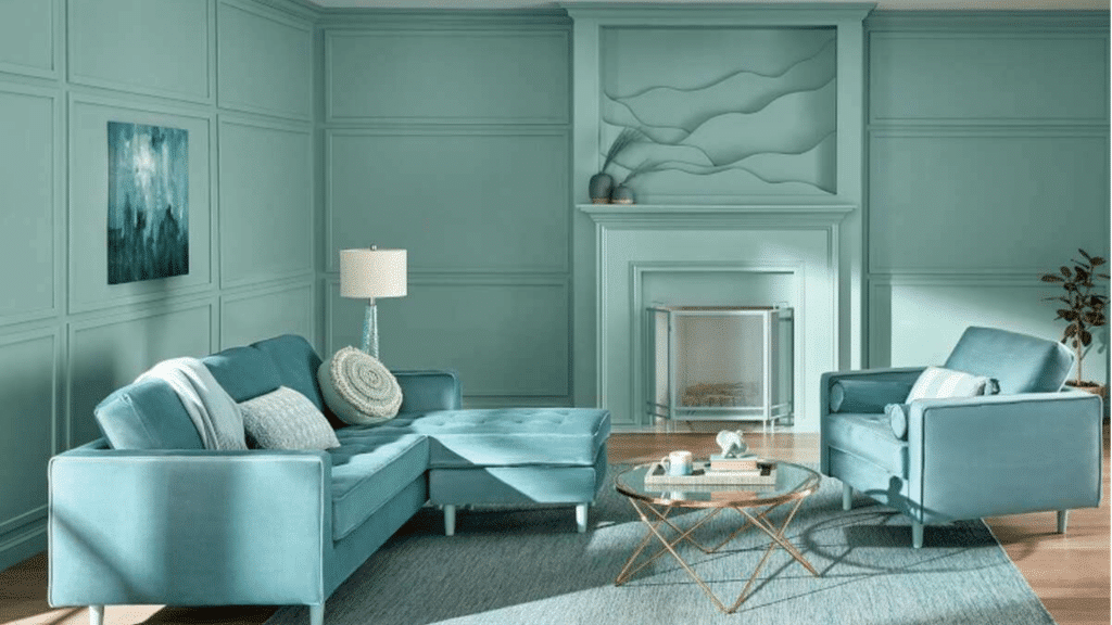
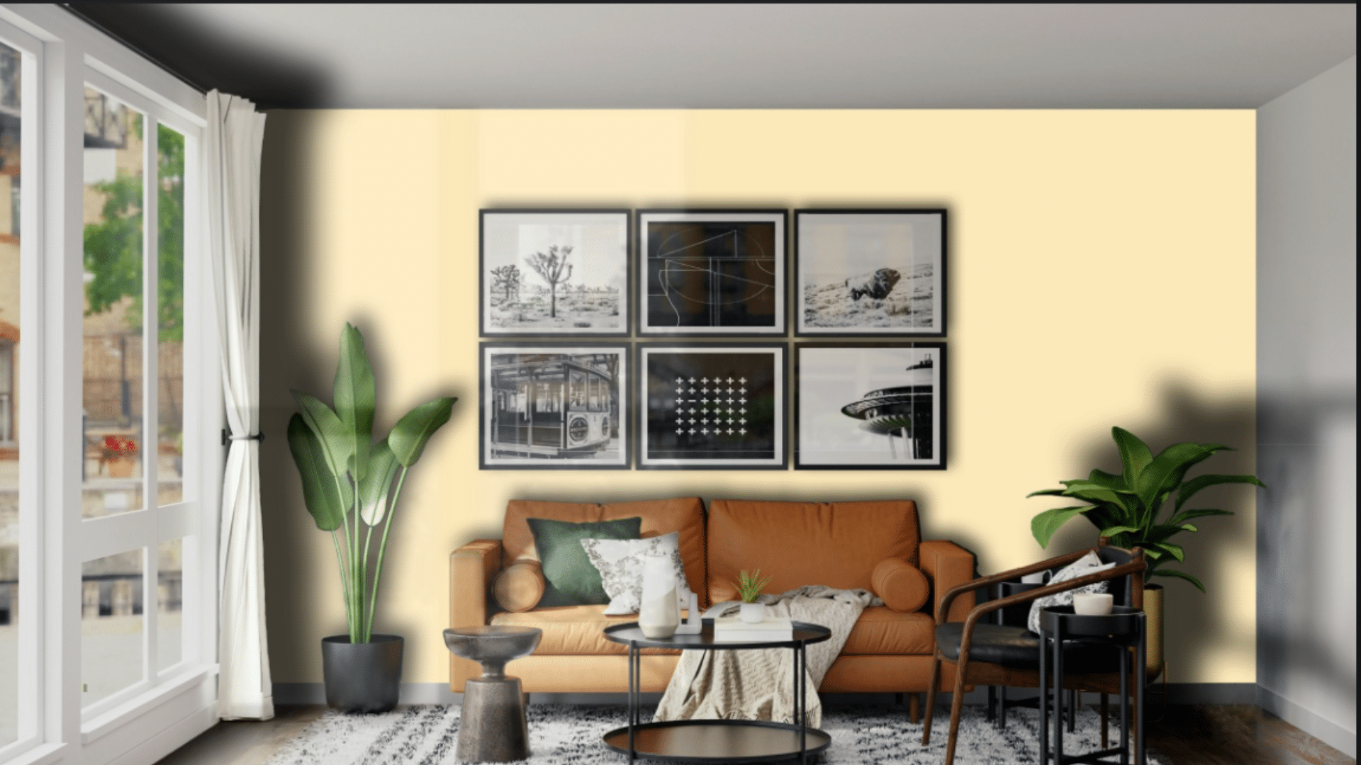
1. Evergreen Fog
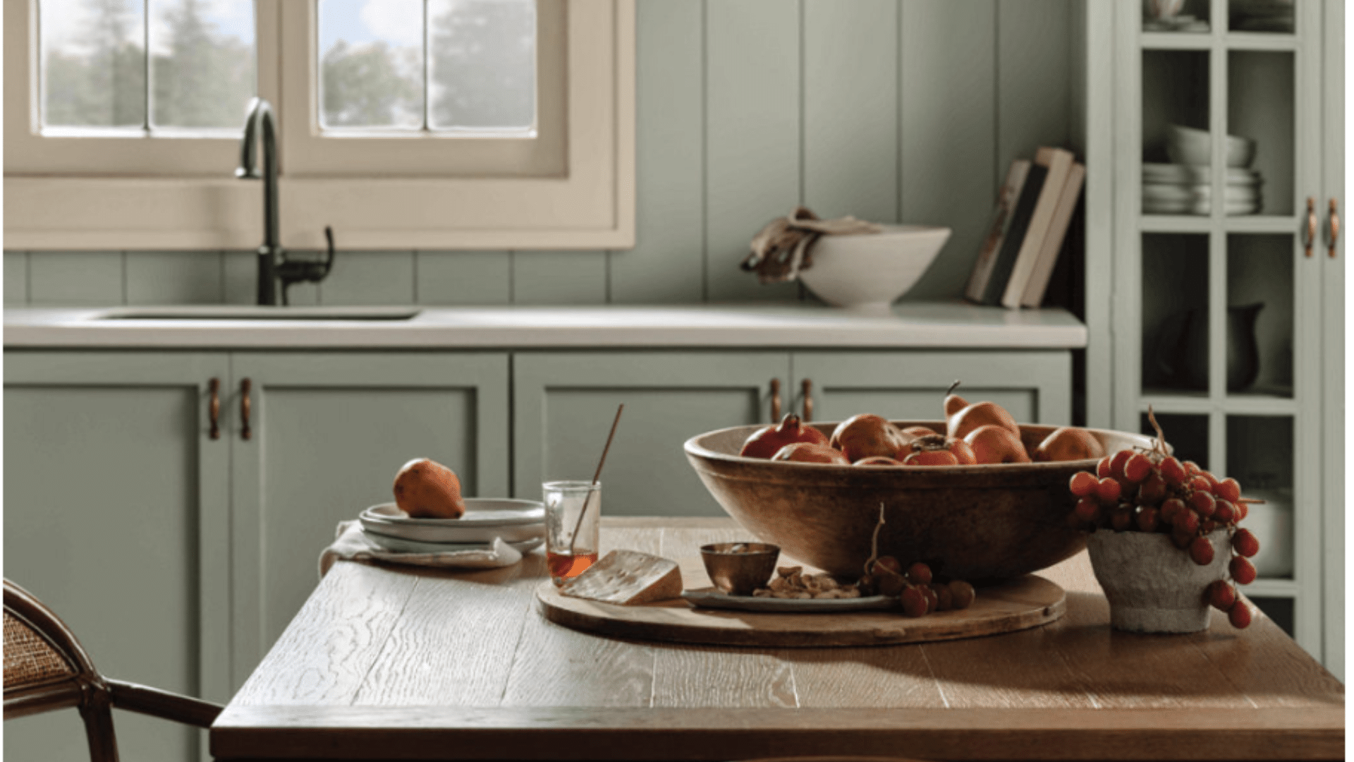
This misty green-gray creates a calm, grounded feeling that hides dirt like a champ.
It shifts between sage and pewter depending on the light, making it an ideal backdrop for both metal and wood accents.
Color experts love its ability to feel both current and lasting, perfect for spaces that should blend rather than stand out.
2. Cardamom
A warm, spicy neutral that adds coziness to your entry and pairs beautifully with natural wood.
This rich, earthy tone has subtle red undertones that evoke the comfort of coming home after a long day. It creates a space that feels both protected from the elements and warmly inviting.
3. Stoney Ground
Just like its name, this earthy beige mimics natural stone and creates a warm welcome. It’s a smart take on traditional beige with complex undertones that adapt to your lighting conditions.
This is the color expert’s secret for creating a mudroom that transitions perfectly into both modern and traditional interiors.
4. Gettysburg Grey
A medium-toned neutral that works in almost any lighting and complements both cool and warm accents. This historically inspired color carries subtle complexity that prevents it from ever looking flat or boring.
It’s ideal for creating a backdrop that feels grounded yet bright enough to handle low-light conditions.
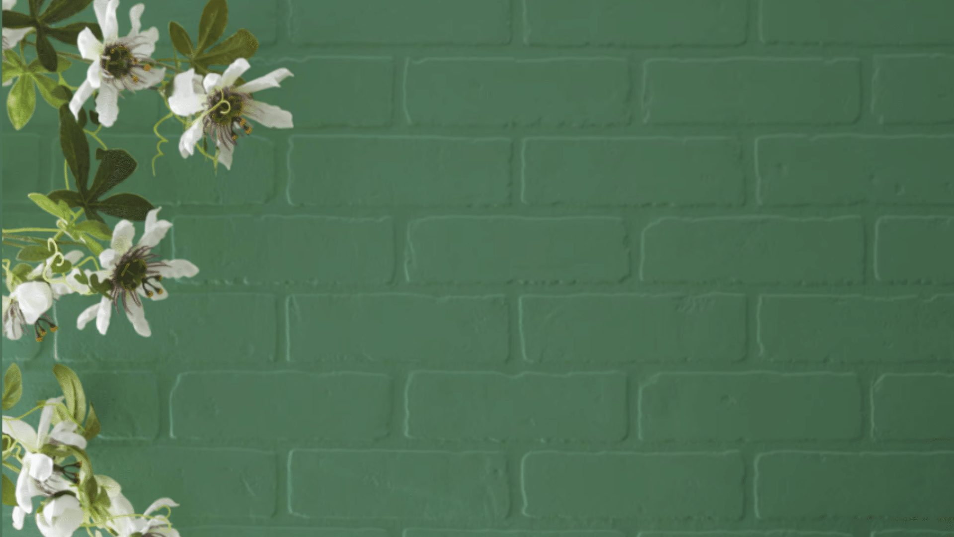
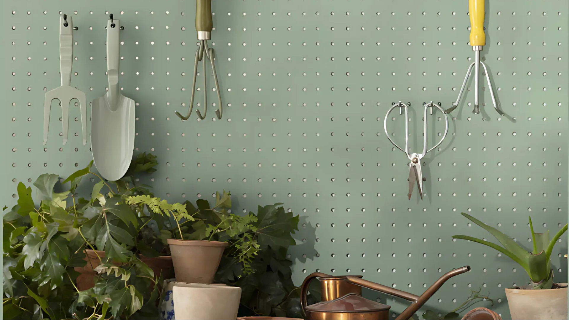
5. Olive Grove
This muted green brings the outdoors in and masks muddy paw prints with ease. The subtle yellow undertones give it a fresh, vibrant quality even on the dreariest days.
Home experts love how it references landscape colors without becoming overly theme-y or tied to temporary trends.
6. Driftwood Beige
A sandy neutral that hides dirt while keeping your space light and airy.
This color captures the essence of weathered wood and beach finds with its subtle warmth and gray undertones. It’s perfect for creating a casual, unfussy vibe in entry spaces that see plenty of traffic.
Why This Palette Works
Earthy colors create a natural transition from outdoors to in, making your mudroom feel connected to both spaces.
These tones hide dirt naturally and pair perfectly with wood, stone, and other natural elements typically found in entryways.
They’re lasting choices that won’t look dated even as trends shift.
Cool Blues and Greens
These refreshing shades create a calming buffer between the busy outside world and your peaceful interior. They’re perfect for homes where you want that subtle reminder of sky and garden as you transition inside.
7. Old Navy
Deep and dramatic, this blue hides scuffs while adding serious style to your entry. The inky depth creates a polished envelope that makes even the most basic hooks and benches look intentional and high-end.
This shade creates a striking contrast with lighter flooring and trim, giving mudrooms the same design attention usually reserved for living spaces.
8. Fresh Balsam
A crisp green that feels clean and naturally connects to the outdoors. This forest-inspired hue captures the feeling of a deep woodland walk with its slightly cooled undertones.
Perfect for homes with garden views, it brings nature inside without sacrificing refinement.
9. Renew Blue
A soothing, watery blue that creates a serene transition into your home.
This color channels clear skies and calm waters with its medium intensity that never feels too pale or too saturated. It brightens darker entryways while maintaining a visual connection to outdoor elements.
10. Krypton
This blue-gray chameleon shifts with the light, keeping your mudroom interesting.
In morning light, it leans blue; by evening, it transforms to a refined gray with subtle depth. It partners beautifully with both cool and warm metal finishes in mudroom hardware.
11. Norway Spruce
A soft, misty green that calms the chaos of a busy entry. This whisper-quiet color has just enough pigment to feel intentional without overwhelming a compact space.
It creates visual breathing room in high-traffic areas, offering a moment of peace as you enter and exit your home.
12. Bayou Shade
Deep, layered teal that adds dimension and hides marks from daily use. This color blends blue’s tranquility with green’s natural energy, creating a uniquely balanced atmosphere.
It makes architectural details pop while disguising the inevitable scuffs of an active household.
13. Alexandrite
A gem-toned blue-purple that makes even the most utilitarian space feel special. Named after the color-changing gemstone, this rich hue brings unexpected quality to forgotten spaces.
It elevates mudrooms from purely functional to statement-making, proving utility spaces deserve beautiful colors too.
14. Aleutian Blue
A misty coastal blue that brings peaceful vibes to a high-traffic area. This subtle, grayed blue whispers rather than shouts, creating a backdrop that’s interesting without competing with mudroom clutter.
It references water and sky in a polished, never-beachy way.
15. Basque Green
This muted sage works as a new neutral that’s more interesting than beige. With its perfectly balanced undertones, it avoids looking too yellow or too blue in any light.
It bridges traditional and modern aesthetics, making it ideal for homes with mixed architectural elements.
Why This Palette Works
Blues and greens create a psychological bridge between outdoors and indoors, making your mudroom feel intentional rather than forgotten.
These colors naturally evoke water and plants, which means they handle mud and moisture themes without feeling out of place.
They pair beautifully with both light and dark woods and can coordinate with nearly any home style from coastal to farmhouse to modern.
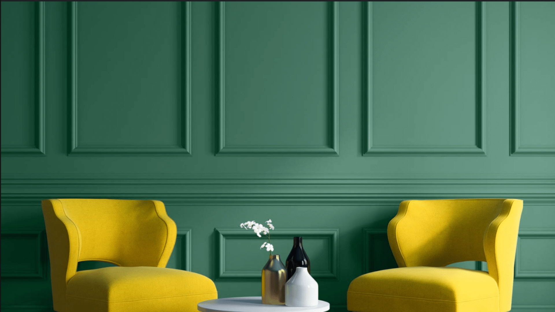
Bold and Beautiful
For those who don’t shy away from making a statement, these rich, deep colors bring major impact to your entry. They’re perfect for larger mudrooms or spaces where you want to create a distinct zone within your home.
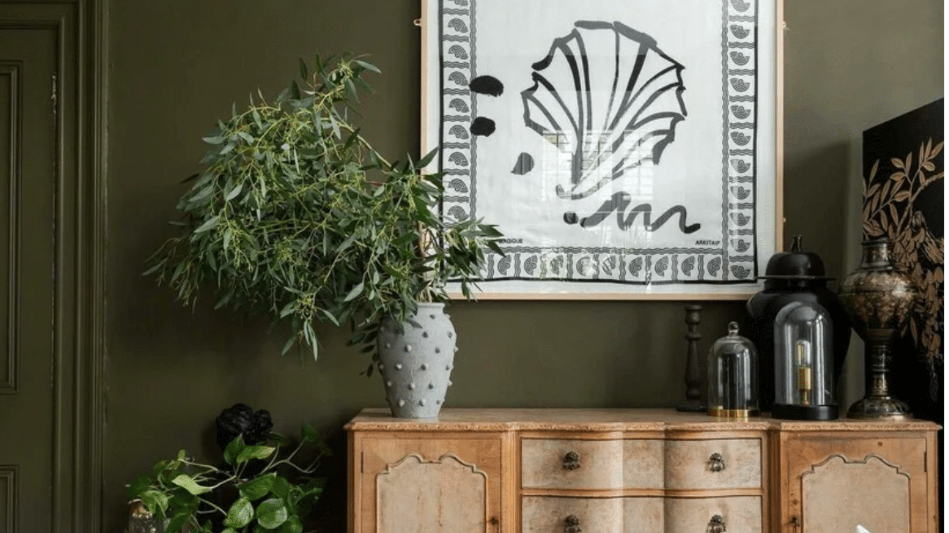
16. Brinjal
Aubergine purple that adds drama and polish to your mudroom. This rich, vegetable-inspired hue brings unexpected quality to utility spaces with its deep, complex undertones.
It makes a statement that still feels grounded, it’s striking without being impractical.
17. Studio Green
Almost-black green that creates a moody, refined backdrop for brass hooks and natural textures. In different lights, it reveals subtle hints of spruce and forest, never appearing flat or truly black.
It elevates mudroom14s from afterthought to architectural feature, especially when paired with crisp white trim.
18. Soot
A near-black that creates dramatic contrast with light floors and furnishings, this inky shade has the faintest blue undertone, giving it depth that true black lacks.
It creates a gallery-like impact in transitional spaces, making even simple hooks and benches look like deliberate design choices.
19. Dusk in the Valley
A smoky purple that adds unexpected depth and interest.
This twilight-inspired hue shifts between lavender and gray depending on the time of day, creating an ever-changing welcome. Perfect for creative households that want a mudroom both refined and playful.
Why This Palette Works
Dark, bold colors might seem counterintuitive for a utility space, but they actually work brilliantly in mudrooms.
These statement shades hide dirt and scuffs better than any other palette while adding serious design quality to an often overlooked space.
Dark colors also create a striking contrast with typical mudroom elements like white built-ins or light flooring, making your entryway feel designed rather than simply functional.
Light and Bright
These airy shades open up tight spaces and help darker mudrooms feel bigger and brighter. They’re ideal for small or windowless entries where maximizing light reflection is key to creating a welcoming feel.
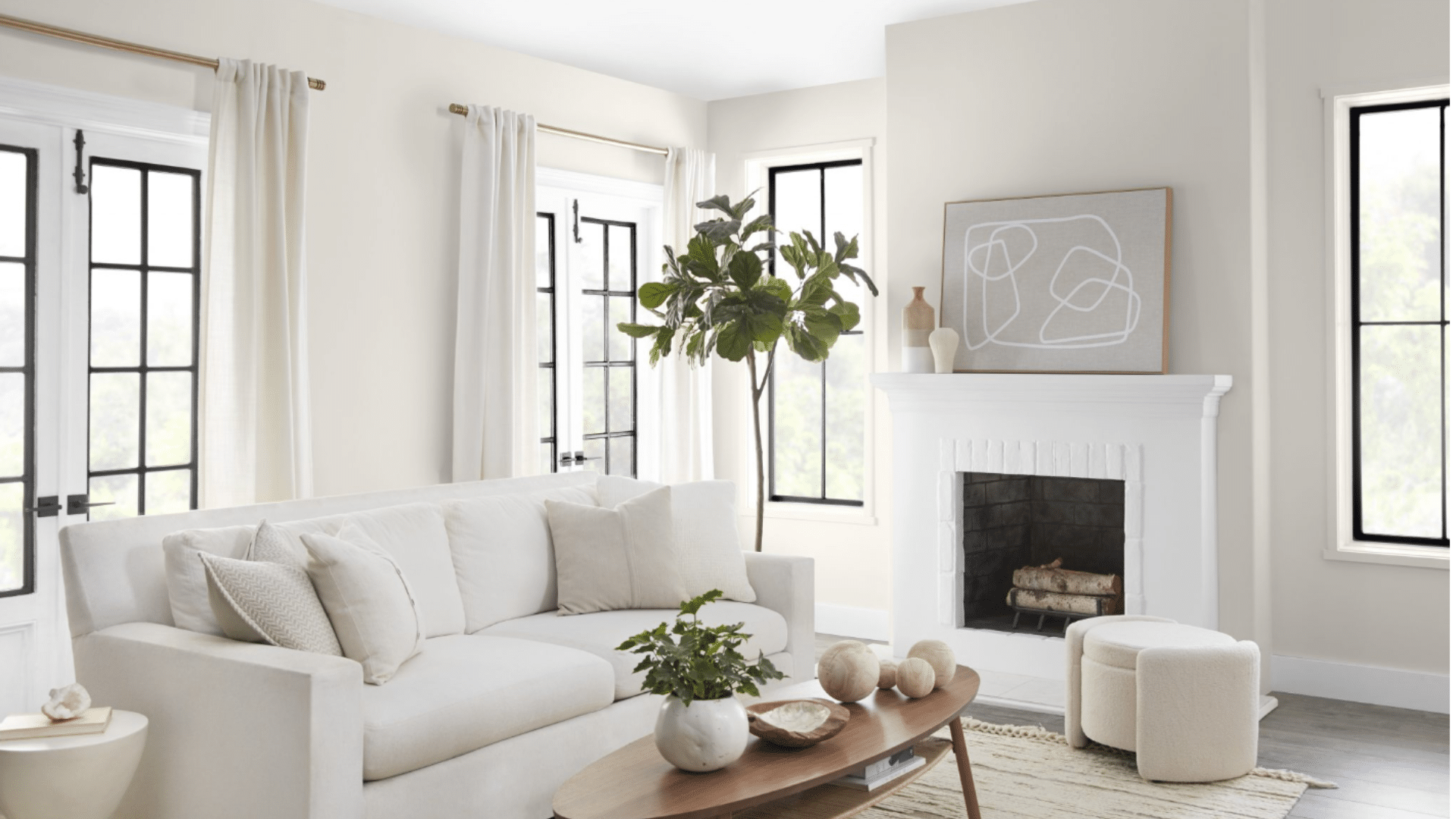
20. Snowbound
A soft white with subtle warmth that brightens dark entryways without feeling stark. The faintest hint of cream undertones prevents it from feeling clinical or cold, even in north-facing spaces.
This versatile white creates a clean canvas that still feels welcoming and lived-in.
21. Cuddle
The coziest off-white with pink undertones that feels like a warm hug when you walk in. This nuanced neutral has just enough blush to feel special without looking obviously pink in most lighting conditions.
It creates a mudroom that feels both fresh and inviting, especially effective in spaces with natural light.
22. Blank Canvas
A true neutral white that makes small mudrooms feel bigger and brighter. Unlike stark whites, this shade has perfect balance between warm and cool undertones, making it compatible with any accent color.
It offers maximum flexibility for changing out seasonal accessories and textiles.
23. Cloud White
A crisp, clean white with just enough softness to feel welcoming. The subtle gray undertones give this white a contemporary edge without feeling cold or stark.
It creates a fresh, airy feeling in transition spaces, especially when paired with natural wood elements for warmth.
24. Simply White
The perfect white that works in any lighting condition and makes a small space feel airy. This crowd-pleasing shade reads as pure white but carries the faintest yellow undertone that gives it life and luminosity.
It’s the perfect choice for a foolproof white that works with any flooring or cabinet finish.
25. Drift of Mist
The softest possible gray that brightens dark corners without showing every scuff. This barely-there color has a chameleon quality, sometimes reading as white and other times as the palest possible silver.
It creates a subtle dimension in small spaces while maintaining the light-reflecting qualities of white.
Why This Palette Works
Light colors visually expand small spaces, making them perfect for compact mudrooms. They also create a sense of cleanliness and order in spaces that are naturally chaotic.
While whites and light neutrals do show dirt more easily, they can be paired with darker floors or furniture to balance practicality with style.
These shades work especially well in mudrooms with limited natural light or interior locations without windows.
Perfect Neutrals
These go-with-anything shades create seamless flow from your mudroom to the rest of your home.
They’re the ideal choice when you want your entry to feel connected to your overall color scheme while still handling the practical demands of a high-traffic space.
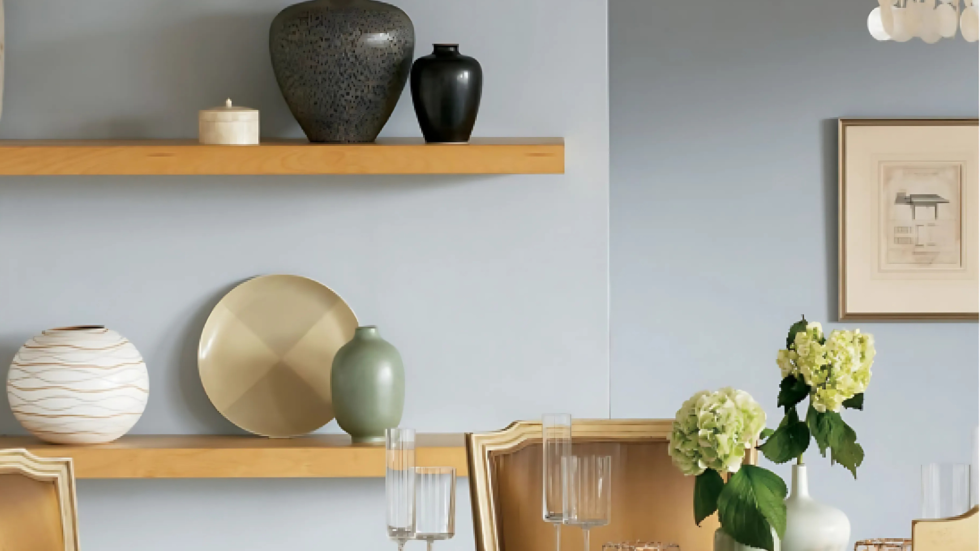
26. Gray Frost
A light gray that bridges the gap between cool and warm tones, playing well with any accent color. This versatile neutral reads differently throughout the day, sometimes appearing silvery and other times taking on a warmer cast.
It creates subtle refinement without the maintenance concerns of pure white.
27. Chestertown Buff
A classic buff that feels both traditional and fresh, hiding dirt like a dream. This historical color has been used for centuries in entrances and hallways for its practical beauty and warm welcome.
It creates lasting mudrooms that reference traditional architecture while feeling perfectly current.
28. Gilded Linen
This warm neutral has subtle gold undertones that make your space glow. In morning and evening light, it takes on an almost luminous quality that elevates simple spaces.
This refined neutral creates a luxurious feeling without using bold color. Its subtle richness works in any style of home.
29. Gull Wing Gray
A mid-tone gray that’s the perfect backdrop for colorful accessories and natural elements.
This true gray with balanced undertones never leans too blue or too purple in any light. It creates depth without darkness, particularly in mudrooms that open directly into other living spaces.
30. Champagne Tickle
A festive name for a versatile neutral with a hint of sparkle. This refined beige carries the faintest pink-gold undertone that catches light beautifully, especially near windows.
It creates a subtle glow in transition spaces, making even the most mundane mudroom feel special and intentional.
Why This Palette Works
Neutrals are the chameleons of the color world – they can match any home style while still providing enough color to feel intentional. These versatile shades let your hardware, hooks, benches, and baskets take center stage.
They bridge the gap between your mudroom and adjoining spaces, creating flow rather than visual disruption.
Neutrals also have staying power, meaning you won’t need to repaint when you update other elements of your space.
Considerations When Choosing a Mudroom Color
Before grabbing your paintbrush, think about:
- Lighting – Dark colors need good lighting; bright whites might be too harsh in sunny spaces
- Size matters – Small spaces usually benefit from lighter shades
- Your home’s flow – Choose colors that work with adjoining rooms
- Your lifestyle – Homes with kids and pets need more forgiving colors
- Your design style – Your mudroom can reflect your personality, just like any other room
Make the Mudroom Your Favorite Room
Your mudroom might be the hardest-working space in your home, but it doesn’t have to be boring! With the right color, this practical space can become a stylish introduction to your home. The mudroom sets the tone of all that is to come.
Pick a shade that makes you happy every time you walk through the door—because coming home should always feel good.
What color would you choose for your mudroom? Sometimes the most unexpected choices create the most delightful spaces! Tell us in the comments how we inspired your mudroom’s new look!
Want to keep the style flowing through your home’s entryways? Don’t miss our blog on The Best Paint Options for Long-Lasting and Stylish Doors to complete the look with the perfect front door finish.