
Why Your Neutral Paint Never Matches the Chip (And Why It’s Not Personal)
You know that moment when you’re in the paint aisle feeling powerful and decisive like, “Yes. This is the perfect soft gray” and then you get home and it’s… lavender. Or your “classic beige” turns into a faintly pink latte situation.
Here’s the annoying truth I wish someone had tattooed on my forehead the first time I painted an entire room: no neutral is actually neutral. Every gray, beige, and white has a sneaky little undertone hiding in it like a gremlin waiting for the right lighting to jump out and yell, “SURPRISE, I’M GREEN NOW.”
Let’s talk about why those tiny paint chips are lying to you, how to spot undertones before they move into your walls rent free, and how to test paint like a normal person (not someone who has the time to run a full science experiment in their dining room).
Why Paint Chips Are Tiny Liars
Paint chips make you feel confident. They’re clean, they’re neat, they’re under flattering store lighting that makes everything look like it has its life together. Your house… does not have that lighting. Your house has “one window, a ceiling fan light from 2003, and vibes.”
Also: when you look at a little chip, you mostly see the main color (the “mass tone”). But when paint goes on a wall big surface, different texture, light bouncing around those hidden undertones start doing pushups and suddenly they’re all you can see.
So if you’ve ever thought, “But it looked perfect on the chip!” yes. That’s the trap. Welcome.
Mass Tone vs. Undertone (AKA: What You Think You Bought vs. What You Actually Bought)
Mass tone is the obvious part: “This is a light gray.” “This is a warm white.” “This is beige because I’m trying to be a stable adult.”
Undertone is the secret tint mixed in: blue, green, purple, pink, yellow… all the colors that show up later to humble you.
And here’s the thing: undertones don’t show up the same way in every room. Your floors, your countertops, your sofa, and your lightbulbs will all gang up and bring out whichever undertone they feel like spotlighting.
First, Pick Your Team: Warm or Cool
Before you start collecting 47 paint strips like they’re Pokémon, decide whether your room wants to lean warm or cool. This one choice cuts your options in half and saves your sanity.
Warm undertones = yellow, red, orange, pink, brown. Cozy. Soft. Inviting. (Also: they can make a room feel a smidge smaller, like it put on a comfy hoodie.)
Cool undertones = blue, green, purple, gray. Crisp. Clean. Polished. (Also: if you go too far, it can start feeling like a dentist’s waiting room. Ask me how I know.)
If your house has lots of honey oak, warm floors, beige tile, brass warm leaning neutrals usually play nicer. If you’re living in a world of chrome, grays, cooler woods, crisp whites cool might be your lane.
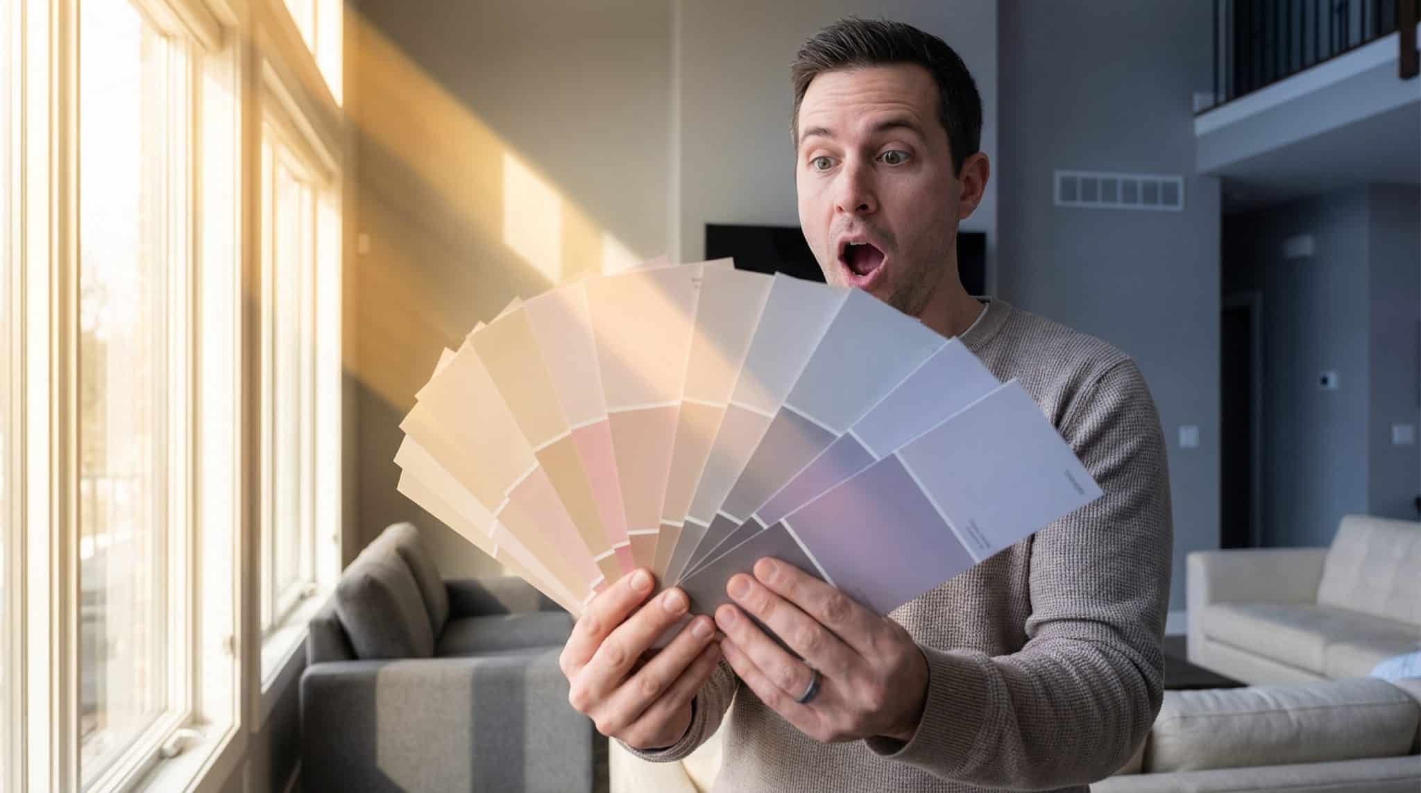
3 Ways to Spot Undertones in the Paint Aisle Without Losing Your Mind
1) Look at the darkest shade on the strip
This is my favorite trick because it works fast. The palest color at the top of the strip will look “nice” no matter what (that’s how they get you). The darkest shade shows the undertone way more clearly.
If the bottom looks muddy brown or creamy hello warmth. If it looks steely, bluish, greenish cool territory. And if the bottom shade makes you go “Why is that… purple?” congrats, you just found your undertone.
2) Hold it next to something actually white
Don’t judge a color in isolation. Your eyeballs need a reference point.
Grab a piece of plain white printer paper (the least glamorous design tool, but wildly effective) and put the chip next to it. Suddenly you’ll see if that “neutral” is secretly yellow, pink, green, or blue.
3) Compare a few similar strips side by side
Pick 3-5 “almost the same” options and line them up. The differences become obvious immediately. It’s like trying on jeans one pair makes you feel amazing and the rest are just… confusing choices you made in bad lighting.
Lighting: The Chaos Gremlin That Changes Everything
Paint is basically a mirror for light. And light changes all day long. So if you’ve ever said, “It looked fine yesterday and now it’s weird,” you’re not losing it. You’re just living on Earth.
Window direction (the quick and dirty version)
- North facing rooms: cooler, steadier light. Warm neutrals usually balance it out.
- South facing rooms: bright, warm light. Undertones show up more. You can usually handle cooler neutrals here without them feeling icy.
- East facing rooms: brighter in the morning, shadowy later. Things can look a little weird early on.
- West facing rooms: golden later in the day. Warm tones can get extra at night, so you really need to test in the evening.
Lightbulbs matter more than you want them to
If you’re mostly home at night (hi, same), your bulbs can matter more than your windows.
- Warm bulbs (2700K-3000K): add yellow warmth. Cozy, but they can make “clean whites” look creamy and make some grays look kind of… sad.
- Cool bulbs (4000K-5000K): add blue. Great for task areas, but they can make warm neutrals look flat or even a little greenish.
Also, if your bulbs have a higher CRI (90+), colors tend to look more accurate. This is not the sexiest topic, but it can save you from repainting, so here we are.
Match Your Paint to the Stuff You’re Not Replacing (Unless You’re Secretly a Millionaire)
Paint usually “goes wrong” because people pick it like it’s the only thing in the room. It’s not. Your paint and overall room color proportions have to get along with the permanent roommates:
- Flooring and tile (they take up a ton of visual space)
- Countertops/backsplashes (especially in kitchens and baths where everything is right in your face)
- Cabinet wood tones (expensive to change, so let’s not fight them)
- Fireplace stone/brick (aka “the immovable object”)
If your finishes don’t match each other (because previous owners loved “variety”), pick the one that dominates the room visually and match your paint to that. Paint is the peacemaker. It’s not the diva.
Sheen: The Sneaky Thing That Makes Undertones Louder
If you want undertones to calm down and stop yelling, don’t go super glossy.
- Matte/flat: soft, forgiving, undertones feel quieter (but it can look a bit darker).
- Eggshell: my default for most walls practical and not too shiny.
- Satin: more wipeable, but it can highlight wall texture and make undertones more obvious.
- High gloss: gorgeous on trim/doors, but it will amplify everything. Everything.
One more thing: using the “same color” in different sheens on walls vs. trim can make them look like two different colors. It’s normal. It’s also mildly infuriating.
How I Test Paint (So I Don’t End Up Rage Painting at 10 PM)
If you take nothing else from this post, take this: stop trusting tiny chips.
Paint big sample boards
I like foam core or poster board. Paint at least 12×12 (bigger is better), do two coats, and let it dry fully. Then you can move it around the room without painting six different “test squares” directly on your wall like a confused art project.
Check it in real life, not just “nice daylight”
Look at it:
- in the morning
- midday
- late afternoon
- at night with your actual lights on (this is the make or break one)
I honestly start judging after dark because that’s when I’m actually using the room. If it looks good at 8 PM under your real bulbs, you’re usually safe. If it only looks good at noon on a sunny day… that’s not a relationship built to last.
If Your “Neutral” Went Sideways, Here’s What’s Probably Happening
Before you repaint in a dramatic spiral (again, relatable), figure out the problem:
- Wrong undertone (most common)
- Clashing with a fixed finish (floors, counters, tile, stone)
- Lighting is pulling something weird (hello, green cast)
- The room is empty and the color has nothing to “connect” to yet
Two quick fixes and neutral palette accent ideas I try before I give up:
- Repeat the undertone on purpose. If the paint is reading a bit pink-ish, pull in a pillow, art, or rug that has that same tone. Suddenly it looks intentional instead of accidental.
- Swap bulbs. If the room feels too yellow, try a slightly cooler bulb. If it feels icy, go warmer.
But if the undertone looks wrong in every light and it’s fighting something you can’t change? That’s when I sigh deeply, buy a new sample, and remind myself that paint is cheaper than therapy (most days).
My Final “Pick a Neutral Without Crying” Checklist
- Decide warm vs. cool based on your floors/counters/wood tones.
- Use the darkest shade on the strip to reveal undertones.
- Compare against true white (printer paper works).
- Test big sample boards, and judge at night.
- Don’t ignore your lightbulbs. They’re part of the design whether you like it or not.
That’s it. Go forth and pick a neutral that doesn’t randomly turn purple the second it hits drywall. And if it still happens… welcome to homeownership. I’ll be over here, staring at paint samples like they owe me money.