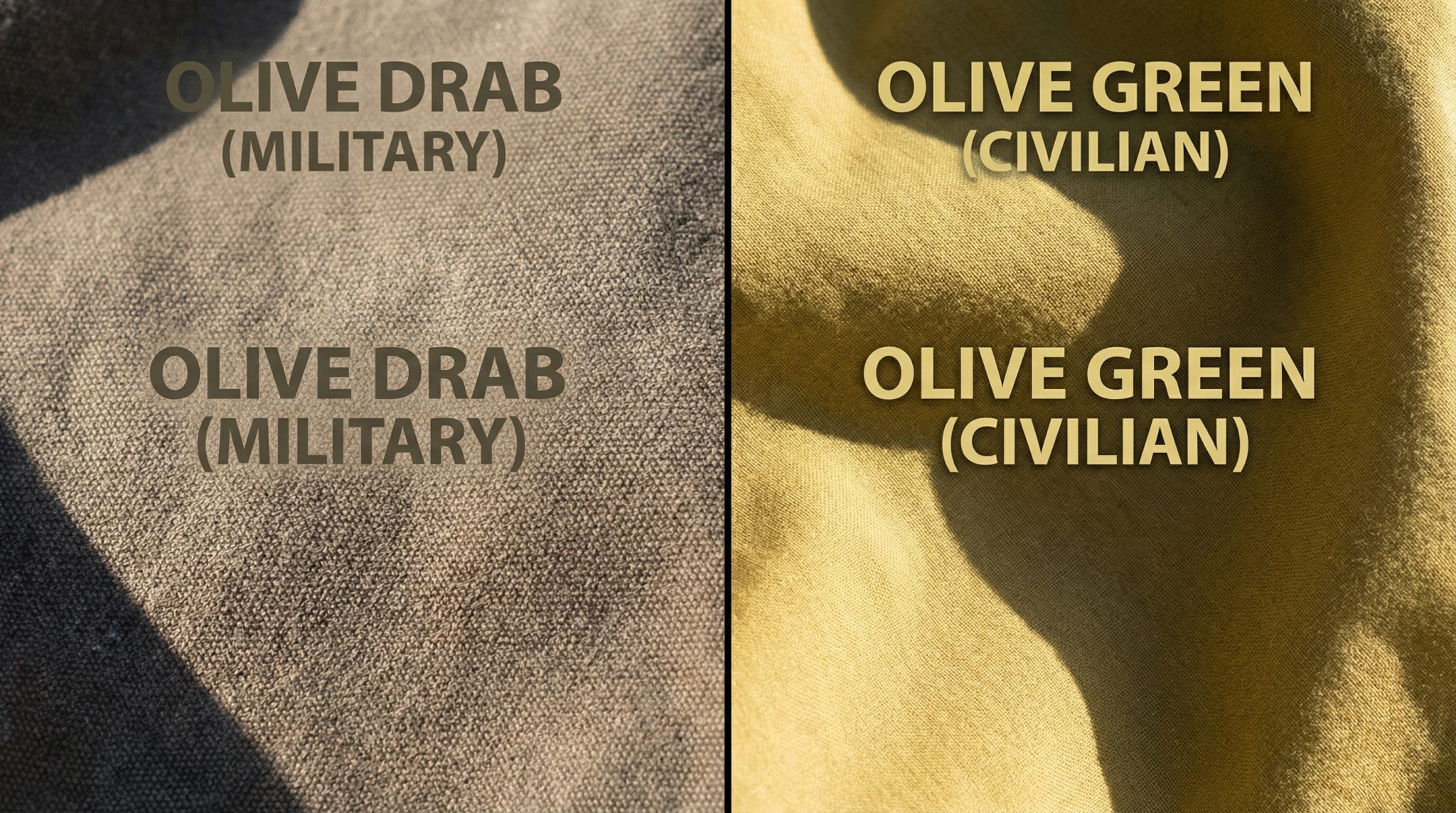
If you’ve ever ordered a “soft olive” jacket and then opened the box to find something that looks like it retired from active duty in 1973… welcome. You are among friends.
Olive drab vs olive green trips up so many people. Paint, clothes, sofas, backpacks if it says “olive,” there’s a solid chance it’s not the olive you thought you were getting.
So let’s get our olive together.
The 10-Second Olive Test (No Color Degree Required)
You’re standing there with two “olive” things two throw pillows, two jackets, two paint chips and they look like they’re from different planets. You’re not crazy. They are.
Here’s the quick daylight test:
- Take them near a window in natural light.
- The one that looks dusty, gray brown, like old military canvas?
→ That’s olive drab.
- The one that looks warmer and more yellow, like an actual olive you’d eat?
→ That’s olive green.
Boom. You already know more than half the product descriptions on the internet.
Undertones: Where the Real Drama Lives
Forget the names on the tags. Names lie. Undertones don’t.
Olive Drab: The Sneaky Camouflage One
Olive drab is a muted, brownish gray green. It was literally designed to disappear in nature.
Think:
- Vintage army jackets
- Old canvas duffel bags
- Jeeps in WWII documentaries
It tends to:
- Look serious and utilitarian
- Soak up light instead of bouncing it around
- Blend quietly into outfits and rooms
If olive drab were a person at a party, it’d be the one hanging out in the corner booth with good stories and no desire to be on Instagram.
Olive Green: The Polished, Livelier Cousin
Olive green runs warmer, clearer, and more yellow based. It looks more like an actual olive or fresh foliage.
Think:
- Trendy accent walls
- Modern sofas
- “I shop at places with real plants and track lighting” outfits
It tends to:
- Feel more energetic and alive
- Grab a bit more attention
- Read as earthy but stylish vs straight up “military”
Olive green is the friend waving across the room, not the one blending into the wallpaper.
Why Olive Drab Feels “Military” (Because It Literally Is)
Tiny history moment (I’ll keep it short, I promise):
- Olive drab was born on battlefields.
Before WWI, soldiers wore bright uniforms (great for parades, terrible for not getting shot).
Olive drab was chosen because it blended into dirt, grass, and trees.
- Over the decades, the exact shade shifted a bit sometimes browner, sometimes greener but the goal was always the same: disappear into the landscape.
- Meanwhile, paint companies and fashion brands were like, “Love the vibe, don’t love the war associations,” and started pushing a fresher, warmer version olive green for homes and closets.
So:
- Olive drab = utility, surplus stores, old school toughness
- Olive green = nature-y, warm, stylish, doesn’t scream “I just left boot camp”
Once you see that difference, you can’t unsee it.
In Your Closet: Which Olive Belongs on Your Body?
This is where olive drab vs olive green gets personal fast because if the undertone is wrong, your skin will absolutely snitch on you.
Olive Drab in Outfits
Use olive drab when you want understated, casual, and low key cool.
Great for:
- Field jackets and parkas
- Cargo pants
- Canvas sneakers
- Utility style bags
Why it works:
- It behaves almost like a neutral (think gray or tan that went camping once and now won’t shut up about it).
- Plays really well with black, gray, navy, tan, denim.
- It lets bolder pieces (like a patterned shirt or bright shoes) have the spotlight.
Where it can go wrong:
- On some skin tones it can make you look tired or washed out especially if it leans very brown and you’re already warm toned.
Olive Green in Outfits
Use olive green when you want a little more presence and glow.
Great for:
- Blazers, dresses, jumpsuits
- Sweaters and cardigans
- “Nice casual” pieces where you want to look put together, not like you’re about to pitch a tent
Why it works:
- The yellow undertone often flatters warm and neutral skin tones.
- Looks amazing with cream, camel, burgundy, mustard, rust, and all the autumnal goodness.
- It feels creative and polished without being loud.
The 30-Second Skin Test (Do Not Skip This)
Before you rip off tags:
- Stand near a window (no overhead fluorescent horror, please).
- Hold the item up right under your chin.
- Look in a mirror:
– If your skin suddenly looks dull, sallow, or like you haven’t slept since 2012 → wrong olive.
– If your face looks clearer, more awake, and your eyes pop a bit → that’s your winner.
Your camera roll will 100% expose you later if you ignore this step. Ask me how I know.
Around the House: Olive Walls, Sofas, and Stuff
Olive drab and olive green can both be gorgeous in a home, but they create totally different moods.
Think of them as emotional lighting you paint on the walls.
Olive Drab in Decor: Cozy Cave Energy
Olive drab in a room feels:
- Calm
- Moody
- A little old world
Perfect for:
- Dens and TV rooms
- Reading corners
- Bedrooms where you want that cocoon vibe
Pair it with:
- Leather (brown or camel)
- Brass or antique brass metals
- Warm wood tones
- Cream or ivory textiles
Caution:
- In darker, north facing rooms, olive drab can go from “moody library” to “did someone turn off the sun?”
- It likes some natural light and warm lamps to keep it from feeling flat.
Olive Green in Decor: Energetic but Grounded
Olive green in a room feels:
- Lively
- Warm
- Natural
Perfect for:
- Kitchens (especially cabinets)
- Dining rooms
- Entryways
- Living rooms where you want warmth without bright color chaos
Pair it with:
- Terracotta or brick
- Blush, rust, or mustard accents
- Jute, linen, rattan, oak
- Black accents for a modern edge
Where to Use What (Quick Room Guide)
- Living Room
– Olive drab: cozy, layered, a bit dramatic
– Olive green: welcoming, warm, and social
- Bedroom
– Olive drab: best for a dark, restful, “curl up with a book” feel
– Olive green: nice if you want cozy but not super dark
- Kitchen
– Olive green wins here 99% of the time. Cabinets in olive green? Yes please.
- Home Office
– Olive drab: calming and focused without feeling like a white box
– Olive green: good if you need a bit more energy not to nap at your desk
Please Do the Lighting Test (Future You Will Thank You)
Olive changes a LOT with light. Do this before you commit:
- Paint a big swatch (like 12″x12″) or use peel and stick samples.
- Look at it:
– Morning
– Midday
– Evening with lights on
If it looks gorgeous at noon but slides into one of those unflattering green shades at 9 p.m., adjust. Your walls are there 24/7, not just during golden hour.
Outdoors & Gear: When Olive Is Not Just a Vibe
If you’re choosing backpacks, jackets, or tactical/outdoor gear, the difference between olive drab and olive green isn’t just aesthetic it can be function.
Olive Drab for Blending In
Use olive drab when:
- You’re hunting in forests, grasslands, or mixed terrain and actually don’t want to be seen.
- You’re using gear that needs to blend into nature: packs, vests, some tents.
It’s still a go to for camouflage style gear because that muted, muddy tone reminiscent of the world’s ugliest color melts into dirt and foliage better than bright greens.
Olive Green for Looking Good While You Camp (Or Commute)
Use olive green when:
- You’re hiking, camping, or just like the outdoorsy look.
- You want your bag, jacket, or boots to feel rugged but not full on military.
It works for:
- Everyday carry bags
- Travel backpacks
- “Tactical inspired” jackets that are more style than survival
Quick Gear Cheat Sheet
- Hunting / serious camouflage → Olive drab or full camo patterns
- Camping & hiking → Either, just pick the one you like looking at
- Everyday bags & jackets → Olive green is usually easier to style with normal clothes
How to Choose: Your Olive Decision Cheat Sheet
If your brain is starting to feel like a paint deck, here’s the short version.
Choose olive drab if you want:
- Muted, quiet, “blends in” energy
- Utility and toughness
- Cozy, moody rooms
- Gear that actually camouflages
Choose olive green if you want:
- Warmer, fresher, more stylish vibes
- Clothes that feel earthy but polished
- Kitchens and living spaces with life and warmth
- Easy to style bags, jackets, and decor
Final Tips Before You Click “Add to Cart”
- Ignore the color name.
“Olive,” “dark olive,” “army green” they’re all used loosely. Look at the undertone:
– More brown/gray → drab
– More yellow/green → green
- Start small.
Not sure yet? Try:
– A throw pillow
– A small side table or accent chair
– A jacket or sweater
Live with it for a bit before you commit to walls or a giant sectional.
- Trust your eyes over marketing.
If you love how it looks in your light, with your stuff, on your face that’s your color. Full stop.
Both olives can be gorgeous and useful. Olive drab brings quiet confidence and depth. Olive green brings warmth and energy while staying grounded.
Pick based on the feeling you want cocoon or glow and every olive that comes through your door will actually earn its keep instead of heading straight to the return pile.


