
Why Designers Keep Choosing Orange and Blue (And Why Your House Might Secretly Want It Too)
Orange and blue is one of those color combos that designers keep dragging back into the spotlight like it’s their favorite slightly toxic ex. And honestly? I get it.
They’re opposites on the color wheel, which means they’re basically built to flirt. Put them in the same room and suddenly everything looks sharper, brighter, and more “intentional adult with opinions” instead of “I bought whatever was on sale at HomeGoods.”
But because life can’t be that easy orange and blue can also go from designer chic to children’s museum gift shop real fast if you don’t balance them.
So let’s talk about why this combo works, how not to make it scream, and the simple rules I use when I’m trying to get that punchy contrast without giving myself a headache.
Why Your Eyes Love This Pairing (Yes, It’s a Real Thing)
Here’s the nerdy but useful part: orange and blue sit far apart in the light spectrum, so your eyes register them as super distinct. Your brain likes that contrast because it’s clear and easy to read kind of like when you finally label the leftovers in your fridge and suddenly you feel like a functioning human.
Also, orange is basically red + yellow vibes, and blue is, well… blue. Together they hit that “complete” feeling because you’re getting the whole primary color party without actually painting your walls like a preschool.
This is why the pairing feels exciting but still… right. Like it belongs.
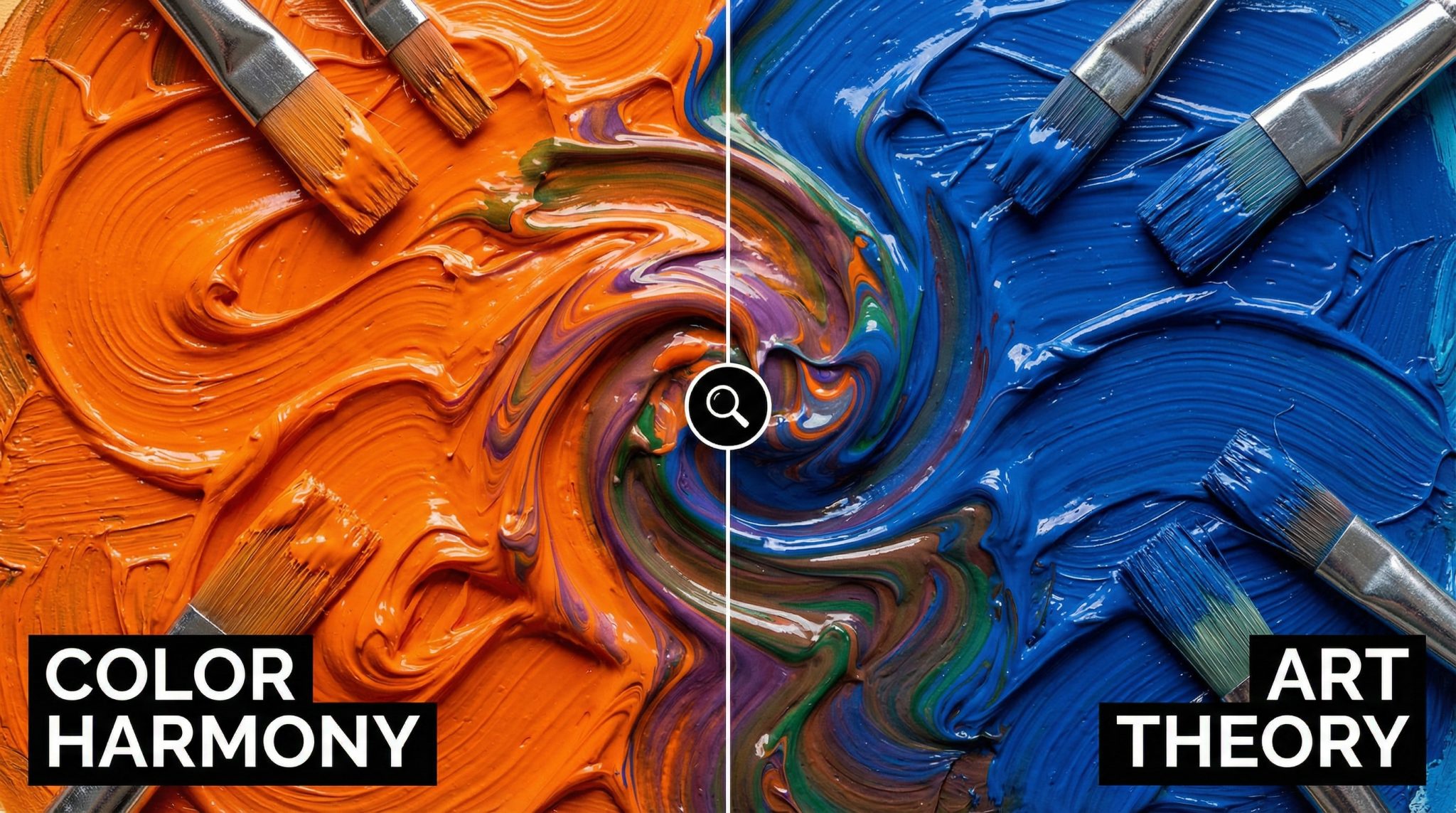
Please Don’t Mix Them Together (Unless You Want Brown)
If you’ve ever had the urge to blend orange and blue paint and avoid muddy brown like you’re making the world’s boldest smoothie: don’t. You’ll get brown. Muddy, sad, “why did I do this at 9pm on a Tuesday” brown.
That said brown is not the enemy. In fact, it’s the secret helper in this whole scheme.
Because all those warm woods, tan leathers, cognac anything, woven baskets, and “accidental beige” rugs? They’re basically the peacekeepers between orange and blue. They help the room feel connected, not like two colors are fighting in the driveway.
So yes: keep orange and blue near each other. Just don’t stir them together like soup.
My Three Non-Negotiable Rules for Using Orange + Blue Without Chaos
1) Match the “loudness”
Complementary colors are a color wheel complement and make each other look more intense just by being side by side. It’s like when you stand next to someone with perfect skin and suddenly you’re aware you have pores.
So if your orange is bright and punchy (think tangerine pillow), your blue should have similar confidence (like a rich cobalt or deep teal). If one is screaming and the other is whispering, the loud one will take over the room and you’ll wonder why it feels “off.”
Personally? I like at least one of the two colors to be a little grown up. Dusty. Smoky. Moody. (Not “highlighter orange meets pool noodle blue.”)
2) Make sure one is lighter or darker (aka: don’t let them tie)
This is the part most people skip, and then they can’t figure out why their room feels kind of… mushy.
You need value contrast light vs. dark so your eye knows what’s happening. My favorite easy win is dark navy + soft peach. It’s classy and it photographs like a dream.
Quick cheat: take a photo of your room and turn it black and white. If your “blue” and “orange” areas look like the same gray blob, you need more contrast. (Yes, this feels dramatic. No, it doesn’t lie.)
3) Don’t do 50/50 unless you want constant energy
A perfect split sounds fair, but design is not a courtroom. A 50/50 room makes your eye bounce back and forth like it’s watching a tennis match.
Instead, steal this old school formula that still works because it’s not stupid:
- 60% main color
- 30% secondary color
- 10% accent
If you want calm: make blue the 60 and orange the 10.
If you want cozy and warm: make orange the 60 and use blue as the cool “ahhh” contrast.
(And if you’re thinking, “But how do I measure 10%?” You don’t. You eyeball it like a normal person and adjust until you stop feeling annoyed.)
How to Make Orange + Blue Feel Fresh (Not “2014 Teal and Coral”)
I will forever defend teal and coral as a concept… but yes, it got a little overplayed for a while. If you want this pairing to feel updated, here are my favorite tweaks:
Mute one of them
Slate blue walls with a few rust accents? Gorgeous.
Bright orange accessories with soft gray blue? Also great.
Two fully saturated colors at full blast? That’s… a choice.
Shift the shades, just slightly
Instead of “orange,” try terracotta, cinnamon, burnt sienna, copper.
Instead of “blue,” try dusty denim, stormy navy, smoky teal.
These versions feel less like a sports team and more like you have taste.
Give them a buffer
If orange and blue touch directly with no break, they can “vibrate.” (You’ll feel it. Your eyeballs will complain.)
Add breathing room with:
- cream/white trim
- warm gray
- natural wood
- woven textures
Your eye needs a place to rest, just like you need a place to sit down after “quickly rearranging” a room for three hours.
Where Orange and Blue Actually Work Best (Room by Room)
Living rooms
This is the easiest place to start because you can keep it flexible. Try:
- navy or slate sofa/walls
- terracotta pillows
- a little art that ties them together
It’s cozy, it’s inviting, and it makes your space look styled without feeling precious.
Bedrooms
Keep it softer here. You want “sleepy interesting,” not “circus tent.”
Dusty blue bedding with a tiny hit of apricot or copper (lamp base, pillow, throw) is chef’s kiss.
Kitchens
Blue cabinets + warm wood is basically orange and blue in disguise. It’s one of my favorite combos because it feels classic but not boring. Add brass hardware and you’ve got that warm/cool balance locked in.
Outdoor spaces
Orange and blue are basically sunset colors. Terracotta pots against blue cushions? Yes. Navy outdoor rug with warm toned lanterns? Also yes. Nature already did the color planning steal it.
If You Want a Super Easy Starting Point
If you’re nervous (normal), don’t start by painting an entire room bright orange. Please. I’m begging you.
Start small:
- one blue anchor (rug, sofa, bedding, cabinets)
- a few orange accents (pillows, art, a vase, a throw)
- some warm neutrals (wood, tan leather, woven stuff) to keep the peace
Then look at it in daylight and at night before you commit. Orange especially loves to get weird under certain bulbs. (I have learned this the hard way, in a hallway that looked like a nacho at 10pm.)
Orange and blue work because they make each other glow. You’re not forcing a trend you’re using a built in visual trick designers lean on for a reason.
Pick one room. Grab a couple paint chips or fabric swatches. Hold them next to each other and see if your brain goes, “Ooooh.” If it does, you’re on the right track.