
The Real Opposite of Orange Isn’t What You Think (And Yes, It Matters)
If you’ve ever Googled “what color is opposite orange” and gotten three different answers (blue! cyan! something vaguely sea glass!), you’re not losing it. The internet isn’t even wrong for once. The problem is that color behaves like a completely different creature depending on whether you’re dealing with light (screens) or pigment (paint/ink).
And if you’ve ever painted a room based on a pretty color palette you saw on your phone… only to end up with something that feels like a traffic cone arguing with a swimming pool? Hi. Been there. Regretted that. Ate snacks in the driveway while “thinking about my choices.”
So let’s make this simple and actually useful.
Why “Opposite” Orange Has Multiple Answers
Here’s the whole drama in one sentence:
Screens make color by adding light. Paint makes color by subtracting light.
Same word (“orange”), totally different rules. That’s why designers and artists sound like they’re arguing when they’re really just talking about different mediums.
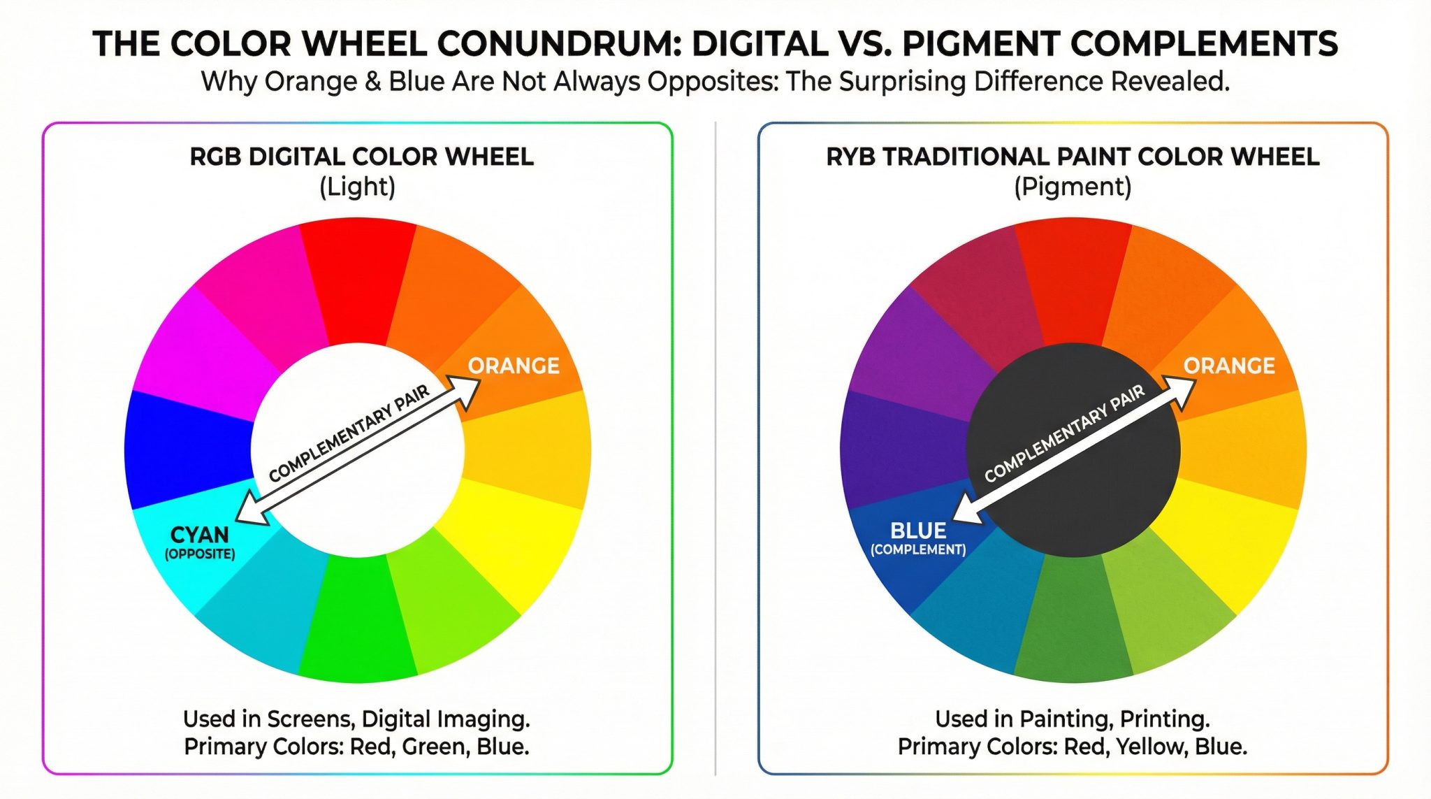
On screens (RGB): orange’s opposite is cyan
Screens start dark and add red, green, and blue light to create everything you see.
- Orange on a screen is basically red + green light.
- The “opposite” (complement) is what balances it out to white light, which is green + blue… aka cyan.
So if you’re designing something digital Instagram graphics, a website, a Canva invitation, whatever cyan is the true complementary color to orange. That’s why those orange and teal palettes look so punchy and clean. (Also why every wedding in 2014 looked like that, but I digress.)
With paint (RYB-ish reality): orange’s opposite is blue
Paint pigments don’t glow. They sit there and absorb certain wavelengths and reflect others back to your eyeballs.
On the traditional painter’s color wheel (the one most of us grew up with), orange sits across from blue. And when you mix a real orange pigment with a real blue pigment, you don’t get “bright magic” you get neutralized, usually a gray brown muddy something. (The technical term is “neutral.” The emotional term is “why is it the color of wet cardboard.”)
So for home stuff paint, decor, textiles when you want to balance orange, you typically reach for blue.
Okay, So What Should You Use? (Pick Your Medium)
1) If you’re working on a screen: go cyan/teal-ish
If your project lives on a screen, use the orange complement explained approach:
- Use your design tool’s Complementary color setting, or
- Spin the hue slider about 180° from your orange
You’ll land in cyan/blue green territory. It gives that satisfying “pop” without looking like you accidentally dressed your design in opposing sports teams.
A quick pattern I’ve noticed over and over:
- Warm, rich oranges look great with cool, crisp blue greens
- Light peaches usually need a darker, moodier opposite to keep things from looking washed out
(Also: if you pick a super saturated orange and pair it with a super saturated bright blue, it can look… loud. Like a Nerf gun. Sometimes that’s the vibe! Just be honest with yourself.)
2) If you’re mixing paint or choosing wall colors: go blue (and test it)
For actual pigment art paint, wall paint, furniture paint you’re usually looking for blue to calm orange down.
And here’s my favorite low stress way to check if your blue is actually doing the job:
The “Does This Neutralize?” test
- Put a dab of your orange and a dab of your blue next to each other.
- Mix equal parts.
- If it turns into a neutral gray/brownish tone, congrats you’ve got a solid complementary relationship.
- If it’s going weirdly purple or green, your pigments aren’t true opposites. Try a different blue.
This happens a lot because “blue” is not one color. It’s a whole extended family with drama:
- Some blues lean purple (warmer blues)
- Some blues lean green (cooler blues)
If your orange + blue keeps going purple, try a blue that leans greener (think more cerulean/phthalo vibes). If it keeps going greenish, try a deeper, warmer blue.
And if you’re picking paint for your house, please don’t skip samples. Paint is a liar and will change its mind depending on lighting, time of day, and whether Mercury is in retrograde.
3) If you’re printing something: expect your “perfect” colors to get humbled
Print is where dreams go to be slightly less vibrant.
In theory, orange’s complement is still in that cyan zone for print work but the moment you move from glowing screen to paper, things can shift warmer and duller. It’s normal.
If you’re doing anything you care about (like invites you already paid for, or signage for an event where people will definitely notice), do this:
- Ask your printer what color profile they need
- Convert/export using that profile
- If possible, do a proof (even a cheap one)
Because nothing hurts like opening a box of prints and realizing your gorgeous teal looks like dental office aqua.
Two Mistakes That Make People Hate Color (Don’t Do These)
Mistake #1: Using a digital color picker to choose paint colors
Digital tools will happily tell you orange’s complement is cyan and for screens, yes. But that doesn’t mean cyan-ish paint is going to neutralize your orange-ish paint.
For paint: use a physical color wheel, sample cards, or (my favorite) the actual mixing test. Your specific pigments matter.
Mistake #2: Thinking “blue is blue”
“Blue” on a screen can mean a super electric, intense blue (#0000FF) that looks like it was invented by a gaming keyboard. “Blue” in paint can mean something softer, grayer, greener, deeper… a blue versus teal spectrum.
So if your orange and blue combo looks harsh, it’s not that the concept is wrong you may just have the wrong version of blue.
My One Rule Cheat Code for Color Confidence
Before you pick a complementary color, ask one question:
Where is this color going to live on a screen, in paint, or in print?
That’s it. That’s the whole secret.
- Screen? Orange’s opposite lives in cyan/teal territory.
- Paint/decor? Orange plays nicest with blue (tested in real life, not on your phone).
- Print? Complementary still applies, but color profiles and paper will mess with your confidence proof when you can.
Now go forth and make orange behave. And if it starts acting wild again, just remember: it’s not you. It’s physics.