
You picked beige because you wanted a calm, neutral, “I have my life together” wall color… and now your living room is giving subtle blush. Like the walls are flirting with your sofa.
Rude.
And no—you’re not imagining it. This happens to a lot of people who choose “safe” neutrals. Beige is basically the catfish of the paint world: it looks chill on a tiny chip, then shows up on your full wall with a whole different personality.
Let me explain what’s actually going on, how to spot the pink before you buy, and what to do if you’ve already painted and you’re currently side eyeing your walls every time the sun goes down.
Why Your “Neutral Beige” Is Suddenly Blushing
Everyone wants to blame lighting (and lighting does matter more on that in a minute). But the usual culprit is sneakier:
Red oxide pigment.
A ton of creams, beiges, and taupes are made from bases that include reddish brown pigments. Paint companies tweak and tint from there to land on what looks like a neutral… on a chip.
But here’s the problem: undertones get louder when you scale up.
A beige that looks totally normal in a 2″ square becomes a full on mood when it’s wrapped around your entire room. It’s like adding the tiniest drop of strawberry syrup to a drink—barely noticeable in one sip, and then suddenly you made Fruit Punch for 40 people.
And then contrast kicks in:
- Put that beige next to bright white trim? Pink jumps out.
- Next to cool gray furniture? Pink jumps out.
- Next to warm wood floors? Pink throws a party and invites peach.
Basically: the wall is telling the truth the chip conveniently left out.
Undertones: The Plot Twist Under Every “Neutral”
Here’s the simplest way I know to explain paint without making your eyes glaze over:
- Masstone = the color you notice first (beige, tan, taupe)
- Undertone = the sneaky color hiding underneath (pink, yellow, green, violet…)
Undertones are why two “beiges” can look completely different on your wall even if they look basically identical at the store.
And BTW, your room already has undertones everywhere—floors, countertops, tile, rugs, even that “neutral” sofa. When those undertones get along, your space looks pulled together. When they don’t, you get that annoying feeling of, “Why does this look… off?”
And you can’t fix “off” with throw pillows. (Ask me how I know.)
Sometimes It’s Not the Paint. It’s Your Bossy Finishes.
Paint doesn’t live alone. It’s more like it moves in with your floors and immediately starts absorbing their bad habits.
A few repeat offenders that make beige look pinker:
- Travertine / limestone / warm stone: often has peachy pink tones baked right in, and it reflects onto the walls.
- Red/orange wood floors: the warmth stacks up, and your beige slides right into rosy territory.
- Green leaning floors (some woods, some tiles): green and pink are opposites on the color wheel, so the contrast can make your walls look pinker even if the paint isn’t that pink.
I once watched a “perfect neutral” go full blush because of a honey oak dining table. We covered the table with a sheet for an afternoon (very glamorous), and suddenly the paint looked 30% less pink. The table was basically throwing a warm glow like it was paid to do so.
So yes—sometimes your floor is the instigator.
The 3 One Minute Tests That Save You From Pink Regret
Before you buy gallons. Before you commit. Before you spend your weekend repainting while muttering to yourself.
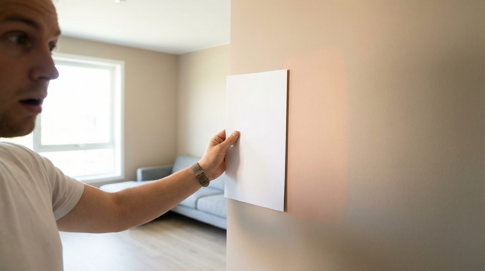
1) The White Paper Test (my ride or die)
Take the paint chip and put it on bright white paper in natural light.
White paper is brutally honest. It makes undertones pop immediately:
- If your “beige” suddenly looks rosy/peachy next to the paper… there’s your answer.
2) The “Look at the Darkest Swatch” Test
If you’re using a paint strip, look at the bottom/darkest shade.
Undertones show up way more in darker versions of the same color. If that darkest swatch looks pink brown, the whole strip is living in the same pink ish family—just turned down.
3) The Baseline Test (side by side reality check)
Hold your chip next to something you trust:
- a true white
- a true gray
- or a neutral you already know behaves in your house
Undertones hide when you look at one chip alone. Next to a baseline, they jump out like, “HELLO I AM MAUVE.”
Do those three tests and you’ll eliminate a bunch of “why is this flirting with salmon?” options before you ever buy a sample.
Sampling: Paint Chips Are a First Date. Your Wall Is Marriage.
If you skip sampling and go straight to gallons, I can’t stop you… but your future self might haunt you.
Here’s how to sample without making it a whole production:
Go bigger than you think
Paint at least 18″ x 24″ (two coats). Bigger is better. Tiny patches lie.
Even better: paint poster board and move it around. That way you’re not sanding “test squares” for the next seven years.
Put the sample where it will actually live
Test near the things that matter:
- trim
- floors
- countertops
- the big sofa you’re not replacing (be honest)
And test more than one wall if you can—one bright wall, one shadowy wall.
Check it at a few key times
You don’t need a spreadsheet, but do look at it:
- morning
- midday
- late afternoon
- evening with your actual bulbs on
If it only looks good at 11:30 AM with the sun hitting it just so… it’s not “the one.”
Light: The Final Filter on Every Paint Color
Light is basically Instagram for your walls. It explains why paint shifts by light.
Window direction (the quick and dirty version)
- North facing rooms: cooler light; can pull out gray/violet undertones and make some beiges look muddy or mauve.
- South facing rooms: warm, strong light; makes colors look creamier and warmer overall (and can wash pale colors out).
- East facing rooms: best clarity in the morning; tends to give you the most “honest” read early in the day.
- West facing rooms: dramatic golden hour shifts; a paint color can look calm at 2 PM and weirdly pink at 6 PM.
Bulbs matter too (yes, really)
Bulb packaging will list Kelvin (K):
- 2700K = warm/yellow (often makes pink show up more)
- 3000K-3500K = still warm but a bit cleaner
- 4000K+ = cooler/bluer (can reduce warmth, but may push some pinks toward lavender)
So if your beige looks fine all day and then turns pink at night… your bulbs might be hyping it up.
Okay, But What If You Already Painted and It’s Pink?
First: you’re not dumb. Beige is tricky. It’s not a moral failure. (Although it may feel like the walls are mocking you. Valid.)
Here’s a simple way to diagnose what kind of pink you’re dealing with:
If it looks mauve / lavender / gray pink
That’s usually a cool pink undertone meeting cool light (north light or cooler bulbs).
- Try warmer bulbs first.
- If it still reads mauve no matter what, you probably need a beige with a warmer/less violet undertone.
If it looks peachy / salmon / orangey
That’s usually a warm undertone being amplified by warm light and/or warm floors.
- Try cooler bulbs.
- If it stays peachy, you’ll likely want a more neutral beige (or a slightly different undertone direction).
If it looks different on different walls
Normal. Annoying, but normal.
Different walls get different light. If you want less shifting, look for neutrals that are more gray balanced (not heavily warm).
If you want to play detective (without losing your mind)
Temporarily remove or cover the biggest color casters:
- a warm rug
- a honey wood table
- a big red toned piece of furniture
If the pink calms down when that item is gone, congrats: it wasn’t all the paint’s fault. If the pink stays no matter what, it’s probably the paint undertone itself—and yes, repainting is the cleanest fix. (I know. I’m sorry. I’ve been there.)
“No Thank You, Pink” Neutrals (What to Look For Instead)
If you’re done with rosy surprises and you just want a neutral that behaves:
Creamy/yellow leaning neutrals (warm, but not pink)
Look for chips that read buttery or soft gold next to white paper—not peach.
Green/olive leaning greiges (my personal favorite for tricky rooms)
These can look a tiny bit “muddy” on the chip, but they often look amazing on the wall—especially with warm wood floors—because they don’t go rosy.
True gray balanced neutrals
These are the least dramatic. They don’t scream yellow, green, or pink next to white paper. They’re not always the coziest, but they’re steady and predictable (unlike that pinky beige that gaslit you).
Do the three quick tests from earlier and you’ll spot which family you’re in.
My “Don’t Let Beige Bully You” Checklist
When you’re picking a neutral and you want it to stay neutral:
1) Identify the bossy finish.
Usually the floor, a big countertop, or the largest piece of furniture. Put that next to white paper and figure out what undertone you’re working with.
2) Choose your undertone on purpose.
Not “this seems fine,” but “I want creamy,” or “I want olive greige,” or “I want true neutral.”
3) Run the three quick tests (white paper, darkest swatch, baseline comparison).
Do not skip this. It takes two minutes and saves two weekends.
4) Sample like you mean it.
Big sample. Two coats. Multiple walls. Check it morning to night with your actual bulbs.
Because yes—samples cost money. But repainting costs money and your sanity.
Now go pick a neutral that doesn’t turn emotionally expressive the second it hits drywall.