Imagine a color so unappealing that multiple governments basically said,
“Yep. That one. That’s the color we’ll use to make smoking look tragic.”
That color is Pantone 448 C.
It’s a murky brown green that lives somewhere between old bandage, swamp water, and the inside of a smoker’s lung. If you’re picturing “split pea soup someone forgot in the fridge for three weeks,” you’re very much in the neighborhood.
And yet… designers have used shades like this for centuries in art, fashion, and interiors.
So how did this one muddy mess get crowned “the world’s ugliest color”?
And can you actually make a color like this look good in your home?
Let’s gossip about it.
Meet Pantone 448 C: The Official Color of “Nope”
Pantone 448 C is a flat, dirty brown green. Too brown to feel like rich soil, too green to feel like a plant, too gray to feel alive. It’s just… joyless.
You’ve probably seen it without realizing: it’s the color that covers cigarette packs in places like Australia and the UK. All of them. Same sad shade.
And no, that wasn’t random. In Australia, back in 2012, the government literally hired researchers to find the most off putting color they could.
“Instead of selling a product, let’s sell regret.”
Researchers showed smokers a bunch of colors and asked:
“Which one makes this pack look the worst?”
Pantone 448 C “won” by a landslide. People called it:
- “Death”
- “Dirty”
- “Tar”
- And a few comparisons I will spare you if you’re currently eating
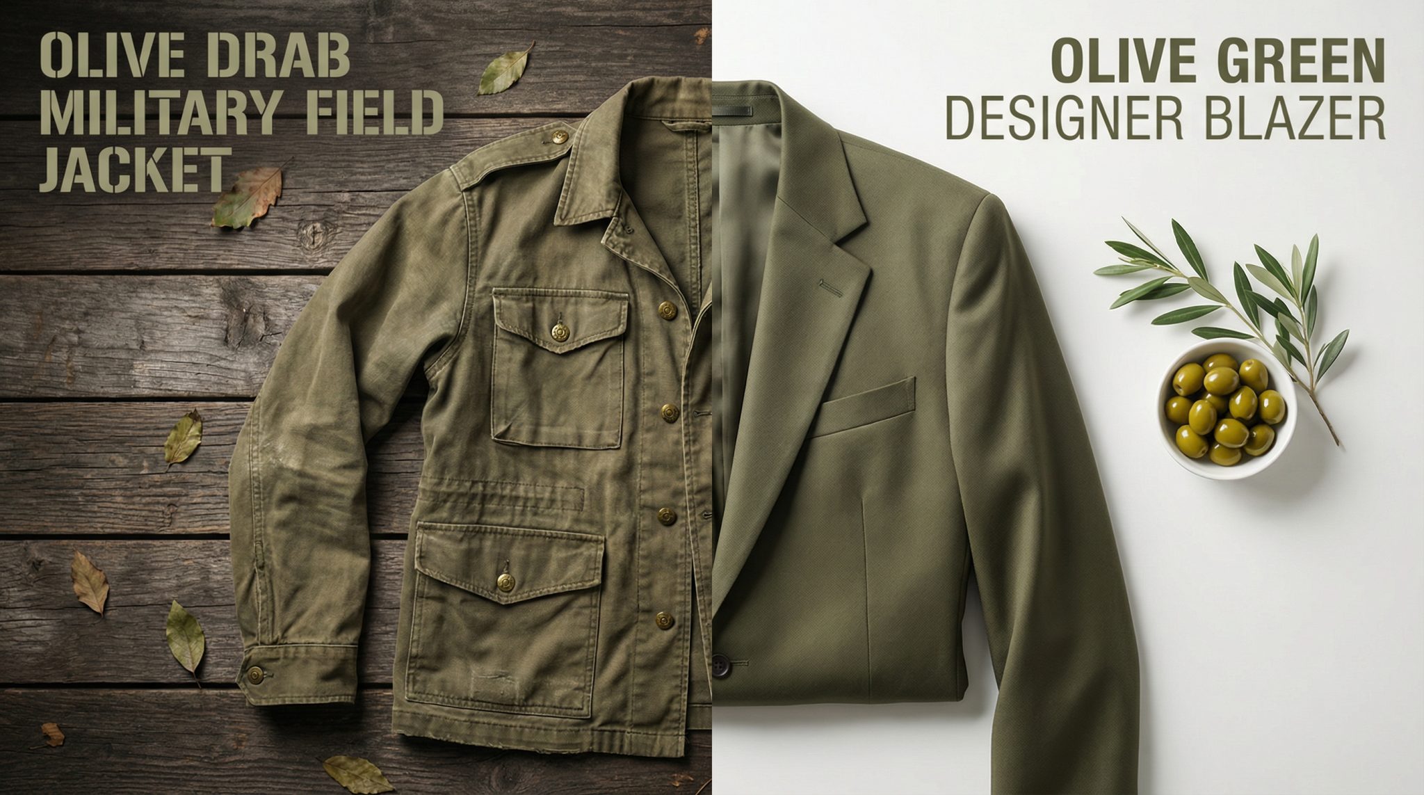
At first they called it “olive green,” until olive producers (understandably) said, “Please do not drag our antipasto into this.” So it got a more neutral name: opaque couché. Fancy name, revolting vibe.
From there, Australia made every cigarette pack:
- That same ugly color
- With standard fonts
- And huge health warnings
Basically, they took decades of sleek branding and said, “Nope. You all get the same depressing school uniform now.”
Other countries saw this, loved the drama, and followed.
Why Your Brain Hates This Color So Much
Let’s be fair: Pantone 448 C is not just “not pretty.” Your brain actively recoils from it. There’s a reason why this shade repels.
1. Your Disgust Alarm Is Going Off
Disgust is one of those built in survival tools, like being suspicious of chicken that smells even a little weird.
Certain browns and greens live in what I call the “contamination zone” because they resemble:
- Bruised fruit
- Stagnant water
- Infected skin
- Old food doing science experiments in your fridge
Pantone 448 C sits squarely in that zone. It’s the exact kind of color your brain has learned:
“Hey, that might carry disease. Maybe let’s not.”
Compare that to:
- Neon orange – loud, but energetic
- Beige – boring, but inoffensive (the extra in every movie scene)
This one? It demands attention and then offers… absolutely nothing pleasant.
2. Culture Piles On
In Western cultures, muddy olive browns are often linked to:
- Decay and dirt
- Dull military uniforms
- Nicotine stains and ashtrays
- Medical images of damaged lungs (fun!)
So when governments slapped this shade on cigarette packs, they weren’t just picking an ugly color. They were choosing a color that already whispered “sickness” and “stains you can’t scrub off.”
Your brain loves a dramatic backstory, and this color has one.
So… Did Ugly Packaging Actually Work?
Short answer: yes, ugly absolutely works.
Once Australia switched to plain, drab packs:
- Smoking rates kept dropping
- Smokers reported their cigarettes tasted worse and felt lower quality,
even though nothing inside the pack changed
Same tobacco. Sadder outfit. Different vibe.
It’s a great reminder: we don’t experience color in a vacuum. Color changes how we feel about what we’re looking at, even if we think we’re being logical.
And that brings us to the fun part…
The Plot Twist: Designers Made the Ugliest Color Look Chic
Because of course they did.
A British designer, Bradley Devereaux, basically looked at Pantone 448 C and said,
“Challenge accepted.”
He created designs using only this supposedly hideous color and… they were actually beautiful. The trick?
- Pairing it with gold accents
- Using minimal layouts
- Putting it on rich textures like leather
Suddenly, the same muddy tone felt:
- Earthy
- Calm
- A bit expensive, honestly
Even the Pantone Color Institute has pointed out that opaque couché belongs to a family of deep earth tones used in:
- Luxury leather goods
- Military inspired fashion
- Cozy, nature based interiors
And if you look at old paintings? This color shows up everywhere.
Think of:
- Rembrandt’s moody shadows
- Caravaggio’s dramatic backgrounds
- Those deep olive browns in classic landscapes
The “ugly color” has been doing the most in art history for centuries. It just got a bad PR gig with cigarettes.
Ugly vs. Pretty: It’s Mostly About Context
Here’s the real secret:
No color is universally ugly. It’s the context that makes or breaks it.
Pantone 448 C looks awful when:
- It covers a big flat area
- With no contrast
- On cheap, glossy material
- Next to pictures of diseased lungs (kind of a buzzkill)
But that same color can look rich and interesting when you:
- Use it in smaller doses
- Add contrast (creams, warm whites, golds, or even dusty pinks)
- Put it on texture – think linen, leather, matte walls, stone
Ugly isn’t a color. It’s a combination.
Which is very good news if you’re currently side eyeing the weird green tile in your bathroom or that rental wall color you didn’t choose and definitely don’t love.
How This Helps When You’re Picking Paint (Or Stuck With a Weird Color)
Let’s bring this home. Literally.
You might not be painting with Pantone 448 C (please don’t do an entire small hallway in it unless you’re going for “Victorian tuberculosis clinic”), but you will run into tricky colors like ugly green shades:
- Muddy greens
- Dingy beiges
- Brownish grays that look kind of… tired
Here’s how to make “difficult” colors work instead of fighting them.
1. Look at What It’s Paired With
Before you declare a color hopeless, ask:
- What’s next to it?
- Is everything around it also dull or dirty toned?
- Is there any contrast at all?
Often, the problem isn’t the color itself—it’s that everything around it is also sad.
Try:
- Adding fresh white or soft cream nearby
- Bringing in clearer colors (soft blues, blush, warm caramel)
- Swapping one muddy piece (like a rug or curtains) for something lighter
Sometimes you change one thing and suddenly the “ugly” color looks purposeful.
2. Play With Texture, Not Just Color
Flat, glossy surfaces make muddy colors look cheaper and more lifeless.
But that same tone on:
- Linen curtains
- A velvet pillow
- A matte painted accent
- Woven baskets
…can feel warm and grounded instead of gross.
If you’re stuck with an ugly countertop or tile, bring in textured items around it—wood, woven trays, soft textiles—and watch it calm down.
3. Use the Color in Smaller Doses
If a whole wall in a swamp tone feels like a cry for help, try:
- A piece of furniture (like a cabinet or small dresser) in that shade
- Picture frames or a lamp base
- A throw pillow or blanket that includes that color in a pattern
Sometimes a color that’s horrible at “leading role” is fantastic as an extra in the background.
4. Test Before You Judge (and Before You Panic Buy More Paint)
Don’t trust the tiny paint chip. It lies. It always lies.
Do this instead:
- Paint a big swatch on the wall (or use poster board you can move around)
- Look at it in morning, afternoon, and evening light
- Try it next to your actual furniture, flooring, and fabrics
And if it’s still giving cigarette pack energy? THEN you can break up with it.
The Real Takeaway From the World’s Ugliest Color
Pantone 448 C is a bizarre little case study:
- Governments used it to make smoking look gross
- Our brains help out by associating it with illness and decay
- Designers still turn similar shades into luxury vibes all the time
So while it might be the official color of “absolutely not” on cigarette packs, that doesn’t mean colors in this family are doomed forever.
When you’re staring at a wall of paint chips feeling overwhelmed, remember:
- There is no single, universally ugly color
- Context, pairing, texture, and proportion matter way more than the swatch name
- Even the world’s most hated shade can look chic in the right setting
So next time you run into a color that makes you hesitate, don’t automatically banish it.
Play with what’s around it.
Change the texture.
Shrink the amount.
And maybe—just maybe—let one awkward, swampy little color earn its keep in your space.