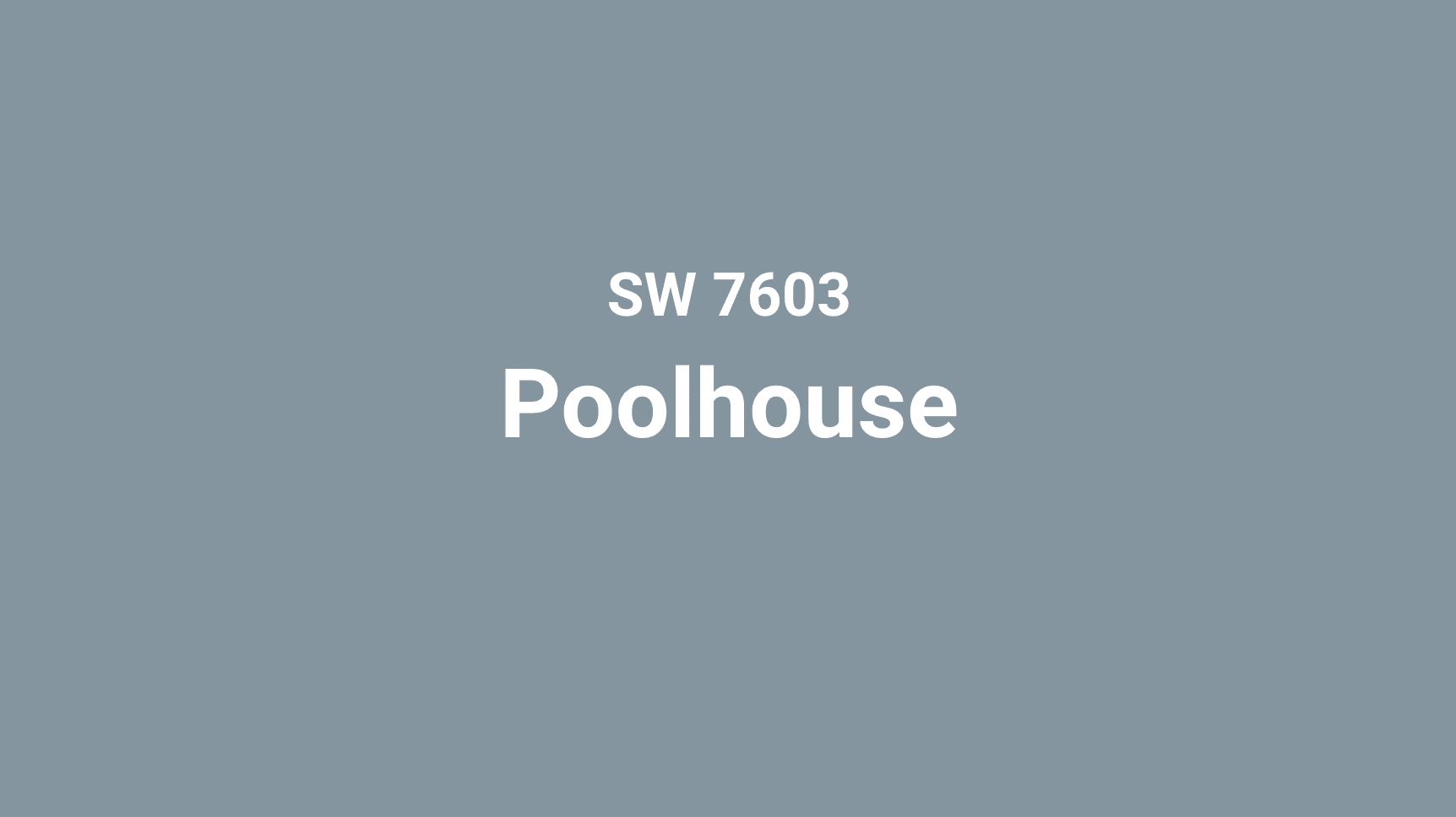
Do you feel tired of the same old blue paint choices? Sherwin-Williams’ Poolhouse (SW 7603) brings the calm feeling of water to your walls, without looking like every other blue out there.
This blue-green color works in more places than you might think. While most water-colored paints feel right only in summer or beach homes, Poolhouse fits in year-round and in any room. It has hints of gray that make it look grown-up and planned.
What makes this color special is how it changes. In morning light, it might look more blue. By afternoon, you’ll see more green tones come through. This small bit of magic keeps rooms feeling fresh day after day.
Want to see why home experts keep coming back to this color? Read on to learn why Poolhouse gives rooms both strong character and lasting good looks at the same time.
Sherwin-Williams Poolhouse Overview
| Attribute | Details |
|---|---|
| Color Name | Poolhouse |
| SW Color Code | SW 7603 |
| Location Number | 280-C3 |
| LRV (Light Reflectance Value) | 29 |
| RGB Values | 128 / 149 / 160 |
| Hex Value | #8095A0 |
| Color Family | Blue/Green |
| Color Collections | Coastal Cool, Living Well |
| Available In | Interior/Exterior |
| Description | A balanced blue-green with gray undertones that evokes the tranquil depth of water with sophisticated restraint |
Psychological Impact of Blue-Green Tones
Blue-green hues like Poolhouse occupy a unique position in color psychology, blending the tranquility of blue with the renewal of green:
- Lower heart rate and blood pressure, creating immediate physiological calm
- Reduce stress hormones and promote mental relaxation
- Enhance creative thinking and problem-solving abilities
- Create perceived expansion of space (especially beneficial in smaller rooms)
- Establish natural connections to water and sky, elements associated with freedom and possibility
How Poolhouse Evokes Tranquility and Adaptability
Poolhouse strikes a remarkable balance between cool blue and refreshing green, with gray undertones that elevate it beyond typical aquatic colors:
Tranquility: The blue foundations of Poolhouse instantly create a sense of calm and order. Unlike brighter turquoises that can sometimes feel energetic or playful, Poolhouse maintains a serene presence that transforms spaces into sanctuaries. Its connection to water—one of nature’s most soothing elements—creates rooms that feel like peaceful retreats from everyday stress.
Sophistication: The gray undertones in Poolhouse give it remarkable sophistication and prevent it from feeling juvenile or thematic. This isn’t a color that announces itself loudly; rather, it reveals its complexity over time, rewarding closer observation with subtle shifts in tone depending on light conditions. This restraint makes it appropriate for formal spaces and adult-centered design.
Adaptability: Perhaps Poolhouse’s most impressive quality is its chameleon-like adaptability across different design styles. It complements traditional elements with the same ease as contemporary ones, working equally well with natural wood tones and sleek metals. This versatility extends to seasonal transitions as well—the color feels refreshingly cool in summer months yet maintains a comforting presence in winter.
Ideal for Those Who Value Restful Grace with Modern Appeal
Poolhouse appeals to individuals with discerning tastes who appreciate nuance and longevity in their environments:
- The modern professional seeking a home that feels like a genuine retreat
- Design enthusiasts who appreciate color with subtle complexity rather than bold statements
- Those who entertain frequently and want sophisticated backdrops for social gatherings
- Individuals drawn to water and its restorative properties
- Anyone looking to create spaces that feel simultaneously current and timeless
This color particularly resonates with those who find typical blues too expected and trendy teals too intense. Poolhouse offers the perfect middle ground—refreshing enough to create atmosphere, sophisticated enough to transcend trends, and adaptable enough to grow with evolving design preferences.
How Poolhouse Changes Your Rooms
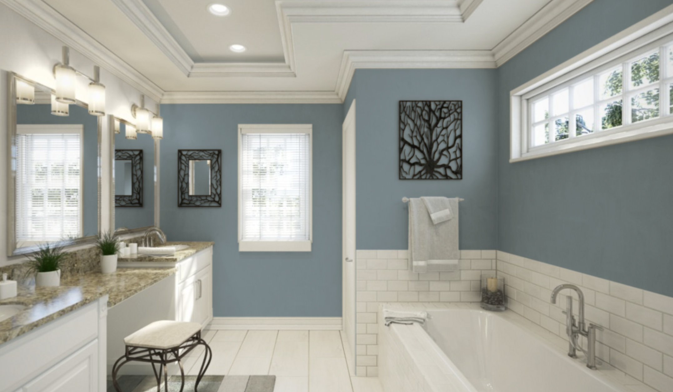
Bathrooms: Spa-Like Serenity
Poolhouse creates bathroom environments that transcend mere functionality, transforming everyday routines into spa-like experiences. The color’s natural association with water makes it particularly fitting in this context, while its sophisticated undertones prevent it from feeling like a literal interpretation.
In bathrooms with natural light, Poolhouse shifts throughout the day, appearing more vibrant in morning light and settling into a deeper, more mysterious tone by evening.
When paired with white fixtures, marble surfaces, and natural wood accents, Poolhouse bathrooms achieve a perfect balance between refreshing and relaxing—spaces that energize morning routines while providing calming backdrops for evening wind-downs.
Bedrooms: Restful Retreats
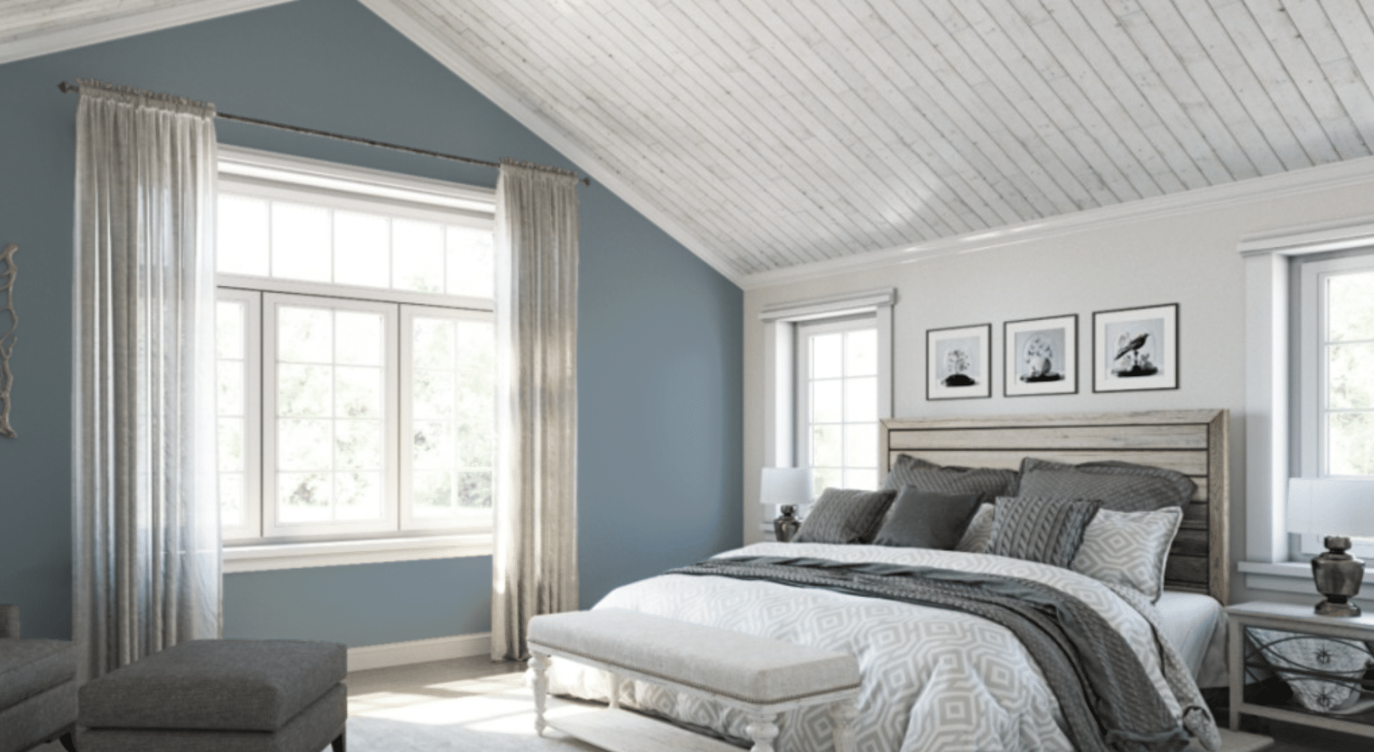
In bedroom settings, Poolhouse reveals its most tranquil qualities, creating sleep environments that genuinely support rest and renewal. Research has shown that blue-green tones can lower heart rate and blood pressure, making this an evidence-based choice for spaces dedicated to sleep.
The color creates a cocooning effect without feeling heavy or dark, especially when balanced with lighter bedding and textiles. Whether in primary bedrooms or guest rooms, Poolhouse creates spaces that feel both special and serene, with a subtle sophistication that works equally well with traditional furnishings or more contemporary designs.
Home Offices: Focused Creativity
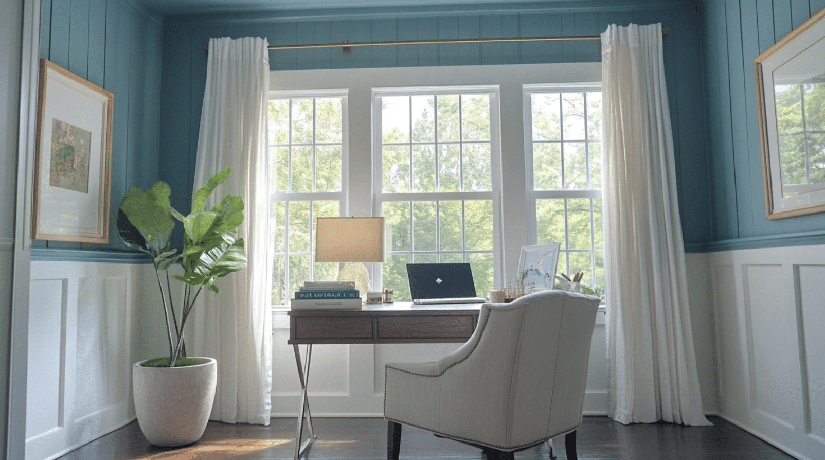
For work environments, Poolhouse offers the ideal backdrop for both concentrated work and creative thinking. Its blue qualities support focus and productivity, while the green undertones promote innovation and fresh perspectives.
The color’s depth and complexity create visual interest without distraction, making it particularly effective for video conference backgrounds. When used in home offices with warm wood furniture, brass accents, and plenty of natural light, Poolhouse creates a professional atmosphere that feels distinctly personal—a workspace that supports both productivity and wellbeing throughout the workday.
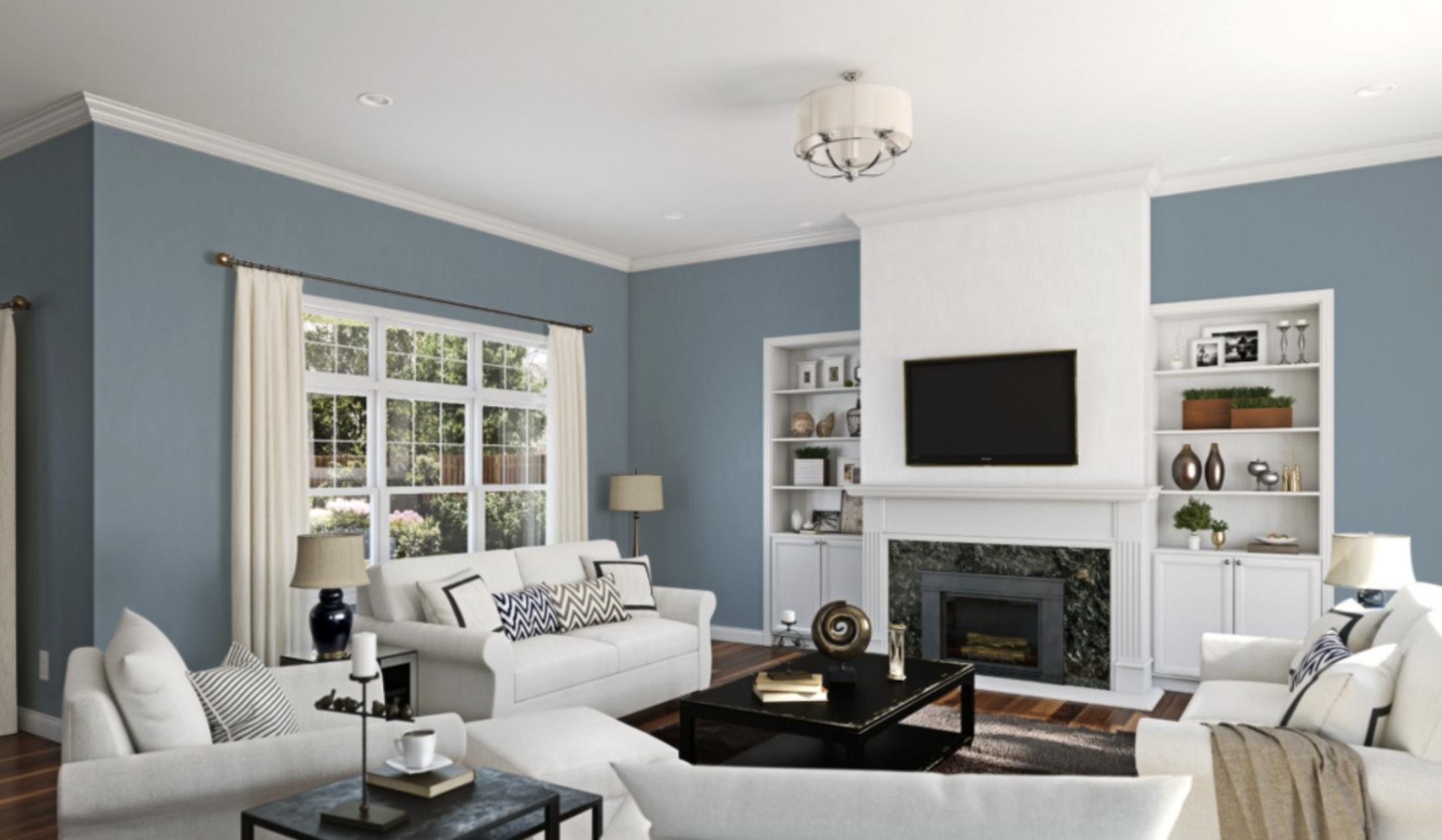
Living Areas: Sophisticated Comfort
Poolhouse creates living spaces that balance sophistication with genuine comfort in a way few other colors achieve. Its depth provides enough presence to anchor a room without dominating other design elements.
In open concept spaces, Poolhouse walls create natural zoning without requiring physical barriers, helping to define areas while maintaining visual flow.
The color pairs beautifully with both neutral furniture (creating a serene, monochromatic effect) and warmer accent colors (offering pleasing contrast). As natural light changes throughout the day, Poolhouse living areas evolve from bright, energizing spaces to cozy, intimate gathering places.
What Colors Pair Well With Poolhouse
Complementary Colors: Crisp Whites, Brushed Nickel, Soft Grays
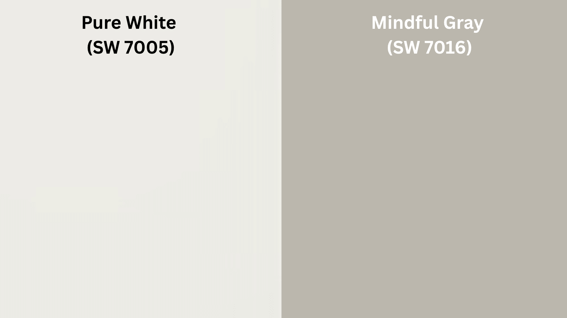
Poolhouse creates sophisticated harmony when paired with crisp whites like Pure White (SW 7005) or Extra White (SW 7006). These clean whites provide contrast without harshness, allowing Poolhouse’s subtle complexity to be fully appreciated while creating visual breathing room. The combination feels fresh and timeless rather than clinical.
Metallic elements in brushed nickel or chrome enhance Poolhouse’s contemporary side. These cool-toned metals echo the sophisticated gray undertones in the color, creating a relationship that feels modern and refined. This pairing works particularly well for fixtures, hardware, and lighting elements.
Soft grays like Passive (SW 7064) or Mindful Gray (SW 7016) create elegant layering with Poolhouse. This tone-on-tone approach allows for sophisticated depth without high contrast, resulting in spaces that feel cohesive and thoughtfully designed rather than pieced together.
Contrasts: Warm Woods, Terracotta Accents, Navy Depths
For natural contrast, warm wood tones—particularly medium oak, teak, or walnut finishes—create beautiful balance with Poolhouse. This combination brings organic warmth to the cool blue-green, resulting in spaces that feel both grounded and refreshing.
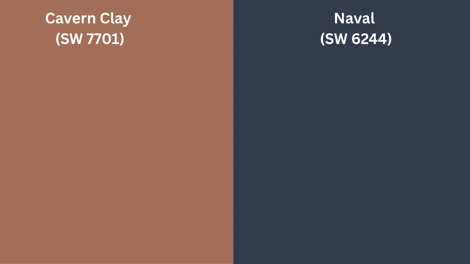
Terracotta accents like Cavern Clay (SW 7701) or Quartersawn Oak (SW 7519) offer unexpected sophistication when paired with Poolhouse. This combination creates a contemporary take on earth and water elements, bringing a subtle Southwest-inspired sensibility to spaces without feeling themed or literal.
For dramatic depth, deep navy blues such as Naval (SW 6244) create a compelling color story with Poolhouse. This pairing creates the visual effect of water depths—from shallow to deep—and works particularly well when used in adjoining spaces or as accent elements within the same room.
Sherwin-Williams Suggestions for Palettes
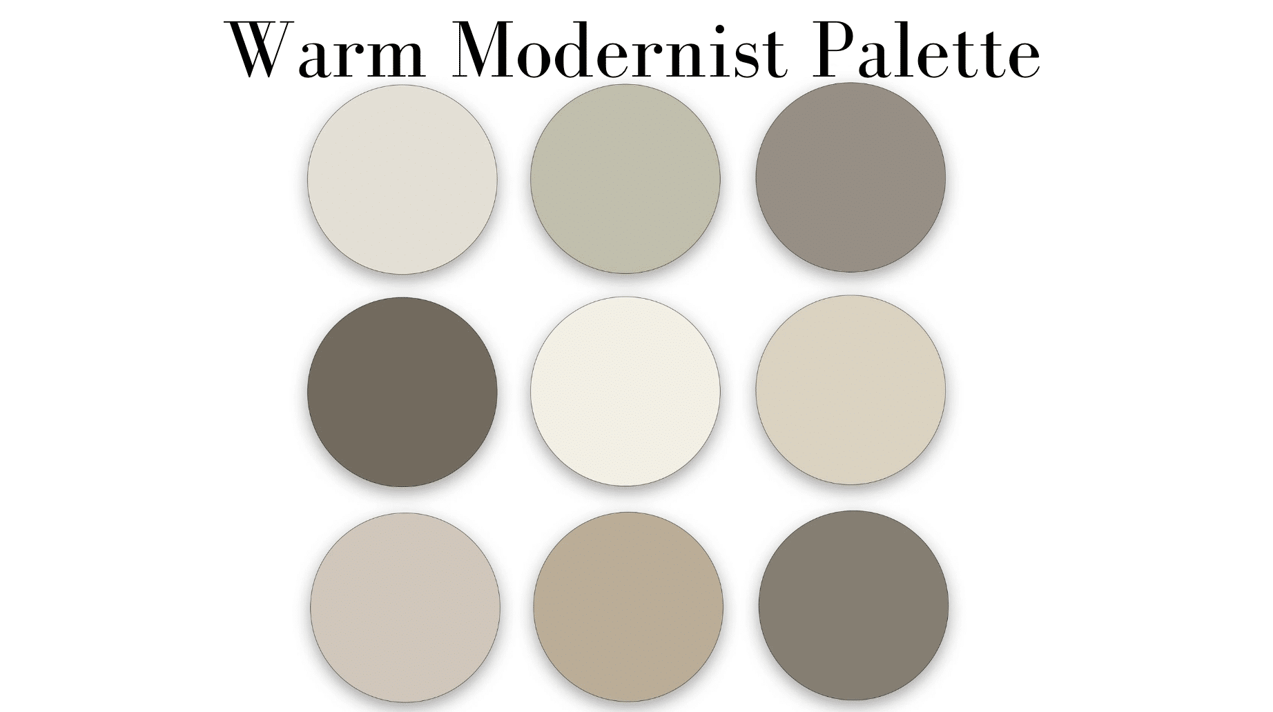
Contemporary Tranquility Palette:
- Poolhouse (SW 7603) – Main walls
- Pure White (SW 7005) – Trim and ceilings
- Modern Gray (SW 7632) – Complementary elements
- Light French Gray (SW 0055) – Accent details
Natural Harmony Palette:
- Poolhouse (SW 7603) – Feature walls or cabinetry
- Alabaster (SW 7008) – Secondary walls
- Natural Tan (SW 7542) – Warming elements
- Sea Salt (SW 6204) – Coordinating color (lighter)
Sophisticated Contrast Palette:
- Poolhouse (SW 7603) – Main color
- Creamy (SW 7012) – Complementary walls
- Naval (SW 6244) – Accent color
- Urbane Bronze (SW 7048) – Grounding elements
Conclusion
Sherwin-Williams’ Poolhouse stands out as a color that works in two ways at once. It catches the eye but fits well in daily life. With its special blend of blue, green, and gray tones, it creates spaces that look clean and well-thought-out—rooms that lift your mood without being too strong.
The true value of Poolhouse comes from how well it matches different home styles. It’s not stuck in the past or trying too hard to be modern. It goes with many home types while still keeping its own look. This means it will look good years from now when other colors have come and gone, making it worth buying for both today and tomorrow.
In times when we look at screens all day, having colors around us that boost our well-being matters more than ever. Poolhouse helps create this feeling, building spaces where you can let go of worry and think more clearly.
For those who want rooms that work now and for years ahead, Poolhouse proves that the most loved colors often connect us to what has always brought calm to our lives—such as the peaceful look of quiet waters.

