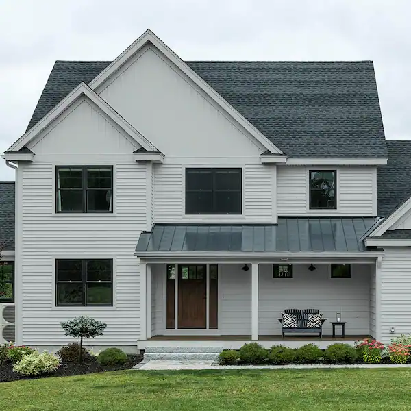
Sherwin Williams Light French Gray 0055 is a cool-toned gray that can be stunning if you know how to use it. Not everyone looks at grays as a first choice when it comes to choosing colors for their walls. However, this shade is as unique as it can get, but only if you know how to contrast it with other shades to bring out its brilliant purple undertones.
The Light French Gray has an LRV of 53. The higher the LRV of a shade, the lighter the color is, meaning that it will reflect more light. And a lower LRV means that the color is darker and does not reflect much light. Hence, the 0055 hits the scale right in the middle and is not as light as you may imagine.
That does not mean that you cannot consider the French Gray for your home. In fact, if you prefer a vintage look for your home, straight out of history books and one that allows you to play with vibrant colors in the foreground, then this shade is worth looking at. You just have to know how to pair it correctly. Let us review why and how you can consider this shade of gray for your home.
Reasons to Consider Light French Gray for Your Home
At first look, the Sherwin Williams Light French Gray best resembles wet concrete. For some, that may not be a very appealing image. But there is more to it than what meets the eye. This is because the purple undertones of the shade create vibrancy in the shade that otherwise comes across as a dull color. Let us see why it can be perfect for your home.
1. The Perfect Neutral
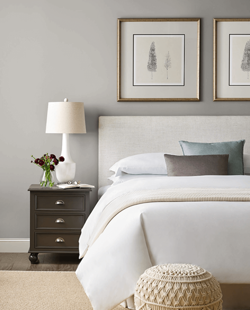
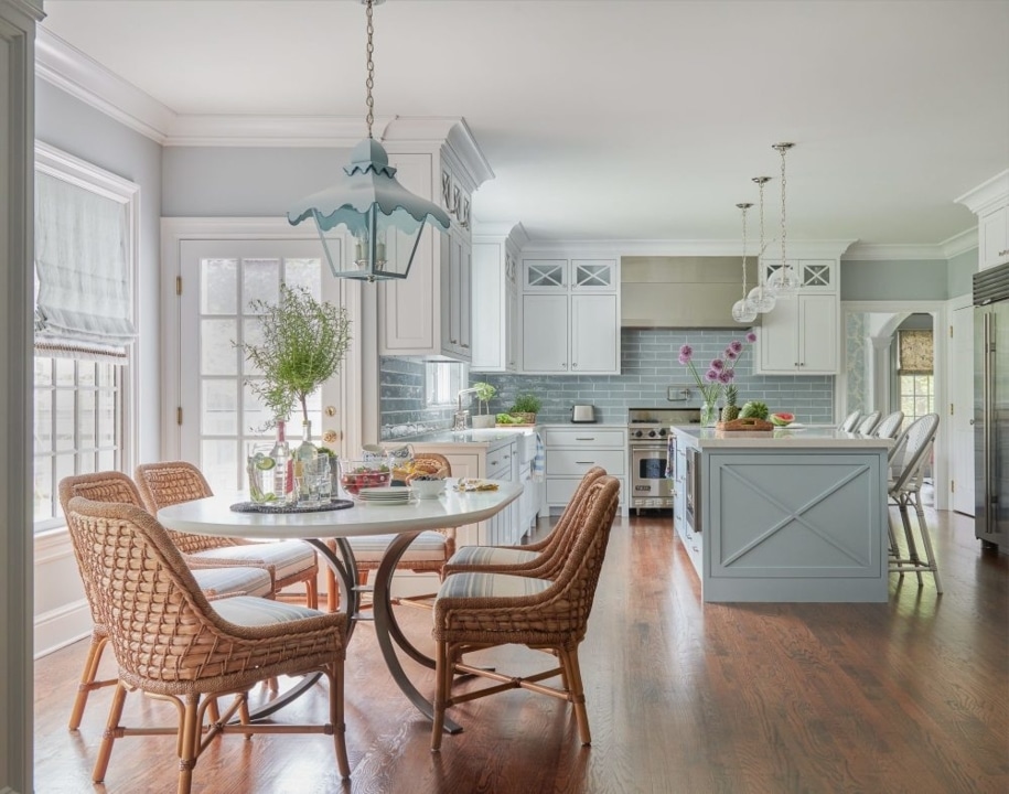
It is a simple, basic, neutral shade that can be the perfect backdrop for almost every aspect of your home. If you are keen on soft and muted colors that go with everything, then you should definitely consider this shade. The gray can be the perfect backdrop for a vibrant painting in your living room or your vintage curtains with bold patterns.
As a neutral shade, it will make almost every other color stand out and pop, giving you a wide range of options while doing your home décor. This way, when you want to change things up a little bit, you won’t have to worry about changing the paint.
2. Smooth Texture
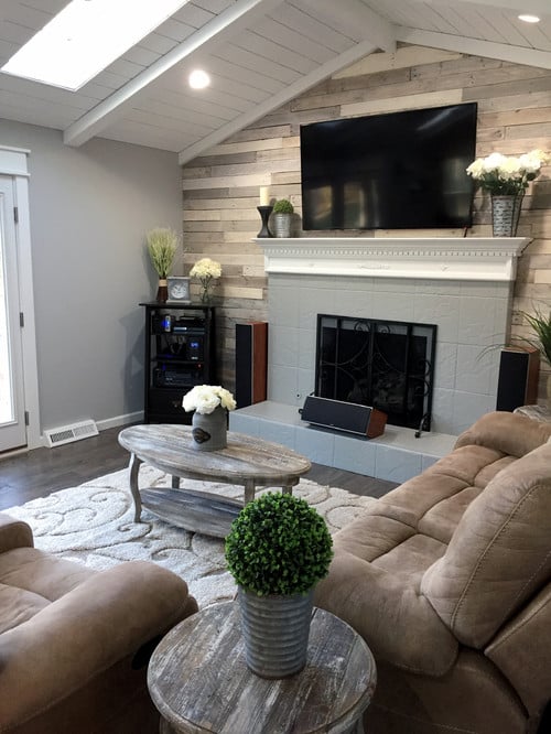
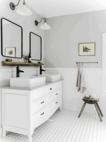
The paint itself has a smooth texture with a very light sheen. It is just the right balance of smoothness and matt finish, and that makes it perfect for playing with a wide range of textures in the foreground. Because the finish is so smooth, you can add irregular texture to the other room décor elements for an earthy vibe.
That would include wooden floors with a grainy texture, rattan furniture, jute furnishings, or clay knickknacks. You will be amazed by how well everything comes together. In the same way, if you want a stark and minimalist setting, the modern glass and steel look will also complement the shade perfectly.
3. Interplaying with Lights
The French Gray has a cool undertone with hints of purple so that it can look different under various light conditions. With an LRV of 53, this shade does not brighten your room. Rather, if any of your rooms get a lot of light and you want to tone it down a little, this is the shade you should be looking at.
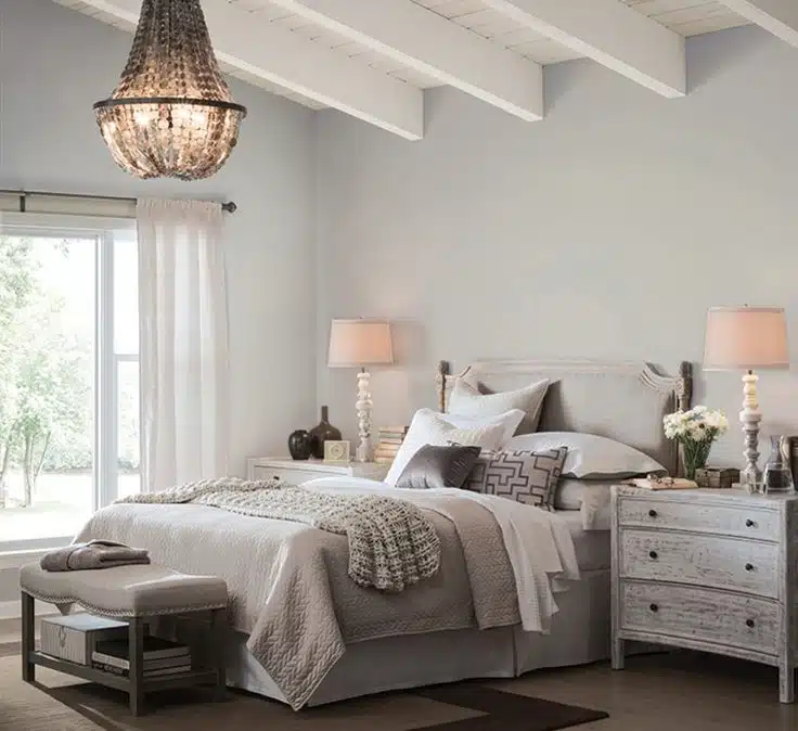
Too much light can sometimes affect your state of calmness as it can be overtly stimulating to the nerves. This shade is perfect for creating that balance between light and shade in your room. And yet, the soothing color will not make your room darker than needed. Moreover, you can create a modern look by adding modern chandeliers and lampshades that stand out beautifully against the neutral walls.
4. Outdoor Setting
If you love entertaining your friends outdoors, you must look at French Gray for your outdoor spaces, like patios, decks, and lawns. Outdoor spaces are best done in neutral shades so they do not clash with the greenery and burst of colors around you. Moreover, they also look soft and muted under the harshest sun in the mornings.
With its cool undertones, the French Gray ticks all the boxes. The color takes on a greenish tinge in certain lights and looks very good when lit up in the evenings, helping you create a dreamy ambiance that blends well with the environment.
Understanding the Undertones of Sherwin Williams French Gray
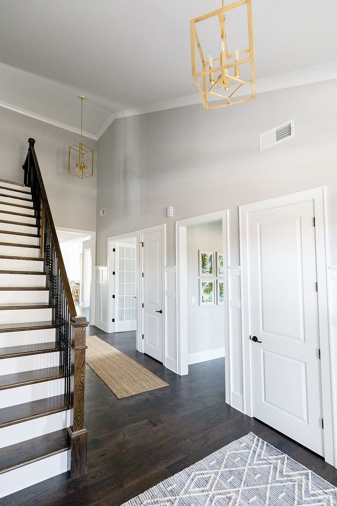
Almost all shades of undertones, even neutral ones like the French Gray. There is a purple and blue in it. However, none of them are very strong, and you only get to see the hint of these colors under specific light conditions. North-facing rooms in the northern hemisphere, which face away from the sun, may take on a bluish tinge in the early mornings or the late evenings.
At times, you may even detect a hint of green in it, but that is also due to the interplay of lights. The shade is mid-toned gray; since it is a cooler shade, it is not a creamy gray. The color is crisp; you should consider it carefully if you live in cold climates. This is because you might not get the warmth in this color that you want while living in colder climes.
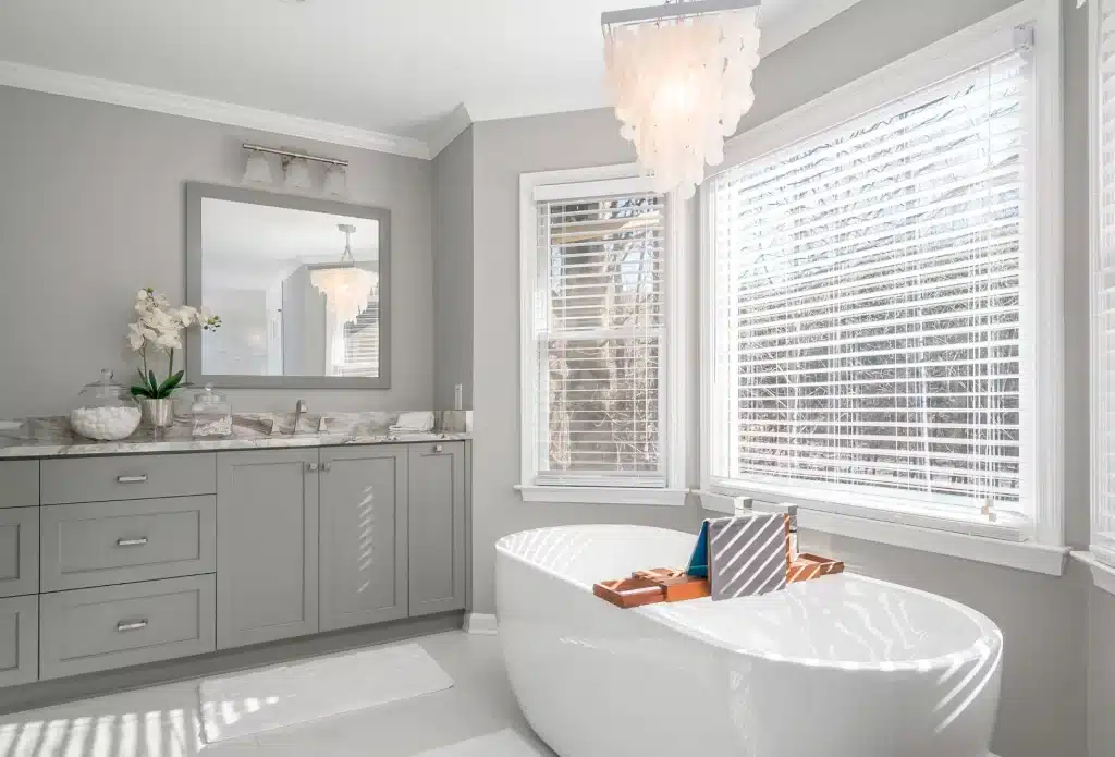
However, since the shade contrasts well with white, a white floor, and ceiling can add some vibrancy to the rooms by reflecting ample light. It is a good idea to get a sample of this color, and after painting a considerable portion of the wall with it, you should leave it for a couple of days to see how it looks during various times of the day.
How to Try French Gray with Various Elements to Get the Most Out of It?
Even if you do extensive research about a shade of paint, you will not really understand how it will look on your walls unless you have done a patch test. After going through expert reviews, you should draw your own conclusions to make the best of the shade you have chosen.
That will save you tons of regret later when you may have already painted your walls with a shade, only to realize the final effect is not what you hoped for. Here is what you should do while trying out the Light French Gray.
1. Think About the Room Decor
When you think about your room decor, you should not consider all the elements you would like to incorporate. That would include any paintings, works of art, curtains, cushions, shelves, or furniture. Think about the room in its entirety and try to picture the French Gray in the background.
Does it create the desired effect? Do you want to add something unusual to your room, like a futuristic piece of art? What is the final effect that you want to create? Answering these questions while trying out a shade will help you make an informed decision.
2. Visualize Your Rooms
It is very important to visualize your rooms while trying out the paint. And for this, you must go beyond what you see online. For example, you might see a beautiful picture of a bedroom and aim for a similar look. But will it be compatible with your lifestyle, or suit the weather conditions where you stay?
If you stay in a sunny location, you need something on the walls to tone down the effects of the constant sunlight pouring in. If you live in colder climes, you need something that will make your rooms appear warmer and cozier. Hence, you should visualize your rooms and what you want out of them, especially with an unusual color like the Light French Gray.
3. Consider Different Textures
It is important to consider various textures while choosing a shade of paint. Do you want a minimalist and contemporary house made of steel, glass, and marble? Or do you prefer vintage vibes with bold patterns and bright colors? Do you want your furnishing in silk and satin, or the earthy jute and yarn are more your thing?
The different textures you choose to include in your room will have an impact on how the shade looks on your walls. While doing a patch test, try to add some props in various textures around the paint to see how it looks with the textures around it.
4. Add Some Light
A cool shade like the Light French Gray has blue and purple undertones and will look slightly different under various light conditions. The paint may look a little washed out under direct sunlight but will take on a bluish or greenish tinge if the room faces away from the sun or during late afternoons.
You should also add the kind of lights that you intend to use in your rooms. Walls with hanging lights will look sharper, while the light from lampshades will have a dreamier effect while creating a profile. It is important to leave the sample paint on the walls for a few lights so that you have the chance to examine it under various light conditions.
5. Think About the Floor and Ceiling
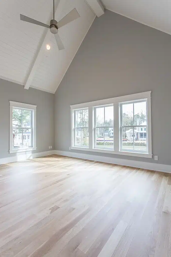
The colors from the floor and ceilings will reflect on the walls and have an impact on how it looks. This is especially true if you have darker floors and ceilings in unconventional colors. What are your floors made of? Hardwood floors have darker hues and will impact the color of the walls when it hits the light. However, it will also add some character and warmth to your room when you have the Light French Gray on your walls.
They will complement each well, bringing the right balance of warmth and coolness. On the other hand, if you have stark white marble on the floor with minimal patterns, then your rooms will look larger and colder. The same goes for ceilings; if you want to create an illusion of a large space, then using lighter colors on your floors and ceiling will help you achieve it.
6. Use Double Coats of Paint
The Light French Gray is not as light as you may think, so it is important to use at least double coats of paint during the patch test. This will help you understand the true depth of color. The Light French Gray has cool pigments that make your rooms appear darker or lighter with a double coat, depending on how the light is hitting the walls. This will help you get an idea of the finished look of your rooms.
Points to be careful about while Choosing the Light French Gray
The Sherwin Williams Light French Gray has great potential when you use them properly to achieve a certain look. Nevertheless, here are some points you should keep in mind.
- The Light French Gray does not have very high reflexivity, so rooms that do not get any light may appear quite dark.
- Use contrasting shades to make your room pop by adding bright colors and unusual textures. If you do not like bright colors, your rooms may look completely washed out.
- The French Gray may also be used as highlights if you use a very light paint shade. That will create some drama without being too conspicuous.
Final Thoughts
The Light French Gray can be tricky to use if you are not aware of how undertones work. The shade’s tinge of blue and purple can make it a great choice if you prefer muted shades. It is also a good choice if you want to do one side of your room with some dramatic wallpaper, keeping the other walls clean and neutral.
Wooden textures, yarns, and rattan go well with this shade because they stand out against the gray. Hence, if you are keen on experimenting, then you should definitely try out the Sherwin Williams Light French Gray. Even if the gray wasn’t your first choice of color for your rooms, this is worth exploring because of the stunning manner in which it can transform your room once it goes on the walls.