
Sage Green: The One Tiny Detail That Changes Everything
Sage green is one of those colors everyone thinks they want… until it’s time to actually commit and suddenly you’re spiraling in the paint aisle like, “But what if my living room turns into a jalapeño?”
I get it. Sage is supposed to feel calm and neutral and expensive in a quiet way. But some sages read like spa serenity, and others read like “I accidentally painted my house guacamole.”
The difference is not magic. It’s undertones. Sneaky little undertones.
So let me walk you through how I pick sage that behaves itself (and doesn’t bully the rest of your decor), how I test it so I don’t end up repainting while muttering curse words, and how to use it room by room without going full green dungeon.
Why Sage Can Feel Neutral (and Why Sometimes It… doesn’t)
True sage has a gray base. That’s the whole vibe.
Forest green struts into the room like it owns the place. Moss green starts giving “cabin in the woods.” Sage, when it’s the right sage, is the friend who shows up in a perfectly boring outfit and somehow looks chic.
It’s basically a neutral… that took a nature walk.
But here’s the catch: not every paint called “sage” is actually a calm little gray green. Some are warmer, some are cooler, some are secretly olive, and some are one bad lightbulb away from looking like old pea soup. (Ask me how I know. Actually don’t. I’m still emotionally recovering.)
Which brings us to the part that makes or breaks the whole thing…
The 3 Types of Sage (a.k.a. “Pick Your Fighter”)
Every sage leans one of three ways. If you figure out which camp your room needs, you’ll stop second guessing everything.
1) Cool / gray based sage (the “I want it to act like a neutral” sage)
This is sage that’s basically a gray… with a green whisper.
Best for: modern spaces, cooler light, rooms with marble/gray stone, matte black hardware, crisp whites, clean lines.
Pairs well with: white oak, ash, walnut, black accents, navy, cooler whites.
My opinion: This is the safest choice when you’re scared of green. If you want sage to fade back and let your furniture do the talking, start here.
One caution: In some north facing rooms, cool sage can go weirdly murky. Not always, but enough that I don’t play games with it.
2) Warm / olive leaning sage (the “cozy and intentional” sage)
This one has golden/brown notes and looks more obviously “green” in a way that feels earthy and lived in.
Best for: warm wood, creamy textiles, vintage pieces, brass, terracotta accents, that “cozy hoodie” feeling.
Pairs well with: honey oak, cherry, reclaimed wood, cream/ivory, brass, warm stone like travertine.
My opinion: Warm sage is delicious when it’s right. It’s the one that makes a room feel like you light candles even when nobody’s coming over.
One caution: If you already have a lot of warm stuff going on (yellow lighting, warm floors, beige counters), warm sage can drift into “farmhouse but not the cute kind” fast.
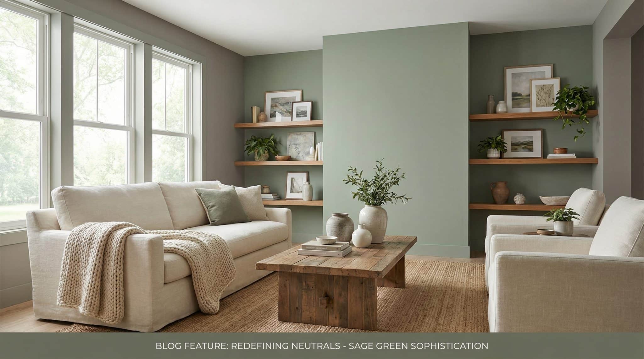
3) Balanced / neutral sage (the “plays nice with everybody” sage)
This is the in between sage—neither noticeably cool nor obviously olive.
Best for: mixed materials (warm wood + cooler counters), open concept spaces, people who do not want to redesign their entire house for a paint color.
A good example in this zone is Sherwin-Williams Soft Sage (SW 9647)—it tends to behave in a lot of homes.
My opinion: If your house is a mashup of finishes because it’s 2026 and none of us are ripping out perfectly fine countertops for fun, balanced sage is your best friend.
Before You Paint Anything: The “Please Don’t Trust a Tiny Swatch” Rule
If you do one thing from this post, do this:
Get bigger samples than you think you need.
I’m begging you. Those cute little paint chips are liars. They’re like trying to judge a haircut from one strand of hair.
What I do: at least 12″ x 12″ samples (bigger is even better), and I put them right next to the big bossy things that aren’t changing:
- floors
- countertops
- tile
- big furniture
- trim color
Then I check them like a total weirdo at different times of day:
- morning (cooler light)
- midday (truest light)
- late afternoon/evening (warm, dramatic, makes everything look “romantic”)
And yes… I like to live with samples for at least a week. Two weeks if I’m being responsible. Because nothing is more annoying than loving a color at 11am and hating it at 7pm when you’re tired and just trying to eat snacks in peace.
Quick room orientation cheat sheet
- North facing rooms: often look cooler and dimmer → you may need a warmer sage so it doesn’t go swampy.
- South facing rooms: generally more flexible → you can usually do cool, warm, or balanced.
- Lots of artificial light: if your bulbs are warm/yellow, some sages turn extra olive → a cooler sage can keep things from looking too yellow.
(Also: if your lightbulbs are all different temperatures in the same room… that’s not sage’s fault, that’s chaos lighting. Fix the bulbs first.)
My “Start Small So You Don’t Cry” Sage Strategy
If you’re nervous (normal), don’t jump straight into painting every wall. Sage is friendly, but you don’t need to elope with it on the first date.
Step 1: Try sage in soft stuff
Grab a few sage-ish accessories—pillows, throw blanket, maybe a small rug—and live with it for a couple weeks.
If it feels soothing? Great.
If it feels like your room has a weird green film? Also great—because you found out without repainting.
(And no, buying more bins to “organize” your way into a new color palette doesn’t count. Nice try.)
Step 2: Go medium commitment
If the accessories feel right, then do one of these:
- curtains
- an upholstered chair
- an accent wall
Accent wall opinion: I like doing it behind a bed or behind the sofa. I usually skip the wall with big windows because shifting light can make sage look like five different colors in one day, and I prefer my walls to be less emotionally complex.
Step 3: Full room paint
Now you paint the whole room when:
- you’ve tested it in your actual light
- you have some warm neutrals to keep it grounded (wood, cream, ivory)
- you’re not expecting sage to fix a room that’s missing furniture and rugs (sage is not a miracle worker, it’s paint)
Also: I personally keep ceilings white/cream. Sage ceilings can be gorgeous in the right house, but they can also give “cozy cave” in a way that’s not relaxing—more like “I’m living inside an avocado.”
And I almost always keep trim light too. Sage trim can lose definition unless you really know what you’re doing.
Where Sage Looks the Best (Room by Room)
Bedrooms
Sage in a bedroom is almost unfair because it’s so good at making things feel slower and calmer.
An easy combo:
- sage walls
- cream bedding
- natural wood furniture
- a neutral rug (beige, warm gray, jute)
If you want it extra cozy, bring in texture: linen, a chunky knit, a little velvet. Sage likes friends.
Living rooms
Living rooms can handle sage in a bunch of ways:
- all walls (just keep some light/neutral pieces so it doesn’t get heavy)
- one accent wall
- a sage sofa if you want commitment but not “paint the entire house” commitment
My opinion: If you’re worried about sage taking over, don’t make it the only color. Pair it with warm neutrals and at least one darker anchor (black, charcoal, or navy) so the room has structure.
Kitchens
Kitchens are where sage can either look fresh and charming… or like you time traveled to a questionable era.
Cabinets: sage can be gorgeous, but undertones matter more because cabinets sit next to countertops and backsplash all day long like a group project.
If you’re unsure, a cooler/gray based sage is usually the safest for kitchens because it reads cleaner and less “country craft fair.”
Finish note: kitchens need durability—think satin or semi gloss, not flat.
Bathrooms
Same story as kitchens: humidity and splashes are real, so go satin/semi gloss.
Also, bathrooms are often cooler/darker than you think. Test your sage in there specifically, because a “perfect” sage in the living room can look totally different under bathroom lighting (which is often… aggressively unforgiving).
Home offices
If you’re in there all day, test longer. Color fatigue is real. A shade that feels “calming” for 20 minutes can feel “why am I trapped in a terrarium?” after 8 hours.
When Your Sage Looks Wrong (and How to Fix It Without Starting Over)
“It looks murky/dirty.”
Usually undertone + light mismatch.
Try:
- going one step warmer (especially north facing rooms)
- swapping to a more neutral bulb (around 4000K can help if everything looks yellow)
- adding contrast: lighter trim, more cream, darker accents, clearer edges
“It looks dated.”
Nine times out of ten, it’s not the sage—it’s what you paired with it when it feels still current or dated.
Try:
- fewer florals/toile (unless you’re fully committing to grandma chic, which can be adorable, but commit on purpose)
- cleaner frames/hardware
- more simple textures like linen, wool, solid rugs
“It’s taking over the room.”
You need grounding.
Try:
- more wood tones (tables, frames, shelves)
- a darker anchor (matte black, charcoal, navy)
- more texture so the room doesn’t look flat and all one note
“It clashes with my floors.”
Undertones, my friend. Floors don’t lie.
Try:
- a large rug in a bridging neutral
- wood furniture that relates to the floor tone
- or… yep, repaint with a sage that leans the other way
Sometimes the correct fix is accepting your floors have an opinion and you must negotiate.
My No Drama Action Plan (Do This This Weekend)
1) Pick three sage candidates: one cool, one warm/olive, one balanced like a timeless muted green paint.
2) Get large samples and put them next to your floors/counters/trim.
3) Look at them in morning, midday, and evening light for at least a week.
4) Choose the one that stays calm in the worst lighting (because your house will absolutely show you the worst lighting at least once a day, usually when you’re already cranky).
5) Start small if you’re nervous, then scale up.
Sage green is worth it when you get it right. It’s serene, sophisticated, and it makes a house feel “finished” without being loud about it. You just need the undertone that behaves in your light, with your materials—because paint is basically a mood ring with a marketing budget.
If you want, tell me what direction your room faces (north/south/etc.), what your floors look like, and whether your counters lean warm or cool—and I’ll tell you which sage family I’d start with.