
Why Some Sage Greens Age Better Than Others (and how not to pick the “mid 2020s special”)
Sage green is still having a moment in 2026. But not all sages are invited to the party anymore.
If you’re thinking about sage for walls, cabinets, or even a cute little built in moment, here’s the truth: the Pinterest era sage (you know the one) is starting to feel… timestamped. Not “ugly,” not “call the paint police,” just very “Ah yes, 2023-2025. We all lived through it.” Kind of like chevron. Or barn doors. Or my brief relationship with galvanized metal.
The good news: sage can absolutely age well. The bad news: you can also pick a sage that turns muddy, yellow, or weirdly hospital-y the second the sun sets. So let’s talk undertones, light, and a couple places where sage still looks insanely good—plus one spot where I’d personally stop you at the paint counter and gently take the sample pot out of your hand.
First: paint brands still love sage… but the trend is narrowing
Yes, the big paint brands are still pushing sage family colors (Sherwin-Williams has Halcyon Green in the mix, Behr’s Hidden Gem keeps popping up in designer spaces, etc.). So no, you’re not “late.”
But the vibe has shifted. What used to be “fresh and calming” is now “fresh and calming… if you do it right.” Sage is heading into that phase where it’s less about the color itself and more about how you use it.
And that brings me to my hottest sage take.
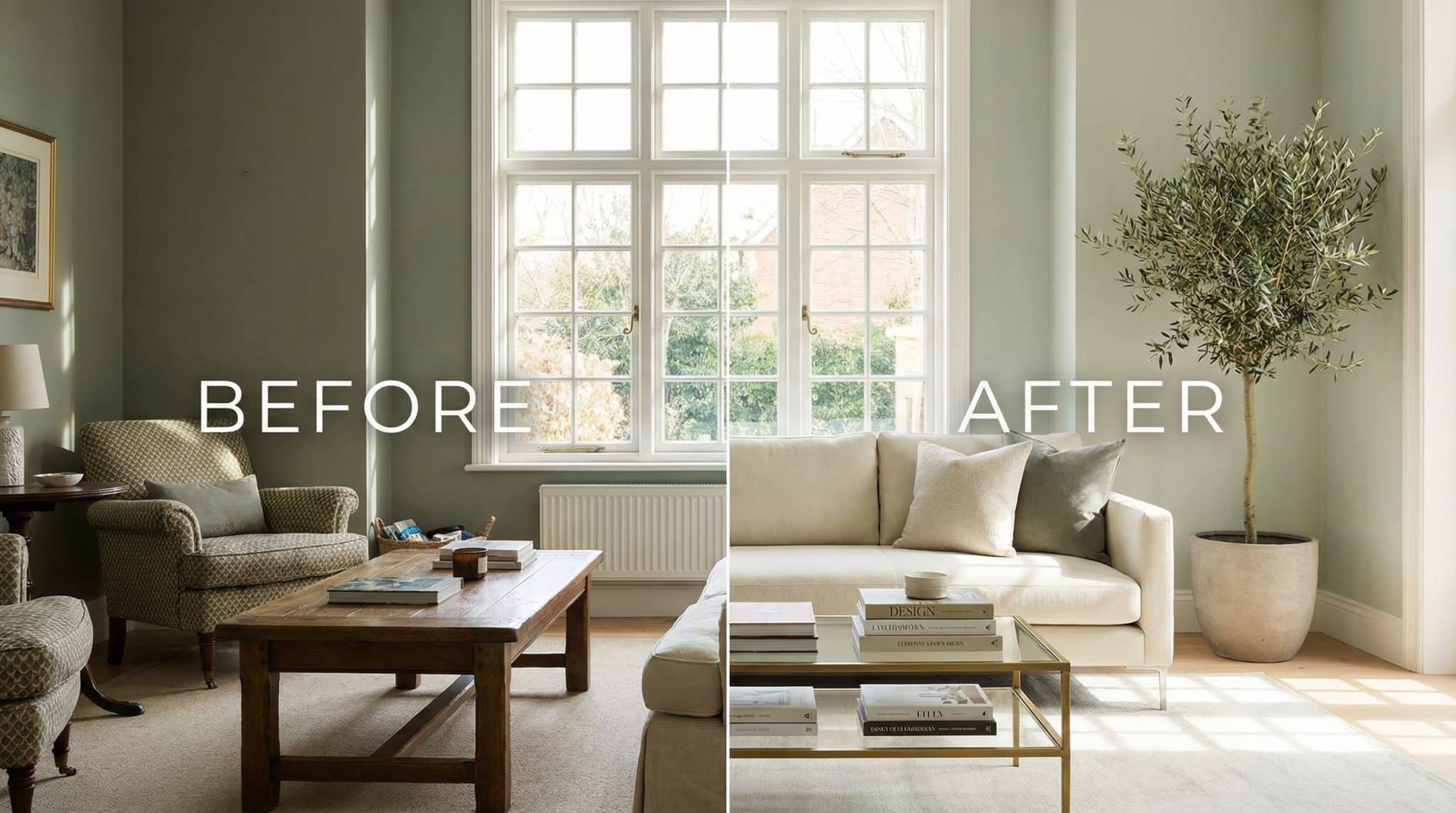
Sage kitchen cabinets? We need to talk.
Sage cabinets had a huge run, and honestly… I get it. They’re pretty! They’re soft! They look like you drink lemon water unironically!
But the very specific formula that took over Pinterest—sage cabinets + white subway tile + chrome hardware + cool lighting—is starting to read like a template. Like the kitchen came pre-assembled from the Internet.
If you already have sage cabinets, don’t panic and start sanding at midnight. You can update the supporting cast and make the whole thing feel intentional again:
- Switch the hardware. Warm metals (matte brass, aged copper) are sage’s best friends right now. Chrome is giving “new build showroom.”
- Warm up your lighting. If your under cabinet lights are blasting 5000K interrogation beam white, sage is going to look… unwell. Aim warmer.
- Change the backsplash vibe. If you love subway tile, try charcoal grout so it feels more designed. Otherwise, think warm bone, slate, or something with a little depth.
The cabinets aren’t inherently the problem. It’s the combo meal that got over-ordered.
The secret sauce: undertone (aka why some sage looks timeless and some looks like pea soup)
If you take nothing else from this post, take this: sage is not one color. It’s a whole family of “green-ish neutrals,” and undertone is everything.
My vote for best aging sage:
Gray undertone sage.
This is the sage that behaves. It’s the one that reads like a neutral with personality instead of a “theme color.” It usually holds steady in different lighting and doesn’t swing yellow the second you turn on a lamp.
The one that can feel dated faster:
Warm undertone sage.
Warm sage can be gorgeous—especially with terracotta, earthy textiles, and sun soaked rooms—but it’s also more likely to feel “of its era” by 2030. (Again: not bad. Just specific.)
The “middle” sage:
Not too warm, not too cool. It can work beautifully… unless your room’s light is doing something chaotic (and it often is).
Which leads us to the thing nobody wants to think about until after they’ve painted the whole room:
Light will make or break your sage (yes, even the “perfect” one)
I’ve watched people pick the prettiest sage chip on Earth and then act personally betrayed when it looks like swamp latte on the wall. It’s not you. It’s your light.
- North facing rooms (cool, bluish light): gray leaning sages usually look cleaner and calmer. Warm sages can go flat or a little dingy.
- South facing rooms (warm, strong light): warm light can pull yellow out of a sage real fast. Gray undertone sages tend to stay steadier here too.
And let’s not ignore the villain of the story: your nighttime bulbs.
If your house is lit like a dentist office (cool LEDs), sage can start to look sterile instead of soothing. I’m a big fan of warm bulbs—2700K-ish—especially in bedrooms and living rooms.
My “don’t make me cry” testing method
You don’t need a complicated science experiment, but you do need more than one glance at a sample pot.
Here’s what actually works:
- Paint directly on the wall (a nice big patch—don’t be shy).
- Live with it for at least 3 days. A week is even better.
- Check it morning, midday, late afternoon, and at night. Sage shape shifts like it’s auditioning for a role.
While you’re watching it, look out for the four sage deal breakers:
- Muddy (low light makes it look dull/dirty)
- Yellow (warm light pulls it too far)
- Flat (lifeless, like it’s giving up)
- Clinical (cool light makes it feel sterile)
If it’s doing any of those, it’s not your sage. Keep moving.
Where sage still looks amazing (aka sage’s best behavior zones)
Sage isn’t dead. It just wants the right room.
- Living rooms: Sage is still a superstar here. It’s calm without being cold, and it plays well with cozy textures.
- Bedrooms: Lighter, mistier sages are chef’s kiss at night—soft, not icy, not beige.
- Home offices: Underrated. A sage wall or shelving behind your desk gives “focused” without “I work in a printer paper box.”
- Bathrooms/entryways: Great if you bring in warmth—wood, textured towels, warm metals, not just shiny white everything.
The pairings that make sage look expensive (and the ones that date it)
If you want your sage to feel current, think: warm + natural + a little matte.
My favorite combo right now is:
sage + caramel wood + matte brass
It’s grounded, cozy, and doesn’t scream for attention.
Things that generally help sage with accent pairings by undertone:
- warm metals (matte brass, aged copper)
- oak/walnut/honey toned woods
- linen, cotton, wool (anything that looks touchable)
- off white/cream trim instead of blinding bright white
Things that can push it into “mid 2020s formula” territory:
- lots of chrome/polished nickel
- gray stained wood on top of a gray leaning sage (it can get gloomy fast)
- cool, industrial finishes without warmth to balance them
Sage shades worth sampling (my shortlist)
If you want a timeless Sherwin Williams pick that tends to behave across a lot of homes:
Cool/gray undertone sage (aka the “ages well” crew):
- Sherwin-Williams Halcyon Green
- Valspar Sage Slate
- Sherwin-Williams Evergreen Fog
Bolder, moodier options:
- Behr Hidden Gem
- PPG Olive Sprig
Balanced warmth (pretty, but test carefully):
- Benjamin Moore October Mist
- Farrow & Ball Breakfast Room Green No. 81
(And yes: sample first. Your lighting is the final boss.)
When I’d skip sage entirely
Two situations where sage tends to suffer:
- Windowless rooms. Without natural light, sage can lose that “nature” feeling and go sad and murky.
- Rooms lit mostly with cool artificial light. If your bulbs are on the cold side and you don’t have warm materials to balance it, sage can read sterile instead of soothing.
If that’s your space, you might be happier with a warm putty, soft terracotta, or a deeper olive that can handle low light without getting weird.
The real reason sage can feel “timeless” (if you let it)
Sage is one of those colors that doesn’t always wow you in five minutes. It’s more of a slow burn paint color. It shifts with the day, the season, the lamp you forgot you hated, the tree outside your window—everything.
The people I know who still love their sage a year later are the ones who didn’t rush it. They sampled, they watched it at night, they noticed how it felt when they were tired and cranky and just wanted the room to stop yelling at them.
So take your time. Test the undertone. Warm up your lighting. And choose the sage that looks good at 8 a.m. and at 8 p.m.—because that’s the one that’s going to age like it knows what it’s doing.