
Matching paint colors sounds so innocent. So wholesome. Like, “I’ll just pop into Sherwin-Williams, they’ll wave their little scanner wand, and I’ll walk out with the exact color that’s already on my wall.”
And then you paint your “perfect match,” it dries, and suddenly your living room looks like it’s wearing somebody else’s foundation. Too pink. Too green. Too… not right.
Paint matching is a little like online dating: it looked amazing under those fluorescent lights, and then you got it home and realized you’ve been catfished by undertones.
Here’s the truth I wish someone had yelled at me (lovingly) years ago:
Paint is chemistry, not wishful thinking. And a “match” can mean three totally different things.
First: What kind of “match” are you actually asking for?
Before you hand over a sample and put your hope in a tiny robot eye, decide what you need because “close enough” and “identical” are not even in the same zip code.
1) You need an exact match (no surprises, no drama)
If you’re painting trim, cabinets, a built in, a front door, or anything you’ll see up close, save yourself and buy the original brand + product line.
Especially if it’s:
- a white (whites are divas)
- a super pale neutral (also divas, just quieter about it)
- a designer color (hello, complicated pigment cocktail)
2) You need a “looks right on the wall” match
This is the most common scenario. You’re repainting a room, finishing a project, or trying to coordinate with an existing color.
A Sherwin-Williams scan can work great here but only if you test it at home before you commit to gallons and tears.
3) You need a touch up that disappears
Okay, listen. I’m not saying it’s impossible, I’m just saying… touch ups are the part of painting that makes otherwise stable adults whisper swear.
Even if you have the original can, your wall has:
- aged
- been cleaned
- been sun faded
- absorbed oils, humidity, life, vibes, etc.
So if you’re trying to patch a ding and make it vanish like Photoshop? Set expectations accordingly. The best “magic trick” is often repainting the whole wall or feathering the edges (more on that below).
Why a perfect match across brands is so hard (aka: the part nobody tells you)
Sherwin-Williams has good tech. But a scanner can’t override the fact that different brands use different paint bases and colorants.
Think of it like baking: you can try to recreate someone’s cookie recipe, but if you’re using different flour and butter… your cookie’s gonna have opinions.
Different bases + different pigments = different results
Every paint line has its own “base” (that untinted starting point) and its own pigment system. When you try to match, the computer is basically doing:
“Okay, with our ingredients, how do we get close to that color?”
And here’s the kicker: when you add pigment to correct undertones, you often darken the paint. So you “fix” one thing and break another. (Ask me how I know. I have lived through the beige that went SW 9650 green incident of 2019.)
Some brands are just… a pain to match
If you’re trying to match Farrow & Ball, I’d personally either:
- buy the actual Farrow & Ball, or
- accept that you’re going for “inspired by,” not “identical twin.”
Their colors are gorgeous, but they don’t always translate cleanly into other systems. You can end up with a version that’s technically similar but weirdly swampy, smoky, or just “off.”
Lighting is the ultimate liar
Something can look dead on in the store and totally wrong at home because of metamerism (fancy word for “the lighting tricked you”).
- North facing rooms pull colors cooler
- South facing rooms brighten and warm things up
- Evening bulbs can turn a nice neutral into “why is this banana cream?”
Lighting will betray you without blinking.
What Sherwin-Williams is actually doing when they “match” your color
There are basically two ways a store can “match”:
Option A: They “look up” the competitor color
You give them a Benjamin Moore name/code (or whatever), and they pull a stored formula from a database.
It’s fast. It’s convenient. It is also not always great.
Why? Because it doesn’t account for:
- the specific paint line you’re matching from
- changes over time
- batch variation
- how your actual painted wall has aged
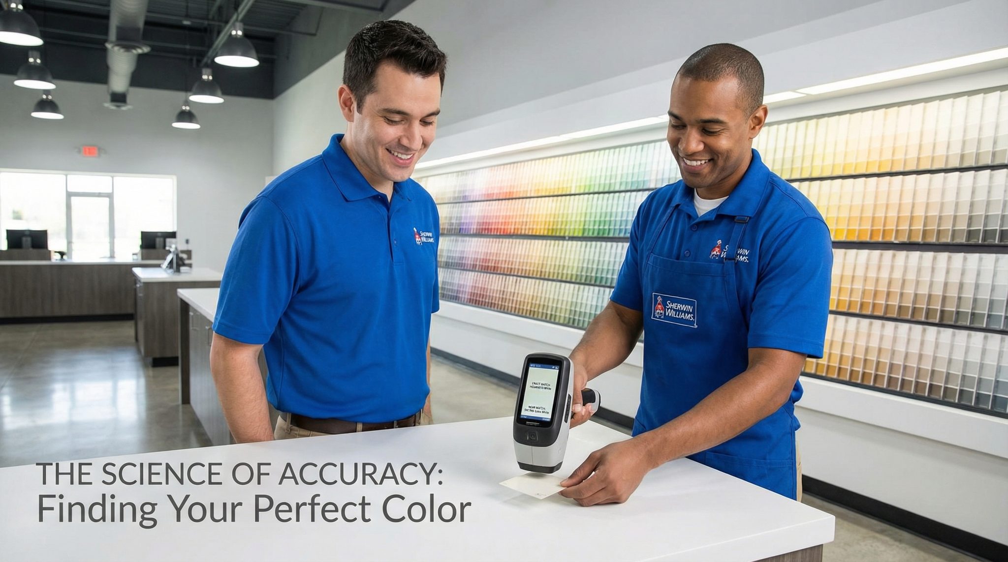
Option B: They scan your physical sample (do this)
This is the spectrophotometer scan (often ColorSnap/ColorReader style devices). It reads how your sample reflects light and then builds a formula based on that.
If you do one thing from this entire post, do this:
Bring a real sample and ask them to scan it.
Also: sheen matters more than people think. The same color in flat vs satin can look like two different paint colors having a disagreement.
How to get the best match possible (without spiraling)
I’m going to get mildly bossy here because this is where most “bad matches” are born.
1) Bring a physical sample (your phone photo is not invited)
Phone cameras autocorrect everything. They’re basically like, “Let’s make this prettier!” and then your paint turns out wrong and you’re standing there like a fool holding a screenshot.
Best samples:
- a painted drywall piece
- a paint chip (real, not printed)
- a small section of trim (if you’re already replacing it)
If you’re matching an existing wall, the most reliable move is to cut a small patch from a hidden spot (behind a toilet, inside a closet, behind a dresser). Try to avoid sun faded areas, because the scanner will faithfully match your wall’s tan line.
2) Match the sheen and the paint line you’ll actually use
If you’re painting in satin but you test in flat, you’re not testing the color you’ll end up living with. Sheen changes how light hits the surface and it can make a color read lighter or darker.
If you’re torn between two sheens, grab samples of both. Future you will be grateful.
3) Test it on the real wall (not just the sample card)
Paint the test patch on the actual surface you’re painting, ideally with the same prep (primer/no primer) you’re planning for the whole project.
Bare drywall, old paint, stained wood these all affect the final look. Paint is annoyingly sensitive, like a toddler who skipped a nap.
The 48 hour test (yes, really)
Paint dries, then it cures. And lighting changes all day long. So give your test patch a little time before you commit.
If you want a simple routine, check it:
- Morning (cool light shows blue/gray undertones)
- Midday (your most “neutral” light)
- Late afternoon (warm light reveals yellow/red)
- Evening under your actual bulbs (this one is the deal breaker)
If it looks wrong at night, it’s going to haunt you every night. Don’t do it to yourself.
Pro tricks that hide a lot of sins
Even if the match is good, sloppy application can make it look bad. Paint is a snitch.
Box your paint
If you’re buying more than one gallon, pour them into a big bucket and mix them together before painting. Two gallons can vary slightly, and on a big wall those tiny differences can show up like a weird stripe you can’t unsee.
Feather touch ups
If you’re patching, don’t paint a perfect little square and walk away like “nailed it.” That hard edge will flash.
Instead, blend the new paint out past the repair area (I usually go a good 18-24 inches) so there’s no obvious boundary line.
And if your wall paint is older? Sometimes the only truly clean solution is painting the whole wall corner to corner. I know. I’m sorry. But also: it works.
When you should just buy the original paint (aka: the grown up choice)
Sometimes matching is not worth the emotional damage.
I would buy the original brand if:
- it’s white or very pale
- it’s trim/cabinets or anything high visibility
- you want an exact designer color (especially Farrow & Ball)
- you’ll need easy touch ups later
Also, the cost difference is often way smaller than the cost of repainting. Paying an extra $10-$20 per gallon hurts a little… repainting a whole room hurts a lot.
If your match already went sideways: your recovery plan
You don’t necessarily have to sand everything down and move to a new state.
Try this:
- Paint the whole wall (removes the “side by side comparison” that makes mismatches scream)
- Use it on an adjacent wall and call it intentional contrast (I support your pivot)
- Get a small amount of the original paint for touch ups if the manufacturer sells it
Worst case? You accidentally found a new color you like better. That’s not a failure. That’s a plot twist.
Bottom line
Sherwin-Williams color matching can be really good if you give it good info and you test like a person who doesn’t want to repaint twice.
Bring a real sample. Get it scanned. Match your sheen. Test it at home for 48 hours. And if it’s a high stakes situation (trim, cabinets, whites), don’t be a hero buy the original.
Now go paint a test patch and make that wall earn its makeover.