
Choosing the perfect paint color can feel overwhelming with thousands of options available. You want something that’s calming but not boring, colorful but not too bold.
Sherwin-Williams Daphne SW 9151 might be exactly what you’re looking for. This medium blue paint with subtle gray undertones has been gaining attention for its ability to create peaceful, welcoming spaces. As a Sherwin-Williams paint, it coordinates easily with popular trim whites.
But does it live up to the hype? After seeing this color in action across different room types and lighting conditions, I can share what really works and what doesn’t.
In this review, I’ll break down Daphne’s true color characteristics, show you how it performs in various spaces, and help you decide if this popular blue-gray is right for your home transformation project.
What Makes Sherwin-Williams Daphne Blue Special?
Sherwin-Williams Daphne stands out among blue paints with its perfect mix of blue with gray undertones. This color sits between navy and sky blue, giving walls a soft, muted look that feels modern yet timeless.
With color values of RGB: 137/156/170 and Hex: #899CAA, it creates a distinct look that’s not too bold or too subtle.
The medium tone, with an LRV of 32, reflects enough light to keep spaces feeling open while still adding depth. Unlike lighter blues that can feel washed out, Daphne holds its own in various lighting conditions.
Color Profile & Technical Details
This medium-toned blue falls into the “cool” category on the color wheel with a hue of 205°. What makes it unique is how the gray undertones balance the coolness, preventing it from feeling too cold or intense.
This balance creates a color that stays true throughout the day, unlike many blues that can shift dramatically with changing light.
In north-facing rooms, Daphne appears slightly warmer and more saturated. In south-facing spaces with more intense light, the cool undertones become more visible without looking washed out.
Best Rooms to Use Sherwin-Williams Daphne Blue
Finding the right place for Daphne Blue in your home can make all the difference. This color functions as both a statement and a neutral, making it highly adaptable to various spaces. Its medium depth and calming tones work in many rooms, each with its distinct effect.
Bedroom
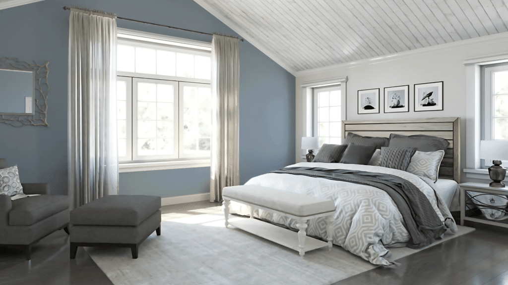
In bedrooms, Daphne Blue creates a peaceful sanctuary that promotes rest. The color tends to make walls recede slightly, making smaller bedrooms feel more open. The blue-gray mix mimics the sky at dusk, sending subtle signals to your brain that it’s time to unwind.
Pairing this color with soft whites on the trim and the ceiling keeps the room feeling fresh. Natural wood tones in furniture balance the coolness of the walls.
To tie the room together and create a complete look, use textiles in cream, light gray, or navy.
Living Room
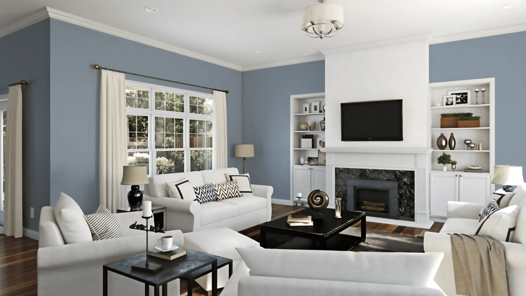
Living rooms painted in Daphne Blue strike a balance between stating a design position and staying neutral enough for changing decor. The color creates a backdrop that makes both warm and cool accent colors pop without competing for attention.
This shade works especially well in living spaces that receive plenty of natural light, as it maintains its true color without looking flat. In evening light, it takes on a richer quality that feels cozy and inviting for gatherings.
Bathroom

Bathrooms benefit greatly from Daphne’s clean yet warm feeling. The color brings a spa-like quality to the space, reminding users of water and sky. In smaller bathrooms, it can make the walls feel as if they’re expanding outward.
When used with white fixtures, the contrast creates a crisp, clean look that still feels soft. Consider using this color on all walls in a bathroom, as the consistent color helps a small space feel more cohesive and larger.
Kitchen & Dining Area

While many shy away from blue in kitchens, Daphne Blue offers the perfect mid-tone for cabinets or as an accent wall. Its grayish undertones help it complement both warm wood tones and cool stone surfaces common in kitchens.
This color creates a pleasant backdrop for meals in dining areas. Studies show that people tend to have more meaningful conversations in blue rooms, making it ideal for creating a dining space where family and friends can connect.
Exterior

Daphne Blue makes an excellent choice for exterior spaces when you want something beyond typical neutrals. On home exteriors, it reads as a soft coastal blue that stands out from neighbors without looking too bold or out of place.
The color seems particularly fitting on coastal homes or properties near water.
The color performs well in different lighting conditions outdoors, maintaining its character throughout the day as sunlight changes.
Its medium tone means it won’t show dirt and wear as quickly as lighter colors might, making it practical as well as attractive.
Complementary & Coordinating Colors
Choosing the right colors to pair with Daphne Blue can enhance its beauty and create a complete color story in your home. This versatile shade works with many color families, from crisp whites to rich navy and earthy tones. Use these ideas as color inspiration when planning adjoining rooms.
1. Monochromatic Pairings
Creating a layered look with colors in the same family as Daphne brings depth to any room.
SW Aleutian (6241) is a slightly lighter option with similar undertones, perfect for adjoining spaces where you want color flow.
For a deeper shade in the same family, SW Dockside Blue (7601) adds rich contrast while maintaining harmony.
Using these monochromatic pairings creates a sense of calm and order. Try painting built-ins or furniture in these related shades to add visual interest without breaking the peaceful mood Daphne creates.
2. Contrasting Accents
For a more dramatic look, pair Daphne with colors that create tension and visual interest. SW Naval brings a deeper navy that anchors a space when used on lower cabinetry or furniture pieces with Daphne on the walls. The two blues speak to each other while creating a clear contrast.
Warm Taupe tones like SW Truly Taupe (6038) balance the coolness of Daphne with earthy warmth. This combination feels both modern and timeless, working particularly well in living spaces where you want to create both comfort and style.
3. Complementary Hues
Soft whites like SW Pure White or Extra White create clean, crisp trim that makes Daphne’s walls look intentional and fresh.
For a warmer approach, light beige tones like SW Drift of Mist (9166) soften Daphne’s coolness while maintaining a light, airy feel.
Muted greens such as SW Cool Avocado (9029) share blue undertones with Daphne but add a natural element to the color story. This combination works beautifully in spaces connecting to the outdoors, creating a subtle transition between inside and outside.
Similar Colors & Alternatives of Daphne Blue Color
If you love Daphne but aren’t completely sold, several similar colors might better match your vision or lighting conditions.
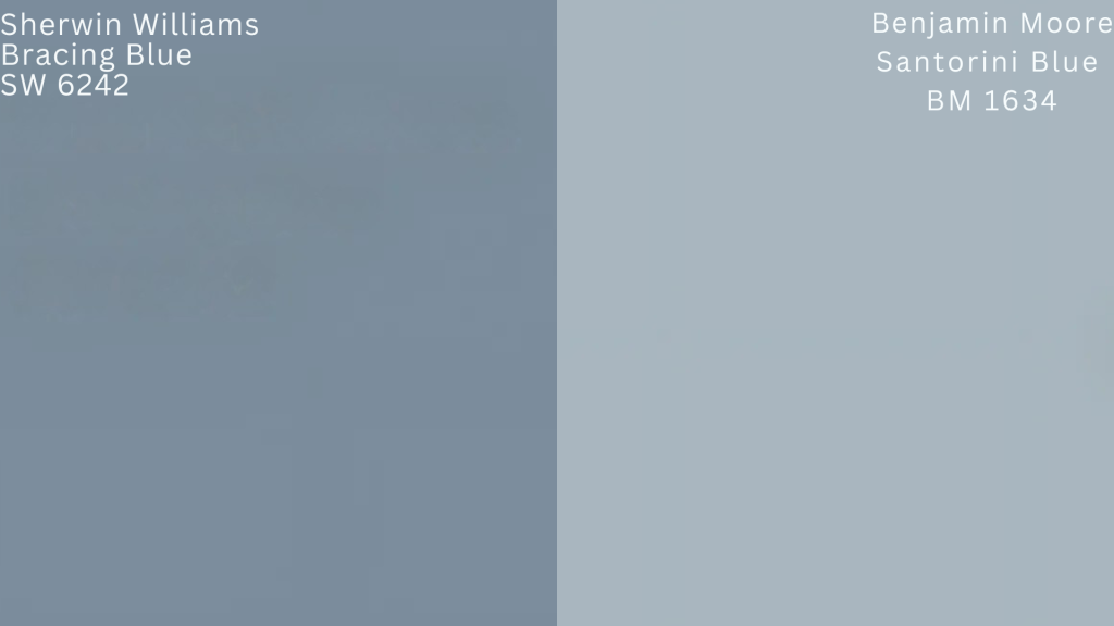
SW Bracing Blue (6242) offers a slightly deeper version with similar undertones. This option works well in rooms with abundant natural light where Daphne might read in too light. The additional depth creates a more grounded feeling while maintaining the calming blue-gray effect.
For those looking at other brands, Benjamin Moore Santorini Blue creates a similar effect with slightly more blue and less gray in the mix. This makes it a touch brighter while still offering that medium-toned blue that works so well in many spaces.
The difference between SW Aleutian and Daphne comes down to subtle shifts in depth and undertone. Aleutian has an LRV of 38, which reflects more light than Daphne’s 32. In practice, this means Aleutian appears slightly lighter on walls.
Additionally, Aleutian leans a touch more gray, while Daphne maintains more of its blue character even in low light. In rooms with limited natural light, this difference becomes more noticeable, with Daphne holding its color better.
Final Thoughts
Sherwin-Williams Daphne Blue offers that perfect middle ground between a statement color and a versatile neutral. Its blue-gray balance creates spaces that feel both fresh and grounded.
If you’re considering this color for your home, remember that lighting plays a key role in how it appears. Test a sample on different walls before committing, as north and south-facing rooms will show different facets of this multidimensional shade. A few samples visualize the shade in your exact lighting.
Whether used throughout a room or as an accent, Daphne brings a sense of calm sophistication that few colors can match.
It pairs beautifully with both warm and cool tones, making it a versatile choice for your existing decor.
Ready to bring this versatile blue into your home? Grab a sample and see the magic for yourself!