

Finding the right paint color can feel like searching for a needle in a haystack. The wrong shade could make your room feel cold, cramped, or just not quite right.
Sherwin-Williams’ Delft (SW 9134) addresses this common issue by providing a versatile blue-gray that suits multiple spaces. This color brings depth and character while remaining livable for everyday homes.
In this guide, we’ll examine what makes Delft special, which rooms benefit most from this color, and how to use it effectively. You’ll learn about similar alternatives if Delft isn’t quite the right fit.
Let’s analyze how this rich blue-gray can change your home without overwhelming it.
Meet Delft: A Sophisticated Blue with Depth
Delft (SW 9134) stands out as a deep, muted blue-gray tone. It features a slight touch of green that adds depth to its character. This color draws inspiration from classic vintage ceramics found throughout Europe’s rich cultural heritage.
The mood Delft creates is notably calm and grounding. When you add this color to a room, it brings a feeling of quiet comfort. Spaces with Delft walls often feel more put-together and refined without trying too hard.
What makes Delft truly helpful is its effectiveness in various settings. You can use it in a modern apartment with clean lines and simple furniture. It works just as well in a house with older, more classic styling. This color doesn’t pick sides – it makes both types of rooms look good.
Many homeowners find that Delft gives their spaces a finished quality that basic whites or beiges can’t match. The color has enough personality to make a statement without being overly attention-seeking.
Bring Delft Home: Room Ideas for Every Mood
Delft’s rich, calming tone makes it a versatile choice across the home—whether you’re going for cozy, sophisticated, or bold, it adapts beautifully to different spaces.
1. Living Room
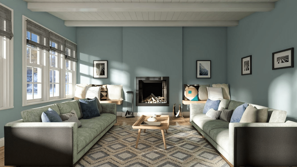
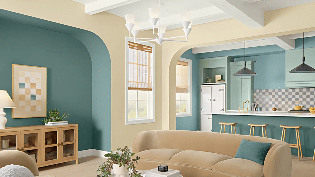
The living room shines as a top spot for Delft. This color creates a cozy feeling that makes people want to stay longer. Your guests will notice how the blue-gray tones make the space feel warm yet put-together.
Delft works well with soft blankets, plush rugs, and comfy pillows. Try adding small touches of gold or brass in lamps, photo frames, or coffee table items to make the room feel special.
2. Bedroom
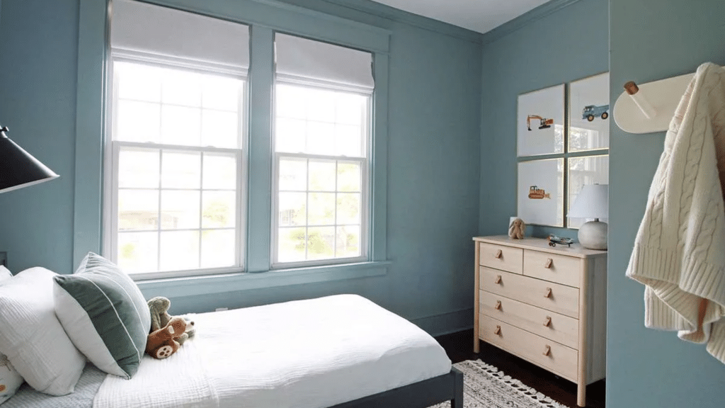
In a bedroom, Delft shows its most helpful side. The color naturally soothes the mind and promotes rest. Many people report better sleep in rooms painted in these blue-gray tones. A Delft bedroom becomes a serene retreat, offering a quiet respite from daily stress.
Add crisp white bedding for a clean look, or warm woods for a more cozy feel. Either way, you’ll have made a classy space that feels like a fancy hotel room.
3. Home Office
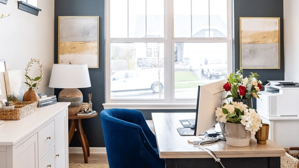
The home office benefits greatly from Delft walls. The color helps you stay on task without feeling dull or bored. Unlike bright colors that can distract, Delft sits in the background, helping your mind settle into work mode.
Many find they can focus longer in a blue-toned room. The color works well with both dark and light wood desks, and looks clean with white shelving units too.
4. Bathroom
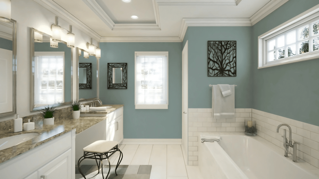
A bathroom with Delft walls feels much fancier than its actual cost. This color turns basic spaces into spots that feel like high-end spas. The key is to pair it with the right lights – soft and warm rather than harsh.
White towels and fixtures stand out nicely against the blue-gray background. Small plants add life and create a fresh feeling against the cool tones of the walls.
5. Accent Walls or Built-ins
Not ready for a full room of Delft? Try it on just one wall or built-in shelves. This smart move adds visual interest without making a big change. A Delft accent wall behind a bed or sofa works as a focal point.
Painted built-ins look sharp and well-planned rather than like an afterthought. This method allows you to test the color in small doses while still reaping its main benefits.
Perfect Pairings for Delft by Sherwin-Williams
| Category | Suggested Pairings |
|---|---|
| Neutrals | Warm Whites, Soft Grays, Taupes |
| Accent Finishes | Brass, Gold, Matte Black Hardware |
| Complementary Colors | Terracotta, Mustard, Blush |
Not Just Delft: Other Moody Blues to Try
Sherwin-Williams Anchors Aweigh (SW 9179)

Anchors Aweigh offers a deeper navy tone than Delft. This color brings more drama to a space with its intense blue depth. It works well for those who want a stronger statement on their walls.
People often choose this shade for dining rooms or studies where a more formal mood fits the function. The color stands firm without fading into the background. If Delft feels too soft for your taste, Anchors Aweigh might hit the right note.
Benjamin Moore Hale Navy

Hale Navy from Benjamin Moore has gained fans for good reason. This rich, timeless navy hue remains true in most lighting conditions. It has less gray than Delft, giving it a clearer blue quality.
Many designers opt for this color when they want something that will endure changing trends. Hale Navy pairs well with whites, creams, and natural woods. This color works in both small spaces, like powder rooms, and large areas, like family rooms.
Sherwin-Williams Smoky Azurite (SW 9148)

If Delft feels too dark for your needs, Smoky Azurite offers a lighter path. This softer blue still has depth but won’t make a room feel small. The color brings a bright yet settled feeling to spaces with less light.
Many people find this shade more approachable for those new to color. Smoky Azurite keeps the same cool tone family as Delft but turns up the brightness level just enough to feel fresh rather than moody.
Smart Ways to Work Delft Into Your Home
- Use in well-lit spaces or balance with lighter furnishings – Delft works best in rooms with good natural light or when paired with light-colored furniture that helps brighten the space.
- Sample it first—colors shift with lighting – Paint a test patch on different walls to see how the color changes throughout the day before you commit to the whole room.
- Great as a cabinet or door color for a bold twist – Painting cabinets or doors with Delft adds a smart pop of color without changing your entire room’s look.
Conclusion
Delft by Sherwin-Williams offers a balanced blue-gray option for homeowners looking to add character to their spaces. This color brings calm and sophistication to any room it touches. Looking back at what we’ve learned, Delft stands out for its flexibility.
It works well in living rooms, bedrooms, offices, and bathrooms. You can go bold with a full room or start small with an accent wall or cabinet project. So what makes this color worth trying? Delft brings a sense of comfort without feeling boring.
It pairs well with many styles and works across both modern and classic homes. What’s next? Get a sample and test it in your lighting. See how it changes from morning to night. Try it next to your current furniture to check the match.
Would you like to share your projects with Delft? Leave a comment below about which room you’re planning to paint. Your ideas might help other readers find their perfect blue.
Frequently Asked Questions
Is Delft a Warm or Cool Color?
Delft is a cool color with blue-gray tones that can feel soft and soothing in most spaces.
How Does Delft Compare to Other Blue Paint Colors?
Delft has more gray in it than pure blues, making it less intense and more livable for daily use.
Can I Use Delft in a Small Room?
Yes, but pair it with plenty of white trim and good lighting to keep the space from feeling too closed in.
How Many Coats of Delft Paint Will I Need?
Most walls need two coats for full, even coverage, especially when painting over lighter colors.