
Looking for the perfect moody shade that’s not quite black? Iron Ore might be the color you’ve been searching for.
This deep charcoal gray from Sherwin-Williams has become a favorite among homeowners and designers alike.
Many people struggle with dark colors, unsure how to use them without making spaces feel small or gloomy. The good news is that Iron Ore is incredibly versatile.
This guide explains everything you need to know about Sherwin-Williams Iron Ore.
You’ll learn what makes it special, which colors complement it, and how to use it in different rooms of your home.
What is Sherwin-Williams Iron Ore

Sherwin-Williams Iron Ore (SW 7069) is a soft black with rich depth. Its subtle warmth sets it apart from true blacks. Designers love it for its versatility and dramatic effect.
Iron Ore has slight blue-green undertones. These give the ore color more complexity. In most lights, it still reads as neutral.
With an LRV of only 6, Iron Ore absorbs most light, making it appear very dark on walls. In dim rooms, it looks almost black. Brighter spaces reveal more of its gray qualities.
Despite its darkness, Iron Ore doesn’t feel cold. This balance works in many design styles. It creates a bold contrast with lighter colors.
Use it for accent walls, trim, cabinets, or full rooms when you want cozy spaces.
Iron Ore Color Palette: Perfect Pairings

Iron Ore works well with many colors. Its dark nature makes it a strong anchor for lighter shades. Here are the best paint colors to pair with Iron Ore:
Alabaster (SW 7008) creates a classic high-contrast look. This soft, warm white brings balance to Iron Ore’s darkness. It works in any room for trim, ceilings, or adjacent walls.
Pewter Green (SW 6208) offers a muted, natural partnership. This sage-like green has similar depth but adds color. Try this duo in kitchens or bedrooms for a calm feel.
Felted Wool (SW 9171) gives a softer contrast than bright whites. This light greige has warmth that complements Iron Ore’s depth. Use in living spaces or hallways.
El Caramelo (SW 9184) brings unexpected warmth. Its caramel tone creates rich, earthy combinations, perfect for dining rooms or studies.
Habanero Chile (SW 7589) adds bold energy. This rusty orange creates dramatic tension with Iron Ore. Use sparingly as an accent in neutral rooms.
For bedrooms, pair Iron Ore with Felted Wool and soft blues. In kitchens, try Iron Ore cabinets with Alabaster walls. Living rooms look great with Iron Ore accent walls against El Caramelo.
Comparing Iron Ore with Similar Shades
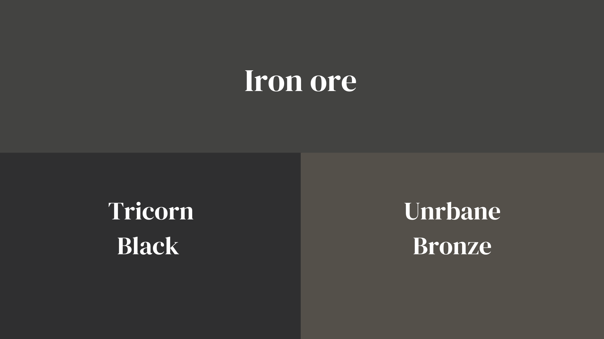
Here’s a comparison of Iron Ore with similar popular Sherwin-Williams colors in an easy-to-read table format:
| Feature | Iron Ore (SW 7069) | Tricorn Black (SW 6258) | Urbane Bronze (SW 7048) |
|---|---|---|---|
| Color Family | Charcoal gray | True black | Brown-gray |
| LRV | 6 | 3 | 8 |
| Undertones | Slight blue-green | Neutral | Strong brown |
| Appearance | Soft black with depth | Darkest, most crisp black | Earthy, muddy, dark brown |
| Best For | Versatile – works inside and out | Modern, dramatic spaces | Natural settings, exteriors |
| Pairs Well With | Whites, greens, warm neutrals | Stark whites, bright accents | Greens, creams, terracottas |
| When To Choose | Want black-adjacent without harshness | Need the darkest possible option | Desire earthier, warmer dark tones |
| Room Suitability | Any room great for cabinets | Accents, doors, windows | Exteriors, rustic interiors |
Iron Ore is a middle ground between these two popular colors—not as stark as Tricorn Black but not as warm as Urbane Bronze. This makes it highly versatile.
Where to Use Iron Ore in Your Home
Iron Ore works well in many spots around your house. Here’s how you can use this rich color palette iron ore brings to different spaces:
On Your Home’s Outside
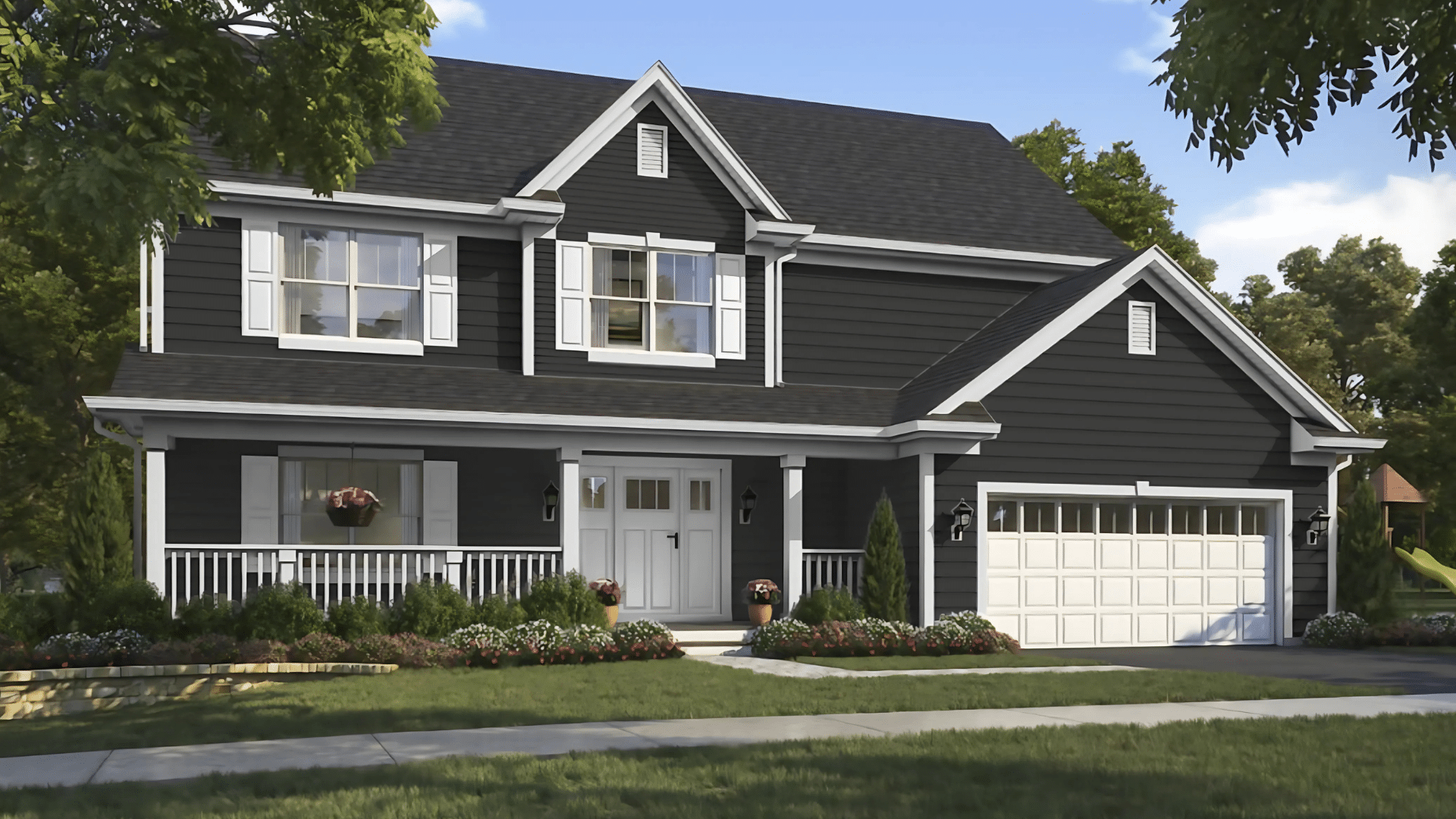
Iron Ore looks great on front doors. It stands out against light-colored houses. Many homeowners paint their shutters this iron shade for a classic look.
Iron ore siding looks sleek on Modern homes. Pair it with white trim for a sharp contrast. Garage doors in this shade hide dirt and look upscale.
The color holds up well in different weather. It doesn’t fade quickly like some darker paints. Iron Ore also pairs well with brick and stone.
In Your Kitchen
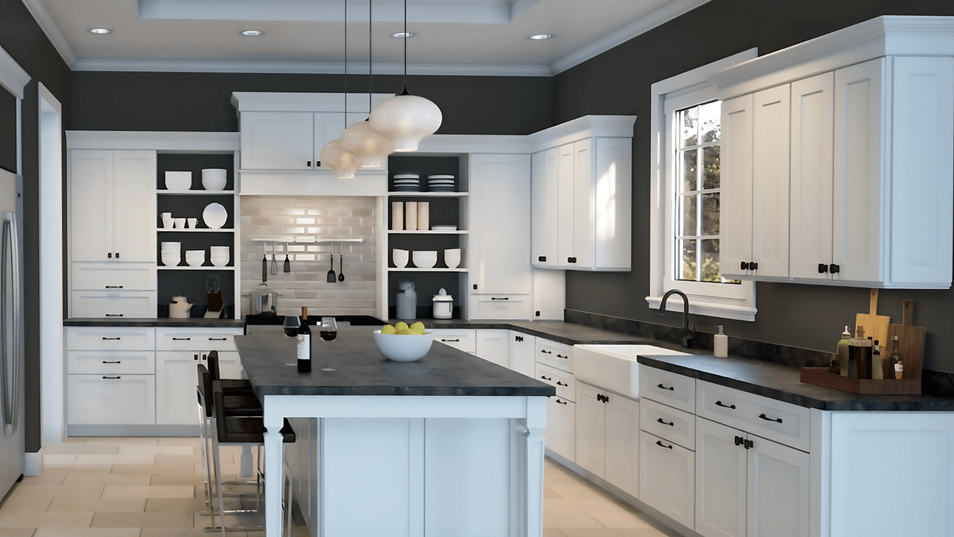
Dark cabinets make a kitchen look custom-built. Iron Ore cabinets work in both large and small kitchens and better hide fingerprints than white cabinets.
Try painting just the island in Iron Ore. This creates a focal point without darkening the whole room. Add brass or gold handles for a touch of warmth.
Iron Ore also works well on kitchen walls with white cabinets. This flip of the usual paint color scheme feels fresh and bold.
On Your Walls
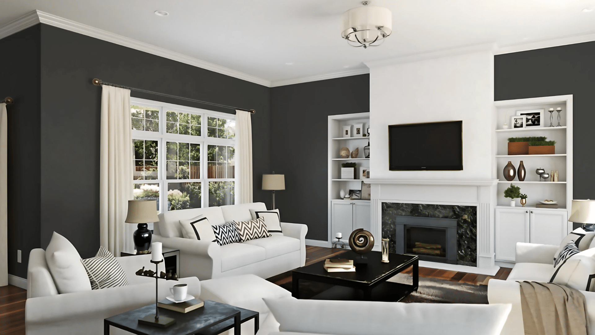
Accent walls add drama without much work. Iron Ore makes artwork and light furniture stand out. It works well behind TVs to make them blend in.
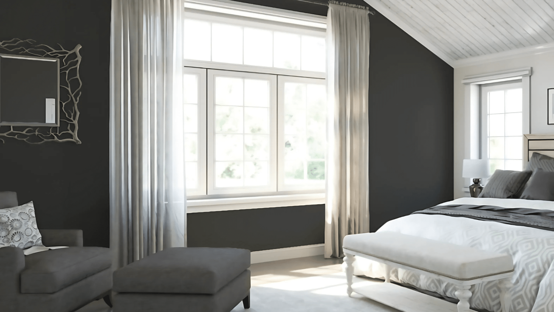
An Iron Ore wall behind the bed makes bedrooms feel cozy. One dark wall in a living room adds depth. This color makes home offices feel more focused.
The color changes slightly throughout the day. Morning light brings out its gray tones. Evening light makes it appear almost black.
In Your Bathroom
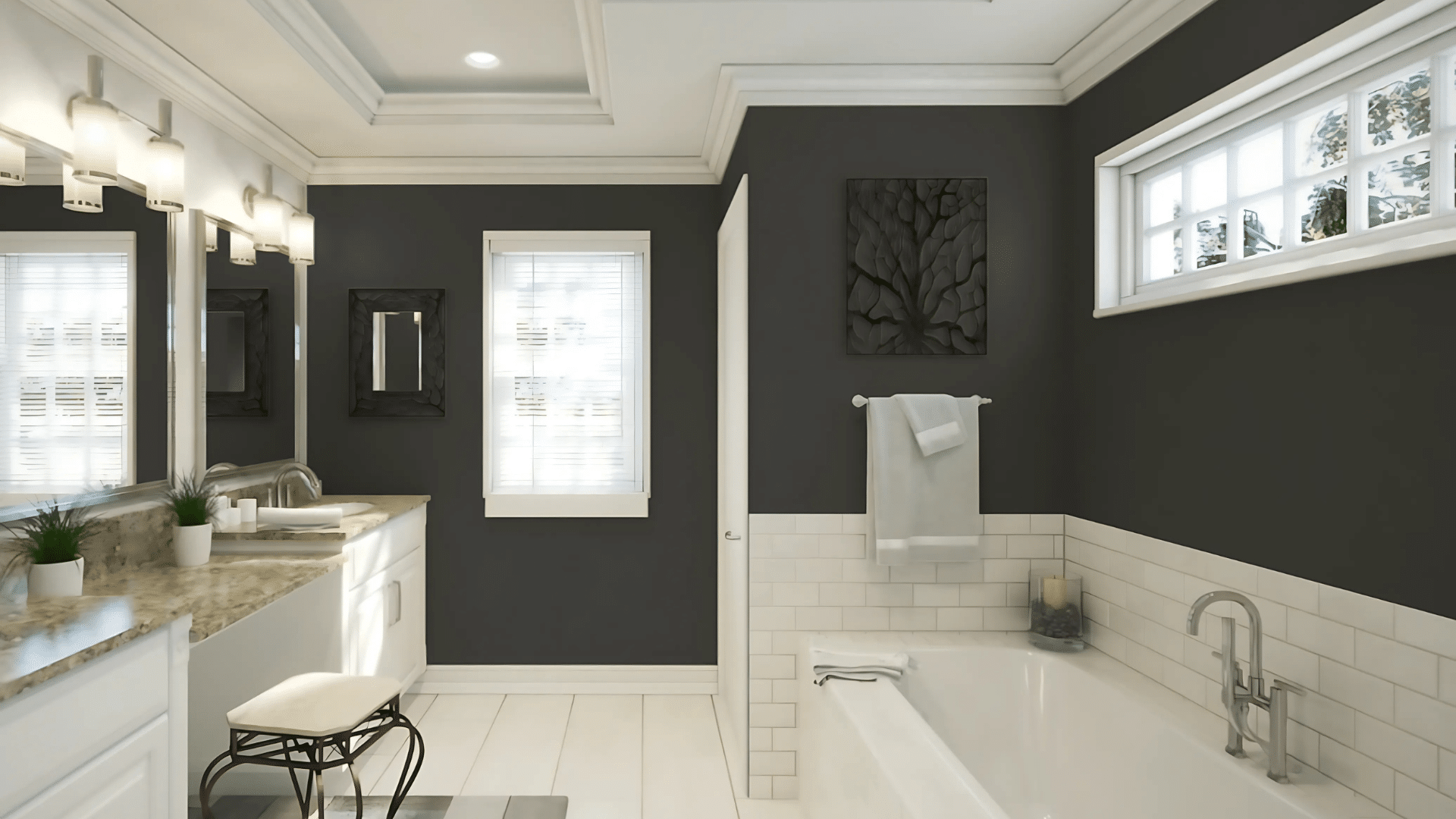
Iron Ore bathroom vanities look expensive. They pair well with many countertop colors. White sinks pop against this dark backdrop.
Small powder rooms look amazing in full Iron Ore. The dark color makes these tiny spaces feel like jewel boxes. Add good lighting to keep the space from feeling too dark.
Even just the door and trim in Iron Ore can update a basic bathroom. It costs little but makes a big impact.
Tips for Using the Iron Ore Palette Effectively
Get the most from this versatile dark shade with these practical painting tips. Sherwin Williams Iron Ore can completely change your space when applied correctly, but it requires some consideration for lighting, trim choices, and finishes.
These guidelines will help you achieve professional-looking results while avoiding common mistakes that can make dark colors feel overwhelming.
How Lighting Affects Iron Ore
- Test Iron Ore in your actual space—it appears darker in north-facing rooms.
- Natural daylight reveals Iron Ore’s subtle blue-green undertones.
- Under yellow artificial lighting, Iron Ore appears slightly warmer.
- Install adequate lighting in rooms with full Iron Ore walls to prevent them from feeling too dark.
Choosing the Right Trim and Ceiling Colors
- White ceilings make Iron Ore walls feel taller and more balanced.
- Match your trim color to your ceiling for a cohesive look.
- Alabaster (SW 7008) is an ideal trim partner—warm without yellowing.
- For a dramatic look, paint trim the same Iron Ore as your walls.
Surfaces and Finishes for Iron Ore
- Use satin or semi-gloss finish for trim and doors for easy cleaning.
- Eggshell finish works best for Iron Ore walls—not too shiny, not too flat.
- Matte finish Iron Ore can look chalky and show marks more easily.
- Test different sheens—the same color appears darker in glossier finishes.
Iron Ore Sherwin Williams Paint Palettes and Color Samples
Before committing to Iron Ore, it’s wise to explore color samples and see how this paint color palette works in your space. Sherwin Williams offers sample sizes that let you test ore iron combinations on your walls.
Many designers suggest trying several paint palettes with Iron Ore to find your perfect match. The iron oxide undertones in this shade create different effects when paired with warm versus cool colors iron ore complements.
For exterior applications, test your palette iron ore choices in both sun and shade. Different palettes work better depending on your home’s architecture and surrounding landscape.
Iron Ore: The Dark Shade Your Home Needs
Iron Ore stands out as one of Sherwin-Williams’ most versatile dark colors. This deep charcoal gray works well in many settings throughout your home.
Iron Ore delivers rich results; Its subtle undertones create interest without feeling harsh like a true black.
The color pairs beautifully with whites, warm neutrals, and even select bold shades iron ore enhances. This flexibility makes it ideal for various design styles, from modern to farmhouse.
Remember to test Iron Ore in your specific lighting conditions before committing. The right finish and complementary colors will help you get the most from this sophisticated shade.
With the tips and ideas from this guide, you’re now ready to confidently incorporate Iron Ore into your home for a timeless, designer-approved look.
