

Finding a neutral paint color that feels balanced can be tricky. Many whites feel too cold, while most beiges turn too warm once they’re on the wall.
Sherwin-Williams Oyster White solves that problem perfectly. It’s a soft, warm greige, a mix of gray and beige, that stays light without feeling stark.
Oyster White brings subtle warmth and refined class to a space, whether you use it on walls, cabinets, or exteriors.
It’s adaptable, calm, and classic, one of those shades that simply works wherever you put it.
We will break down everything you need to know about Oyster White, including what it looks like, how it behaves in different lighting, and where it fits best in your home.
What Color Is Oyster White Really?

At first glance, Oyster White might look like a standard off-white, but there’s more depth here than meets the eye.
It has a refined mix of gray, beige, and a subtle green undertone that helps it adapt beautifully to light and surroundings.
1. Understanding LRV (It’s Easier Than It Sounds)
Every paint color has an LRV, or Light Reflectance Value, which shows how much light it reflects. The scale runs from 0 for pure black to 100 for pure white.
Oyster White’s LRV is 72, putting it in the light category. It reflects enough light to keep a space feeling open and airy, but not so much that it looks sterile.
It’s the kind of shade that feels soft and balanced, with just the right amount of brightness.
2. The Secret Undertones (The Color Behind the Color)
Oyster White has a subtle greige base with a whisper of green underneath.
This undertone doesn’t make the color look green; it just helps balance warmth and prevent yellowing in strong light.
The mix of gray, beige, and green is what keeps the color calm and flexible.
3. How Lighting Changes Everything
Lighting can completely change how Oyster White looks.
- North-facing rooms have cooler light, which makes the color lean a bit more gray.
- South-facing rooms get warm sunlight that brings out its creamy beige side.
- East and west-facing rooms shift throughout the day, cooler in the morning and warmer in the afternoon.
That’s part of what makes Oyster White so interesting. It responds to its environment, which means it always feels natural on the wall.
Where Oyster White Works Best
Oyster White works beautifully across interiors and exteriors because of its balanced tone. On exteriors, it delivers a soft, welcoming look that doesn’t wash out in sunlight.
Inside, it adapts to everything from cozy traditional spaces to modern open layouts.
1. Painting Your Home’s Exterior

As an exterior color, Oyster White provides warmth without looking yellow or dingy. It pairs beautifully with darker accents like navy, charcoal, or black for an ageless contrast.
For a balanced, modern look, try pairing it with wood tones on trim or doors.
2. Interior Walls and Ceilings
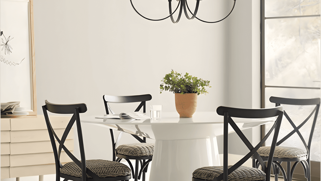
Inside, Oyster White is an ideal whole-home color. It’s light enough to keep rooms airy but warm enough to feel inviting. In living areas, it complements wood furniture and textured fabrics.
In kitchens, it provides a clean backdrop that doesn’t feel sterile. In bedrooms, it creates a soft, restful atmosphere.
3. Cabinets and Built-ins
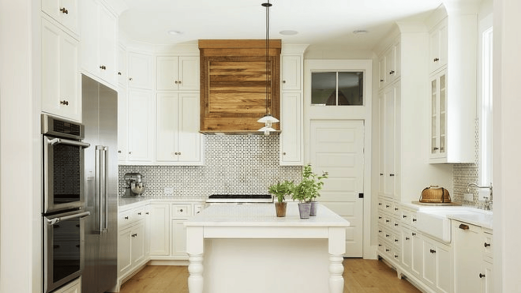
Oyster White on cabinetry offers a refined neutral that complements both warm metals like brass and cool finishes like chrome.
It looks polished on kitchen cabinets, built-ins, and trim without feeling overdesigned.
Side-by-Side: Oyster White vs. Similar Shades
When you’re looking at paint colors, you’ll probably see several that look similar to Oyster White. Here’s how they compare.
| Paint Color | Brand | LRV | Undertones | Best For | Key Difference from Oyster White |
|---|---|---|---|---|---|
| Oyster White (SW 7637) | Sherwin Williams | 72 | Greige with subtle green | flexible neutral for interiors and exteriors | The baseline-balanced greige |
| Alabaster (SW 7008) | Sherwin Williams | 82 | Warm cream | Traditional white with warmth | Noticeably brighter and creamier; reads more “white” than greige |
| Natural Choice (SW 7011) | Sherwin Williams | 73 | Warm beige | Spaces needing maximum warmth | Slightly warmer and lighter; more beige, less gray |
| Benjamin Moore Gray Mist | Benjamin Moore | 70 | Cool gray | Modern, cooler spaces | Cooler with less warmth; leans more gray than greige |
| BM Swiss Coffee | Benjamin Moore | 84 | Warm cream | Traditional, warm interiors | Much warmer and creamier; more yellow undertones |
Coordinating Palettes
Every good paint color needs companions. Here’s what works well with Oyster White.
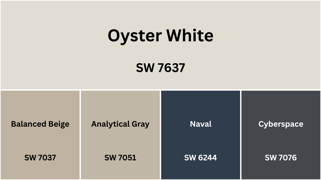
1. Balanced Beige
Balanced Beige is slightly warmer than Oyster White and works great in rooms where you want extra coziness. Use it to create a subtle shift in adjacent rooms while maintaining a cohesive, flowing feel.
2. Analytical Gray
Analytical Gray is even cooler and grayer, creating beautiful tonal depth when used alongside Oyster White.
This pairing works especially well in modern or contemporary spaces where you want subtle class without jumping to bold colors.
3. Navy and Deep Blues
Blues of almost any shade work beautifully with Oyster White, from soft sky blues to deep navy.
Blue and neutral off-whites are a classic, classic combination that adds depth and interest without overwhelming your space.
4. Charcoal and Dark Grays
Charcoals and dark grays create a dramatic contrast with Oyster White.
An accent wall in charcoal keeps the rest of the room feeling light and open while adding bold, modern definition that makes a real statement.
The Good and the Not-So-Good About Oyster White
Let’s be real, no paint color is perfect for everyone. Here’s the honest truth about Sherwin-Williams Oyster White.
Pros:
- Works in all lighting: Looks balanced whether the room gets cool or warm natural light.
- Pairs with everything: Complements both warm wood tones and cool modern finishes.
- Bright but soft: Keeps rooms feeling open without that harsh, stark-white glare.
- Flexible for interiors and exteriors: Looks equally elegant inside or on your home’s façade.
Cons:
- Slight green undertone: Can show up subtly in certain lighting or next to warm hues.
- Not a pure white: Leans greige, so it won’t give a crisp, gallery-white effect.
- Changes with lighting: May shift slightly cooler or warmer depending on exposure.
- Needs testing first: Always sample before painting since undertones behave differently in different rooms.
How to Test Paint Before You Commit
The best way to choose paint is to test it in your actual space. Start with a sample and apply it directly to your wall.
Observe the color morning, afternoon, and evening under natural and artificial light. This shows how the undertones shift throughout the day.
Always check how it looks next to flooring, cabinetry, and countertops. Paint should support your existing finishes, not compete with them.
How to Buy Oyster White
Ready to make the leap? Here’s how to actually get your hands on this color.
Where to Shop
Sherwin-Williams stores are located pretty much everywhere. You can walk in, talk to a paint specialist, and get color chips and samples on the spot.
The staff can answer questions about which formula and finish to choose for your specific project.
Online at sherwin-williams.com is super convenient. You can order color chips, samples, and full gallons for delivery to your door or for pickup at a local store.
What to Order
If you’re just starting your color journey, begin with a color chip (it’s free!). This gives you a rough idea and helps you compare Oyster White to other options.
Next, get a sample quart. For around $5-8, you can paint a good-sized section of wall to see the true color.
Some people prefer peel-and-stick samples (like Samplize) because they’re mess-free and repositionable. Either works – just make sure you’re seeing the color on your actual wall.
Once you’re 100% certain, order your final paint in the right sheen and quantity for your project.
Wrapping It All Up
Oyster White is one of those rare neutrals that feels classic yet modern.
Its balanced undertones make it easy to work with, and its soft brightness brings calm to any room.
If you want a color that’s flexible, warm, and never too much of anything, this one fits the bill perfectly.
Before committing, test it on your wall, observe it at different times of day, and pair it with your favorite accents.
Once you see how flexible it is, you’ll understand why Oyster White has become a go-to choice for so many designers and homeowners alike.
Frequently Asked Questions
Is Oyster White a True White?
No, it’s a light greige with soft gray, beige, and green undertones. It reads as off-white rather than bright white.
Does Oyster White Look Green?
In most lighting, no. The green undertone is minimal and mainly acts to balance warmth. It can appear faintly in certain conditions, but it never reads as true green.
Is It Good for Exteriors?
Yes, it’s one of the most popular Sherwin-Williams exterior colors because it stays balanced in sunlight and pairs beautifully with darker accents.
What White Pairs Best for Trim?
Pure White or Extra White are excellent trim partners. They provide clean contrast and keep the overall look fresh and cohesive.