

Ever stared at paint swatches until your eyes crossed? Gray paint seems simple. But walk into any paint store and face a wall of fifty different shades of gray. Suddenly, simple becomes overwhelming.
Here’s the thing about Repose Gray. It’s the friend who gets along with everyone at the party. Not too warm, not too cool. Just right.
This colour has become a favorite for good reason. It works in tiny apartments and sprawling homes. Modern kitchens and cozy bedrooms. Bright rooms and darker spaces.
Ready to see why so many people choose this color? This guide covers everything, from technical details to real-life room ideas.
When painting one wall or the whole house, these tips will help make the right choice.
Is Repose Gray a Warm or Cool colour?
Sherwin-Williams Repose Gray sits beautifully in the middle of the colour temperature spectrum, making it a perfect choice for any home.
While it appears neutral at first glance, this shade leans slightly toward the cooler side due to its subtle undertones.
The color temperature becomes more apparent in different lighting conditions – natural light tends to bring out its cooler qualities, while warm artificial lighting can make it appear more balanced.
To identify its colour temperature, observe how it looks next to other colours in your space. When placed beside true warm grays.
Sherwin-Williams Repose Gray will appear cooler, and when compared to distinctly cool grays, it shows its more neutral character.
What is the LRV (Light Reflectance Value) of Repose Gray?
Light Reflectance Value measures how much light a colour reflects, with 0 being pure black and 100 being pure white. Sherwin-Williams Repose Gray has an LRV of 58, placing it in the medium-light range.
This means it reflects a good amount of light while still providing enough depth to create visual interest.
The LRV significantly impacts how this colour appears in your space. With an LRV of 58, Sherwin-Williams Repose Gray works well in both naturally bright rooms and spaces with limited natural light.
It won’t make a room feel too dark or too bright, creating a balanced atmosphere that adapts to changing light throughout the day.
Is It a True Gray?

Sherwin-Williams Repose Gray is not a true gray in the strictest sense of the term. True grays contain equal amounts of all three primary colours, resulting in a completely neutral appearance.
Repose Gray, however, contains subtle undertones that give it character and warmth while maintaining its gray foundation. This colour features subtle green undertones with hints of blue, creating a soft and calming effect.
Compared to other true grays on the market, Sherwin-Williams Repose Gray offers more personality and depth. Colors like Classic Gray or Agreeable Gray share similar qualities, but each has distinct characteristics that set them apart.
Repose Gray’s subtle complexity makes it more interesting than stark, true grays while remaining neutral enough to work with various colour schemes.
What White Trim Colour Goes with Repose Gray?
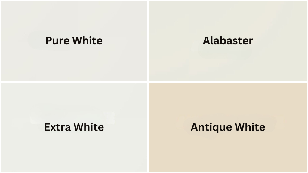
Several white trim colours pair beautifully with Sherwin-Williams Repose Gray:
| White Trim colour | Best For | Effect |
|---|---|---|
| Pure White | Modern & traditional spaces | Crisp, clean contrast with clear definition |
| Alabaster | Relaxed, cohesive looks | Softer, warmer complement to undertones |
| Extra White | Bold contrast preferences | Maximum definition between walls and trim |
| Ivory/Antique White | Unified appearances | Less contrasting, more harmonious feel |
Choose your white trim based on the room’s natural light and your preferred level of contrast. Rooms with abundant natural light can handle crisper whites, while spaces with less light often benefit from softer, warmer whites.
Repose Gray Coordinating Colours
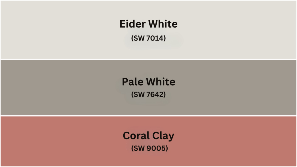
Sherwin-Williams Repose Gray pairs beautifully with numerous colour combinations across different design styles:
| COLOR NAME | BRAND | LRV | RGB | COLOR FAMILY |
| Eider White | SW 7014 | 73 | 226 / 222 / 216 | White |
| Pavestone | SW7642 | 32 | 160 / 153 / 143 | Neutral |
| Coral Clay | SW 9005 | 26 | 191 / 121 / 110 | Red |
Bold Accent Colors That Work: Navy blue adds sophistication to any room, while coral brings warmth and energy. Forest green creates natural appeal, and plum or eggplant tones provide richness and depth to the overall colour scheme.
Repose Gray vs Agreeable Gray
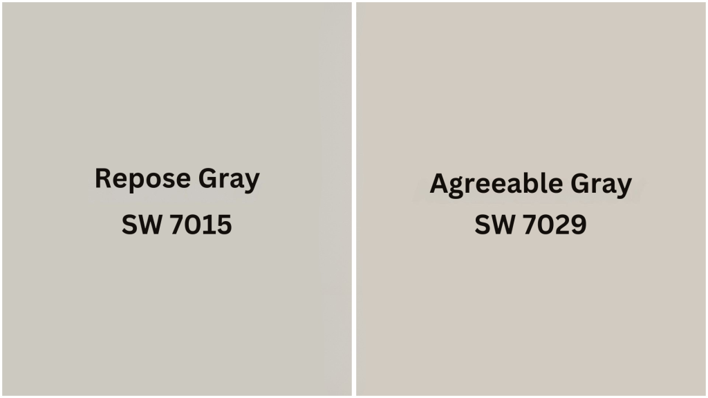
Both Sherwin-Williams colours are popular choices, but they have distinct characteristics:
| Feature | Repose Gray | Agreeable Gray |
|---|---|---|
| LRV | 58 (lighter) | 60 (slightly lighter) |
| Undertones | Green with blue hints | Beige with warm hints |
| Temperature | Cooler | Warmer |
| Style Appeal | Contemporary, adaptable | Traditional, classic |
| Best Lighting | Ample natural light | Limited natural light |
When to Choose Each: Select Sherwin-Williams Repose Gray when you want a fresher, more contemporary feel that works with various colour schemes. Choose Agreeable Gray when you prefer a warmer, more traditional ambiance that feels cozy and inviting.
Repose Gray Interior Application
This color works exceptionally well as a whole-house paint choice because it creates visual flow between spaces while remaining neutral enough to complement any décor style.
If home features traditional, modern, farmhouse, or transitional elements, Repose Gray provides a classy backdrop that complements your furnishings and artwork.
Cabinet Color Applications
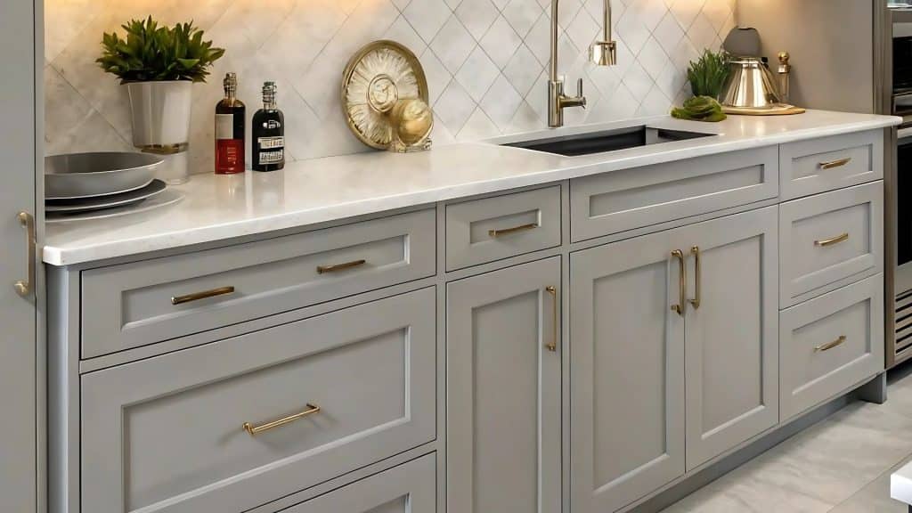
This color works wonderfully as a cabinet colour, particularly in kitchens and bathrooms. Its neutral nature makes it fit to work with various countertop materials and hardware finishes.
Kitchen Cabinet Success Tips: Consider pairing your kitchen cabinets with quartz or marble countertops for a classy look. Use brushed gold or black hardware to complement the gray tones.
Bathroom Vanity Applications: The colour complements both warm and cool tile choices beautifully. It works well with brass, chrome, or black fixtures and pairs perfectly with white or cream countertops while coordinating with various mirror frame finishes.
Kitchen Designs
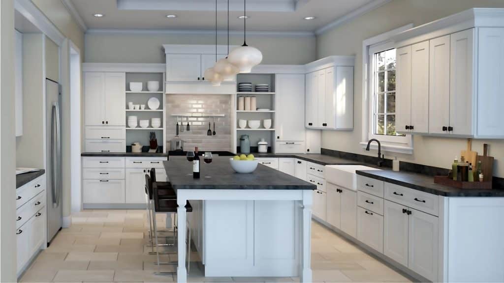
It creates an uplifting, enduring kitchen space. This colour works particularly well in kitchens because it provides a neutral backdrop that won’t compete with colourful dishes, artwork, or seasonal decorations.
Wall colour Combinations: Pair with white or cream cabinets for striking contrast, use with natural wood elements for warmth, or combine with stainless steel appliances for modern appeal.
Kitchen Design Elements That Work: Subway tile backsplashes in white or cream create classic appeal, while natural stone countertops add organic texture.
Living Room Applications
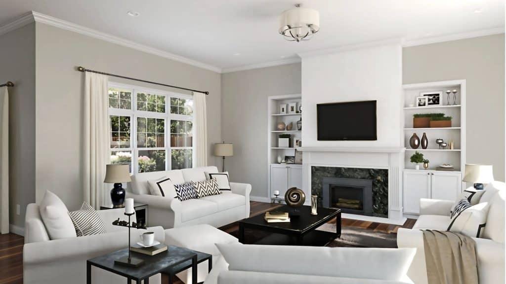
Living rooms benefit from this color’s calming yet modern presence. This colour creates an inviting atmosphere while providing enough neutrality to accommodate changing decor and seasonal updates.
Furniture Coordination Ideas: Cream or white sofas create a beautiful contrast against the gray walls, while navy blue chairs add depth and richness.
Textile and Accessory Suggestions: Patterned rugs in blues and greens tie the colour scheme together. Throw pillows in complementary colours add personality, while curtains in natural linen or soft whites maintain the serene atmosphere.
Bathroom Design
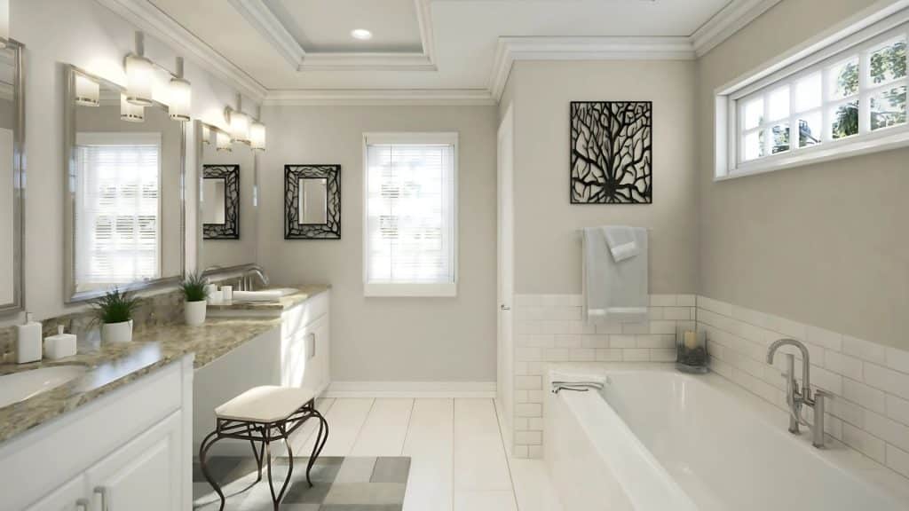
Bathrooms feel spa-like and serene. The colour’s subtle undertones work well with both warm and cool bathroom fixtures and finishes.
Tile Coordination Options: White subway tile creates a classic appeal that never goes out of style. Natural stone adds organic texture and warmth, while soft blue or green mosaic accents provide subtle colour interest.
Fixture Compatibility: It complements both pedestal and vanity sinks while pairing well with white or cream countertops and coordinating with various mirror frame finishes.
Bedroom Applications
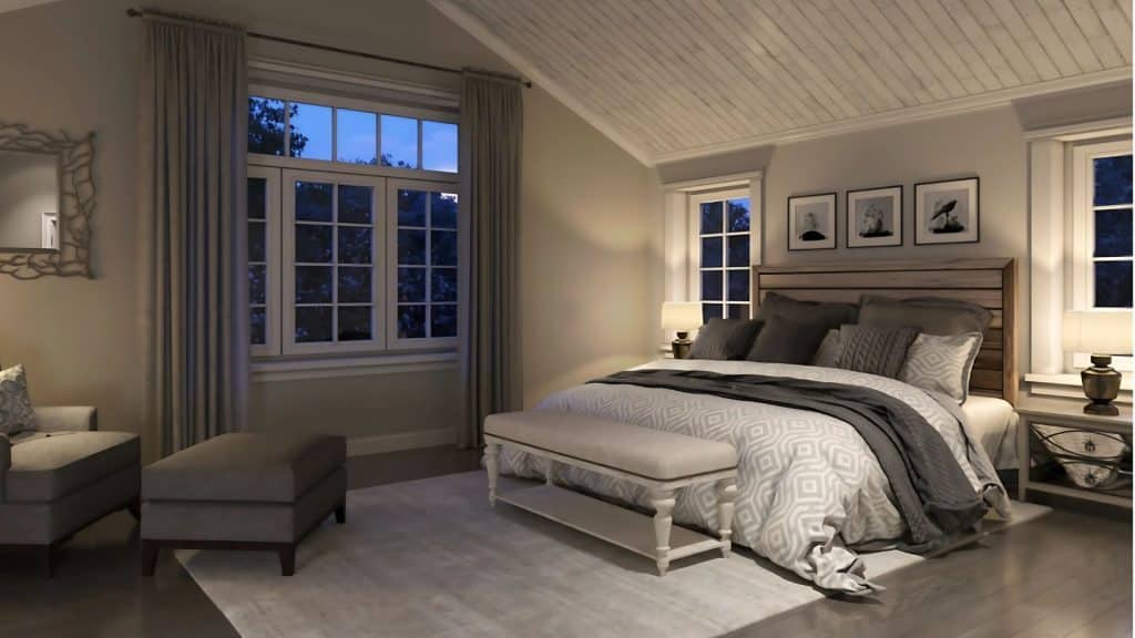
Bedrooms benefit from calming properties. This colour creates a restful environment while maintaining enough interest to prevent the space from feeling bland.
Bedding and Textile Coordination: White or cream linens provide freshness and light, while soft blue accents enhance tranquility.
Natural linen textures add warmth and comfort, and subtle patterns in coordinating colours create visual interest without overwhelming the peaceful atmosphere.
Real Room Examples
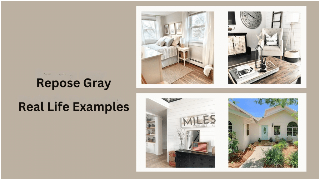
Living Room Application: In a south-facing living room, Sherwin-Williams Repose Gray creates a serene backdrop that changes throughout the day. Morning light brings out its cooler qualities, while afternoon sun warms it up.
Kitchen Success: A kitchen featuring Sherwin-Williams Repose Gray walls, white cabinets, and marble countertops demonstrates the color’s versatility.
Bedroom Retreat: In a master bedroom, Sherwin-Williams Repose Gray walls paired with soft blue bedding and natural wood furniture create a calming sanctuary.
Is This Color Right For You?
It’s perfect for you if you: Prefer neutral colours with subtle character, want a backdrop for various decor styles, like colours that adapt to different lighting conditions, value enduring appeal over trendy choices, or want a colour that increases home value.
Consider other options if you: Prefer distinctly warm or cool colours, want bold statement wall colours, have very limited natural light, or prefer pure white or true gray neutrals.
Making Your Decision: Test the colour in your space with different lighting throughout the day. Consider your existing furniture and decor, think about your long-term decorating goals, evaluate the room’s natural light patterns, and consider the overall flow with adjacent spaces.
Final Thoughts
It strikes the ideal balance between neutrality and character, making it perfect for today’s homes.
Its carefully crafted undertones and adaptable nature work beautifully across different design styles and room applications.
This shade offers several key advantages: it harmonizes effortlessly with countless color palettes, works seamlessly as a whole-house solution.
Experiment with different accent colors and textures to create a space that feels uniquely yours, while benefiting from the enduring popularity of this gray.
Ready to see if Repose Gray is right for your home? Order sample sizes and test them in your rooms throughout different times of day to experience how this flexible color adapts to your specific lighting conditions.