
Are you planning to completely redesign your living area or bedroom but confused about where to start? If yes, then we are here to help you with a basic but essential part of the redesigning process. The most significant ‘element of any room can be its walls.
The way your walls look and the color you choose for the same can deeply impact the overall look of your room. There have been trends in the past where people opt for bright color options or even designer wallpapers to make their walls look attractive.
However, over the years, it has been found that people ultimately choose calmer/soothing color options for their walls. This is where Retreat by Sherwin Williams comes in. People love this color that even bright-color enthusiasts choose it because of its calming and blissful feel and the way it makes the whole room feel nice.
Sherwin Williams Retreat Review: Right Choice or Too Simple?
As we said, there has been a trend of eye-catchy colors and wallpapers, but still, people choose Retreat by Sherwin Williams. This is because, after some time, bright colors are not too attractive anymore, and it might even spoil the feel of the room.
Your living space or bedroom does not need to have an aggressive vibe to it all the time. This is why Retreat by Sherwin Williams might be the best option for you.
The color is soothing, and its tone instantly gives a warm feel to the whole ambiance of the room; that’s what you need for your living room or bedroom to have a calm and welcoming vibe to it. If you are an enthusiast for bright colors, you can opt for a brighter color option, but in the longer run, that bright color should only be in the less visited rooms of your home so that you do not get tired of it.
On the other hand, you will not get tired of the minimalism and calm that Retreat by Sherwin Williams has on offer. If you are a big fan of aesthetics, then you will definitely like Retreat by Sherwin Williams, the somewhat dual-tone finish of this paint is what makes it very special. The seamless mix of Grey and Green colors makes the paint look unique and remarkably tranquil.
Dual-Tone and Calm at The Same Time
Now we know that you might be wondering that if the paint is dual-tone, then how can it be calm or not aggressive? Retreat by Sherwin Williams has a soft undertone of the color grey with a hint of green to it, and these two colors mix very well to create a classy yet calming environment. So either of the color’s visibility depends upon the lighting of the room. In natural bright lighting, the paint shows off its Grey color, which is more easily visible, and in artificial lighting, it shows off its green color.
It is important to keep in mind that none of the colors are too aggressive. The overall finish of both will always look calm, and the wall always perfectly blend in the background of the room as it should be. We recommend you to have Retreated by Sherwin Williams in a room that has a fair share of natural lighting coming in during the day so you can enjoy both of the colors which the paint has to offer.
Specifications of Retreat by Sherwin Williams
When reviewing a paint, it is important to also go through its scientific numbers for people who want to have knowledge about it and also factor it in while making their decisions. To better understand how light or dark the paint is, let us first discuss the Light Reflectance Values (LRVs). The LRV of Retreat by Sherwin Williams is 21; this means that this color is more on the darker side of the scale. The color values of the paint with respect to Red, Green, and Blue stand at 122, 128, and 118, respectively.
The color values help in determining the composition of colors in Retreat by Sherwin Williams. Now even though the paint falls in the “Darker” category of the LRV scale, it is important to know that because of its dual-tone finish, it does not look dark, especially if it is being used in a room with ample natural light coming in. If the paint is used in a room with no windows or natural light coming in. It might make your room feel more compact, but the overall finish will still feel more calm and aesthetic.
Maintaining the Retreat by Sherwin Williams
Maintaining the paint is not a challenging task considering that it is a matte finish paint and the color is not too bright, so the dust will not be easily visible. If you do notice any dust, just use a slightly wet piece of cloth and rub it across the surface, which has dust accumulation very gently, so your paint won’t be smudged, and the finish will look just as new.
It is recommended that you do not place furniture too close to the wall and maintain gaps in between so the cleaning process is easier and dust accumulation is minimum. Just follow these simple steps, and your paint will look as good as new.
Best Places to Use Retreat by Sherwin Williams in Your Home
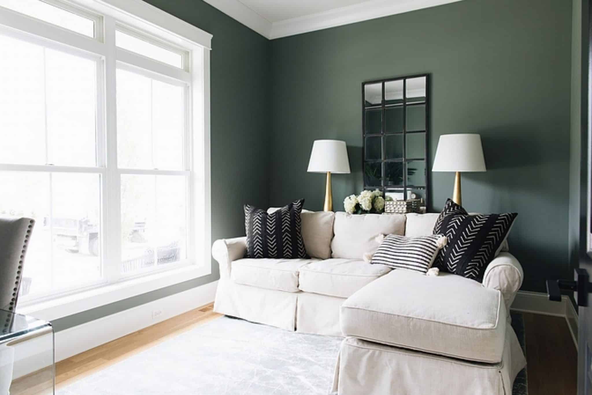
Even though the Retreat can be used anywhere in the house and it will look good, there are still some rooms where it will look better than others. The best place to use it, of course, would be the living room.
1. Living Room
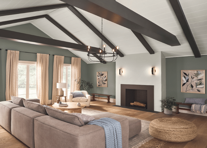
The living room is the most commonly used room in the house, and even when guests arrive, they are seated in the living room. Because of the subtle hue of the Retreat by Sherwin Williams, it is a good choice to use in the living, and it will pair perfectly with your interior décor and furniture. Also, most living rooms have ample amounts of natural light coming in which gives you the advantage of enjoying the dual-tone finish of the paint.
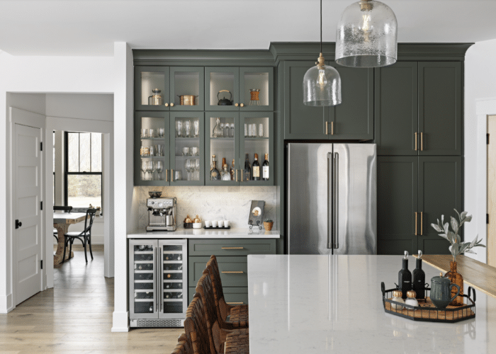
2. Kitchen
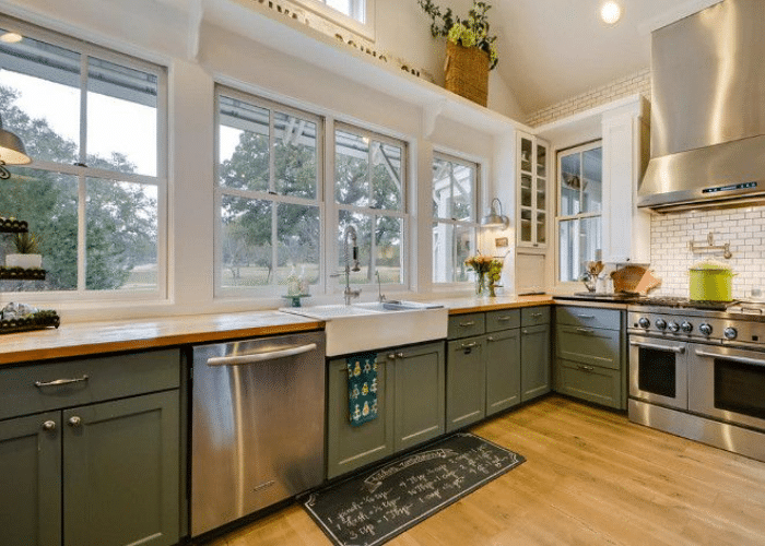
If you want to use the Retreat in your kitchen, it might not be the best idea for you as there might be an accumulation of oil on the wall after a while, and it can damage the paint and definitely the look of your wall. We would recommend you refrain from using the Retreat in the kitchen and rather use plastic oil of a similar color to get a similar finish. You can apply the paint on the cabinets after applying a layer of Primer so you get the best finish and your paint stays on for a long period of time.
3. Bathroom
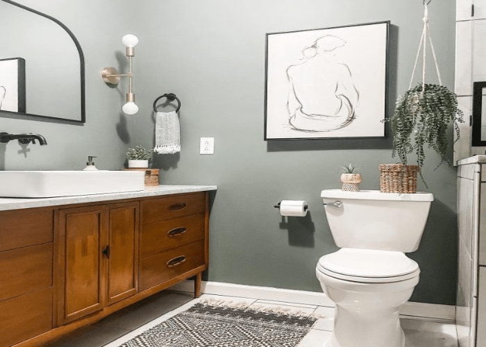
If you plan to use the Retreat by Sherwin Williams in your bathroom, it is a good choice. The paint can act as a perfect accent wall in your bathroom. If paired up with a correctly contrasting vanity cabinet and mirror, the look will come out even better, giving your bathroom a modern yet subtle and aesthetic look.
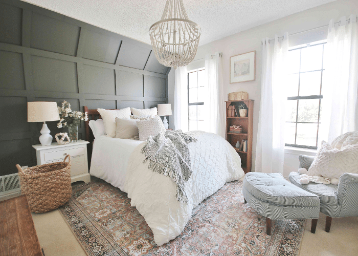
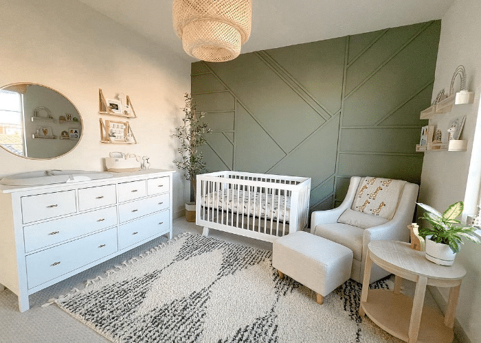
4. Bedroom
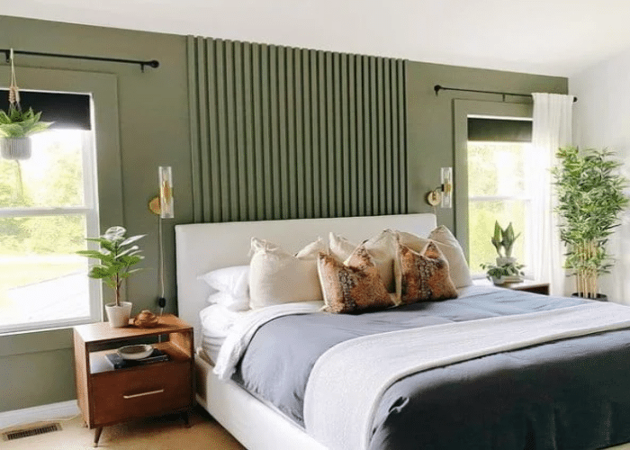
The bedroom is yet another room in which the Retreat will go very well. It can match up with your bed and create a nice soothing back wall of your room. Since the paint is slightly on the darker side, the room will be compact like a bedroom should be.
It is important to remember that you should prefer using the Retreat by Sherwin Williams in a well-lit room with ample natural light coming in so that you can enjoy the dual-tone finish that it has to offer.
Is Sherwin Williams Retreat Definitely Your Color?
- Individuals seeking vibrant or bold color schemes should not go for Retreat by Sherwin Williams. This painting leans towards a more subdued and calming tone which might not be a suitable choice for those aiming to have a more energetic or eye-catching atmosphere in their rooms.
- If you have limited, very less to no natural light coming into your room, then you should not opt for this paint. As explained earlier in the article, the Retreat by Sherwin Williams has two subtle tones of 2 colors, Grey and Green. Both colors are differently visible in different lighting. So if your room only has artificial lighting, then you will not enjoy the dual-tone finish of this paint, and thus, there is no benefit of getting it if you don’t get to experience everything that it has to offer.
- If you are planning to use the Retreat in a commercial place with a lot of movement, then maybe you should reconsider. This kind of place requires paints that can withstand heavy use; since it is a commercial space, the walls are not cleaned often, so Retreat by Sherwin Williams definitely should not be considered in such spaces.
- Those seeking a warmer color palette should also not consider Retreat by Sherwin Williams. This is not an option if you want color finishes of red, orange, or yellow. The retreat offers a grey hue color with a green undertone to it. So it will not solve the purpose if you want warm colors on your wall.
- If you have unique home décor or furniture items with only a few specific color options, you should first see how well they can fit with Retreat by Sherwin Williams before finalizing it.
Conclusion
So there it is; this is everything you need to know about the Retreat by Sherwin Williams. If you are planning to go for a mixture of class and subtle finish, then definitely go for this. Make sure to go and see a sample of this paint better to understand the final look and finish of the paint. Also, check out how the paint will look in different lighting conditions to clarify how it will look in your own house.
You do not have to worry about how well it will go with your furniture because of its light hue finish and dual-tone property; it will go well with almost any furniture which will be lined up against the wall. A simple two-layer application of this paint will do the job, and your wall is ready to go.
If you do not have experience in DIY, we suggest you get it done professionally. For more insights, visit Sherwin William’s official site to get more detailed options for executing your project with ease.