
Sherwin-Williams Snowbound has become a go-to white paint color for homeowners and designers seeking the perfect neutral backdrop.
This versatile shade offers a clean, fresh appearance without the harsh brightness of pure white or the yellow undertones found in some warm whites.
When selecting paint colors for your home, Snowbound (SW 7004) stands out for its balanced tone that works harmoniously across various spaces.
If applied in bedrooms, kitchens, living rooms, or bathrooms, this neutral white creates an ideal canvas that complements diverse design styles and color palettes.
As we learn about this popular paint color, you’ll understand why it has become a staple choice for those looking to refresh their interiors with a white that performs beautifully in different lighting conditions.
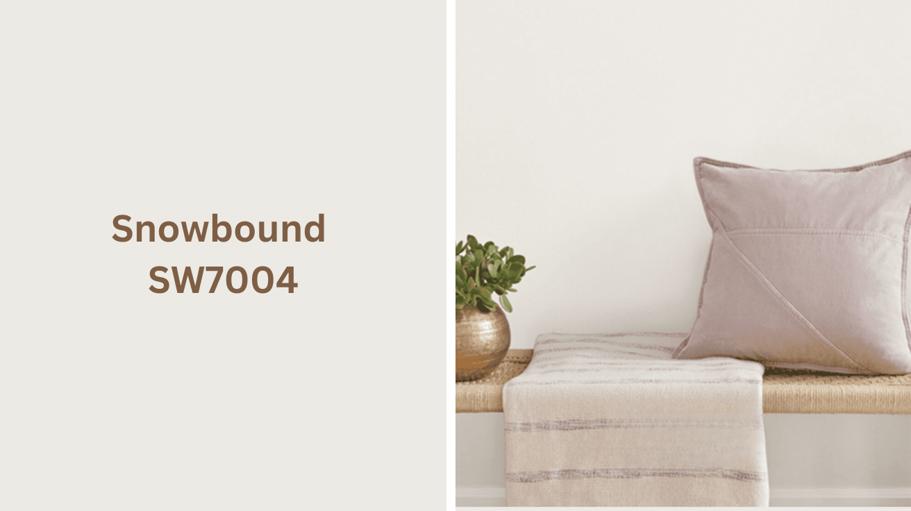
What is Snowbound SW7004 Paint Color?

Snowbound SW7004 is a soft, warm, off-white paint color from Sherwin-Williams. Its subtle hints of gray and beige give it a versatile and cozy feel.
This color is perfect for creating light and airy spaces while maintaining warmth and comfort. It works well in both modern and traditional settings, offering a clean and neutral backdrop for various decor styles.
Snowbound is commonly used for walls, trim, and ceilings, creating a fresh, calming atmosphere that pairs well with other soft hues or bold accents. Its understated beauty makes it a popular choice for rooms that aim for a serene, inviting vibe.
Understanding Snowbound Paint Color Basics
Here is the table for Sherwin Williams’ Snowbound paint color:
| Property | Value |
|---|---|
| LRV (Light Reflectance Value) | 83 |
| Color Category | Neutral |
| Comparison | Slightly warmer than Pure White, with more depth |
| RGB Value | 237, 234, 226 |
| Hex Code | #EDEAE2 |
Undertones:
- Cool undertones with hints of gray and blue.
- It has a soft, crisp feel, making it versatile for various spaces.
- It pairs well with both warm and cool tones but leans slightly cool.
Why Choose Snowbound SW-7004?
Snowbound SW7004 is a versatile paint color that works well in a variety of spaces. Its soft, cool undertones, including light grays and hints of blue, create a calm, airy feel, making it perfect for both modern and traditional designs.
With a high Light Reflectance Value (LRV) of 83, Snowbound reflects light well, brightening rooms and making them feel larger without overwhelming the senses.
Durability is one of Snowbound’s standout qualities. Sherwin Williams’ paint is known for its high-quality, long-lasting finishes that resist wear and tear.
Snowbound adapts beautifully to various textures and finishes; it can be applied to smooth matte walls or textured surfaces with satin or eggshell finishes.
It intensifies surrounding materials, such as stone, wood, or fabric, making it ideal for both contemporary and classic interiors. Its neutral yet cool nature creates a foundation for any room, offering a serene and inviting atmosphere.
Snowbound seamlessly complements vibrant or subtle colors in decor, blending effortlessly with modern and traditional styles.
How Snowbound Will Look in Interior Design
Sherwin Williams Snowbound SW7004 is a versatile soft white with subtle, cool undertones. Its light gray-blue hues create a calm, inviting atmosphere in any space, ideal for modern, minimalist designs.
Living Room
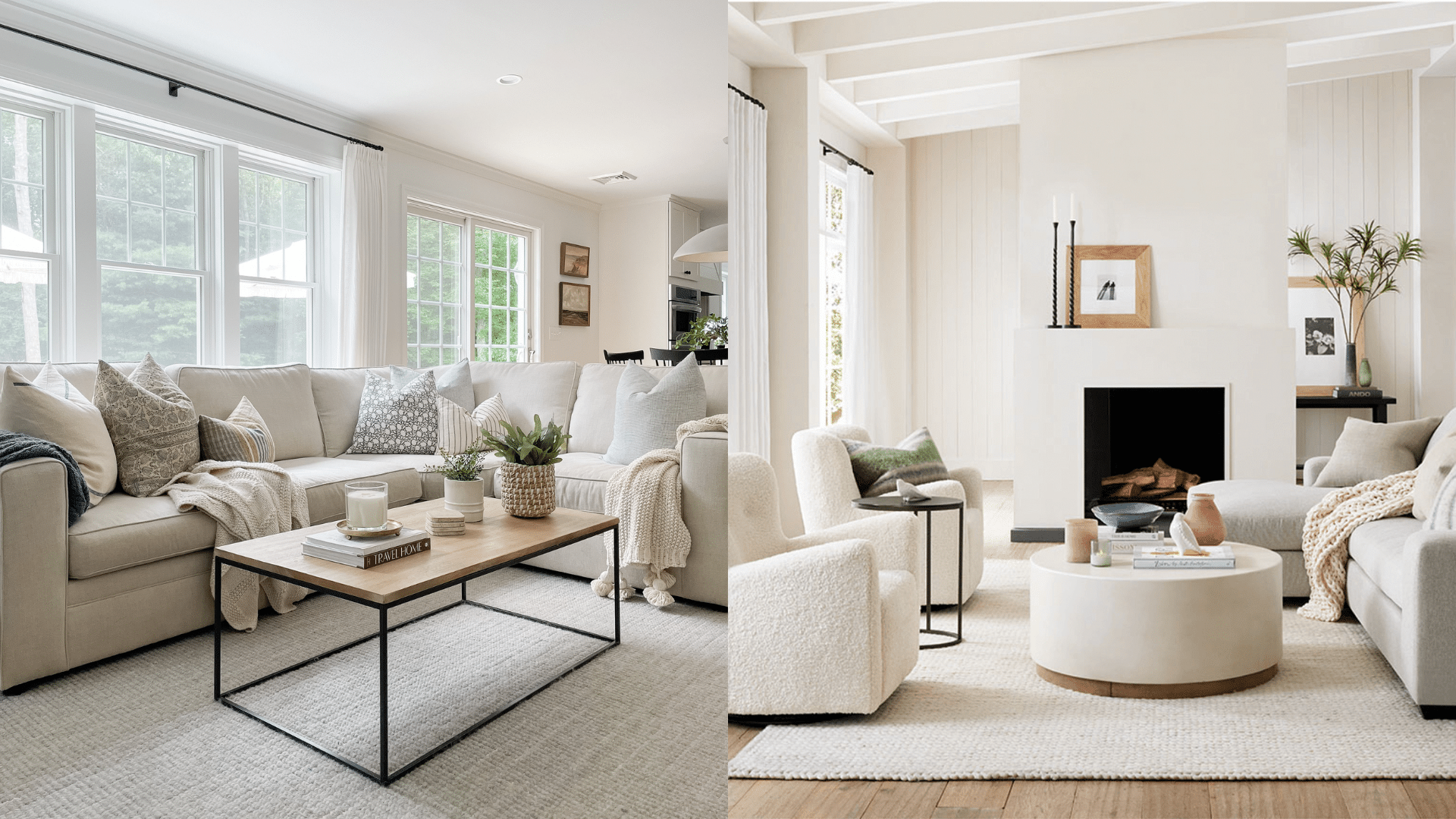
- It intensifies the natural light, making the space feel airy and expansive.
- Neutral tones in furniture and accents create a calm, inviting atmosphere.
- Soft undertones complement the modern and minimalist decor, adding a serene feel.
Bedroom
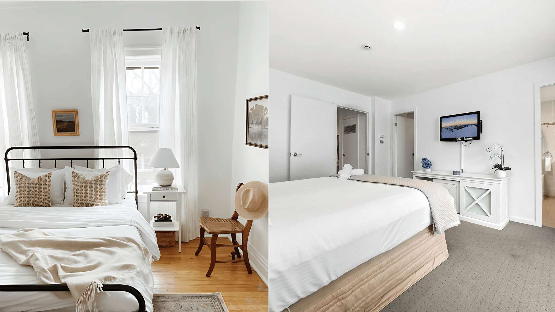
- It creates a peaceful, calming atmosphere ideal for restful sleep.
- Light wood furniture and soft bedding complement the soft gray-blue undertones.
- Large windows increase the airy, bright feel of the space, making it feel open and serene.
Kitchen and Dining
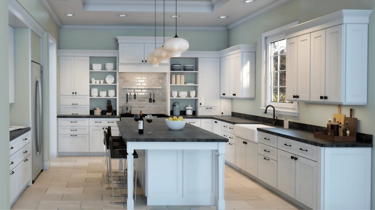
- It increases the brightness of the space, reflecting natural light throughout.
- White cabinetry and natural wood furniture create a welcoming, modern vibe.
- The neutral color creates a clean and timeless look, perfect for a cozy yet functional space.
Bathroom
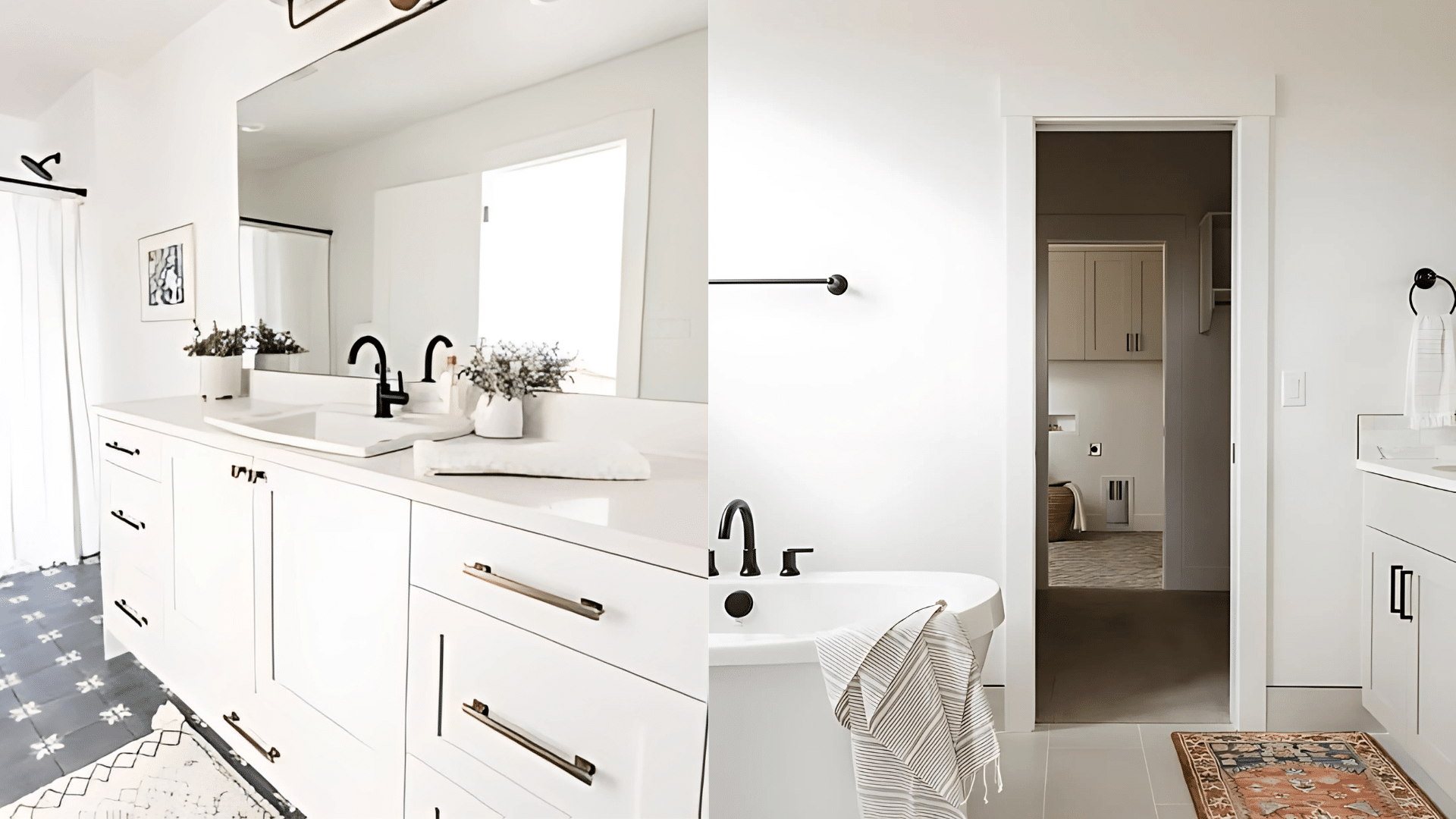
- Snowbound SW7004 creates a clean, fresh ambiance with its light gray-blue tones.
- Natural light and white tile accents make the bathroom feel open and airy.
- The soft, cool undertones complement modern fixtures, creating a spa-like, tranquil space.
Tips for Using Snowbound
When using Snowbound SW7004, the way you light your space plays a crucial role in bringing out its full potential. Proper lighting can intensify the color’s subtle undertones, making the room feel brighter and more inviting.
If you’re working with natural light or artificial sources, consider how the light interacts with the color to create the desired atmosphere in your space.
1. How Lighting Affects Snowbound
- Natural Light: Snowbound reflects natural light, making rooms feel brighter and more spacious.
- Artificial Lighting:
- Warm lighting softens Snowbound, creating a cozy atmosphere.
- Cool-toned lighting enhances gray-blue undertones for a modern, clean feel.
- Accent Lighting: Use sconces or spotlights to highlight walls painted with Snowbound for added depth and dimension.
2. How to Use the Right Trim
- Darker Trim: Pair with deep gray or navy blue trim for contrast and visual interest.
- Lighter Trim: Use soft off-white or cream trim for a subtle, seamless transition.
- Wood Trim: Natural wood trim (oak, walnut, or whitewashed wood) adds warmth and texture to complement Snowbound.
3. Surface and Finishes
- Matte or Satin Finish: Matte on walls creates a soft, serene look. Satin on trim adds a light sheen and subtle look.
- Textured Surfaces: Snowbound complements textured surfaces like stone or exposed brick, increasing their depth.
- Glossy Surfaces: Glossy finishes on trim or molding create a contemporary touch, highlighting architectural features
Color Pairings and Combinations for Snowbound SW7004
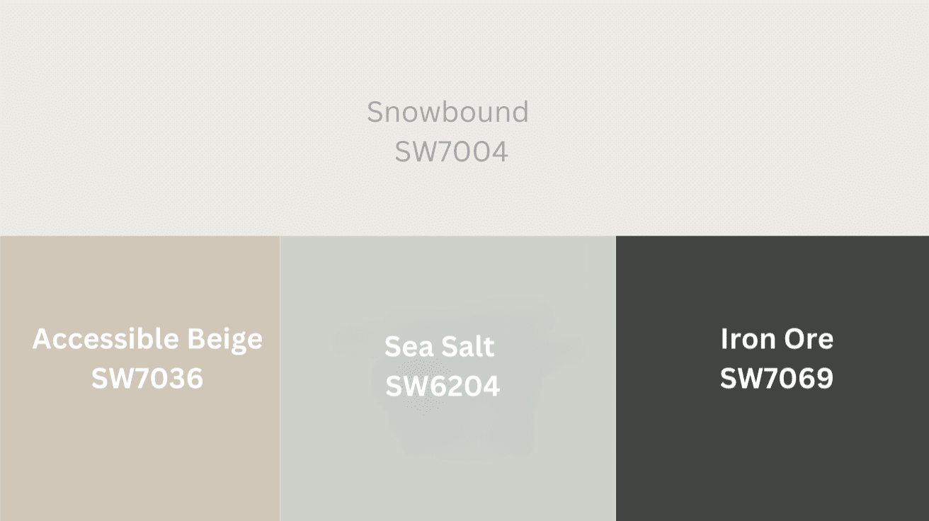
- Accessible Beige SW7036
Accessible Beige adds depth and warmth to Snowbound without being overpowering, offering a cozy, neutral palette perfect for various spaces. - Sea Salt SW6204
The cool, muted tones of Sea Salt contrast beautifully with Snowbound’s warmth, creating a serene and refreshing vibe in any space. - Iron Ore SW7069
Iron Ore’s deep, rich gray creates a striking contrast with Snowbound’s lightness, resulting in a modern and refined aesthetic.
Paint Colors: Perfect Alternative to Snowbound
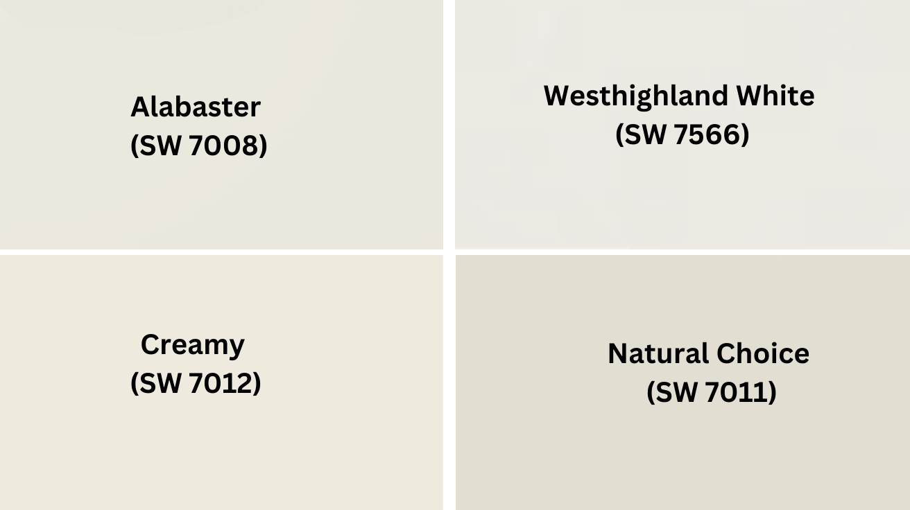
-
Alabaster (SW 7008): A soft, warm white with creamy undertones, perfect for a serene and inviting space.
-
Westhighland White (SW 7566): A warm, creamy white with beige undertones, offering a cozy and elegant feel.
-
Creamy (SW 7012): A rich, warm white with a touch of beige, providing a soft, inviting atmosphere.
-
Natural Choice (SW 7011): A muted off-white with a hint of warmth, creating a relaxed, earthy tone.
Wrapping It Up
Snowbound is the perfect choice for anyone looking to brighten their space with a soft, creamy white tone.
Its versatility allows it to blend beautifully with different styles and colors, from warm earthy tones to cool shades.
If you’re decorating a cozy living room or a sleek kitchen, Snowbound creates an inviting atmosphere that makes any room feel open and fresh.
For those looking for alternatives, shades like Alabaster SW 7008 or Swiss Coffee SW 7566 bring a similar warm touch, giving a variety of options depending on the vibe you want to create.
With these options, it’s easy to transform your space into a welcoming haven. Snowbound and its alternatives offer timeless style and charm, making them perfect choices for any home.
So, pick the shade that fits your style and enjoy a cozy, stylish space!