
Have you ever walked into a room and felt instantly at ease? The wall color might be the reason. Accessible gray sits between gray and beige—not too cold, not too warm. It’s that “just right” shade many homeowners search for but rarely find.
This gentle color works in homes both old and new. It pairs well with white trim, wood tones, and most furniture styles. Unlike stark whites or bold colors, accessible gray won’t fight for attention in your space.
Many paint stores list it as a top seller year after year. Why? It fits with changing decor trends without needing constant updates.
People choose this color because it makes rooms feel bigger and brighter. It shifts subtly as light changes throughout the day.
Want to know how to use this color in your own home? Let’s look closer.
Key Features of Accessible Gray
Accessible gray combines the best of both worlds. It sits in the sweet spot between plain gray and warm beige, creating a color that works in many homes and styles.
Let’s look at what makes this paint color stand out:
| Feature | Description |
|---|---|
| Color Family | Sits between gray and beige (often called “greige”) |
| Undertones | Soft neutral base with hints of warm beige |
| Light Reflectance Value (LRV) | Mid-range (around 50-60) |
The Light Reflectance Value tells us how much light bounces off this color. With a mid-range LRV, accessible gray won’t make rooms too dark or too bright. This balance helps rooms feel cozy yet open.
As natural light shifts during the day, you’ll notice subtle changes in color. Morning light might bring out more beige tones, while evening light might show more gray.
Why Choose Accessible Gray?
People pick accessible gray for good reasons. It fits almost any room in your home. This color doesn’t show dirt easily, which makes it great for busy homes with kids or pets.
Fits Many Room Types
- Perfect for living rooms and bedrooms
- Makes small bathrooms feel bigger
- Gives hallways a clean, fresh look
Accessible gray works in many different spaces. It brings a calm feeling to bedrooms where you want to rest. In living rooms, it creates a welcoming base for your furniture and art. Small bathrooms look bigger with this shade on the walls. Even hallways and home offices feel clean and fresh with this paint color.
Handles Light Changes Well
- Stays true in morning sunlight
- Looks warm under yellow bulbs
- Shifts gently throughout the day
One big plus is how this color handles changing light. Morning sun, cloudy days, and evening lamp light—all show this color at its best. Unlike some paints that look odd under certain lights, accessible gray stays pleasant no matter the time of day.
Matches Your Stuff
- Goes with light and dark wood
- Makes the white trim stand out
- Doesn’t clash with metals
Your furniture and decor will thank you for this color choice. Dark wood, light wood, white trim, and even metal items all work well with these walls. You won’t need to worry about clashing colors when you bring home new pillows or artwork.
How Accessible Gray Works in Different Spaces?
This versatile color adapts to any room in your home. Let’s see how it plays in different spaces and how you can style each area for the best results.
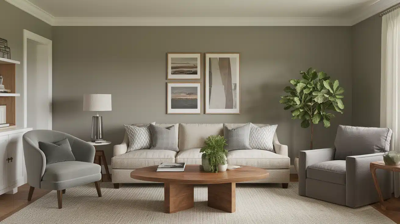
1. Living Room
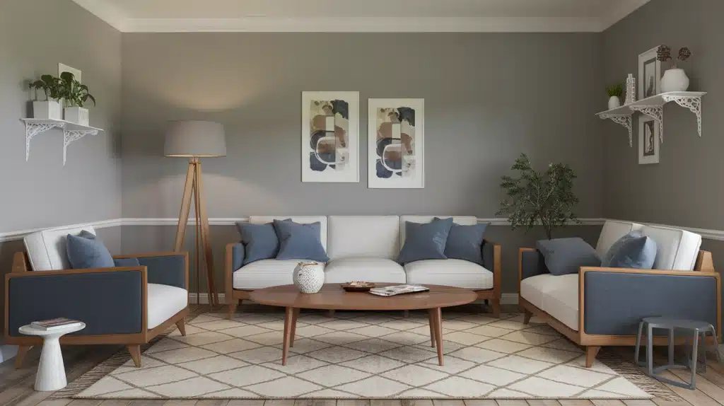
Accessible gray creates a warm backdrop in living rooms without being boring. The walls take on a soft glow during daytime hours and feel cozy when evening comes. This color helps living rooms look bigger and less cluttered. It works in both formal living rooms and casual family spaces.
Styling Tips:
- Add white or cream sofas for a clean contrast
- Bring in wood coffee tables to add warmth
- Use blue or green pillows to add life to the space
- Hang simple white frames for artwork
- Place a soft rug with subtle patterns
2. Bedroom
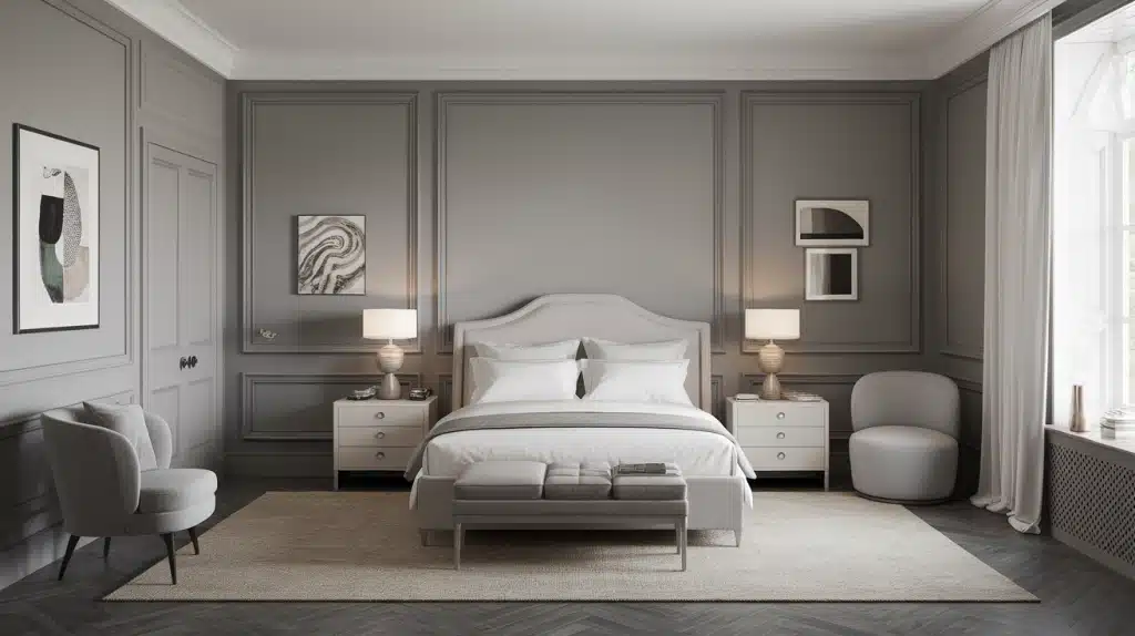
This color promotes rest and calm in bedrooms. The slight warmth in accessible gray makes the room feel safe and peaceful. Morning light brings out its lighter tones, while lamp light at night enhances the cozy feeling. This paint makes both master bedrooms and guest rooms look finished.
Styling Tips:
- Choose white bedding for a hotel-like feel
- Add one or two colorful throw pillows
- Use wood nightstands to bring warmth
- Hang simple curtains in white or cream
- Place a small plant for a touch of nature
3. Kitchen
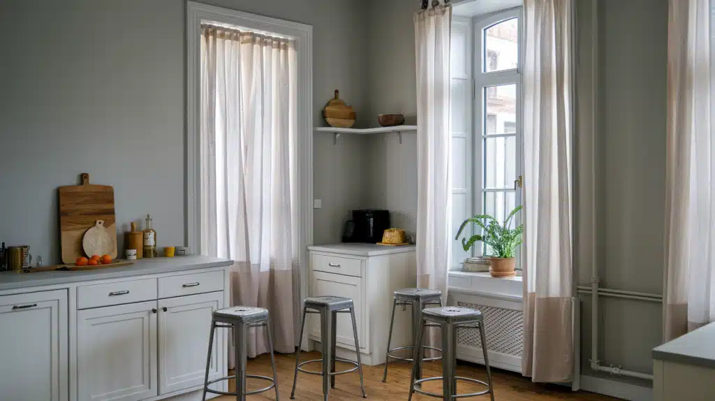
Kitchens with accessible gray walls feel clean yet homey. Food colors pop against this neutral base. The paint handles cooking steam and light splashes well. It stays looking fresh longer than white walls, which can yellow near cooking areas. This color works in both large and small kitchens.
Styling Tips:
- Pair with white cabinets for a classic look
- Use wood cutting boards as both tools and decor
- Add metal bar stools for a modern touch
- Keep window treatments simple and light
- Use plants or herbs as natural color pops
4. Bathroom
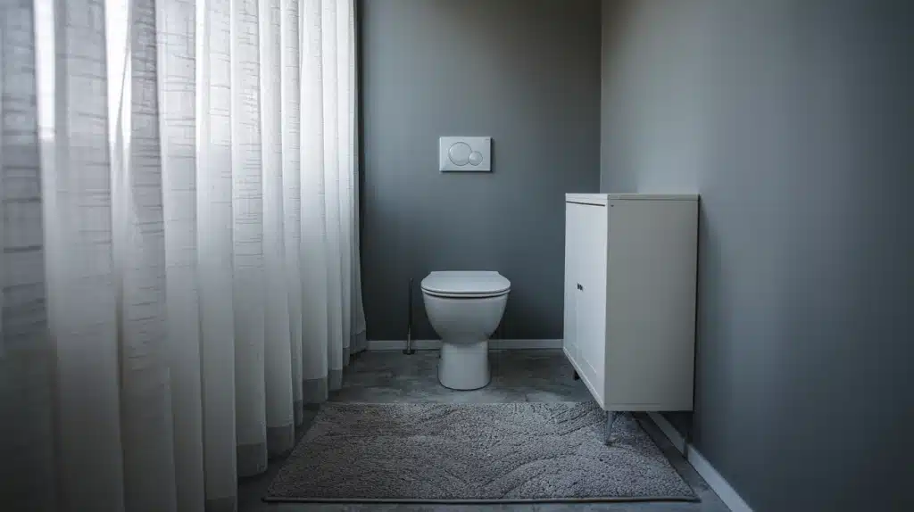
Small bathrooms look bigger with this color. The light but warm tone creates a spa-like feel without the coldness of pure gray. It hides water spots better than darker colors and doesn’t show steam marks as much as white does. This color benefits both the main and guest bathrooms.
Styling Tips:
- Use white towels for a fresh look
- Add a wood bath mat or stool for warmth
- Choose simple metal fixtures in silver or brass
- Keep art simple with small framed prints
- Use clear glass shower doors when possible
Pairing Accessible Gray with Other Colors

The right color partners can make accessible gray shine in your home. This shade plays well with others, from calm neutrals to bright accent hues. Accessible gray works like a good friend – it helps other colors look their best.
1. Whites and Creams
White and cream shades create clean lines against this wall color. The contrast feels crisp without being stark. Bright whites make spaces feel more modern, while creamy whites add a touch of warmth. Use these colors for trim, furniture, or bedding to create a solid base.
2. Blues
Soft blues pair beautifully with accessible gray. Think of sky blue or faded denim tones. These colors bring to mind clear skies and calm waters.
Navy blue acts as a strong anchor in a room with accessible gray walls. Lighter blues keep the room feeling open and airy. Blue works well in fabrics, art pieces, and even kitchen items.
3. Greens
Green brings life to rooms with accessible gray walls. From sage to mint, these colors feel fresh and natural. Sage green has a soft, faded quality that works in both modern and country-style homes.
Deeper forest greens add rich depth to a space. Plants are an easy way to add green, but you can also try green lamps or throws.
4. Yellows
Yellow and accessible gray create a happy balance. The gray tones down yellow’s brightness while yellow adds warmth. Pale butter yellow feels sunny without being too bold.
Mustard yellow brings a touch of spice and works well in the fall and winter months. Even small pops of yellow, like a throw pillow or vase, make a big impact.
5. Pinks and Corals
Soft pinks add gentle warmth to gray spaces. When paired with accessible gray, blush tones feel grown-up, not childish.
Coral brings energy to a room without being too bright. These colors work well in bedrooms and sitting areas where you want a touch of color without going bold.
Conclusion
Is accessible gray the right choice for your walls? If you want a color that works in many places and with most furniture, the answer is yes.
This color sits between gray and beige, giving you the best of both. It stays true in different lights and makes rooms feel bigger. From living rooms to bathrooms, it creates a warm backdrop for your life.
Before you paint, buy a small sample. Paint a test patch on your wall and watch it throughout the day. Notice how it looks in morning sun and evening lamp light.
The right color makes a house feel like home. With accessible gray, you get a color that grows with you as your style changes.