
The Trick to Mixing Warm and Cool Neutrals (Without Your Room Looking “Off”)
You know that feeling when you put a pretty gray next to a nice beige and suddenly your living room looks like it’s silently judging you? Like the colors are technically “neutral,” but together they’re giving… awkward middle school dance.
That isn’t you being picky. That’s undertones. Tiny sneaky colors hiding underneath your “safe” neutrals, living their best secret lives and starting fights when you’re not looking.
The good news: you can mix warm and cool neutrals and have it look intentional and gorgeous and very “yes, I meant to do that.” The trick is simple:
- figure out what temperature you’re actually working with,
- pick a dominant “team captain,”
- use the opposite temperature like seasoning—not like the whole entrée.
Let’s do this.
Step 1: Catch the Undertones (Because Paint Names Are Liars)
Warm neutrals usually have red/yellow/orange vibes underneath: cream, beige, tan, warm taupe, cognac, all those cozy oatmeal-y colors.
Cool neutrals have blue/green/purple undertones: true grays, charcoal, blue grays, those crisp whites that feel a little icy.
My favorite stupid easy test: grab plain white printer paper and stand near a window (natural light, not your overhead “interrogation bulb”). Hold your paint chip/fabric sample next to the paper.
- Looks creamy/yellowish next to the paper? Warm.
- Looks kind of blue gray or just sharper/cleaner? Cool.
And please, for the love of your sanity, don’t trust the name. A paint called “Creamy White” can absolutely be cool. A “Blue Gray” can lean warm if it’s got enough muddy undertone in it. Paint companies name colors like candle companies name scents. Vibes only. No facts.
Step 2: Pick Your Dominant Temperature (Start With What You Can’t Change)
Here’s where people get themselves into trouble: they try to force the room into a temperature that fights the stuff that’s already there.
So instead, start with your hard to change anchors:
- flooring
- countertops
- big tile
- a giant sofa you’re not replacing because you’re a normal person who likes having money
Whatever those lean toward (warm or cool)? That’s your dominant temperature.
Once you pick the captain, the rest of the team makes sense.
Also: paint chips lie. Those tiny little rectangles are chaos gremlins. If you’re choosing paint, do yourself a favor and paint a real sample on the wall (big—like 12×12, at least). Look at it in the morning, afternoon, and at night when your lamps are on and you’re questioning all your life choices.
Step 3: Use a Bridge Color (AKA: The Peacemaker)
If you’ve got warm and cool stuff already living together (hi, 90% of houses), you need something that plays nicely with both.
My go to bridge colors:
Greige
Yes, “greige.” Gray + beige. The Switzerland of neutrals. It can link warm woods and cool grays without making it feel like your room is split into rival factions.
Muddy blues
Not a bright, punchy “hello I’m a blueberry” blue. More like a muted, slightly warm, grown up blue that doesn’t scream next to warm tones.
Black
Black is wildly helpful because it doesn’t really read warm or cool—it just says, “I’m here to add structure.” A black frame, a lamp base, cabinet hardware… suddenly everything looks more intentional.
(Just don’t go wild and turn your whole house into a moody noir film unless that’s your dream. A little goes a long way.)
The “Don’t Make Me Come Over There” Rule: Keep the Big Stuff on One Temperature
This is where I’m going to be slightly dramatic: your walls and your biggest furniture pieces cannot be fighting each other. If you’ve got warm beige walls and a cool gray sectional (or the reverse), your eye doesn’t know where to land, so it bounces around like it just drank an energy drink.
So choose your dominant temperature for:
- walls
- large upholstery
- main rug (usually)
- big case goods (dressers, large tables)
Then bring the opposite temperature in through smaller, swappable things.
If your room is mostly cool (grays, crisp whites, charcoal):
Add warmth with:
- natural wood
- brass/copper
- cream/tan textiles
- woven/jute textures
- 2700K bulbs (warm lighting—this matters, promise)
If your room is mostly warm (beige, cream, warm woods):
Cool it down with:
- blue gray accents
- chrome/nickel
- cool toned art
- glass/marble touches
Also, materials have “temperatures,” which is honestly rude because we already have enough to think about:
- Warm: oak, leather, rattan, brass
- Cool: marble, glass, stainless, chrome
Mixing both keeps a room from feeling flat.
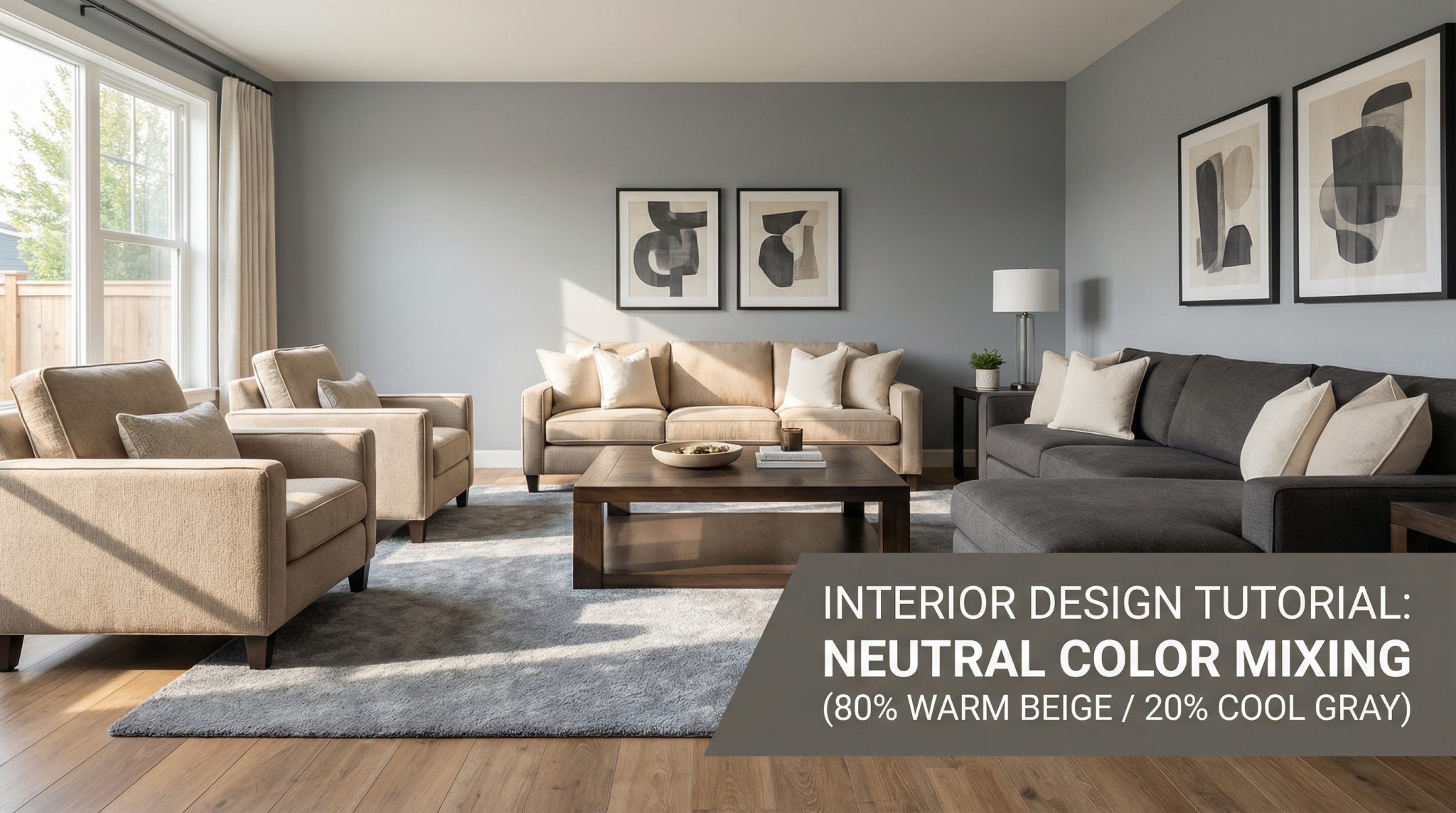
My 3 Rules for Mixing Warm + Cool Neutrals (No Math Degree Required)
1) Do an 80/20 split
About 80% dominant temperature (your foundation), 20% opposite temperature (neutral rooms with accents). This is the easiest way to make it look designed instead of accidental.
If you want more contrast later, you can creep toward 70/30. But start with 80/20 unless you love redoing things for fun.
2) Make sure your cool tone isn’t lighter than your warm tone (most of the time)
This is one of those weird visual weight things: a light cool gray next to a medium warm beige can look… floaty and unsettled. But a darker cool next to a lighter warm usually looks grounded and calm.
Not a law of physics, just a pattern I see constantly.
3) Repeat the “opposite” at least twice
One random cool thing in a warm room looks like a mistake. Two or three cool touches looks intentional.
Example: cool toned art + a pillow + a vase. Boom. Now it’s a “choice.”
Lighting: The Secret Villain in Most “Why Does This Look Weird?” Situations
If you’ve ever loved a color in the store and then brought it home and wanted to cry—hi, lighting.
- North facing rooms = cooler/bluer light. They often look better with warmer neutrals to balance that out.
- South facing rooms = warmer light. They can handle cooler colors without feeling like a dentist office.
And then there are bulbs.
- 2700K (warm bulbs): make warm neutrals glow, but can make some cool grays look a little weird (sometimes slightly greenish—so fun).
- 4000K+ (cool bulbs): can make warm neutrals look dull or sallow.
Before you repaint an entire room, try spending $10 on different bulbs. It’s the least glamorous fix, but it’s often the correct one.
Quick Fixes for the Most Common “Something’s Off” Problems
“Everything looks kind of murky.”
Usually your light/dark balance is off. Your cool element is too light compared to your warm element (or vice versa). Try darkening the cool or lightening the warm so they feel like they belong in the same universe.
“My cool room feels sterile.”
You need warmth. Add wood, warm metals, creamy textiles, and warm bulbs. (Throw in a chunky knit blanket and suddenly you’re a person with hobbies.)
“My warm room looks dated.”
Add cool contrast: cooler art, a blue gray accent, black details, or brushed nickel. Warm rooms don’t need to become gray—just give them something crisp to bounce off.
“My gray walls are making my beige furniture look purple.”
Classic paint undertone problem. Try a gray that’s a shade or two deeper than the beige or pivot to a bridge color like greige that doesn’t pick sides.
“My accents feel random.”
Pick fewer “extras.” Two or three accent colors, similar vibe (muted with muted, bold with bold). Otherwise it starts to look like you decorated by wandering the aisles and following your heart… which is adorable, but not always cohesive.
The Actual Trick (In One Sentence)
Pick a dominant temperature based on your fixed stuff, then sprinkle in the opposite temperature on purpose—using bridge colors and repetition—while paying attention to your lighting.
That’s it. That’s the magic. No swearing allegiance to “only warm” or “only cool” for eternity.
Now go do the printer paper test on whatever paint chip is currently haunting your kitchen counter, and tell me you don’t immediately see the undertone. Once you see it, you can’t unsee it (welcome to the club).