
Paint Undertones: Why Your “Perfect White” Looks Weirdly Yellow
If you’ve ever painted a whole room, stepped back feeling very proud of yourself… and then watched your “crisp white” turn into a sad cup of buttery popcorn as the sun went down hi. Welcome. You’ve just met undertones, aka the sneaky little gremlins living underneath every paint color.
And no, you’re not “bad at color.” Paint is just… dramatic.
Undertones are the reason one “Swiss Coffee” looks creamy and calm, and another “Swiss Coffee” looks like it’s trying to match your 2003 kitchen appliances. (Ask me how I know.)
So let’s talk about how to spot undertones before you commit to repainting your life.
Undertones 101 (the 30-second version)
Paint has two vibes going on:
- Overtone: the obvious color you think you’re buying (white, gray, beige, etc.)
- Undertone: the subtle color cast underneath that decides whether your “neutral” looks pink, green, purple, or “why is this… yellow?”
In general:
- Warm undertones lean yellow, red, or orange (creamy, cozy, beige-y, sometimes slightly pink)
- Cool undertones lean blue or green (crisp, icy, gray tinged, spa-ish)
Here’s the annoying truth: neutrals are never truly neutral. White, gray, greige… they all lean warm or cool eventually. It’s just a matter of when the lighting exposes them.
My favorite undertone “tests” (because guessing is expensive)
You don’t need a design degree. You need a couple of simple comparisons and the willingness to look at paint in more than one light source. That’s it.
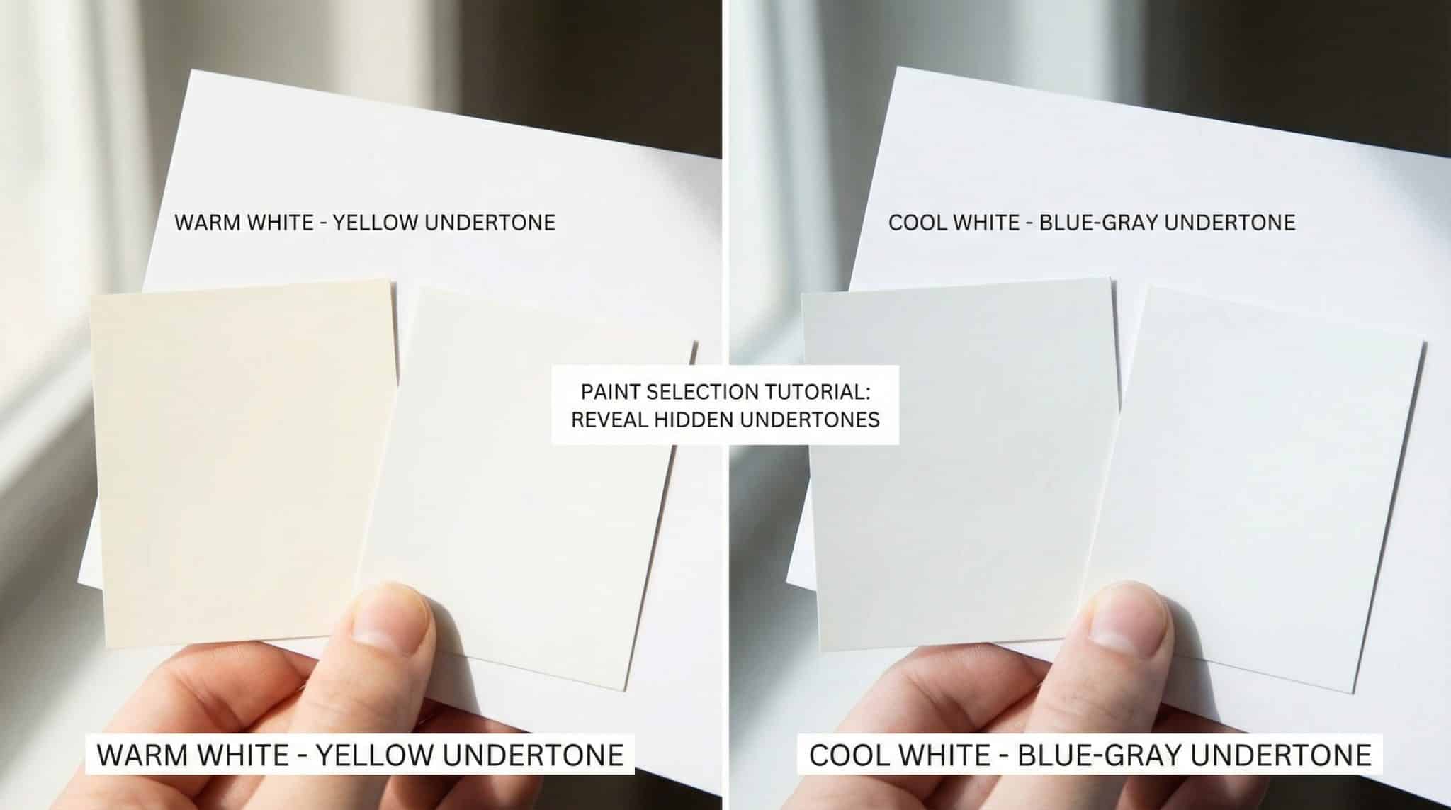
1) The “Printer Paper Doesn’t Lie” test
Grab plain white printer paper (not cream, not “eggshell,” not your kid’s off white homework sheet).
Hold your paint chip against the paper near a window in daylight.
- If the chip looks creamy/yellow/pink/beige next to the paper → it’s warm
- If it looks blue/green/gray-ish → it’s cool
This is the fastest reality check I know. It won’t tell you how warm or cool, but it’ll tell you what direction you’re heading.
2) Compare your maybes side-by-side (aka: make them fight)
If you’re choosing between three whites that “all look the same,” put them all on the same sheet of white paper and look again.
Suddenly one will look pink. One will look dingy. One will look like a clean little angel. That’s undertones doing their thing.
Pro tip: If you can, compare your “maybe” to one paint you know is warm and one you know is cool. Your color will visually drift toward one team.
3) Look at the darkest color on the strip (undertones get louder down there)
On the paint card, the lightest swatch can be a liar. The bottom/darkest swatch usually tells the truth because there’s more pigment.
If the darkest swatch looks a little green-ish or purple-ish, guess what your “soft pale gray” is going to do on a whole wall? Yup. It’s going to go full goblin at sunset.
4) Paint names are… hints. Not evidence.
Names like Linen, Cream, Honey, Swiss Coffee often point warm. Names like Glacier, Ocean, Air, Mist often point cool.
But don’t bet your weekend on this. Paint names are basically marketing poetry. Still fun, occasionally helpful, never a legal guarantee.
5) If you like nerdy shortcuts: peek at RGB
If you can find a paint’s RGB numbers or paint light reflectance values online (many brands list them), it can help you screen options.
Here’s the quick and dirty version:
- Higher red than green tends to read warmer
- Higher green than red tends to read cooler
- If they’re super close, it’s a shifty neutral and lighting will decide its personality that day
Do not use RGB as your final answer. Use it like you use a weather app: helpful, but you still look outside before you leave the house.
6) The only test that really counts: the real life sample
Paint is a completely different animal on a wall than on a chip. Undertones get louder with scale like a toddler with a microphone.
My go to method: paint two coats on a piece of foam core board (the cheap poster board stuff) instead of directly on the wall. Then you can move it around the room like you’re conducting a color investigation. Also, your current wall color won’t mess with your eyes as much.
Check it:
- in the morning
- midday
- evening
- under your lamps (because “daylight” isn’t the only light you live in)
Leave it up for a couple days. If you still like it after you’ve seen it in every mood lighting scenario congrats. That paint earned its spot.
Your room’s direction is basically a paint filter
This part matters a lot, especially with whites and Sherwin Williams warm gray paints.
- North facing rooms = cooler, bluer light most of the day
Warm undertones usually help the room feel less… chilly and flat. - South facing rooms = lots of bright light, often pretty balanced
You can go warm or cool, but check late afternoon when things get golden. - East facing rooms = bright, clean mornings, then softer/dimmer later
Cool undertones can look great early on. Just make sure they don’t get gloomy at night. - West facing rooms = meh mornings, then very warm afternoon/evening light
Warm undertones usually play nicely here. Some cool paints can get weirdly muddy.
My lazy rule of thumb: if your room gets sad daylight (you know the kind), a paint with a little warmth is often your friend.
Don’t forget the stuff you’re not changing (floors + trim will judge you)
Paint doesn’t live alone. It has roommates: floors, cabinets, counters, trim. And they all have undertones too.
Before you commit, hold your sample next to:
- your flooring
- your cabinets
- your countertop
- your trim color
A few quick pairings that tend to save heartbreak:
- Golden oak floors (warm/yellow) usually like warm whites and warm greiges
- White oak / more gray floors often look best with cooler whites and cooler neutrals
- Cherry / red toned wood can clash fast with cool blue grays (it’s not impossible, just… picky)
- Dark walnut often looks great with cooler neutrals. Super warm creamy walls can get strange
And trim? Trim is a whole personality.
- Bright, crisp trim next to a warm wall can look very high contrast (sometimes cute, sometimes harsh).
- Creamier trim with warm walls feels softer and calmer.
- Cool trim with cool walls looks clean and modern.
You’re not trying to make everything “match.” You’re trying to make it not argue.
4 undertone traps I see all the time (including in my own house, unfortunately)
1) The store lighting scam
That paint chip looked perfect under big box fluorescent lights. Then you get home and it’s suddenly banana pudding.
Always sample at home. Always.
2) The “but the numbers said!” confusion
RGB and codes are helpful, but your room lighting can still make a cool paint look warm (especially in golden west light). Trust your eyes in your space.
3) Conflicting test results
If one test says warm and another says cool, you probably tested in different lighting. Re-check in the same spot at the same time of day. If it still shifts? Congrats, you found a borderline neutral, aka the shape shifter.
4) The scale surprise
A tiny chip looks neutral. A whole room looks pink. That’s normal. Undertones get louder on big surfaces. Sample boards save marriages. (Kidding. Mostly.)
The real takeaway (so you don’t end up repainting twice)
If you do nothing else, do this:
- Compare paint chips to true white paper
- Check the darkest swatch on the strip
- Sample on a movable board and watch it through the day
- Hold that sample next to your floors + trim
That’s the whole magic trick. Testing beats hoping every single time.
And if your “white” still goes a little yellow at 6 pm? You’re not cursed. Your house is just doing what houses do: changing the light and making you question your choices. Totally normal.