
Dark green paint shades have become a common sight in modern homes, but finding the perfect balance between too dark and too light can be tricky.
I’ve tested countless green paint colors over the years, and Benjamin Moore Vintage Vogue stands out for its unique depth and versatility.
I promise to show you exactly why this color deserves your attention, breaking down its true nature and helping you determine if it’s right for your space.
Through my experience as a color consultant, I’ve learned the secrets to making this shade work in any room.
In this guide, I’ll walk you through real-world examples, share specific color combinations, and give you honest insights about where Vintage Vogue truly shines.
What Makes Benjamin Moore Vintage Vogue Special?
Description and Appeal
Meeting Vintage Vogue for the first time feels like finding that perfect leather jacket – it has character without trying too hard. This deep, smoky green carries subtle hints of black and brown, making it stand out from typical dark greens.
In my color consulting work, I’ve noticed that Vintage Vogue fits beautifully in new builds and century-old homes. That rare paint color makes sense whether you’re painting a modern kitchen island or a traditional library’s built-in shelves.
Vintage Vogue can step in where you might typically use black or brown. I’ve seen it create the same rich depth but with more personality. It adds substance to a space without the heaviness of pure black or the warmth of brown.
Light Reflection Value (LRV)
Vintage Vogue has a Light Reflective Value (LRV) of 11.85. This means it absorbs about 88% of light while reflecting 12%. This placement on the scale makes it noticeably dark but not overwhelming.
Undertones
The undertones tell an interesting story. While green at its core, Vintage Vogue carries subtle black and brown notes that shift throughout the day.
You might catch more of the green in the morning light, while evening light brings out its smokier side. This natural shift helps the color stay balanced – never too warm or too cool – making it easier to pair with other colors in your home.
Why Vintage Vogue Stands Out Among Other Dark Greens
Comparison to Similar Colors
| Detail | Information |
|---|---|
| Benjamin Moore Backwoods |
LRV: 12.68 Slightly higher than Vintage Vogue. Reads cooler and less complex. Comparable to a lighter cousin of Vintage Vogue. |
| Chimichurri (CSP-810) |
LRV: 9.7 It leans heavily into black undertones, making it moodier. It feels like nighttime, while Vintage Vogue feels like dusk. |
| Dakota Shadow (448) |
LRV: 11.6 Pulls more blue-gray and lacks the olive notes that make Vintage Vogue adaptable. |
Benjamin Moore and Sherwin Williams Equivalents
| Detail | Information |
|---|---|
| Sherwin Williams Rookwood Dark Green (SW 2816) |
LRV: 10 It’s slightly darker and warmer than Vintage Vogue. Shows warmth more openly, while Vintage Vogue keeps it subtle. |
| Valspar Flora (5004-2C) | It carries more gray, missing some depth that makes Vintage Vogue stand out. |
| Why Vintage Vogue Stands Out | It balances dark, warm, and cool tones, unlike others that lean too hard in one direction. |
Applications for Benjamin Moore Vintage Vogue
1. Kitchen Cabinets
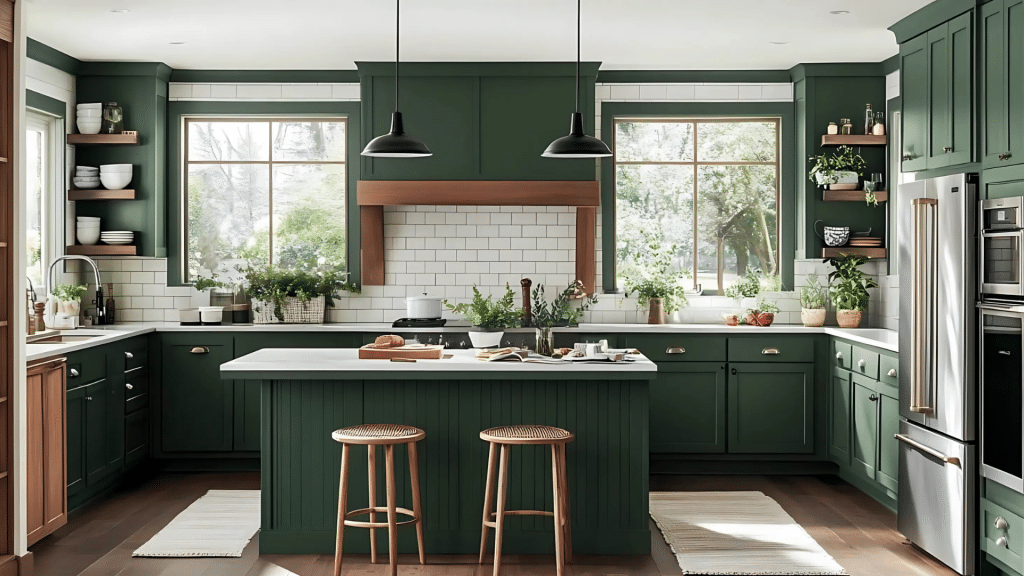
Something special happens when Vintage Vogue meets kitchen cabinets – the space turns inviting.
Pair it with brass pulls and knobs, and the cabinets come alive. Through my color consultations, I’ve found this combination works magic in both full cabinet makeovers and just on kitchen islands.
Little design tip: If you’re hesitant about going all-in, try painting just your lower cabinets Vintage Vogue while keeping the uppers light. I’ve seen this create a beautiful balance in kitchens of all sizes.
2. Living Rooms
Vintage Vogue brings a special touch to living spaces. When you paint an accent wall behind a cream sofa or use it on built-ins flanking a fireplace, the color creates natural depth without darkness.
I love suggesting white oak or walnut furniture pieces against Vintage Vogue walls – the natural wood tones and deep green create a perfect partnership.
Add crisp white trim, and the whole room feels put together without trying too hard.
3. Bedrooms
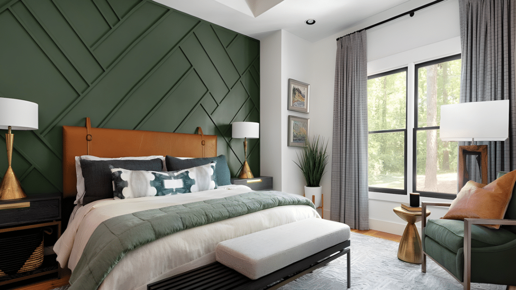
Looking for calm? Vintage Vogue in bedrooms creates a cocoon-like feeling without the heaviness of darker colors. I often pair it with Benjamin Moore Chantilly Lace on the trim and ceiling to keep things fresh.
My favorite trick: Use Vintage Vogue on one wall behind the headboard. It frames the bed beautifully while keeping the room from feeling too dark.
4. Bathrooms
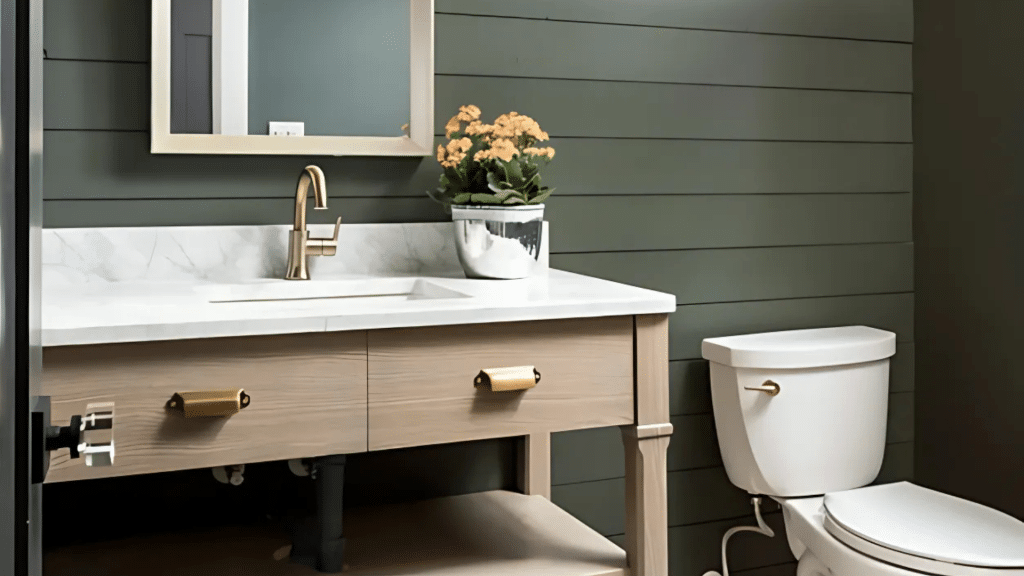
In bathrooms, Vintage Vogue shines on board-and-batten walls or as an accent. I’ve seen stunning results when homeowners pair it with marble counters and vintage-style fixtures.
The color adds character while maintaining a clean look.
5. Exterior Applications
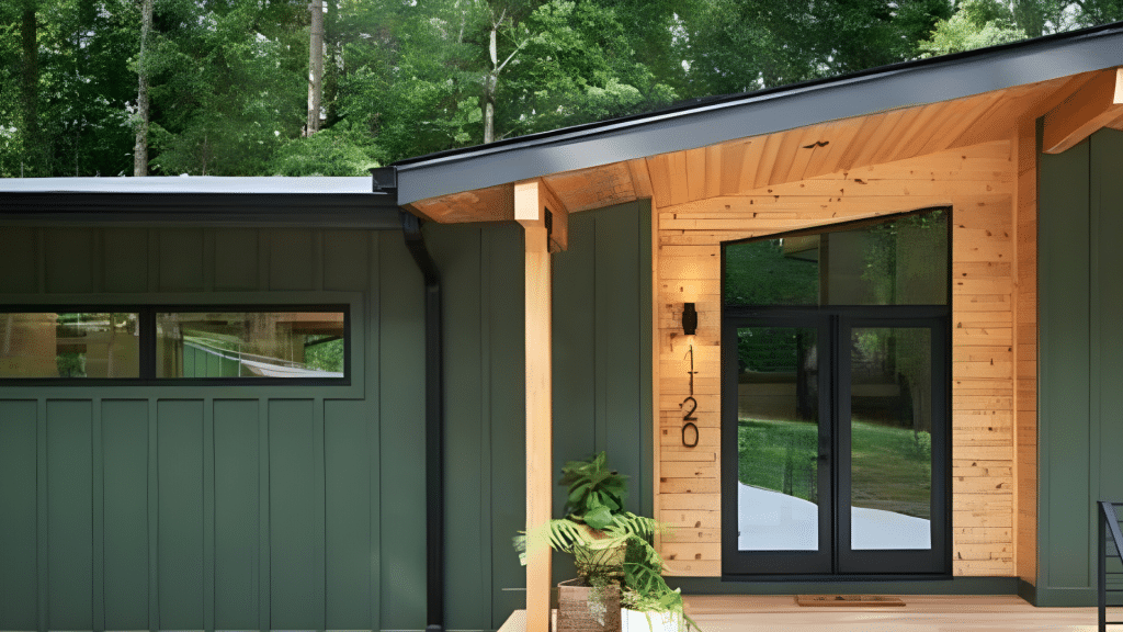
Taking Vintage Vogue outside requires some careful thought. Based on my experience, this color reads about two shades lighter in natural sunlight.
This works in its favor – what looks deep and rich inside becomes pleasantly livable outside.
For exteriors, I recommend testing it on all sides of your house. The color shifts notably between north and south-facing walls, but that’s part of its charm.
It pairs beautifully with natural stone, creating a timeless look that never feels dated.
One important note- Consider your climate. Vintage Vogue holds its color well without fading quickly in sunny areas, making it a practical choice for exterior projects.
Why Vintage Vogue is a Timeless Choice
What makes it stand out? Think of Vintage Vogue like a well-tailored black blazer. Sure, fashion trends come and go, but that blazer always works.
The same goes for this color – I’ve watched it complement farmhouse styles, fit perfectly in modern spaces, and add character to traditional homes.
Through my years of color consulting, I’ve noticed something interesting: Vintage Vogue makes a statement without shouting. It’s confident but quiet, letting your decor choices shine while providing a solid foundation.
Durability in Design
Here’s what I find most remarkable about Vintage Vogue – its ability to adapt. When you choose this color, you’re not locked into one style. Let me share why this matters:
- Season Changes: You can swap out pillows, rugs, and artwork without worrying about clashes. I’ve seen rooms transition from summer brights to winter whites, and Vintage Vogue plays nicely with both.
- Style Evolution: Maybe you love modern farmhouses today but might lean more traditional tomorrow. Vintage Vogue rolls with these changes effortlessly.
Think of it as a reliable partner in your design journey. I’ve had clients completely transform their spaces – changing everything from light fixtures to furniture styles – while keeping Vintage Vogue on the walls. The color adapts to each new look without missing a beat.
What’s particularly special is how it handles both warm and cool accents. Whether you’re working with brass fixtures, silver metals, or natural woods, Vintage Vogue creates a harmonious backdrop that feels intentional and pulled together.
Tips for Using Vintage Vogue in Your Home
Let me share some practical tips from using Vintage Vogue in countless homes. Trust me, these insights will save you time and help you get the best results.
Testing in Your Space
First things first, paint samples matter more than you might think. Here’s my tried-and-true method:
- Paint a 2×2 foot square on each wall you plan to use Vintage Vogue
- Look at it during different times of day (morning, afternoon, evening)
- Check how it looks with both natural and artificial light
- Place it near your fixed elements (flooring, countertops, cabinets)
I’ve learned that Vintage Vogue can shift its personality based on your lighting. In bright spaces, it shows off its green side more clearly. In dimmer areas, it leans into its deeper, moodier character.
Lighting Considerations
Let’s talk about specific room orientations.
1. North-Facing Rooms
- These rooms need extra attention with lighting
- I suggest adding layered lighting (overhead, task, and accent lights)
- Consider using Vintage Vogue on one feature wall rather than all walls
- Pair with light-colored furniture to balance the depth
2. South-facing Rooms
- Natural light brings out the rich undertones beautifully
- The color stays true throughout the day
- You can confidently use it on all walls
3. East/West-Facing Rooms
- Morning and evening light creates different effects
- East rooms show warmer tones in the morning
- West rooms display richer depth during sunset
My best lighting tip? Install dimmers wherever possible. They let you adjust the mood and control how the color reads throughout the day.
Remember, if you’re painting a room that doesn’t get much natural light, strategic lighting isn’t just nice to have – it’s essential.
I often recommend placing floor or table lamps in corners to eliminate shadows and help the color show its true character.
Conclusion
Through my hands-on experience with Benjamin Moore Vintage Vogue, one thing stands clear – this paint color brings more than just green to your walls.
It offers that rare mix of depth and softness that works in every room, from moody offices to bright kitchens.
Here’s what matters most: Vintage Vogue isn’t just another trending color. Its mix of black and brown undertones creates a timeless shade that grows with your style choices.
Whether you’re painting kitchen cabinets, creating an accent wall, or refreshing your entire space, this color delivers.
Ready to try Vintage Vogue? Start with a test patch in your space, watching how it changes from dawn to dusk.
Your perfect green awaits.
