Choosing between White Dove and Alabaster can feel like comparing two identical shades of white – until you put them side by side in your space.
Many homeowners stare at paint swatches, wondering if they can spot any differences between these popular white paints.
What sets these two whites apart isn’t obvious at first glance, but their subtle variations can significantly change how your room feels.
White Dove, from Benjamin Moore, and Alabaster, from Sherwin Williams, each bring distinct qualities to your walls.
Ready to learn the key differences between these whites and find out which one will work best in your home?
Let’s examine them step by step.
Understanding The Basics Of White Dove vs Alabaster
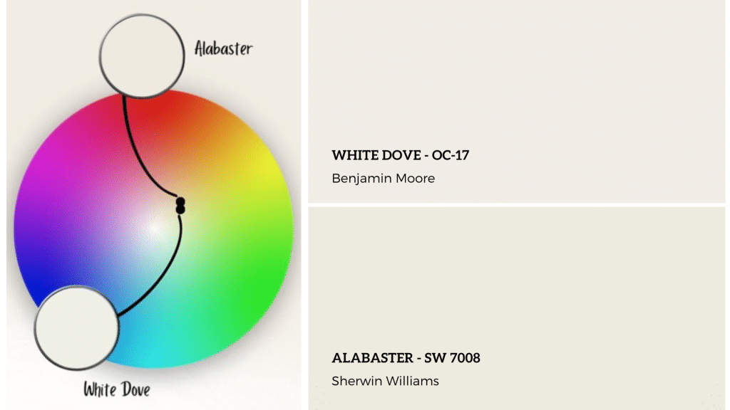
White Dove – OC-17
- Paint Code: Benjamin Moore OC-17
- Light Reflectance Value (LRV): 85.38
White Dove perfectly balances white paints.
Its crisp appearance is gentle on the eyes, with subtle warm gray undertones that shift with light.
This versatile white excels on walls and trims, providing a cohesive look throughout any space.
Natural light brightens while retaining softness; under artificial light, it maintains gentle warmth.
Its balanced nature suits both modern and classic styles, offering flexibility for different design preferences.
Alabaster – SW 7008
- Paint Code: Sherwin Williams SW 7008
- Light Reflectance Value (LRV): 82
Alabaster adds a gentle presence to rooms with its balanced white tone.
This paint features subtle yellow undertones, revealing them in certain light.
When used on walls, it softly contrasts with pure white trim without looking stark.
It maintains its character throughout the day, subtly shifting to enhance the atmosphere.
Alabaster creates a welcoming feel without becoming too creamy.
Its versatility complements various furniture styles and decor, effectively fostering an open, inviting atmosphere without overwhelming the space.
Room-By-Room Analysis – Interiors
1. Bedroom
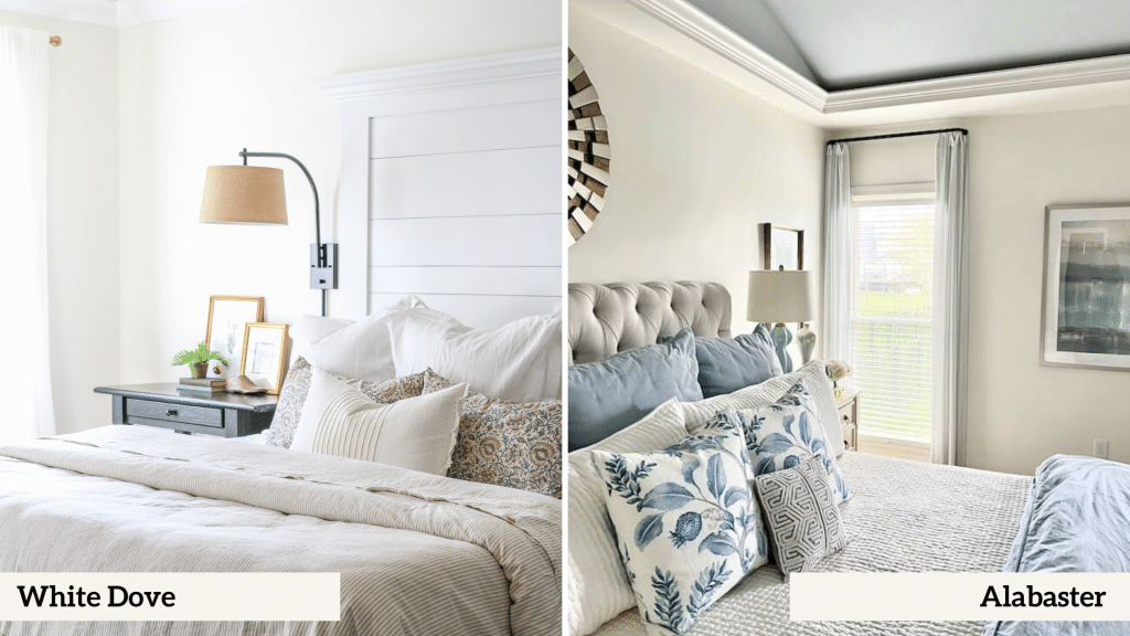
| Feature | White Dove | Alabaster |
|---|---|---|
| Wall Appearance | Appears crisper and slightly brighter | Shows a softer, more muted look |
| Contrast Level | Creates stronger contrast with decor | Offers more subtle transitions with furnishings |
| Overall Feel | Feels fresher and more defined | Creates a gentler, more understated presence |
2. Living Room
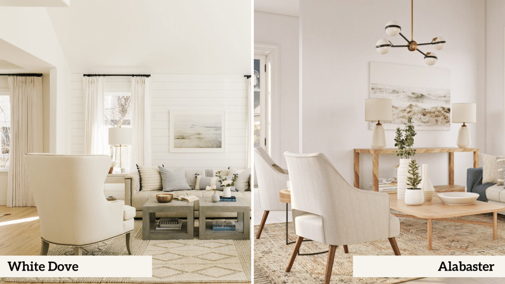
| Feature | White Dove | Alabaster |
|---|---|---|
| Light Reflection | Higher reflection rate (LRV 85.38) | Lower reflection rate (LRV 82) |
| Color Impact | Makes other colors appear sharper | Softens surrounding color appearances |
| Space Perception | Creates more defined spatial boundaries | Offers more blended spatial transitions |
3. Bathroom
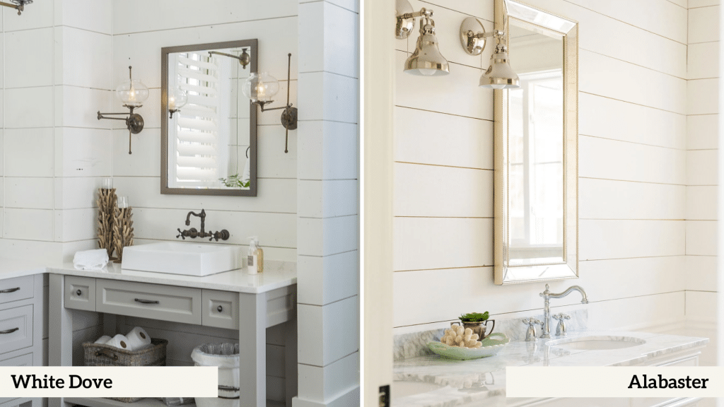
| Feature | White Dove | Alabaster |
|---|---|---|
| Against White Fixtures | Shows minimal contrast with porcelain | Creates slight warmth difference with fixtures |
| With Metal Finishes | Pairs better with chrome/silver | Works better with brass/gold |
| Surface Appearance | Maintains consistent brightness | Shows more subtle depth variations |
4. Kitchen
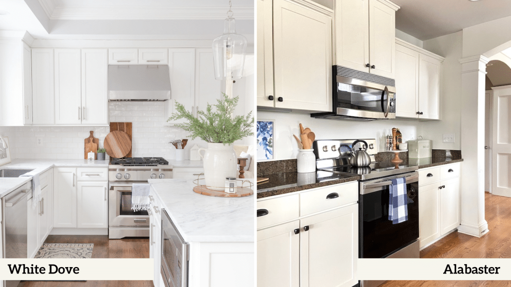
| Feature | White Dove | Alabaster |
|---|---|---|
| Cabinet Application | Keeps a cleaner, brighter look | Adds more warmth to cabinetry |
| With Appliances | Creates stronger contrast | Blends more smoothly |
| Counter Compatibility | Better with cool-toned surfaces | Better with warm-toned surfaces |
Exterior Applications
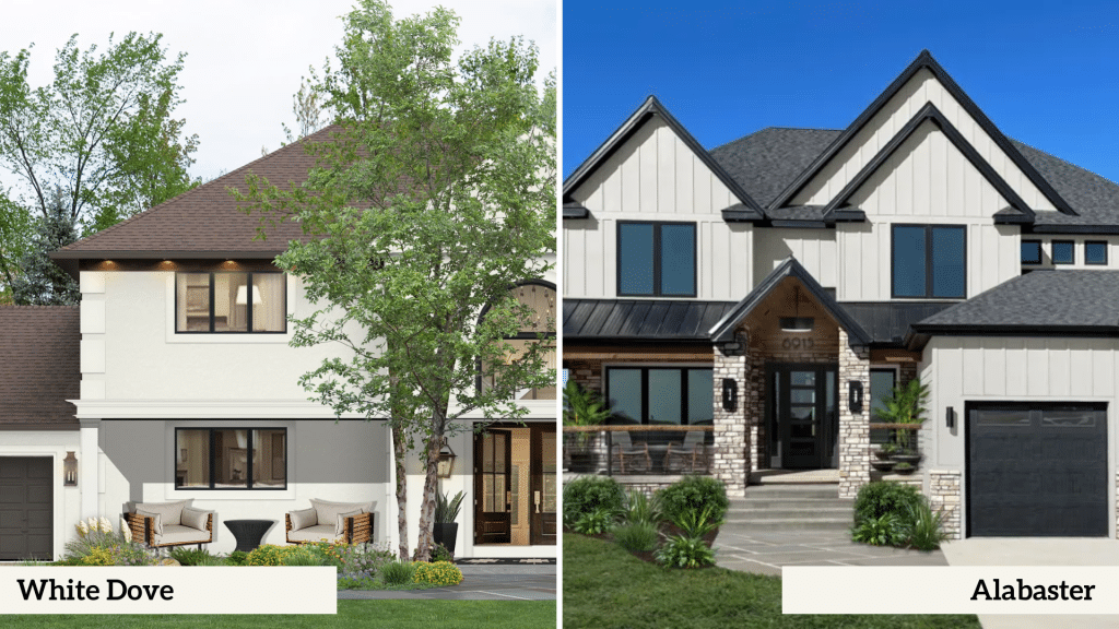
| Feature | White Dove | Alabaster |
|---|---|---|
| Overall Appearance | Appears brighter and crisper in outdoor settings | Shows a gentler, more subdued look on exterior walls |
| With Trim and Accents | Makes dark shutters and doors stand out clearly | Creates smoother transitions with varied trim colors |
| Surface Impact | Shows more defined shadows and architectural details | Offers more subtle highlighting of home features |
| Material Compatibility | Works better with stone and cool-toned materials | Pairs better with brick and warm-toned materials |
The main distinction outdoors is that White Dove maintains its crisp, bright character while Alabaster tends to show its warmer, softer side.
This fundamental difference helps homeowners choose based on their exterior materials and desired curb presence.
Color Similarities
- Both appear as soft whites that suit modern and traditional homes without looking overly bright
- Both create flexible backgrounds that work well with varied decor and furniture styles
- Both offer reliable coverage and maintain their color qualities over time
Visual Distinctions
- White Dove has cooler gray undertones, while Alabaster shows subtle yellow ones.
- White Dove reflects more light (LRV 85.38), compared to Alabaster’s gentler reflection (LRV 82)
- White Dove makes sharper contrasts, while Alabaster blends more smoothly with the surroundings.
Factors Affecting Color Appearance
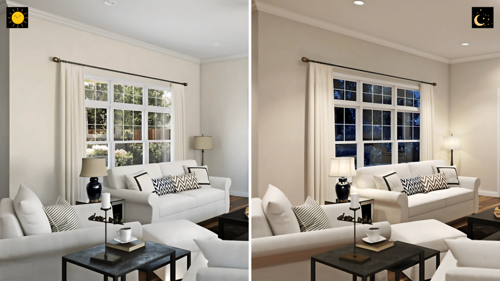
1. Lighting
Natural Light
| Room Orientation | White Dove | Alabaster |
|---|---|---|
| North-facing rooms | Maintains brightness while showing gray undertones | Helps balance cooler light with its warm undertones |
| South-facing rooms | Stays crisp without becoming too bright | Softens bright light without losing warmth |
| East/West-facing rooms | Adapts well to changing light while keeping clarity | Shows consistent color with subtle shifts |
Artificial Light
| Lighting Type | White Dove | Alabaster |
|---|---|---|
| LED lights | Maintains true color | Takes on subtle depth |
| Standard bulbs | Shows slight warmth | Enhances warm undertones |
| Mixed lighting | Keeps consistent appearance | Blends smoothly across light sources |
2. Trim Color Influences
White Pure White Trim
- The Pure White Trim paired with White Dove offers a striking contrast, while Alabaster provides a subtle difference.
- The Off-White Trim alongside White Dove upholds clear separations, whereas Alabaster facilitates smooth transitions.
Matching Trim
- Matching trims with White Dove creates a clean, seamless look while using Alabaster ensures a cohesive appearance.
3. Room Exposure Effects
Size Impact
- White Dove: Makes small rooms feel larger
- Alabaster: Creates cozy feel in any size
Height Impact
- White Dove: Enhances ceiling height perception
- Alabaster: Softens tall walls effectively
Distance Effects
- White Dove: Shows consistent color from various viewpoints
- Alabaster: Maintains gentle presence across distances
Making Your Choice
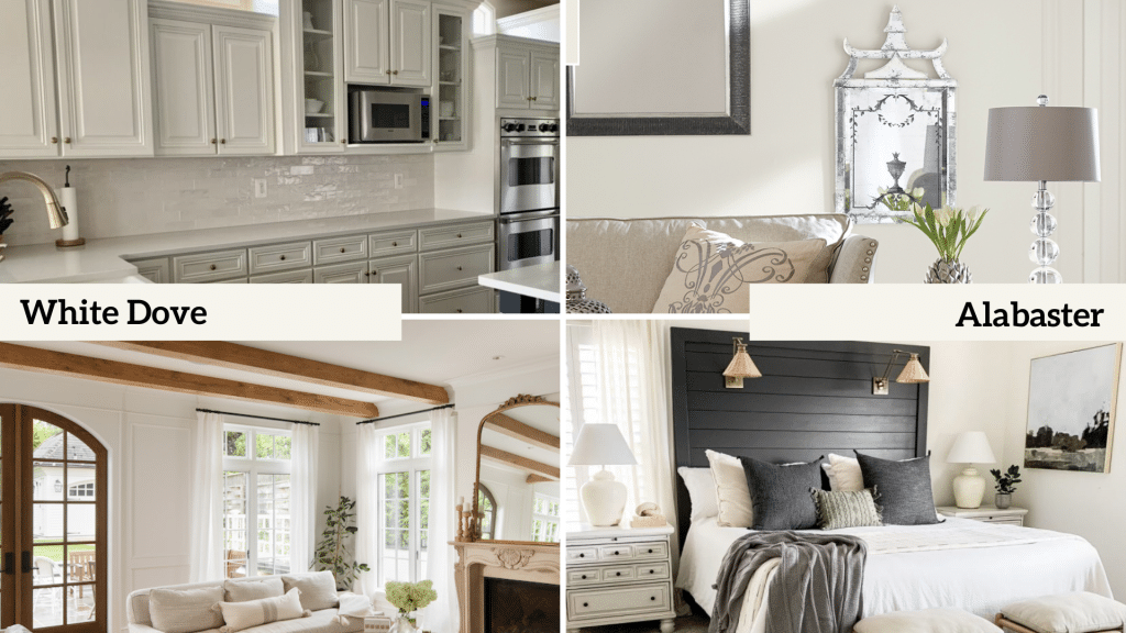
1. When to Choose White Dove
- Best for spaces where you want a crisp, clean look without harsh brightness
- Perfect for modern homes needing clear definition between walls and trim
- It is ideal for rooms that need more light reflection while maintaining softness
2. When to Choose Alabaster
- Excellent for spaces where you want to create a welcoming, gentle atmosphere
- Works well in bright rooms where you need to reduce glare
- Perfect for homes with warm-toned furniture and decor elements
3. Consideration Factors
- Think about your room’s natural light exposure and direction
- Consider your existing furniture and decor colors
- Look at fixed elements like flooring and countertops
- Note the amount of artificial lighting in the space
4. Testing Recommendations
- Paint large sample squares (2×2 feet minimum) on multiple walls
- Look at the colors during different times of day
- Test near your trim, furniture, and window areas
Final Overview
Both White Dove and Alabaster offer unique qualities that can transform your space.
White Dove brings a crisp, bright presence with subtle gray undertones, making it perfect for those seeking definition and clarity.
Alabaster offers a gentle, warm character that creates welcoming environments without overwhelming the senses.
The best choice depends on your specific space and needs.
Remember, what looks perfect in one home might not work in another due to lighting, decor, and personal preferences.
Ready to make your decision?
Start with sample pots of both colors. Paint test patches observe them for a few days, and design your home.


