
You know that moment when you paint your walls a gorgeous moody navy/forest/charcoal… step back to admire your dramatic masterpiece… and suddenly your “crisp white” trim looks like it’s been chain smoking in an alley?
Yeah. That’s not you being picky. That’s not “bad paint.” That’s undertones and light playing little mind games especially when you put white next to a dark color that’s basically screaming, “LOOK AT ME, I’M IMPORTANT.”
The good news: this is fixable. And you don’t have to spend the next six weekends playing Guess The White at the paint store like it’s an Olympic sport.
Why dark walls make white trim look… questionable
Dark paint is a drama queen (respectfully). It doesn’t just sit on the wall and behave it throws its color around the room.
Here’s what’s happening: dark walls reflect their undertone onto whatever is next to them. So if you’ve got a cool navy wall, it can make a warm/creamy white trim look yellowish or even a little pink. And if you’ve got a warm chocolate wall, it can make a cooler white trim look gray and dingy like you need to scrub it (even though it’s literally freshly painted).
The fix is simple, but not “easy” in the paint aisle sense: You match undertones, not “how white it looks on the tiny chip.”
The “don’t make me repaint twice” 4-step plan
If you do nothing else, do this:
Step 1: Figure out what undertone your current trim has
Grab a plain sheet of bright white printer paper (the boring kind). Hold it up to your trim.
- If the trim looks creamy/yellow next to the paper → it’s a warm white.
- If the trim looks grayer/bluer next to the paper → it’s cool.
- If it mostly just looks “white” and doesn’t scream a color at you → it’s probably neutral-ish.
(And yes, sometimes you’ll stand there squinting like a Victorian detective. That’s normal.)
Step 2: Decide if your wall color is warm, cool, or neutral
Quick cheat:
- Warm darks: espresso brown, burgundy, terracotta, warm charcoal, deep bronze vibes
- Cool darks: navy, slate, most forest greens, deep teal, plum, cool charcoal
- True black: basically does its own thing (more on that in a second)
Step 3: Let your room’s light vote
North facing rooms are cooler and can make everything look grayer with a light reflectance value guide. South facing rooms are warmer and can turn some whites into… butter. (Not always bad, but sometimes you’re going for “tailored” and end up with “vanilla pudding.”)
Also: bulbs matter. A LOT.
- 2700K warm bulbs make warm whites look warmer (sometimes too warm).
- 4000-5000K cooler bulbs can make whites look cleaner or just icy, depending on the room.
Step 4: Test 2-3 whites like a sane person
Not one. Not ten. Two or three. Big sample. Real lighting. No guessing. (Skipping this step earns you three gentle whacks with a wet noodle.)
The three “white paint families” (aka why your trim is acting shady)
White paint is not just white. It’s more like a latte order: the base sounds simple until you realize everyone means something different.
- Warm whites: creamy, yellow, peachy undertones. Cozy. Great in low light. Can look weirdly yellow next to cool dark walls.
- Cool whites: gray, blue, or slightly violet undertones. Crisp. Great with cool wall colors. Can feel cold in dim rooms.
- Neutral whites: balanced, quieter undertones. The peacekeepers. They shift a bit depending on what’s around them, which is sometimes exactly what you want.
My go to white trim picks for dark walls (keep it simple)
Paint people can argue about whites like it’s a sport. I’m going to give you a short list that actually helps.
If your walls are warm and dark (espresso, burgundy, warm charcoal, terracotta)
Go warm or neutral warm so the trim looks intentional, not like it needs antibiotics.
- Benjamin Moore White Dove my “when in doubt” choice. Soft, flexible, rarely does anything offensive
- Sherwin-Williams Alabaster definitely warm. Pretty in lower light
- Benjamin Moore Simply White brighter and warmer (test this one. It can go more yellow in warm light)
What I’d avoid: super stark/cool whites. They can make the trim look grayish against warm dark walls.
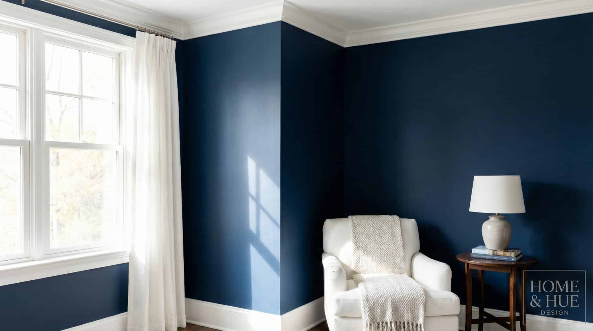
If your walls are cool and dark (navy, slate, cool charcoal, deep green, plum)
Go cool or neutral cool with a Sherwin Williams deep teal wall so the trim doesn’t suddenly look pink/yellow/muddy.
- Benjamin Moore Chantilly Lace very clean, modern, “sharp contrast” energy
- Benjamin Moore Decorator’s White cool leaning and classic with navy/charcoal
- Sherwin-Williams Pure White a super practical “pretty white” that doesn’t go too icy
- Sherwin-Williams Extra White crisp and bright (best when you have decent light)
What I’d avoid: super creamy whites next to navy. Navy loves making them look… strangely custardy.
If your walls are true black or a balanced charcoal
You get more freedom. Black doesn’t reflect a strong undertone the way navy or brown does it mostly just sits there looking fabulous.
Pick the vibe:
- Want high contrast and modern? Try Chantilly Lace or Extra White.
- Want a softer, calmer contrast? Try White Dove or Alabaster.
Lighting: the ultimate unreliable narrator
If your trim color looks perfect at 2 p.m. and weird at 9 p.m., welcome to the club.
Here’s the quick and dirty bias guide:
- North facing (cool light): your room already leans gray → try warm or neutral whites
- South facing (warm light): everything gets golden → try cool or neutral whites
- East/West: big mood swings morning to night → neutral is often safest
- Low light hallways/basements: cool whites can go sad and flat → lean warmer, and consider a bit more sheen to bounce light
And seriously if you’re swapping bulbs soon, do that before you pick the final white. A new bulb temperature can make you feel like you hallucinated your paint choice.
How to test white trim paint without losing your mind
I’m begging you: don’t judge undertones from a tiny swatch. Dark walls make undertones show up like they’re under a spotlight.
Here’s what actually works:
- Paint two coats on a piece of foam board/poster board (big think at least 12″ x 12″)
- Let it dry overnight (fresh paint lies)
- Move it around and check it:
- by the window
- in the darkest corner
- at night with lamps on
- next to flooring/furniture/textiles
Give it a couple days. Your eyes “normalize” fast, and Day 1 opinions are often garbage.
One more thing: test the sheen you’ll use. Semi-gloss will look brighter/cleaner than matte even in the same exact color.
Sheen: the cheap trick that makes trim look cleaner
Even a perfect white can look a little dull if you choose the wrong finish.
My personal, boring but it works hierarchy:
- Walls (especially dark): matte or eggshell (keeps the color rich)
- Trim/doors: satin or semi-gloss (wipes clean, looks sharper)
- Ceiling: flat (because ceilings should mind their business)
That sheen difference is what gives you that satisfying “trim pops” outline without needing a blinding white.
“Can I just use ONE white everywhere?” (aka the dream)
Yes. Also: the dream comes with fine print.
If you want one trim color throughout the house, pick a neutral leaning white that won’t freak out in different lighting. Two that usually behave:
- Benjamin Moore White Dove
- Sherwin-Williams Pure White
The big rule: in open sightlines (like living room → hallway → kitchen), keep trim/doors/cabinets on the same white. Mixing three different whites in one view is how homes start to look accidentally mismatched, and then you start spiraling at 11 p.m. with a paint fan deck.
Quick troubleshooting (because sometimes it’s already painted)
If your trim is already up and looks “off,” here’s the likely culprit:
- Looks yellow/muddy next to cool walls: your trim white is too warm → test a cooler/cleaner white
- Looks stark/icy: too cool/bright for the space → try a softer neutral, or check your bulbs before repainting
- Looks gray or weirdly purple: cool white + low light (or bulb mismatch) → try warmer/neutral and/or change bulb temp
- Looks different all day long: welcome to east/west windows or mixed bulbs → neutral whites usually swing less
My quick action plan for you (so you actually finish this)
- Do the printer paper test on your trim.
- Call your wall color warm or cool.
- Pick 2-3 whites from the right family.
- Test big samples on boards, in daylight and lamplight, for a couple days.
- Choose satin/semi-gloss for trim so it looks clean and intentional.
That’s it. No overthinking, no paint store hostage situation, no living with “why does it look dirty?” for the next five years.
Now go make that trim look like it belongs there.