
Why Your Paint Colors Clash (And the Undertone Fix That Saves Your Sanity)
You know that moment when you’re standing in a doorway and you swear your two perfectly nice neutral paint colors are having a full blown argument?
Like: “I’m a calm, sophisticated greige.”
And the next room is like: “I’m also calm and sophisticated.”
And then together they look like… wet cement next to old oatmeal.
It’s not that you have bad taste. It’s undertones. Sneaky little gremlins living underneath “neutral” paint colors, quietly turning your hallway into a clash zone.
I’ve seen it a million times (and yes, I’ve done it too). The fix isn’t complicated, but you do have to zoom out and stop picking paint like it’s a solo sport. Your house is an ensemble cast, not a bunch of random guest stars.
Let’s fix the flow.
The real reason “neutrals” still fight: undertones
Every paint color has an undertone basically its hidden bias. That’s what makes a gray suddenly look blue on the wall, or a “soft white” turn suspiciously peach by dinnertime.
Here’s the cheat code:
- Warm undertones = yellow, red, pink, orange, brown (cozy, soft, “candlelight vibes”)
- Cool undertones = blue, green, violet (crisper, calmer, sometimes “why does this look like a dentist office?”)
Two neutrals can both be “light gray” and still clash if one is warm (greige-y) and one is cool (blue-ish). Doorways are where the truth comes out because your eyes compare them side by side like a paint trial on Judge Judy.
Step one: your house already chose a side (sorry)
Before you even look at paint, look at the stuff you’re not changing:
- Flooring (especially if it’s wood)
- Countertops
- Cabinets
- Tile
- Big stone/brick fireplaces
- And yes… your light bulbs
Your flooring is usually the bossiest. Honey oak with golden tones? You’re living in warm land. Gray washed floors? Cool land. If you try to paint cool colors over warm floors (or vice versa), the whole place feels faintly “off,” like a shirt that almost matches your pants but definitely doesn’t.
(Also: if you have orange granite from 2003, just know I’m lighting a candle for you.)
Pick an “anchor room” before you pick 17 random paint samples
If your home has open sightlines (and most do), you can’t treat each room like an isolated art project.
Pick your anchor room the one you see from everywhere. Usually:
- living room
- kitchen
- main hallway/entry
Stand there and look around. What rooms can you see at the same time? Those spaces need to play nicely together undertone wise, because you’re going to see them in the same glance while carrying laundry and questioning your life choices.
My opinion: go softer and more neutral in the anchor room. Not boring just… flexible. A calm anchor makes everything else easier. A dramatic anchor color can work, but it’s like building your whole wardrobe around one loud pair of pants. Possible. Risky.
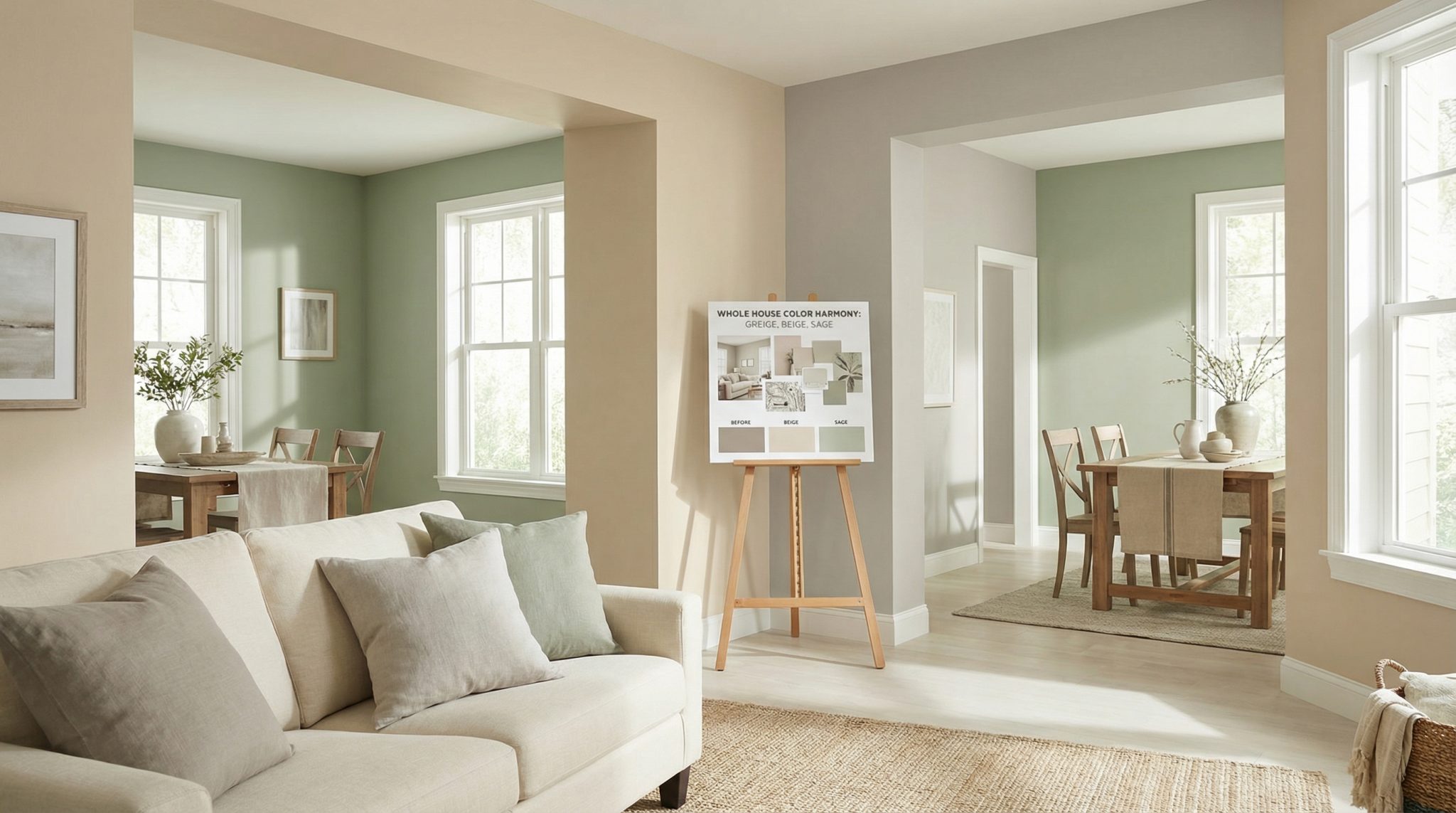
The “3-4 wall colors max” rule (that makes your whole house look intentional)
Here’s where people panic because they think this means every room has to be the same color. Nope.
What I mean is: across connected spaces, try limiting your wall colors to three or four total.
A simple setup:
- 1 main wall color (your dominant neutral)
- 2-3 supporting colors (slightly different depths, or neighboring hues)
Then outside that count:
- 1 trim color you use everywhere (this is the easiest “whole house designer trick” ever)
- a couple accent colors through decor (pillows, art, rugs, etc.)
If you like rules, the 60-30-10 thing really does help with accent shades for beige walls:
- 60% = dominant (usually walls)
- 30% = secondary (big furniture, cabinetry, curtains, rugs)
- 10% = accent (the fun stuff)
And yes, you can absolutely still have personality. Your personality just doesn’t need to show up as five unrelated paint colors competing for attention.
Undertone spotting: do this instead of squinting at a paint chip in aisle 12
When you’re trying to ID undertones quickly:
- Compare the chip to true white paper (printer paper works). Undertones pop when there’s something actually neutral next to them.
- Call it like you see it, not like you want it to be.
If it looks pink-ish, it’s warm. If it looks green-ish, it’s cool. No manifesting. - Do not trust store lighting. Paint chips under fluorescents are basically performance art.
Light bulbs: the plot twist no one warns you about
Paint changes room to room mostly because light changes, not because the paint is haunted.
Before you blame the color, check your bulb temperature while testing paint in real light. Kelvin (K) is the number that tells you how warm/cool the light is:
- Lower K = warmer/yellower
- Higher K = cooler/bluer
My practical (non-fussy) recommendations:
- Living rooms / bedrooms / dining: 2400-3000K (cozy, flattering, doesn’t make everyone look tired)
- Kitchens: 2700-3500K (warm ambient, slightly cooler task lighting if you want)
- Bathrooms: 3000-4000K (ideally dimmable so you’re not doing skincare in interrogation lighting)
- Hallways: 3000-3500K (great “bridge” zone)
Also:
- North facing rooms lean cool warm neutrals usually behave better.
- West facing rooms swing wildly (cooler earlier, warmer later). Choose based on when you actually use the room, not when you happened to test it once at noon.
Order of operations I swear by: set your lighting first → then test paint → then commit.
How to make transitions feel smooth (AKA “stop letting your hallway bully you”)
Hallways and landings aren’t “nothing spaces.” They’re the referees between rooms.
Two approaches that work in real life:
1) The neutral buffer
Keep halls/landings a soft neutral so your eye gets a break between stronger spaces. This is the easiest way to make a house feel calm and connected.
2) Same family, different depth
If your living room is a deeper color, make the hallway a lighter/more muted version in the same undertone family. Think of it like matching socks different shades are fine, but they need to be in the same general vibe.
And please, for the love of clean lines: keep your trim color consistent across connected areas. Trim is like the sentence punctuation of your house. When it changes randomly, everything feels messier.
Testing paint like you actually want to be happy with it
Paint chips are lies. Pretty lies. But lies.
Do this instead:
- Buy sample pots (yes, it’s annoying, yes, it’s worth it)
- Paint a good sized swatch on the actual wall (about a foot square at minimum)
- If two rooms meet at a doorway, test both colors near that doorway so you can see them together
If you want something you can move around, use primed drywall scraps, not poster board. Poster board doesn’t reflect light the same way your wall texture does, and then you’re making decisions based on arts and crafts supplies.
And my favorite rule:
The overnight rule
If you loved it for ten minutes, cute. Live with it for a full day. Morning, afternoon, evening, lamps on, lamps off. Your eyes need time to adjust, and undertones love to reveal themselves at 7:42 pm when you’re too tired to argue.
Quick fixes for common “why does this look wrong?” moments
- The color feels too strong in a small room:
Try swapping bulbs first and adding lighter accessories/mirrors. If you repaint, go lighter but stay in the same undertone family. - Two “neutrals” clash at the doorway:
You probably mixed warm and cool undertones. Either bring in a bridge (a warm-ish neutral between them) or add small accents in each room that nod to the other (wood/brass in the cool room, cooler textiles in the warm room, etc.). - The same paint looks different on trim vs walls:
That’s usually finish. Matte vs semi-gloss changes how light bounces, so the color reads different. If you want a true match, you need the same finish (but most people don’t actually want that trim usually looks better with a bit of sheen).
A realistic weekend action plan (no martyrdom)
If you want to start without spiraling:
- Tonight: walk your house and list your fixed elements (floors, counters, cabinets, tile) + check what Kelvin bulbs you’re using.
- This week: choose your anchor room and test 2-4 contenders on the wall near the main sightline/doorway.
- Next weekend: pick your anchor color, then select 2-3 supporting colors that stay in the same undertone family.
Also: write everything down brand, color name, finish, and where you used it. Future you doing touch ups will want to hug you.
When I’d actually hire a color consultant
If you’ve got a bunch of strong fixed materials pulling different directions (orange granite + gray tile + honey oak + cool LED lighting… the quadruple threat), sometimes you’re too close to it to see clearly. A good color consultant can spot undertone conflicts in about thirty seconds and save you from repainting the same room three times out of spite.
No shame. Paint is cheaper than therapy, but it’s still not free.
The big takeaway (so your rooms stop arguing)
If your home feels disjointed, it’s usually not because you picked “bad colors.” It’s because your colors are in different temperature families or your lighting is making them look that way.
Pick your undertone lane based on what’s staying, choose an anchor room, keep your wall palette tight, test in real light near transitions, and let trim + consistent lighting do a ton of heavy lifting.
You’re not trying to make every room match. You’re trying to make your house feel like it’s telling one story not five unrelated short stories that only connect through a hallway.