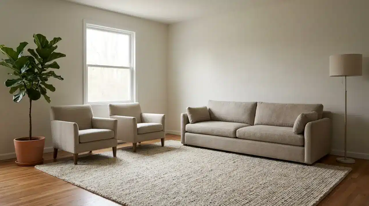
Rooms don’t feel off because the furniture is wrong. They feel off because the decisions behind it were made in the wrong order. Decorating has a sequence. Layout shapes how a room reads, light affects how every surface in it
Accessible Beige is one of the most versatile neutrals in the design world, but its true power emerges when paired with the right complementary colors. This chameleon-like shade transforms spaces from ordinary to extraordinary with thoughtful color partnerships. While some
Looking for a home style that feels both fancy and comfy? French Colonial homes mix French ideas with hot-weather touches, creating a look that’s hard to beat. French Colonial style brings together simple shapes with pretty details. You’ll find tall
Selecting the perfect paint color for your home can feel overwhelming with countless options available. Many homeowners struggle to find a neutral shade that works across various spaces and design styles without looking too stark or boring. Sherwin-Williams Pearl Gray
The decision between Sherwin-Williams’ Tricorn Black and Iron Ore represents a pivotal choice in today’s design landscape, where dark exterior and interior colors dominate contemporary aesthetics. While these neutral tones seem similar at first glance, they offer distinctly different effects
Are you looking for that perfect white that won’t blind you or turn your home into an igloo? You’re not alone. Thousands of homeowners struggle to find a white that feels “just right”—not too stark, not too creamy. Enter Sherwin
Are you looking for ways to make your home feel “put together” instead of random? Unity in interior design is the key. It’s what makes a room feel complete rather than like a collection of furniture. Creating unity doesn’t mean
Join the HelpWithDIY community.
Get the latest guides and inspiration straight to your inbox, every week.