Have you ever felt lost while staring at paint swatches, looking for that perfect soft white that isn’t too stark or clinical? Let me introduce you to my trusted go-to: Eider White SW 7014.
I’ve incorporated this versatile soft white in numerous projects, and it consistently delivers excellent results.
What makes Eider White so remarkable? It strikes the ideal balance between crispness and softness, creating depth without overwhelming your space.
When bathed in morning light, its subtle gray undertones emerge, and as the day transitions to evening, it transforms into a cozy, grounding neutral.
It coordinates wonderfully with everything from bold accent colors to natural wood elements. Need a paint that functions beautifully in open-concept homes?
Let me help you picture how it might change your living space.
Understanding Paint Color Basics

To make the best paint choices, it’s important to start with the fundamentals.
By grasping the key elements of paint color, you’ll better understand how they will interact in your space.
| PROPERTY | VALUE |
|---|---|
| LRV (Light Reflectance Value) | 73 |
| Color Category | Considered a light-tone color (LRV between 60-75) |
| RGB Value | Red: 226 Green: 222 Blue: 216 |
| Hex Code | #E2DED8 |
Eider White sits at the intersection of white, gray, and beige, creating a soft greige that changes subtly throughout the day while maintaining its refined character in any lighting condition.
Undertones
The beauty of Eider White lies in its complex undertones, a delicate balance of warm and cool that delivers a nuanced, refine neutral that never feels stark or clinical.
- Eider White has gentle greige undertones
- It’s a balanced neutral with subtle purple-gray hints
- Not a stark or intense white, but a versatile soft greige
Psychology of Neutral Colors
Eider White taps into our innate desire for calm and balance, providing a backdrop that soothes the mind while creating a foundation for both bold statements and subtle design elements.
- Soft greiges like Eider White create a sense of calm and serenity
- Gray-white tones: Offer sophistication and versatility
- Warm neutrals: Evoke tranquility, subtle elegance, and timelessness
- Benefits: More depth than pure whites, provides visual interest while maintaining a soothing quality, and creates a peaceful backdrop for other design elements.
Eider White SW 7014 in Interior Design
Eider White infuses interiors with refined balance and subtle depth. Its soft, greige hue creates serene spaces that feel sophisticated yet welcoming.
This versatile color pairs effortlessly with neutrals and metallics for a timeless, elegant look.
Living Room
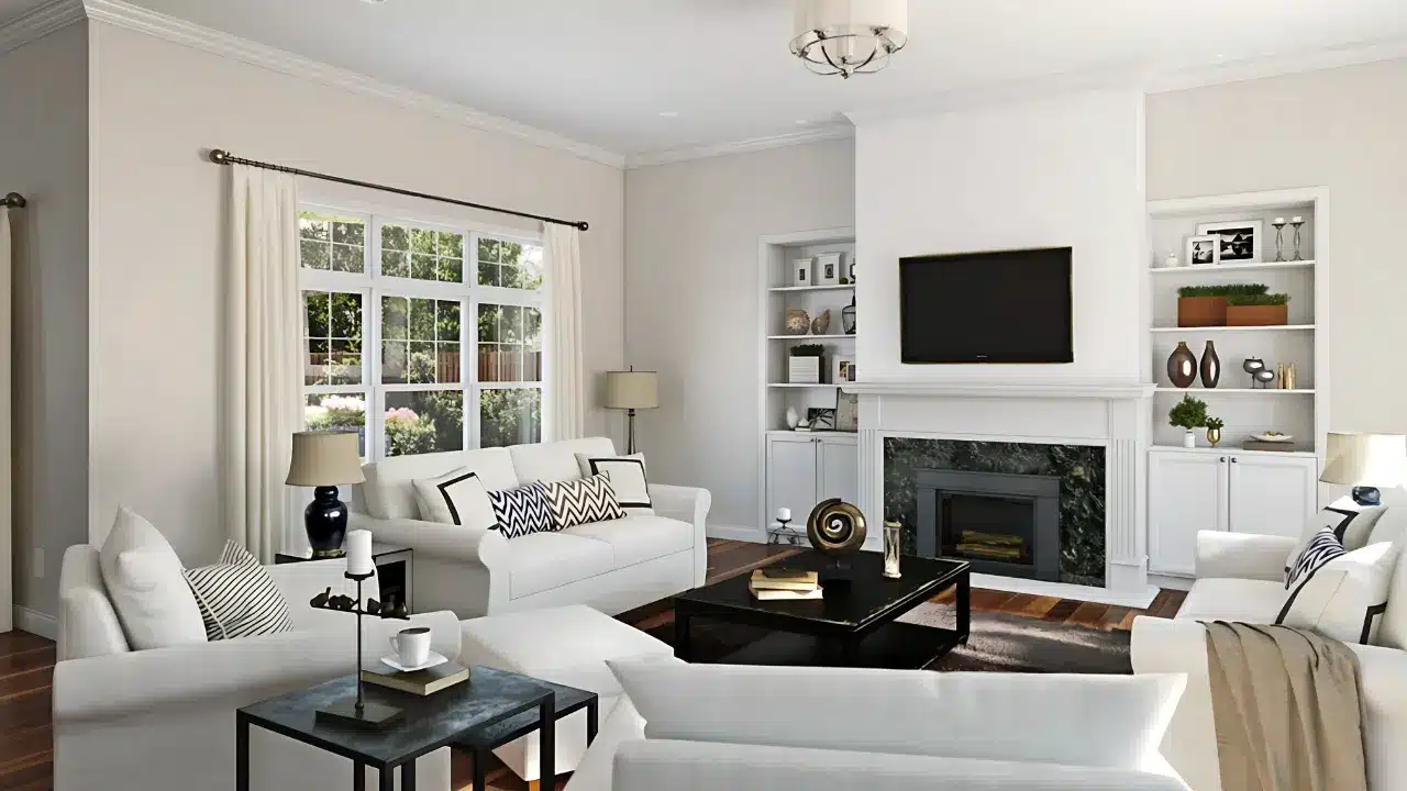
- Perfect for creating calming, sophisticated spaces
- Enhances architectural details
- Complements textural elements
- Works with multiple décor styles
Bedroom
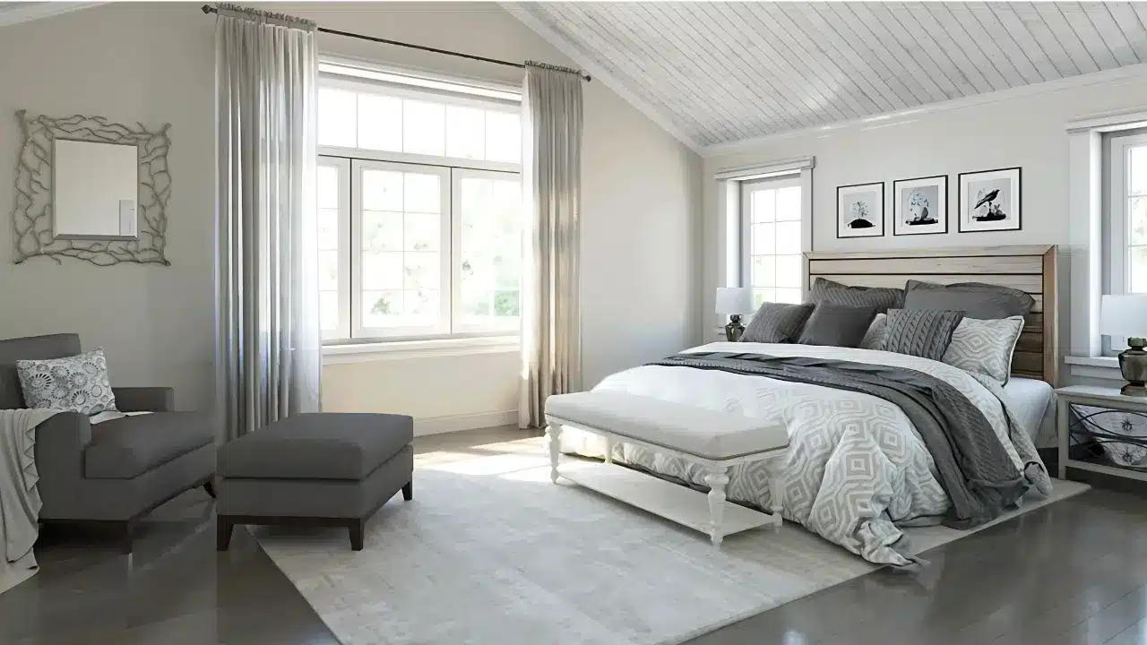
- Promotes restful, peaceful atmosphere
- Evening light enhances its soothing qualities
- Creates a tranquil retreat space
- Adapts to any bedroom dimension
Kitchen & Dining
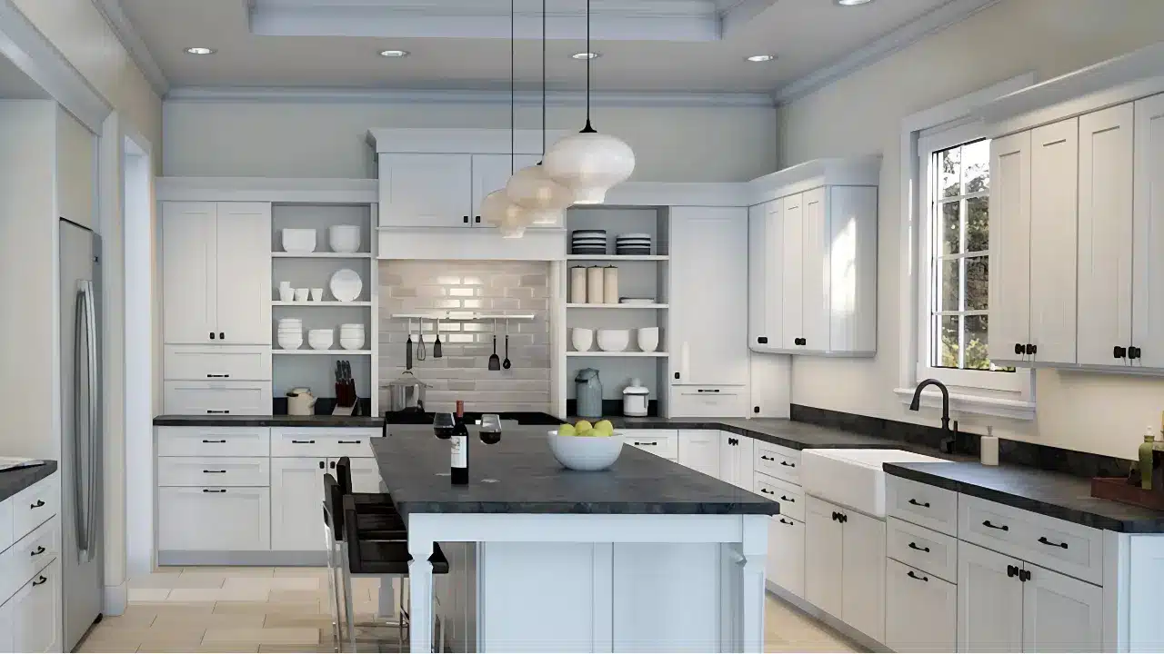
- Offers a refined, elegant appeal
- Complements white cabinetry perfectly
- Provides visual continuity
- Maintains its sophisticated appearance
Bathroom
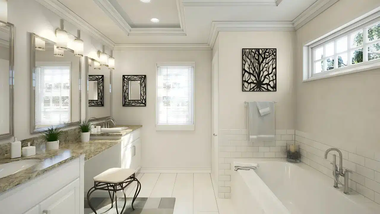
- Creates a spa-like atmosphere
- Adds gentle warmth to complement fixtures
- Complements marble, porcelain, and chrome surfaces
- Maintains color integrity in high-humidity environments
Color Pairings and Combinations for Eider White SW 7014
Strategic color companions that enhance Eider White’s versatility while maintaining its sophisticated character.
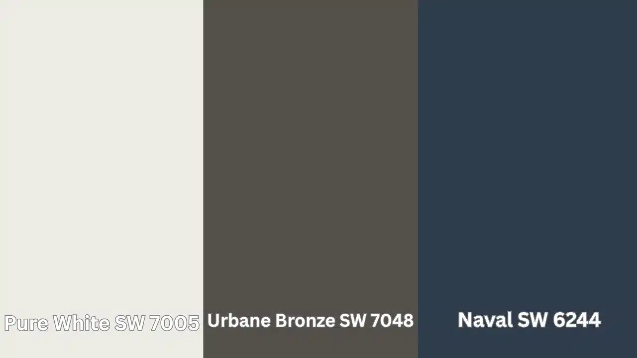
Pure White SW 7005 – A clean, bright white that creates subtle contrast with Eider White while enhancing its soft undertones and sophisticated appeal.
Urbane Bronze SW 7048 – A deep, rich bronze that creates dramatic contrast with Eider White’s softness, adding depth and grounding to the space.
Naval SW 6244 – A classic navy blue that creates a beautiful contrast with Eider White’s neutral tones, adding richness and sophistication to the color palette.
Creating Cohesive Color Schemes
Eider White SW 7014 is a soft greige with subtle purple-gray undertones, creating a refined, tranquil feel perfect for sophisticated, peaceful spaces.
1. Monochromatic Scheme
- Eider White (SW 7014) for main walls
- Pure White (SW 7005) for trim
- High Reflective White (SW 7757) for ceilings
- Agreeable Gray (SW 7029) for accent pieces or adjoining rooms
2. Warm Contrast Scheme
- Eider White (SW 7014) for main living areas
- Kilim Beige (SW 6106) for the dining room
- Accessible Beige (SW 7036) for hallways
- Shoji White (SW 7042) for bedrooms
3. Cool Harmony Scheme
- Eider White (SW 7014) for main walls
- Repose Gray (SW 7015) for bathrooms
- Misty (SW 6232) for bedrooms
- Mindful Gray (SW 7016) for home office
These colors maintain a cohesive, balanced palette that works beautifully with Eider White as the foundation.
They give you options for warmer and cooler coordinating colors while maintaining a serene, sophisticated atmosphere throughout your home.
Why Choose Eider White SW 7014?
Sherwin-Williams Eider White SW 7014 creates a serene, balanced atmosphere that artfully blends warmth with subtle coolness, making it perfect for refined yet peaceful spaces.
This versatile neutral offers exceptional harmony with fixed elements like marble countertops and natural wood flooring, allowing seamless transitions between rooms while providing just enough color depth to feel intentional without dating your design choices.
When applied in premium finishes like Duration or Emerald, Eider White delivers outstanding durability and excellent washability in high-traffic areas, while its subtle greige undertones help conceal minor wall imperfections that might be visible with starker whites.
The color maintains remarkable consistency even in busy living spaces and entryways, resisting wear when properly applied and retaining its refined appearance through years of daily life.
Paint Colors: Perfect Alternative to Eider White
Four refined neutrals that capture Eider White’s essence with subtle variations in warmth and depth-
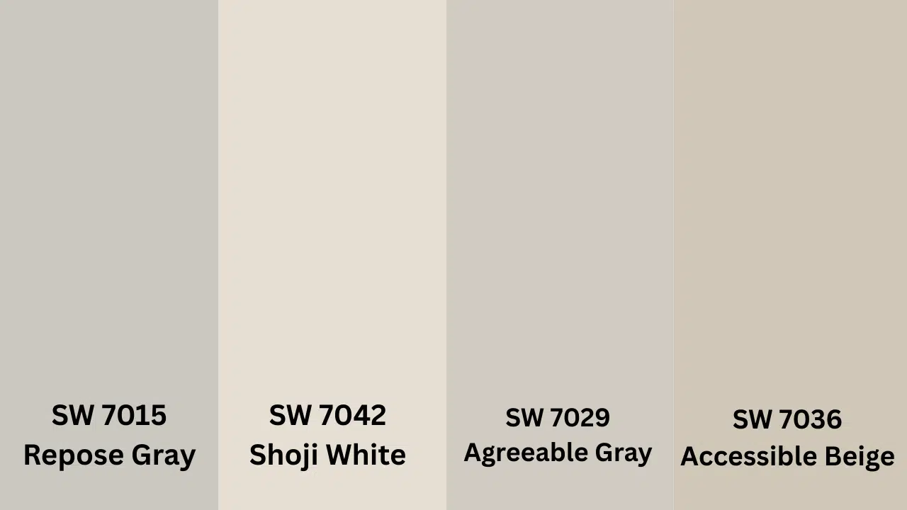
SW 7015 Repose Gray – A slightly cooler gray with similar undertones that creates a more defined version of Eider White while maintaining its balanced neutrality
SW 7042 Shoji White – A warmer, creamier white that intensifies Eider White’s warmth while adding richness to spaces.
SW 7029 Agreeable Gray – A refined greige with warm undertones that creates a natural progression from Eider White while complementing its neutral character
SW 7036 Accessible Beige – A balanced warm beige with slight gray undertones that enhances the sophisticated quality of Eider White while maintaining its versatile, timeless appeal
Conclusion: The Quiet Confidence of Eider White
The right paint color doesn’t just change a room, it changes how you feel in that room. SW Eider White does something remarkable with
This soft, nuanced shade has a way of making rooms feel intentional yet effortless. It does not demand attention; rather, it creates possibility for whatever else you bring into the space.
What makes Eider White special isn’t boldness or drama – it’s versatility. It works with whatever style you embrace, creating that perfect balance of freshness and comfort.
Your home should be your canvas. This color helps make it exactly that.
Ready to see the difference Eider White can make? Pick up a sample from your local paint store this weekend and test it in your space. Start with one accent wall to experience how this versatile shade can change your home.
What room could use a fresh start? Share your plans in the comments below.