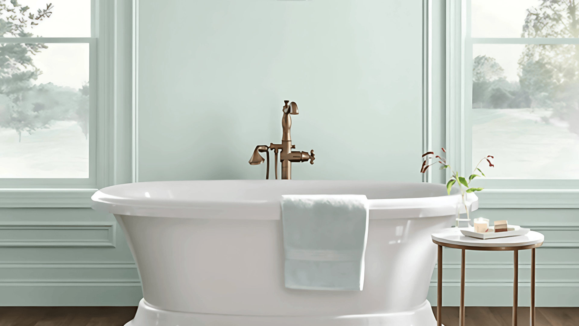
Looking for a paint color that feels like a breath of fresh air?
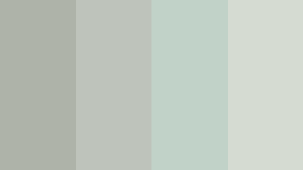
Meet Sherwin-Williams Rainwashed (SW 6211); a soft, dreamy green-gray with just the right touch of blue. This bestselling shade brings a sense of calm without feeling cold or boring.
It’s the kind of color that instantly makes a space feel relaxed, refreshed, and quietly stylish. Rainwashed shifts with the light, showing off more green in the sun and leaning gray in the shade.
If you’re brightening a bedroom, calming a kitchen, or adding charm to your front door, Rainwashed fits the mood. It pairs beautifully with crisp whites, warm neutrals, and even bold accents like navy.
If you’re searching for a color that feels serene but not boring, Rainwashed could be the perfect soft shade to anchor your home’s palette.
What is Sherwin-Williams Rainwashed
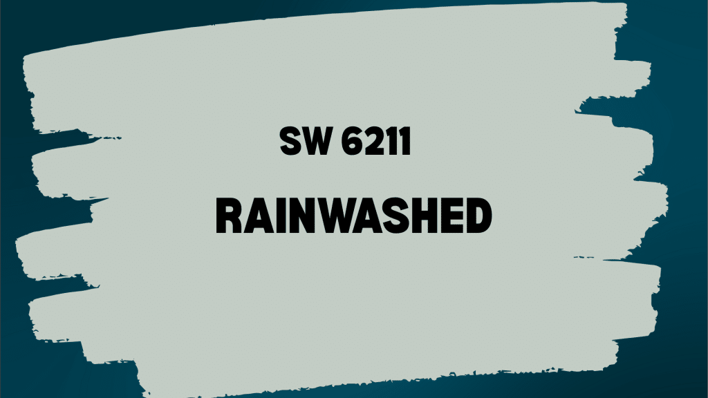
Sherwin-Williams Rainwashed (SW 6211) is a soft green-gray with gentle blue undertones. This calming color shifts beautifully throughout the day, appearing more green in bright light and more gray in dimmer conditions.
Rainwashed has subtle complexity that keeps it interesting. Its blue-gray hints prevent it from looking muddy or dull. In most lighting, it reads as a soothing neutral.
With an LRV of 59, Rainwashed reflects a good amount of light, making rooms feel bright and airy. It’s light enough for smaller spaces but has enough color to feel intentional and designed.
The color doesn’t feel cold, unlike some shades of gray. This warmth complements many design styles. It creates a peaceful backdrop that lets furniture and artwork shine.
Use it for full rooms, accent walls, or cabinets when you want spaces that feel calm and welcoming.
Rainwashed Paint Information
Here’s a quick reference with all the key details you need to know about Rainwashed before making your decision:
| ATTRIBUTE | DETAILS |
|---|---|
| Color Code | SW 6211 |
| Color Family | Green/Gray |
| Undertones | Soft green with blue and gray hints |
| LRV (Light Reflectance Value) | 59 |
| Best Room Lighting | Natural light, south-facing rooms |
| Finish Recommendations | Eggshell, Satin |
| Coordinating Whites | Pure White, Alabaster, Creamy |
| Style Compatibility | Coastal, Modern Farmhouse, Traditional |
Rainwashed Color Palette: Perfect Pairings
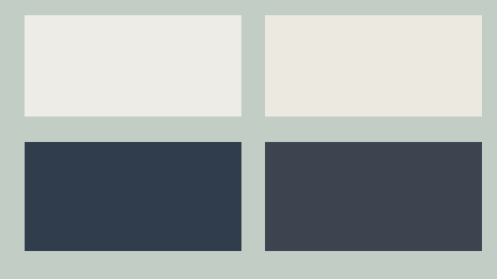
Rainwashed works well with many colors. Its soft nature makes it a gentle backdrop for both bold and neutral shades. Here are the best paint colors to pair with Rainwashed:
Pure White (SW 7005) creates a fresh, clean contrast. This crisp white brings brightness to Rainwashed’s softness. It works perfectly for trim, ceilings, or adjacent walls in any room.
Alabaster (SW 7008) offers a warmer white option. This creamy shade has subtle warmth that complements Rainwashed’s gentle tones. Use in living spaces or bedrooms for a softer look.
Charcoal Blue (SW 2739) brings dramatic depth. This rich blue-gray creates beautiful contrast with Rainwashed’s softness. Perfect for accent walls or built-ins in living rooms.
Naval (SW 6244)brings sophisticated depth. This rich navy creates a beautiful contrast with Rainwashed’s softness. Perfect for accent walls or built-ins in living rooms.
For bedrooms, pair Rainwashed with Alabaster and soft coral accents. In kitchens, try Rainwashed walls with Pure White cabinets. Living rooms look great with Rainwashed as the main color and Naval accents.
Comparing Rainwashed with Similar Shades
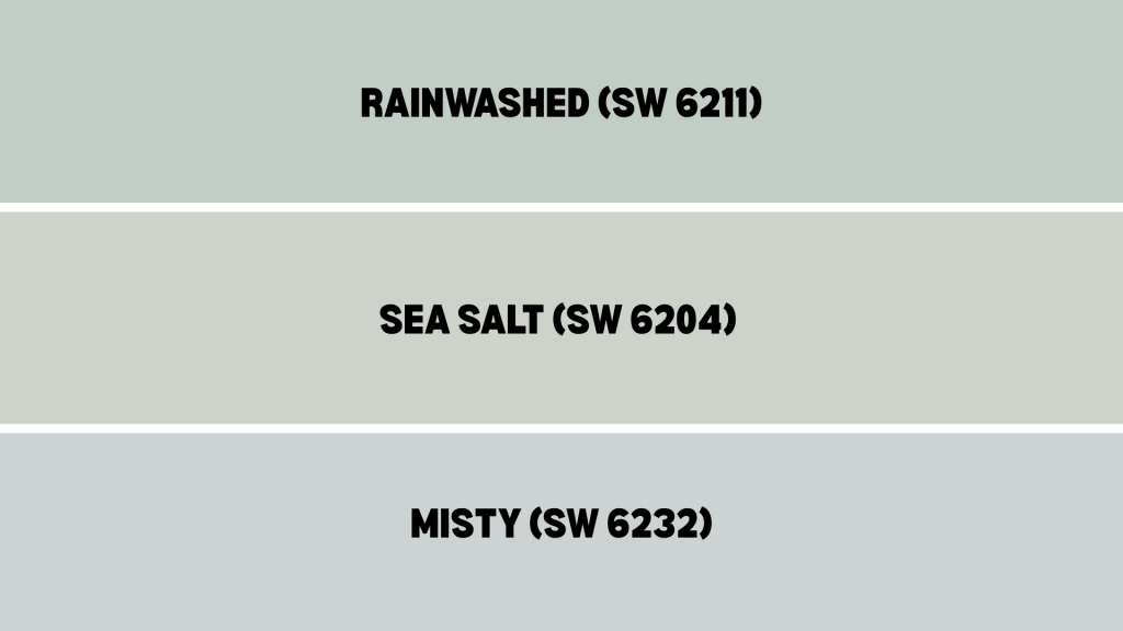
Rainwashed sits between these popular colors; more colorful than Sea Salt but not as light as Misty. This makes it perfect for people who want color without being too bold.
| FEATURE | RAINWASHED (SW 6211) | SEA SALT (SW 6204) | MISTY (SW 6232) |
|---|---|---|---|
| Color Family | Green-gray | Blue-gray | Blue-gray |
| LRV | 59 | 63 | 67 |
| Undertones | Green with blue hints | Blue with green hints | Blue with gray hints |
| Appearance | Soft green-gray, calming | Cool blue-gray, spa-like | Light blue-gray, airy |
| Best For | Bright rooms, coastal style | Cool light, modern spaces | Small rooms, bathrooms |
| Pairs Well With | Whites, corals, navy | Whites, grays, blues | Whites, soft pastels |
| When To Choose | Want a gentle green feeling | Prefer cooler, more neutral | Need a lighter, airier color |
| Room Suitability | Any room, especially bedrooms | Bathrooms, kitchens | Small spaces, powder rooms |
Where Should You Use Rainwashed?
Rainwashed works well in many spots around your house. Here’s how you can use this peaceful color:
On Your Home’s Outside
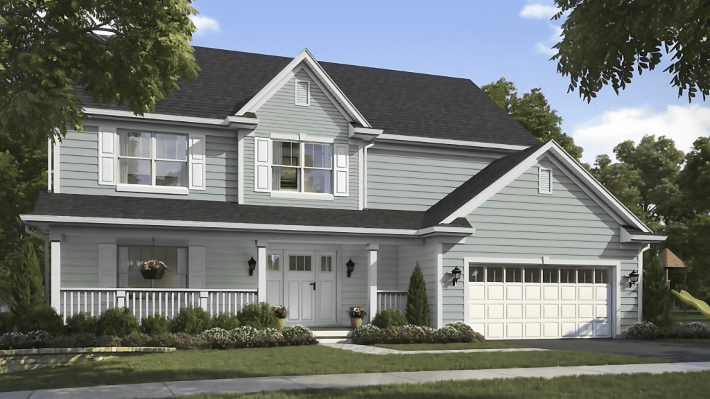
Rainwashed looks beautiful on front doors. It stands out against white or cream houses without being too bright. Many homeowners paint their shutters this color for a calm, welcoming look.
The color works well on covered porches or three-season rooms. It brings the peaceful feeling of nature indoors. Pair it with white trim for a classic coastal style.
Rainwashed holds up well in various weather conditions. It doesn’t show dirt as easily as lighter colors. The color also pairs beautifully with natural stone and brick.
In Your Kitchen
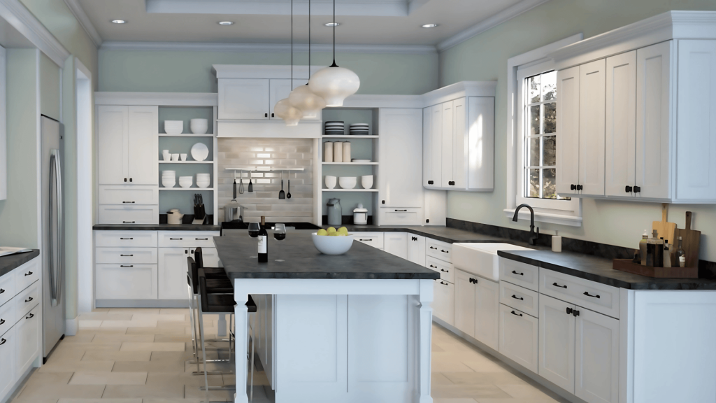
Light cabinets in Rainwashed create a calm and spa-like atmosphere in kitchens. The color works well in both large and small kitchens. It’s easier to keep clean than pure white cabinets.
Try painting just the island in Rainwashed. This creates a focal point without overwhelming the space. Add brass or brushed gold handles for warmth.
Rainwashed also works well on kitchen walls with white cabinets. This creates a soothing backdrop that makes the space feel larger and more peaceful.
In Your Bathroom
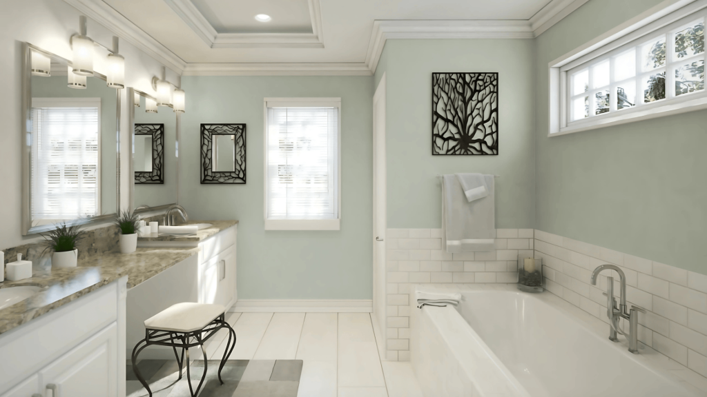
Rainwashed bathroom vanities look spa-like and expensive. They pair well with white countertops and subway tile. The color makes small bathrooms feel larger and more peaceful.
Full Rainwashed bathrooms create a cocoon-like feeling. The soft color makes these spaces feel like personal retreats.
Even just painting the door and trim in Rainwashed can update a basic bathroom. It costs little but makes a big impact on the room’s feeling.
In Your Living Room
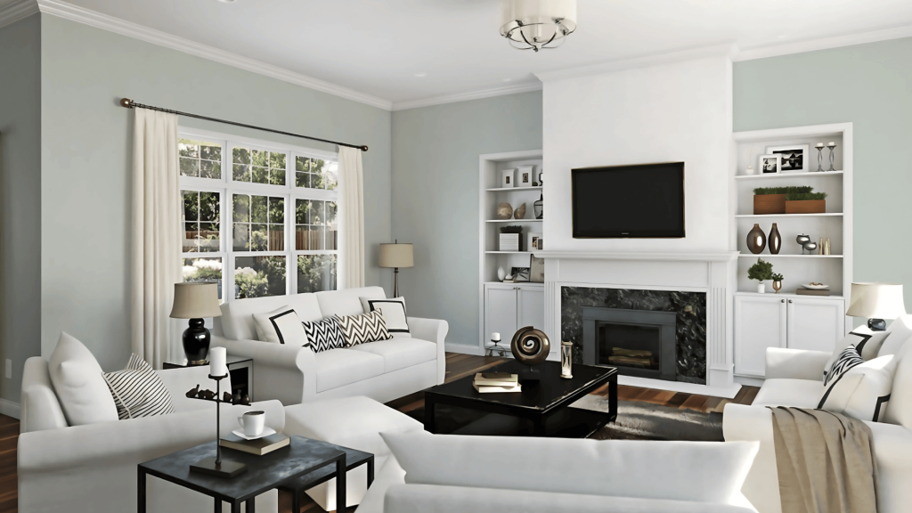
Rainwashed creates the perfect backdrop for relaxing and entertaining. This soft green-gray makes the space feel instantly more peaceful without being boring.
Paint all walls in Rainwashed for a cohesive, enveloping feel that makes the room like a calm retreat.
Try it as an accent wall behind your sofa or entertainment center to add visual interest without overwhelming the room. Light-colored furniture in cream, beige, or white looks stunning against Rainwashed walls, keeping the room feeling bright and airy.
How to Use Rainwashed SW 6211 for Best Results
Get the most from this versatile soft shade with these practical painting tips. Rainwashed can completely change your space when applied correctly, but it requires some consideration for lighting, trim choices, and finishes.
How Lighting Affects Rainwashed
- Test Rainwashed in your actual space; it appears more gray in north-facing rooms.
- Natural daylight reveals Rainwashed’s beautiful green undertones
- Under yellow artificial lighting, Rainwashed appears slightly warmer and more beige
- Install adequate lighting in rooms with Rainwashed walls to bring out their true color
Choosing the Right Trim and Ceiling Colors
- White ceilings make Rainwashed walls feel taller and brighter
- Match your trim color to your ceiling for a cohesive look
- Pure White (SW 7005) is an ideal trim partner, clean without being stark
- For a subtle look, use Alabaster trim for softer contrast
Surfaces and Finishes for Rainwashed
- Use a satin or semi-gloss finish for trim and doors for easy cleaning
- Eggshell finish works best for Rainwashed walls, not too shiny, not too flat
- Matte finish Rainwashed can look chalky and show marks more easily
- Test different sheens, the same color appears different in various finishes
Alternative Colors to Consider
If Rainwashed doesn’t quite feel right for your space, these alternatives offer a similar vibe with slight differences.
Each color has its own personality while maintaining that soft, calming quality that makes Rainwashed so popular.
| Color Name | Color Code | How It Compares | Best For |
|---|---|---|---|
| Oyster Bay | SW 6206 | Similar but more neutral | Conservative color choices |
| Comfort Gray | SW 6205 | Warmer, more beige | North-facing rooms |
| Palladian Blue | BM HC-144 | Benjamin Moore alternative | Similar coastal feeling |
| Healing Aloe | BM 1450 | Slightly more green | Bright, sunny rooms |
Another excellent option for a soft and versatile color is Sherwin-Williams Opaline (SW 6189), a gentle white that adapts beautifully to different moods and lighting conditions.
Rainwashed: The Peaceful Color Your Home Needs
Sherwin-Williams Rainwashed is a soothing, flexible color that works beautifully in any space, from breezy living rooms to elegant exteriors.
Its green-gray base with soft blue hints creates a fresh, welcoming feel that complements your decor without overwhelming it.
If you’re leaning coastal, modern farmhouse, or want a calm retreat, Rainwashed delivers a peaceful look that lasts.
Remember to test it under your room’s lighting and choose the right trim and finish for the best effect.
Ready to refresh your space with a soft, stylish shade? Try Rainwashed SW 6211 and see how effortlessly it changes your home with color that’s gentle, timeless, and full of character.