Searching for a paint color that brings calm to your home? Sherwin-Williams Opaline (SW 6189) might be just what you need. This soft tone offers a gentle presence that fits many home styles and rooms.
People who choose this color often find it creates a peaceful setting in their spaces. Opaline sits in the blue-green family with a touch of gray that makes it easy to use in many settings.
In this blog, we’ll look at what makes Opaline special and how it can work in different rooms. You’ll learn about its color traits, the best light for it, and which colors go well with it.
By the end, you’ll know if this subtle shade is the right pick for your walls and how to make the most of it in your home.
What Is Sherwin-Williams Opaline?
Opaline (SW 6189) is a gentle blue-green shade in the Sherwin-Williams collection. This color sits in the lighter range, adding a soft touch to any room without being too bold or quiet.
Color Information
| Property | Details |
|---|---|
| Color Code | SW 6189 |
| Color Family | Blue |
| Light Reflectance Value (LRV) | 73 (approx. 73.05) |
| RGB Values | 220/223/215 |
| HEX Code | #DCDFD7 |
Color Characteristics
- Mood Effect: Creates a calm, peaceful feeling in rooms
- Undertones: Contains subtle gray undertones that help it stay balanced
- Light Response: Appears more blue in morning light and shows green hints in evening light
- Room Impact: Makes small spaces feel larger and more open
Opaline stands out from other pale colors because it has just enough color to be noticed without shouting for attention.
The slight gray mix helps it avoid looking too baby-blue or mint-like, giving it a more grown-up feel that works in modern and classic homes alike.
Why Opaline SW 6189 Stands Out?
Opaline stands out among paint colors because of its special light-changing quality. In bright spaces, it shows off its blue side, while shadier areas bring out its green tones. This shift makes rooms feel fresh as the day passes and light changes.
The color works with many design styles thanks to its balanced nature. In modern homes, it creates a clean base for simple furniture. In more classic settings, it adds a hint of color without feeling too bold or out of place.
When paired with other colors, Opaline plays well with almost everyone. White trim makes it look crisp and clean while wood tones bring out its warmth.
Its soft, timeless feel won’t make you want to repaint next year, giving it lasting value for home projects.
Where Opaline Fits in the Sherwin-Williams Color Spectrum?
Opaline (SW 6189) is a light, soft shade that bridges several color categories in the Sherwin-Williams palette. It’s officially described as a “light blue-green pastel” with notable gray undertones.
This gentle color creates calm spaces without the boldness of brighter paints or the plainness of basic neutrals.
Related Colors in the Sherwin-Williams Family
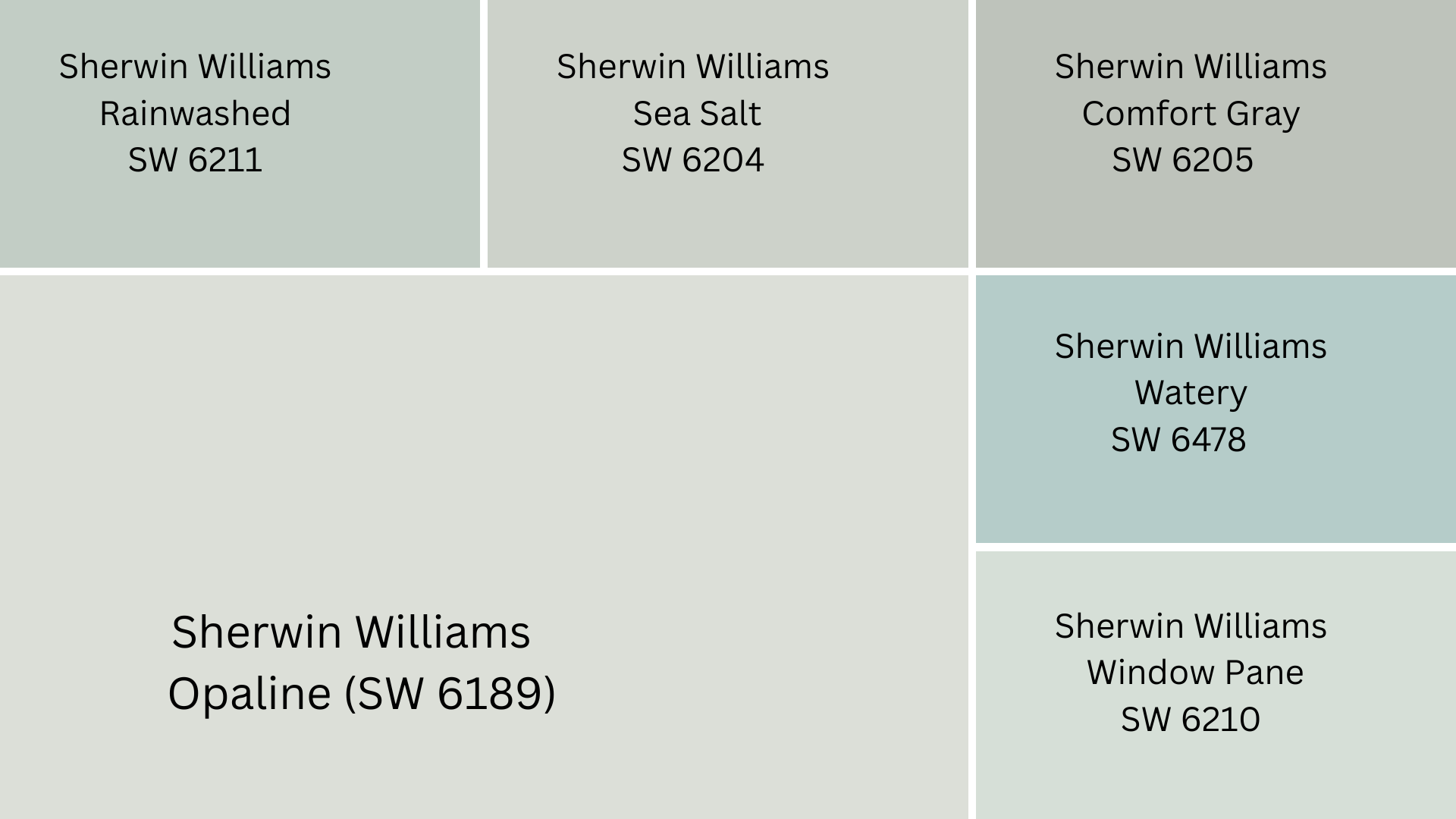
| Color Name | Code | Comparison to Opaline |
|---|---|---|
| Rainwashed | SW 6211 | Slightly greener with more saturation |
| Sea Salt | SW 6204 | More gray, appears more neutral |
| Comfort Gray | SW 6205 | Deeper, more muted version |
| Watery | SW 6478 | Brighter, more vibrant blue-green |
| Window Pane | SW 6210 | Lighter with stronger blue tones |
Opaline Appearance in Color Collections
- Living Well – Recharge: Featured for its wellness and relaxation qualities
- White & Pastel Collection: Included for its soft, muted character
- Coastal-Inspired Palettes: Used for creating serene, beach-like spaces
- Minimalist Designs: Chosen as a subtle color with just enough character
Best Rooms to Paint with Opaline
These spaces benefit most from Opaline’s soft blue-green tones. Each room gains specific advantages from this versatile paint color.
1. Bedrooms
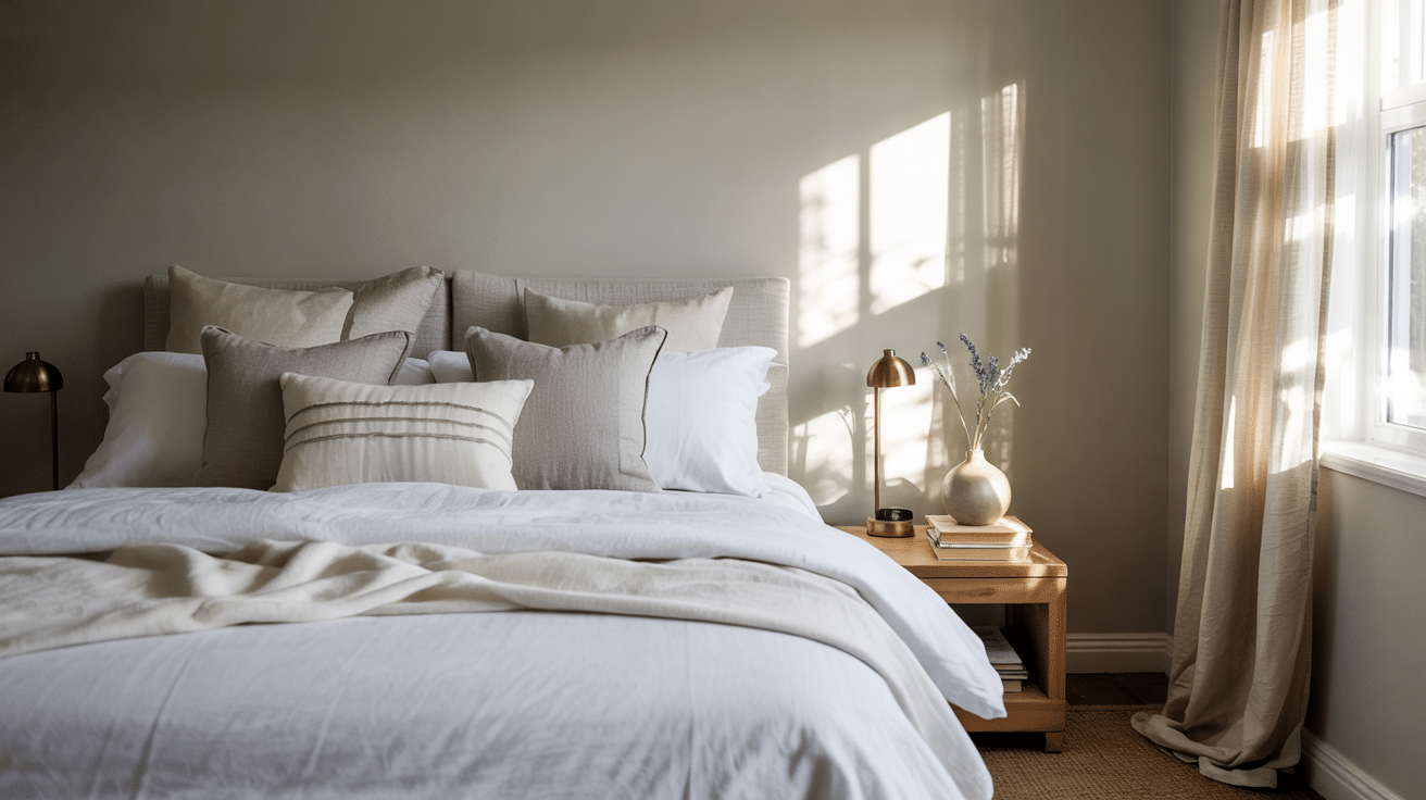
Opaline works wonderfully in bedrooms, creating a peaceful retreat with its soft blue-green tones. The color promotes relaxation and better sleep quality while making the space feel larger and more open.
It adapts well to different lighting conditions, looking fresh in daylight and cozy in evening lamplight.
Perfect pairings: Complements soft bedding, natural wood furniture, and silver or brass accents.
Lighting effects: Takes on a cooler, more blue appearance in morning light and a warmer feel in evening lamps.
2. Bathrooms
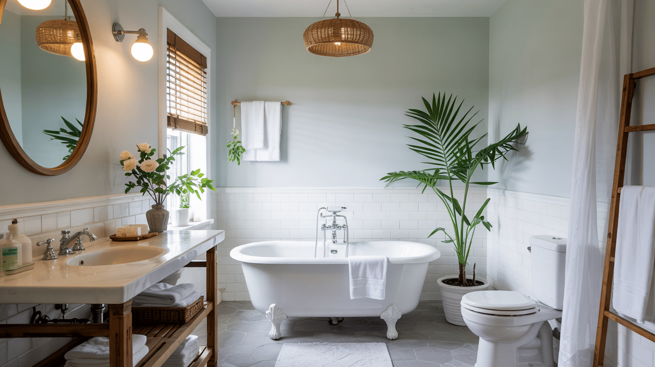
Bathrooms painted in Opaline gain a spa-like quality that elevates the space. The color complements standard white fixtures while hiding water spots better than stark whites or darker shades.
It creates a clean, fresh feeling that works well with the moisture-rich environment.
Perfect pairings: Enhances white porcelain fixtures, glass shower doors, and chrome or nickel hardware.
Lighting effects: Brightens in natural window light while maintaining warmth under typical bathroom lighting.
3. Living Rooms
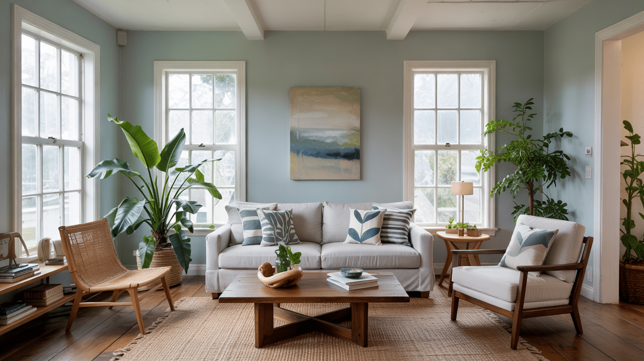
Living rooms benefit from Opaline’s versatile nature as it provides enough color to be interesting but remains neutral enough to work with various décor styles.
The color creates a welcoming backdrop that allows furniture and art to stand out without competing for attention.
Perfect pairings: Balances well with both light and dark furniture, textured fabrics, and wood accent pieces.
Lighting effects: Shifts between its blue and green aspects as natural light changes throughout the day.
4. Kitchens
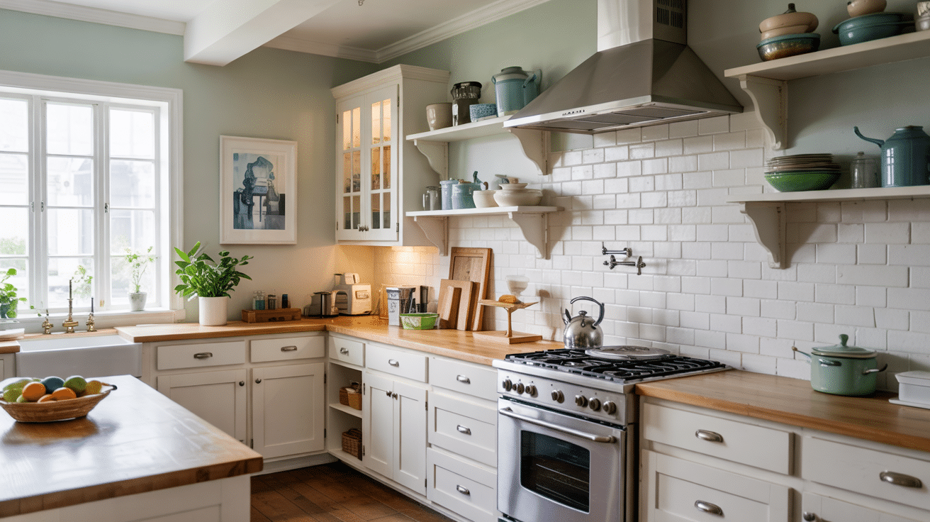
Kitchens painted in Opaline feel clean and fresh without the clinical feel of pure white. The color pairs beautifully with both white and wood cabinets, creating a versatile base for different kitchen styles.
It reflects light effectively, making work areas brighter and more functional.
Perfect pairings: Works with white, wood, or painted cabinets and most countertop materials from light to dark.
Lighting effects: Maintains its clean look under task lighting while softening under pendant or recessed lights.
How Opaline Looks in Different Lighting?
Wall colors can change dramatically based on the light they receive. Opaline shows interesting variations that are worth understanding before you paint.
Natural Daylight
In bright, direct sunlight, Opaline reveals more of its blue undertones. The color appears crisper and slightly cooler, giving rooms a fresh, clean feeling. Morning light particularly brings out these blue qualities.
Natural daylight from north-facing windows gives Opaline a softer, more muted appearance. The gray undertones become more visible, creating a gentle, calming effect that works well in quiet spaces.
Seasonal changes: Appears more vibrant in summer light and takes on a softer quality during winter months.
Window orientation: Shows its truest blue-green balance in east or west-facing rooms with balanced light.
Artificial Lighting
Under cool white LED bulbs, Opaline maintains its fresh, slightly blue-green character. These lights help preserve the color’s clean quality while keeping spaces feeling bright and open.
Warm bulbs (like traditional incandescents or warm LEDs) bring out more of the green and gray in Opaline. The color feels cozier and more settled, making it excellent for evening relaxation areas.
Bulb temperature: Cool bulbs (4000K+) emphasize its blue tones while warm bulbs (2700K) highlight its green side.
Light placement: Overhead lighting brightens the color while floor or table lamps create depth and shadow play.
Evening and Night
As natural light fades in the evening, Opaline deepens slightly and takes on a more mysterious quality. The color shifts toward its gray undertones, creating a cozy, wrapped-in feeling.
Under night lighting conditions, the color can appear almost silvery in certain angles. This moonlight effect adds an interesting dimension to bedrooms and living spaces used after dark.
Light intensity: Bright evening lighting keeps the color true while dimmer settings enhance its softer side.
Shadow effects: Creates gentle shadow gradients rather than stark contrasts when partially lit.
Colors That Look Great with Opaline
Opaline (SW 6189) shines when paired with the right color partners. This gentle, soft shade works well with many colors that bring out its subtle beauty.
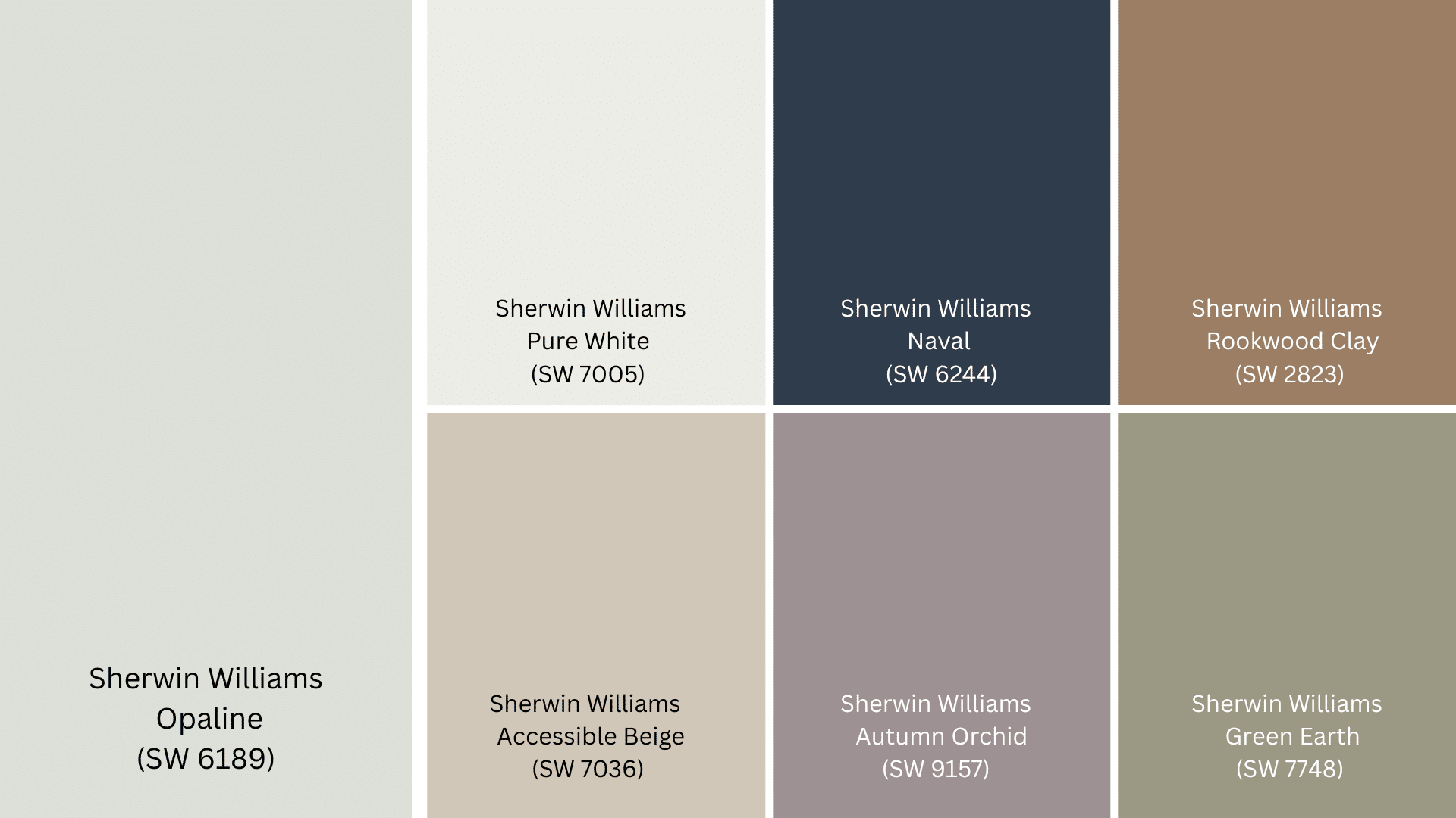
Pure White (SW 7005) offers a clean, fresh contrast with Opaline. The white trim highlights Opaline’s soft nature while adding definition to doorways, windows, and baseboards throughout your home.
Naval (SW 6244) creates a striking pair with Opaline. This deeper blue tone works beautifully for furniture pieces like sofas or accent chairs in an Opaline room, adding depth without feeling too heavy.
Rookwood Clay (SW 2823) brings a warm, earthy feel when paired with Opaline. This clay-toned shade works well for nearby walls or as a color for wood furniture in an Opaline space.
Accessible Beige (SW 7036) acts as a perfect neutral partner that lets Opaline take center stage. This light beige creates a soft flow between rooms when used in connected spaces.
Autumn Orchid (SW 9157) adds a touch of soft purple that feels both fresh and calm next to Opaline. This makes a good accent wall color or works well for smaller items like throw pillows and vases.
Green Earth (SW 7748) pairs with Opaline to create a nature-inspired palette. This green tone feels grounded and works nicely for accent walls or larger furniture pieces in an Opaline room.
Paint Finishes That Work Best with Opaline
The finish you choose can change how Opaline looks and performs in different rooms. Here’s how to pick the right finish for each space in your home.
1. Flat Finish
- Works best in: Bedrooms, formal sitting rooms, and ceilings
- Why it works: Shows Opaline’s true color without shine
- Tip: Use in low-traffic areas where walls won’t need much washing
2. Eggshell Finish
- Works best in: Living rooms, home offices, and dining rooms
- Why it works: Offers a soft, slight shine that’s still low-key
- Tip: The most popular finish for Opaline walls in the main living areas
3. Satin Finish
- Works best in: Hallways, children’s rooms, and family spaces
- Why it works: Balances good looks with better cleaning power
- Tip: Choose this for high-use rooms where walls might get touched often
4. Semi-Gloss Finish
- Works best in: Kitchens, bathrooms, and all trim work
- Why it works: Stands up to water, steam, and frequent cleaning
- Tip: Perfect for Opaline trim next to walls in a flatter finish
5. High-Gloss Finish
- Works best in: Doors, cabinets, and small accent areas
- Why it works: Gives a smooth, shiny look that cleans easily
- Tip: Use sparingly with Opaline for special touches in a room
Opaline in Small vs Large Spaces
Opaline (SW 6189) behaves differently depending on the size of your room. Here’s how to use this color effectively based on your space:
| Aspect | Small Spaces | Large Spaces |
|---|---|---|
| Visual Effect | Creates a cozy, intimate feeling | Produces an open, airy atmosphere |
| Best Applications | Accent walls or built-ins | Full room coverage works well |
| Lighting Needs | Requires extra lighting to prevent darkening | Handles natural light beautifully |
| Trim Options | Bright white trim helps define boundaries | Can work with colored or softer white trim |
| Furniture Colors | Light furniture keeps the space feeling open | Can balance with darker furniture pieces |
| Accent Colors | Limit to 1-2 accent colors | Can support 3-4 accent colors throughout |
| Mirror Placement | Strategic mirror use expands the feel | Less essential but still helpful for light |
The time of day affects how Opaline looks in your space. Test a sample in morning, afternoon, and evening light before painting the entire room.
Conclusion
Sherwin-Williams Opaline (SW 6189) offers a soft touch to your home with its gentle blue-green hue. This color creates a sense of peace in any room it adorns, making it a wise pick for those seeking a calm home setting.
Through our look at Opaline, we’ve seen how it shifts in various lights, pairs with different colors, and works in many rooms. Its strength lies in its subtle nature and how it can change without losing its basic charm.
If you’re aiming for a home that feels both fresh and relaxed, Opaline may be your answer. Try a sample in your space to see how it works with your light and existing items. Remember to check it at different times to get the full effect.
What rooms would you paint with Opaline? Let us know in the comments below!
Frequently Asked Questions
What Is the Most Popular Color in Sherwin-Williams?
Sherwin-Williams’ most popular color is Pure White (SW 7005), with Agreeable Gray (SW 7029) close behind. These versatile neutrals work in almost any space and lighting condition.
How Does Opaline Change in Different Lighting Compared to Popular Neutrals?
Opaline shows more color shifts than neutrals like Agreeable Gray. It reveals blue tones in morning light and greener notes in evening settings.
Is Opaline a Good Alternative to White for Ceiling Paint?
Opaline can work on ceilings in small rooms for a subtle color wash. It adds soft color while still reflecting light well, unlike darker ceiling choices.