Sea Salt vs. Window Pane: the “They Look the Same on the Chip” Trap
You know that moment in the paint aisle when two swatches look basically identical and you think, “Surely I’m an adult who can make decisions”? Yeah. That’s Sea Salt and Window Pane.
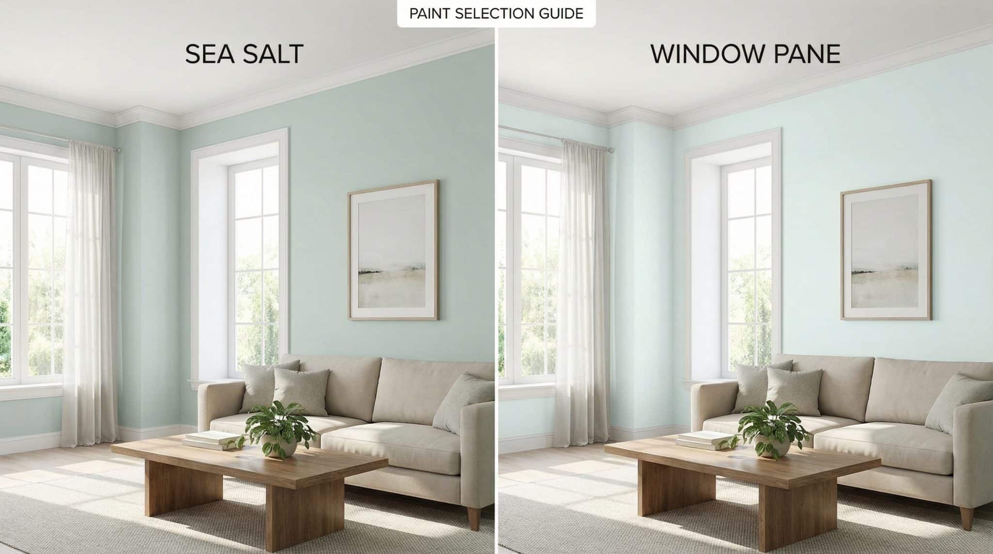
On a tiny little chip, Sherwin-Williams Sea Salt (SW 6204) and Window Pane (SW 6210) can look like twins who borrow each other’s clothes. But on an actual wall? One of them turns into a moody, changeable drama queen depending on the light… and the other plays it cool and quietly pretends to be an off white.
And that’s why people repaint. Not because the color is “bad,” but because it wasn’t the vibe they thought they were signing up for.
Let’s talk about why.
The big difference: Window Pane is basically a near white, Sea Salt is… actually a color
Here’s the simplest way I can say it:
- Sea Salt: you’ll notice it. It’s not loud, but it’s there.
- Window Pane: people walk in and say, “Wow, so fresh!” and then cannot tell you what color it is. In a bright room it can absolutely pass as a clean off white.
The nerdy reason is LRV (Light Reflectance Value). Higher LRV = lighter looking paint.
- Window Pane LRV: ~72 (very light, almost off white territory)
- Sea Salt LRV: ~63-64 (still light, but firmly “this is a color”)
That 8-9 point difference feels like nothing on a chip and feels like a whole personality shift on a 12 foot wall.
If you want a quick gut check:
- If you’re craving bright and subtle, Window Pane is your friend.
- If you want soft color you can actually see, Sea Salt is more your speed.
Lighting: Sea Salt shapeshifts, Window Pane behaves (mostly)
This is where people get emotionally wounded.
Sea Salt in real life
Sea Salt has a warm-ish, yellow green thing happening underneath (it’s sneaky). That means it changes a LOT depending on your room and bulbs.
- North facing room (cool daylight): it can pull bluer.
- South facing room (warm sun): that green shows up more.
- Nighttime with warm bulbs (2700-3000K): hello, green. Like… really green sometimes.
Sea Salt is the paint version of someone who looks different in every photo because the lighting “was weird.”
Window Pane in real life
Window Pane leans cooler (blue green) and has a bit of gray in it, which makes it steadier for a cooler shade comparison. It still shifts because paint always does but it’s less likely to surprise you with a whole new identity at 7pm.
If you’re the kind of person who likes predictability and doesn’t want to play “what color is it today?” Window Pane is calmer.
Where I’d actually use each color (aka: let’s not set you up for regret)
Window Pane works best when…
You want the room to feel airy and consistent like it drank a big glass of water and started using eye cream.
I love it for:
- Small spaces where you need every drop of brightness
- Open concept areas where you don’t want one room looking minty and the next looking icy
- Sunny rooms (it stays clean and light)
- Ceilings when bright white feels too stark (Window Pane is like “white, but with manners”)
Sea Salt works best when…
You actually want the wall color to show up and do something besides whisper.
I like it for:
- Bathrooms (it plays nicely with mixed lighting, and bathrooms are basically lighting chaos anyway)
- North facing rooms where you need a color that won’t just fade into “huh… is this white?”
- Guest rooms, laundry rooms, mudrooms those hardworking spaces that deserve to feel intentional
One quick opinion: if you’re painting a tiny, super bright room and you’re terrified of “why is this blue now,” I’d lean Window Pane. Sea Salt can be gorgeous, but it does not promise to stay in its lane.
Trim + finishes: keep warm with warm, cool with cool (and please don’t pick a creamy trim out of habit)
This is the part where your floor/stone/hardware starts bossing you around. Fixed finishes are like toddlers: they don’t compromise.
General rule:
- Warmer finishes tend to like Sea Salt
- Cooler finishes tend to like Window Pane
Trim whites I’d actually use
Creamy trim can make these colors look a little… tired. (Like they stayed up late doomscrolling.)
Try:
- SW Extra White (7006) for crisp contrast
- SW Pure White (7005) for a softer clean
- SW Dover White (6385) if you want a gentler, less stark white (just don’t go full buttercream)
Finish vibes
- Sea Salt tends to look best with: warmer woods (walnut, cherry, honey oak), warmer marbles, brass/copper
- Window Pane tends to look best with: cooler woods (white oak, ash, gray stains), cooler marbles, chrome/polished nickel
The repaint mistakes I see over and over
When Sea Salt goes sideways
- In very bright rooms, Sea Salt can read way bluer than people expect. Cue panic.
- On cabinets/vanities, it can look washed out or just… not quite intentional. If you want a cabinet color in this general family, Comfort Gray often behaves better.
- With cool gray marble (Carrara, Bardiglio, etc.), Sea Salt can sometimes create this weird greenish cast situation. Not always! But enough that I’d never skip testing.
When Window Pane disappoints
Window Pane’s main crime is being too subtle as a soft green paint color.
- In low light rooms or at night, it can disappear and read as plain white. Which is fine… unless you wanted “soft blue green” and not “yep, that’s white.”
How to test (without turning your house into a paint swatch crime scene)
I’m begging you: don’t choose either of these from a chip or an online photo. These colors are light sensitive little gremlins.
Here’s the method that saves sanity:
- Paint two big samples (or use sample sheets):
- one spot that gets direct daylight
- one spot that stays shadier
- Look at it through the day:
- morning
- midday
- late afternoon
- evening with your actual bulbs on
- Take photos if it helps just don’t let photos overrule your eyeballs (cameras lie like it’s their job).
Pick the color you can live with in all lighting situations, not just the one magical 10 minute window when it looks perfect.
So… which one should you choose?
Choose Window Pane if you want:
- maximum brightness
- a steadier, more predictable look
- very subtle blue green undertones (like “whisper,” not “statement”)
- a good option for open layouts or ceilings
- cooler leaning finishes (chrome, cool stone, gray-ish woods)
Choose Sea Salt if you want:
- walls that read as a real color
- a soft, coastal green blue vibe that moves with the light
- something that won’t just fade to “off white” in a dimmer room
- warmer leaning finishes (brass, warmer woods, warmer stone)
Consider neither if:
You need the color to look identical at 9am, 2pm, and 9pm. That’s not how this family works. (If paint could stop time like that, I’d already have a YouTube channel and a sponsorship deal.)
One combo I actually love: Sea Salt on walls + Window Pane on the ceiling. It can be really pretty and soft just test first so you don’t end up with one room looking oddly green and another looking oddly blue.
Now go grab samples, watch them misbehave in your lighting, and pick the one that feels right in your house (not the internet’s house).