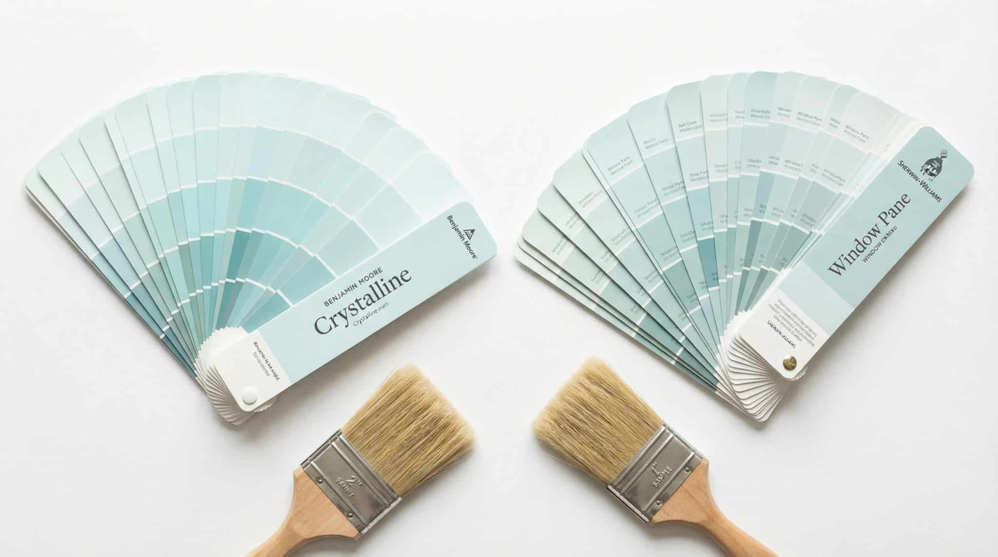
Benjamin Moore’s Best Match for Sherwin-Williams Window Pane (aka: the paint color that gaslights you)
If you’ve ever tried to match Sherwin-Williams Window Pane in Benjamin Moore, you already know the struggle. It’s like chasing a very polite ghost soft blue green, “watery,” soothing… and somehow different in every single photo on the internet. Pinterest says one thing. Your sister’s bathroom says another. Your sample looks perfect at 10 a.m. and then turns into a totally different personality by dinner.
Here’s the deal: you can get a really great Benjamin Moore “close enough to fool your eyeballs” match… but it’s basically impossible to get a perfect identical twin. Not because you’re bad at paint (you’re not). Because paint brands are built differently, and this particular shade loves drama.
Let’s talk about what to buy, what to avoid, and how to test it without losing your mind.
Why Window Pane looks different every five minutes
Window Pane is one of those high LRV, whispery pastels that acts like a mood ring. It’s not you it’s the light.
Here’s what usually happens:
- North facing / cooler light: it tends to look cleaner and bluer (that “watery blue” vibe).
- South facing / warmer light: it can nudge greener or a little grayer, depending on what else is in the room.
- Night lighting: your bulbs are basically in charge now. Warm bulbs = warmer/greener. Cool bulbs = bluer/cleaner.
And then you add in things like trees outside, a red brick neighbor house reflecting into your windows, your beige sofa throwing warmth everywhere… and suddenly your “soft spa blue” is giving “seafoam with opinions.”
So yes, testing matters. (I know. Annoying. But it’s cheaper than repainting.)
The closest Benjamin Moore match (start here)
If you want the short version: start with Benjamin Moore Crystalline (AF-485).
Crystalline sits in the same soft aqua neighborhood light, airy, blue green without screaming “I AM BLUE GREEN.” In most rooms, it’s the closest “Window Pane ish” vibe you’re going to get off the shelf.
A tiny heads up: Crystalline can read a smidge greener than Window Pane, and Window Pane can have a hint more softness/warmth. On a whole wall? Most normal humans will not notice. (You might, though, if you’re the kind of person who can’t sleep knowing your trim is 2% too creamy. Hi, welcome, same.)
If Crystalline isn’t it, try one of these (pick your fighter)
Because rooms are weird and light is rude, here are my favorite backups if you are weighing Rainwashed compared to Window Pane depending on what’s bugging you:
- Clear Skies (2054-70) – If Window Pane always felt too green to you and you wanted a bit more blue.
- Cascade White (2127-70) – Great for north facing rooms where you want that cooler, cleaner read.
- Glass Slipper (1632) – If you want that barely there, floaty look. Soft, light, pretty.
- Quiet Moments (1563) – If Window Pane looks washed out in your space and you want more presence without going full teal.
- Palladian Blue (HC-144) – A classic, but deeper and more color forward. Gorgeous in bright rooms, can feel “a lot” in darker ones.
Personally, if you’re painting a bedroom or bath and want that calm spa feel, I’d rather go a hair too soft than too saturated. The minute it gets too strong, it starts bossing the room around. And I don’t need my walls yelling at me.
Why Benjamin Moore will never be a perfect match (and why that’s normal)
This is the part nobody wants to hear but everybody needs: Sherwin-Williams and Benjamin Moore use different base systems. In real life human terms, that means pale colors can land differently even if the formula looks close.
Sherwin-Williams often has a slightly more muted/softened look in light colors, while Benjamin Moore can read cleaner and crisper with the same general color family.
So your Benjamin Moore “Window Pane match” might look a bit clearer or slightly stronger. Not wrong. Just… not identical.
The one rule I will shout from the rooftops:
Do not try to touch up a Sherwin-Williams Window Pane wall with a Benjamin Moore match. Even if it’s extremely close, you’ll see the patch. Different paint systems = different sheen + texture + how it sits on the wall. You’ll end up with a little “repair polka dot” situation, and nobody wants that.
Trim colors: don’t let warm white ruin your pretty blue green
Window Pane (and its Benjamin Moore cousins) play nicest with cooler whites on trim. Put a warm creamy trim next to it and suddenly the trim looks… dingy. Like it smokes. Like it’s been through something.
Two Benjamin Moore trim whites I love with these soft blue greens:
- White Heron (OC-57)
- Decorator’s White (OC-149)
What I’d personally skip here (unless your whole house is warm and you’re committed to that life):
- Cloud White
- Simply White
They’re lovely colors! Just warmer. And next to a cool aqua they can make everything feel slightly “off,” like a shirt that’s almost the right shade but not quite and now you can’t unsee it.
If you’re not repainting trim, at least hold your wall sample right up against it in daylight. Your eyes will tell you the truth immediately.
How to test without turning this into a full time job
If you do one thing, do this: get samples on the wall. Not just in your hand. Not just a tiny chip you keep moving around like a tiny paint detective.
I like the 12×12 peel and stick samples (or sample pots painted onto poster board). Put them in more than one spot because one wall might get blasted with light and another might live in shadow forever like a houseplant you forgot about.
My lazy but effective testing routine:
- Put one sample on the brightest wall
- Put one on the wall across from it
- Check it:
- Morning (cool light shows undertones)
- Midday (most neutral)
- Evening (warm shift + lamps = the truth serum)
Then wait. Yes, wait. Give it at least 48 hours (3-5 days is even better) so your eyes can stop freaking out and adjust. The right color is the one that stays steady and keeps making you happy even when the light changes.
If none of the “close enough” options work:
Most Benjamin Moore retailers can do a custom color match by scanning a Window Pane sample (usually a few bucks more per gallon). It’s not magic, but it can get you closer if you’re really committed to the exact vibe.
Final thoughts (aka: you’re not failing, this color is just extra)
Finding a Window Pane match for a soft green paint tone in Benjamin Moore isn’t about creating some perfect lab clone. It’s about getting a color that feels right in your room, with your light, next to your trim, with your probably too warm light bulbs.
Start with Crystalline, grab one or two backups based on what you want (more blue? more depth?), and test them like a sane person with time, daylight, and real walls involved.
Because the winner won’t be the one that matches a screenshot. It’ll be the one you walk past at 7 p.m., glance over, and think: Yep. That’s the one.


