Sagey vs Sea Salt: the paint twins that absolutely are not twins
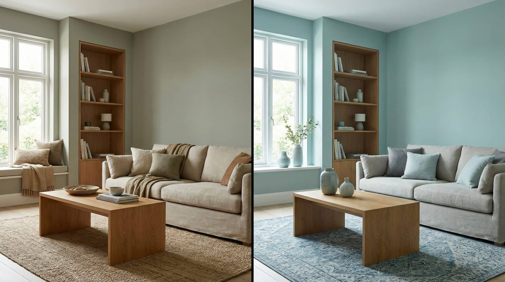
If you’ve ever stood in the paint aisle squinting at two tiny swatches like you’re trying to crack a safe… welcome. Sherwin-Williams Sagey (SW 6175) and Sea Salt (SW 6204) confuse more perfectly normal homeowners than they have any right to. On a little chip under store lighting? They can look basically identical: that dreamy green gray everyone wants right now.
On an actual wall in your actual house with your actual weird lighting that changes every 12 minutes? Ohhhh no. These two behave like totally different people at the party.
Here’s the real difference in one sentence:
- Sagey stays pretty consistent all day.
- Sea Salt shape-shifts depending on the light. (Sometimes “calm spa vibe,” sometimes “why is this suddenly blue?”)
Let’s break it down like friends who don’t want you to repaint in six months out of pure annoyance.
The only paint terms you need (I promise)
I’m not going to make you learn paint chemistry. Just three things:
- Undertone: the sneaky color lurking underneath. A “green gray” might secretly lean yellow (warmer) or blue (cooler).
- Temperature: warm vs cool. Warm = yellow-ish. Cool = blue/green-ish.
- LRV (Light Reflectance Value): how much light the color bounces back. Higher LRV = usually looks brighter/easier in low light.
If you want a quick and dirty hack before we go any further:
Hold both swatches next to the warmest wood tone in your room (oak floors, a wood dresser, that honey cabinet you didn’t pick but now you own). Warm wood will immediately tell on a paint color. One will look cozier. The other might go a little icy or gloomy. That’s your warm vs cool clue.
Sagey vs Sea Salt in real life (not in the paint aisle)
Sagey (SW 6175)
- Vibe: soft, warm-ish, gentle “lived in home that smells like coffee”
- Undertone: green gray with a yellow leaning warmth
- LRV: 74 (pretty bright for a color)
- Personality: dependable. The friend who shows up on time.
This is the one I reach for when someone says, “I want green gray with a Sagey color profile but I don’t want it to do anything… surprising.” Sagey has a slightly vintage softness that plays really nicely with wood, woven textures, warmer neutrals… basically anything that doesn’t look like a sterile showroom.
Sea Salt (SW 6204)
- Vibe: airy spa / beachy calm / “my life is together” (whether it is or not)
- Undertone: cool blue green mixed with gray
- LRV: 63 (still light, but noticeably moodier than Sagey)
- Personality: a shapeshifter. Interesting. Sometimes dramatic.
Sea Salt is gorgeous… when it’s gorgeous. But it reacts to light like a mood ring. Morning? Maybe grayer. Midday? Greener. Late afternoon? Hello, blue. If that sounds fun to you, you’ll love it. If that sounds like emotional labor, choose Sagey and live your peaceful life.
The part nobody tells you: light will decide this for you
I’ve seen people choose Sea Salt from a Pinterest photo, paint the whole room, and then spend a week wandering around saying, “It’s… not what I thought it was.” (And yes, I have also been that person.)
Here’s how both colors behave when your windows start doing their thing:
North facing rooms (cool, steady light)
- Sagey: still reads like Sagey just a touch cooler.
- Sea Salt: can lean very blue green, sometimes more blue than people wanted.
If you’re trying to get a clear green vibe in a north facing room, Sagey is usually the safer bet. Sea Salt can be beautiful here too, but you have to be okay with the cooler swing.
South facing rooms (warm, bright light)
- Sagey: warms up nicely, and the gray keeps it from going full on “green paint!”
- Sea Salt: often looks its best here balanced, fresh, not too icy.
If your room is bright and sunny, Sea Salt can be a stunner.
Low light rooms (aka “why is this hallway always midnight?”)
This is where Sea Salt can get… murky. Not moody in a chic way more like “did my paint just sigh heavily?”
- Sagey handles low light better thanks to that higher LRV (74).
- Sea Salt can look muddy if the room doesn’t get enough natural light.
If the room is dim and you’re not adding lamps/sconces/anything, I’d personally lean Sagey (or pick something even lighter).
Trim can make or break this. Seriously.
This is the part where people accidentally ruin a perfectly good color choice and then blame the color. (It’s not always the color. Sometimes it’s your trim being… aggressive.)
My simple rule:
- Sagey likes softer/warmer whites.
- Sea Salt likes cleaner/cooler whites.
Trim pairings I’d actually use
With Sagey (warm leaning):
- SW Alabaster
- SW Shoji White
These keep Sagey feeling creamy soft, not harsh.
With Sea Salt (cool leaning):
- SW Extra White
- SW Pure White
- BM White Dove (yes, you can mix brands for trim recommendations your painter will survive)
These keep Sea Salt crisp and calm.
What I’d avoid (especially with Sea Salt)
Creamy, warm trims can make Sea Salt look unsettled like it can’t decide what it is. Also, some warm off whites can pull pink-ish next to Sea Salt, which is… not the relaxing spa moment you signed up for.
So if you’re married to creamy trim like Antique White or Navajo White, just know Sea Salt may act weird next to it. (Sea Salt is sensitive. She’s an artist.)
Metals + accents (because your faucet counts as a roommate)
If your fixtures are already installed, don’t ignore them. They’re not going anywhere. They will sit there, silently judging your paint choice.
- Sea Salt usually looks best with chrome, brushed nickel, stainless steel (cool metals).
- Sagey is warmer and more flexible brass, bronze, matte black all play nicely.
This is also why Sagey is such an easy “whole house” color. It’s not picky.
Where each color shines (and where it will drive you nuts)
Sagey works almost everywhere
Living rooms, bedrooms, kitchens, offices, bathrooms… it’s a very “easy to live with” color. It’s fresh without screaming “I painted this green in 2026.”
If you have warm wood floors or anything honey toned, Sagey tends to make it look intentional instead of accidental.
Sea Salt is magical in the right rooms
I love Sea Salt in bedrooms and bathrooms spaces where the shifting light feels calming and kind of special. It can look different from morning routine to nighttime wind down, and in those rooms that’s actually charming.
But in busy, high traffic areas (open concept living/kitchen, a hallway with six doors, etc.), some people find the shifting annoying like the walls are constantly changing outfits.
One firm warning: don’t put Sea Salt on cabinets
If you take one thing from this entire post, take this:
Sea Salt is a terrible cabinet color for most people.
Cabinet doors catch light at different angles, and Sea Salt’s shiftiness can make doors and drawers look like they’re not even the same color. (Nothing like spending real money to create the illusion of mismatched cabinets on purpose.)
If you want a green gray cabinet, pick something more stable.
My “stop spiraling” checklist
Choose Sagey if:
- You want a color that looks basically the same all day (peaceful!)
- Your room is north facing or doesn’t get much natural light
- You have warm wood tones and don’t want them to look orange/odd
Choose Sea Salt if:
- Your room gets lots of natural light (especially south facing)
- You like a color that changes through the day
- You want that cool, airy, spa-ish vibe
Skip both (or go lighter) if:
- The room is truly dim and you’re not adding lighting
(Both need some light to look their best Sagey just tolerates low light better.)
Test them like you mean it (because online photos are liars)
I love the internet. I do. But online photos are not your house. Screens have different brightness, different white balance, different everything. And these two colors are all about undertones and light shifts.
Here’s how to test without losing your mind:
- Go big.
Get large peel and stick samples if you can (at least 12″ x 12″). Tiny swatches are basically useless for these. - Use white poster board.
Tape the sample to poster board instead of sticking it straight on the wall. Your existing wall color can mess with what you’re seeing, and I don’t want your beige walls gaslighting you. - Place it where you’d actually paint.
Start a couple feet away from windows, then move it around. - Check it at the same times for a few days.
Give it 48 hours minimum. 3-5 days is even better. Look at it:- morning
- midday
- late afternoon
- night under your lamps
Sea Salt especially needs time. If you judge it in the first hour, you’re seeing one tiny slice of its personality.
- Put it next to your real stuff.
Hold it near the floor, the sofa, the countertop, the trim. The “oh no” moments show up fast when the sample is next to your actual finishes.
One last thing: “Sea Salt” is not always Sea Salt
This one has caused legitimate household chaos, so I’m saying it loudly:
Sherwin-Williams Sea Salt (SW 6204) is not the same as Benjamin Moore Sea Salt (CSP-95).
BM Sea Salt is warmer and can lean orange/greige. Same name. Completely different paint. Like meeting two people named Chris and assuming they’re the same person because… name.
If someone tells you to use “Sea Salt,” ask: Which brand? What code? Save yourself by confirming the brand and code or using a Benjamin Moore match for Sagey.
My honest bottom line
If you want green gray that’s calm, flattering, and low drama: Sagey.
If you want green gray that’s airy, cool, and shifts beautifully with sunlight (and you’re okay with the shifting): Sea Salt.
And whichever you’re leaning toward please, for the love of all things paint test it in your room for a few days. Light is the boss here. You’re just the one holding the roller.
