
Are you looking to paint your walls but are stuck between Accessible Beige and Agreeable Gray?
I understand the challenge – both colors are incredibly popular neutrals that can transform a space, but choosing between them isn’t always straightforward.
Here’s the good news: Picking the perfect shade doesn’t have to be confusing. After helping countless homeowners select their ideal paint colors, I’ve learned exactly what makes each of these shades shine in different spaces.
In this guide, I’ll show you the key differences between Accessible Beige and Agreeable Gray, from undertones to performance in various lighting conditions.
You’ll learn practical tips for selecting the right color based on your room’s specific features and the atmosphere you want to create.
Understanding the Key Differences
These two popular Sherwin-Williams colors might look similar at first glance, but their subtle variations can significantly impact how your space feels. Let me break down their distinct characteristics.
Light Reflectance Value (LRV)
The LRV tells us how much light a color bounces back into the room. Accessible Beige has an LRV of 58, while Agreeable Gray comes in at 60.
This small difference means Agreeable Gray will make your space feel slightly brighter and more open, while Accessible Beige creates a more intimate atmosphere.
Color Undertones
Accessible Beige contains subtle gray and green undertones, making it a stable neutral that stays true to its color without shifting to yellow tones. This consistency helps it maintain its warmth without becoming too beige.
Agreeable Gray blends beige and gray beautifully, with slight green undertones that might show hints of pink in certain lighting conditions. This versatility helps it adapt to different environments throughout the day.
Making Your Choice
Pick Accessible Beige when You Want
- A warmer, more traditional feel
- A color that works well in rooms with plenty of sunlight
- A neutral that stays true without yellowing
Go with Agreeable Gray if You Prefer
- A fresh, current look
- A shade that performs well in various lighting situations
- A balanced neutral that’s neither too warm nor too cool
Remember: Both colors work beautifully as whole-house options, but their subtle differences can make one more suitable for your specific needs.
How Lighting Affects These Colors
How these paint colors look in your home can change dramatically based on your lighting. Let me explain exactly how these colors shift throughout the day.
| Lighting Type | Accessible Beige (SW 7036) | Agreeable Gray (SW 7029) |
|---|---|---|
| Natural Light |
North-Facing Rooms: Maintains warmth, offering a cozy feel. South-Facing Rooms: Becomes richer and more saturated. |
North-Facing Rooms: May read slightly cooler but still feels open. South-Facing Rooms: Stays neutral, offering balance. |
| Artificial Lighting | Warm/Yellow Bulbs: Intensifies warmth. Cool/White Bulbs: Shows more gray undertones. | Warm/Yellow Bulbs: Shifts to a more neutral tone. Cool/White Bulbs: Maintains a crisp, fresh appearance. |
Remember to test your paint samples in different lighting conditions throughout the day. The same color can look notably different from morning to night, so take time to observe these changes before making your final decision.
Best Spots for Each Color in Your Home
Want to make the most of these versatile shades? Let me show you exactly where each color shines in different rooms of your home.
Perfect Places for Accessible Beige
1. Living Rooms
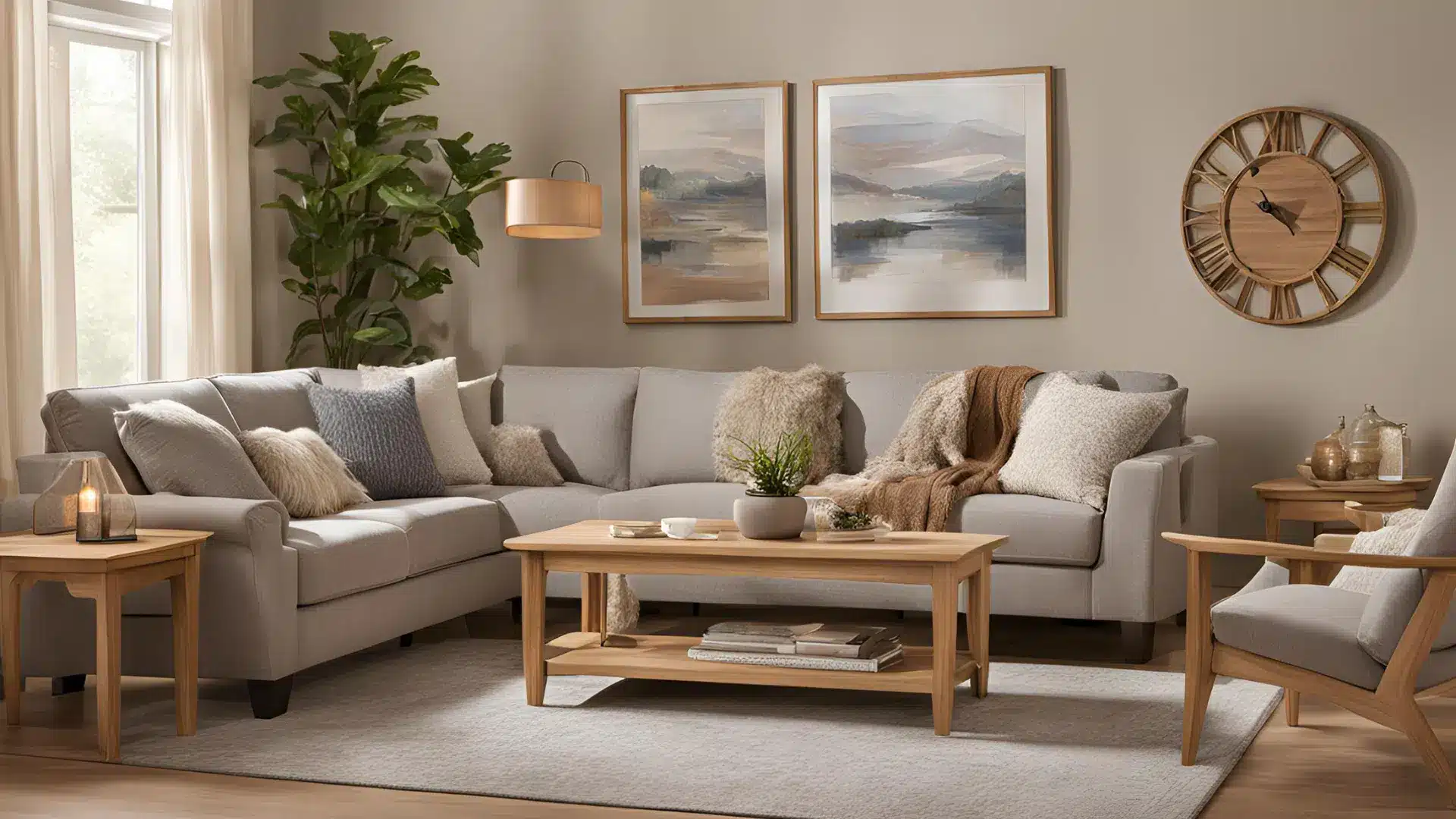
It creates a welcoming atmosphere that makes guests feel at home instantly. The color’s warmth works particularly well with natural fabrics and wooden furniture.
2. Bedrooms
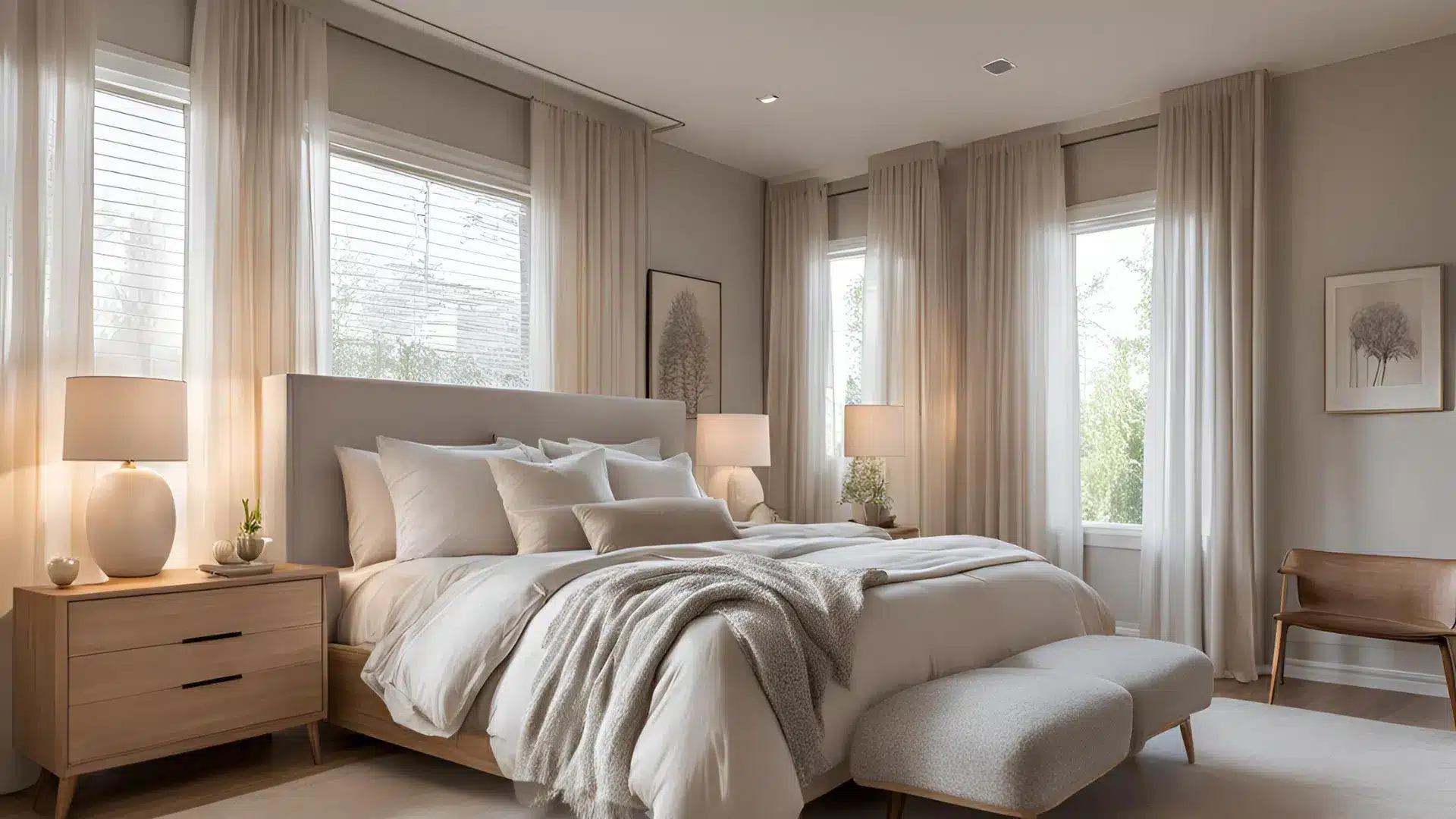
The gentle warmth of SW Accessible Beige makes bedrooms feel cozy without being too dark. It’s subtle enough to let your bedding and decor stand out while providing a soothing backdrop.
3. Bathrooms
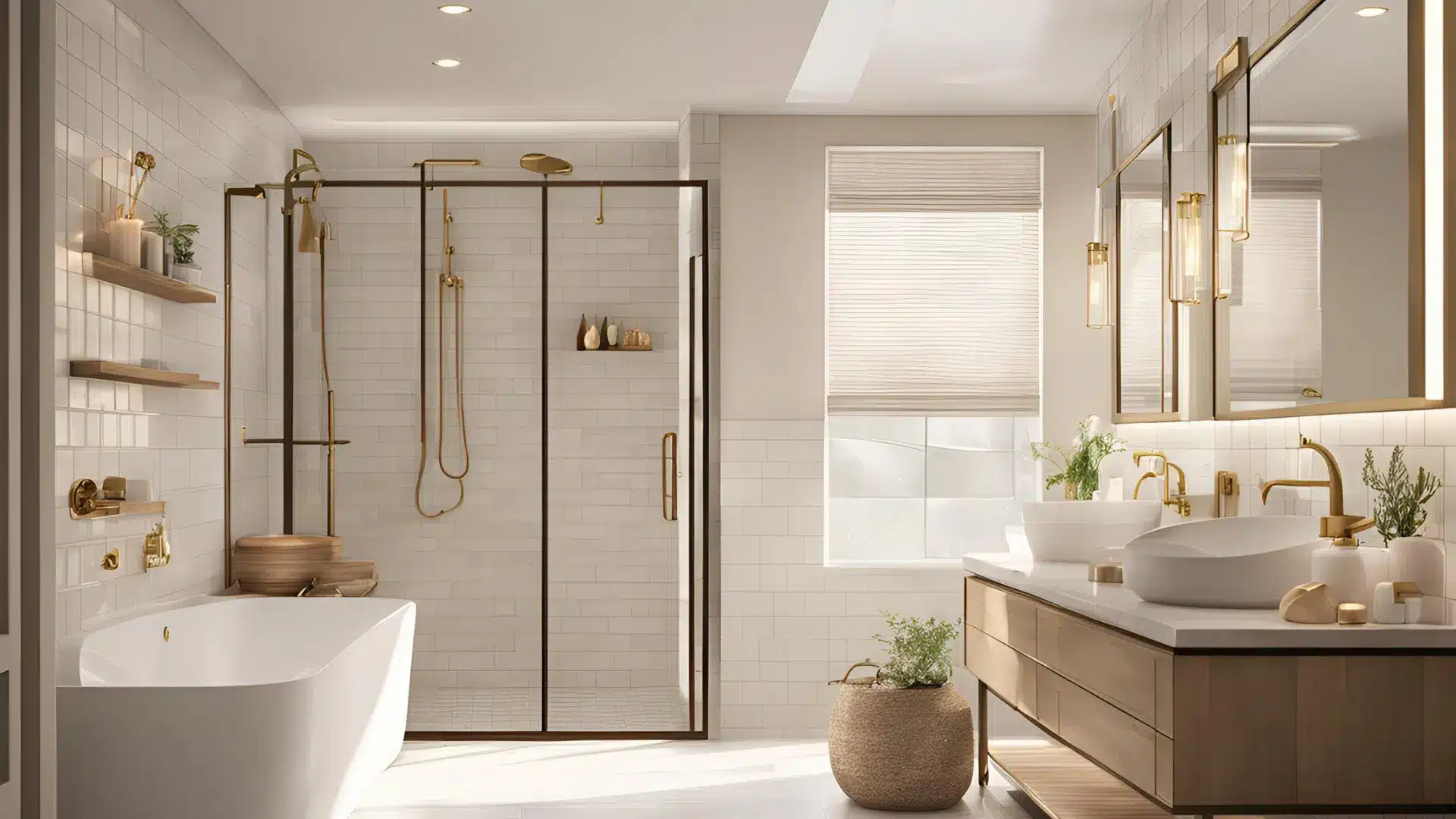
This shade pairs beautifully with natural stone tiles and beige-toned fixtures in any bathroom. It adds just enough warmth to make the space feel less clinical.
4. Kitchens
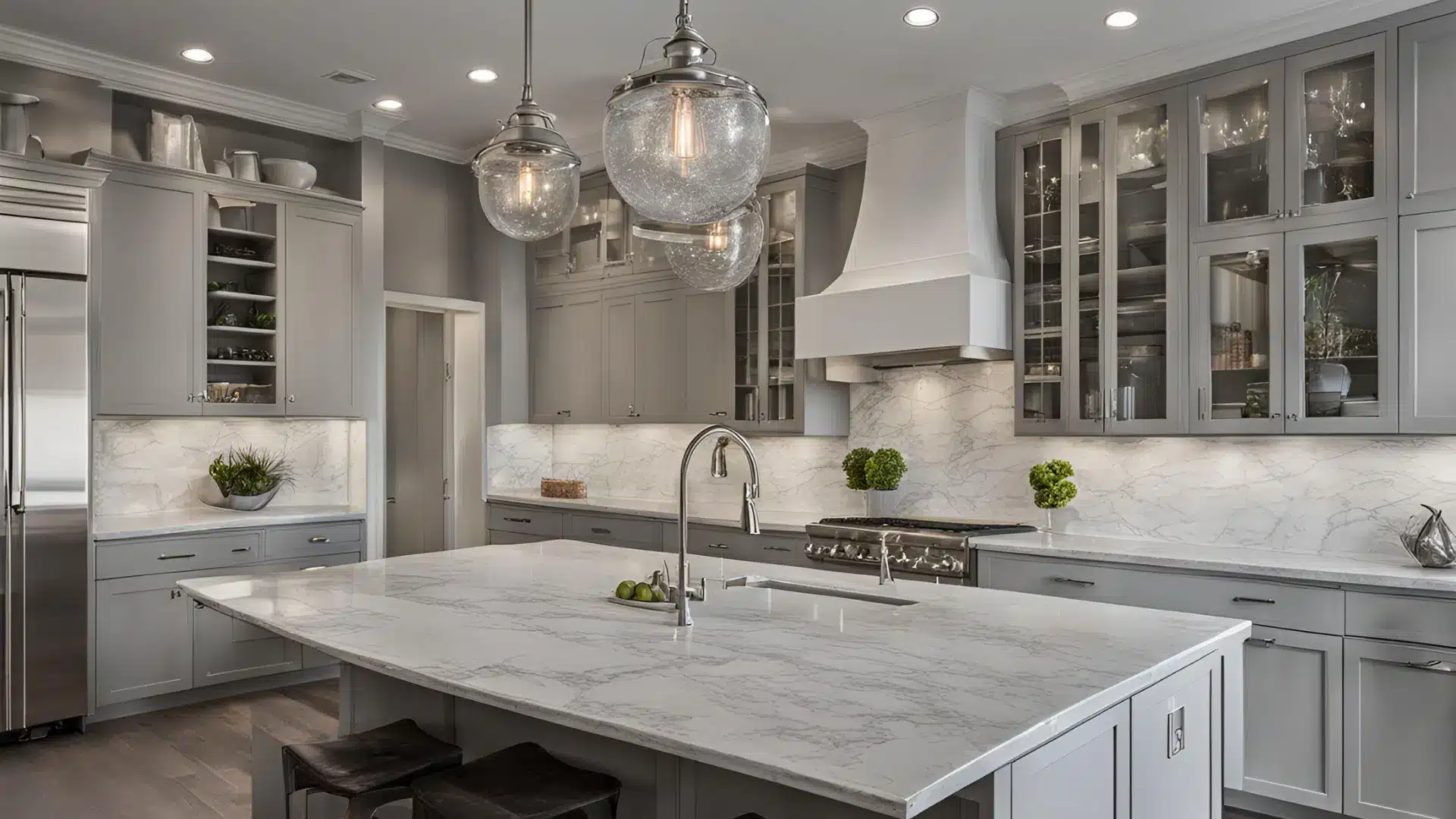
Especially good if your kitchen has
- Wood cabinets (it brings out their natural beauty)
- Brass or copper hardware
- Warm-toned countertops
Ideal Spaces for Agreeable Gray
1. Open Floor Plans
It flows smoothly from one area to another, creating a cohesive look throughout your home. The color stays consistent as lighting changes across different spaces.
2. Dining Areas
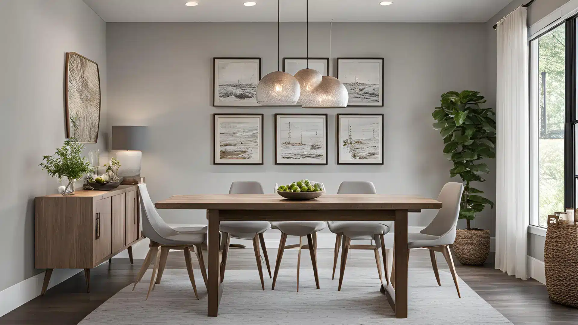
Creates a fresh, clean backdrop that makes every meal feel special. It works well with both modern and traditional dining furniture.
3. Hallways & Entryways
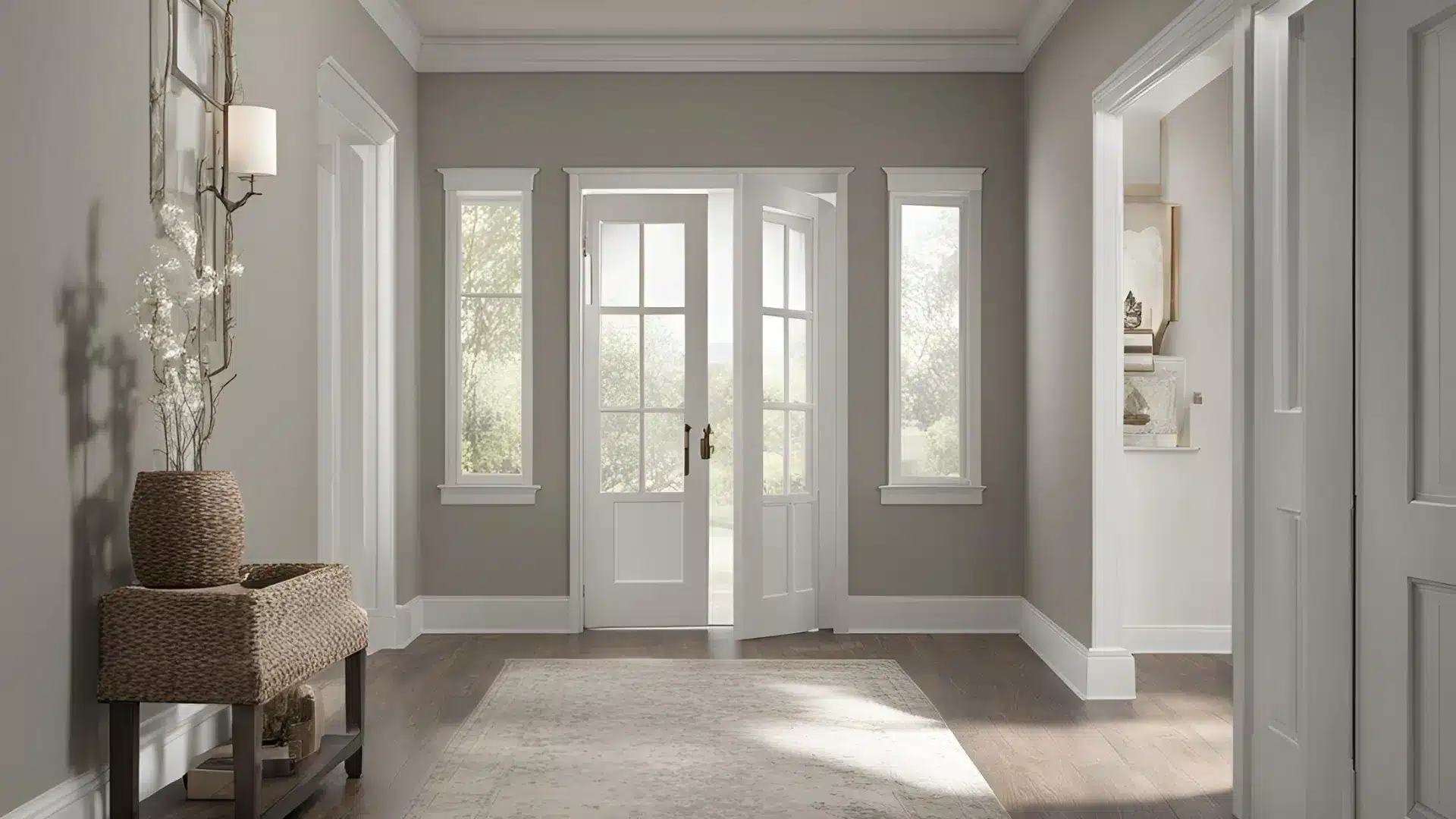
Keeps these transitional spaces feeling open and airy. The color reflects available light well, making narrow spaces appear larger.
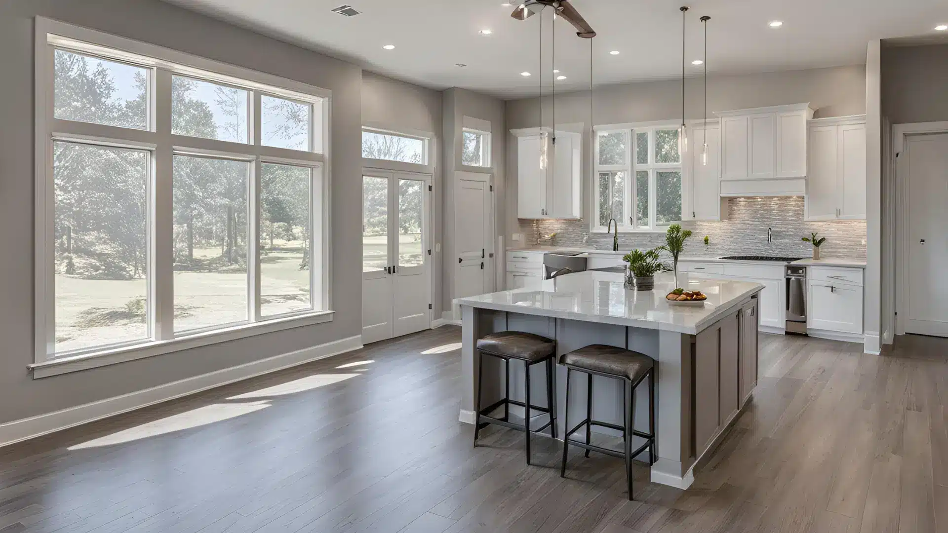
4. Kitchens

Perfect match for:
- White or light-colored cabinets
- Marble or quartz countertops
- Silver or chrome fixtures
Both colors are incredibly versatile, but knowing their strengths helps you make the most of their unique qualities in different spaces.
Creating Perfect Color Combinations
Let me help you pick the right supporting colors to get the most out of your paint choice.
Trim and Ceiling Combinations
| Paint Color | Recommended Trim & Ceiling Colors | Key Benefits |
|---|---|---|
| Accessible Beige (SW 7036) | Pure White (SW 7005) | Clean, subtle contrast Keeps the space bright. Works well in any room |
| Alabaster (SW 7008) | Gentle transition Adds depth without stark contrast, Creating a flowing look. | |
| Agreeable Gray (SW 7029) | Extra White (SW 7006) | Enhances architectural details, Makes the wall color pop, Perfect for contemporary spaces |
| Snowbound (SW 7004) | Creates harmony between surfaces Maintains a cohesive look Ideal for open floor plans |
Building Your Color Scheme
| Category | Accessible Beige (SW 7036) Combinations | Agreeable Gray (SW 7029) Combinations |
|---|---|---|
| Whites / Light Neutrals | Greek Villa (SW 7551) Aesthetic White (SW 7035) | Incredible White (SW 7028) Coral Rose (SW 9004) |
| Rich / Deep Accents | Urban Bronze (SW 7048) Naval (SW 6244) | Brainstorm Bronze (SW 7033) Riverway (SW 6222) |
| Soft Blues / Coordinating Grays | Sea Salt (SW 6204) Top Sail (SW 6217) | Dovetail Gray (SW 7016) Oyster Bay (SW 6206) |
Accessible Beige vs Agreeable Gray: Common Mistakes to Avoid
Let me help you sidestep some frequent issues people run into with these colors. Getting it right the first time saves time, money, and frustration.
Watch Out With Accessible Beige
Poor Lighting Situations
In rooms that don’t get much sunlight, Sherwin-Williams Accessible Beige might
- Make the space feel smaller than it is
- Look flat or lifeless
- Create shadows in corners
Pro Tip: If you love this color but have lighting challenges, consider using it on an accent wall or in combination with strategic lighting fixtures.
Style Mismatches
Skip this beige paint if
- Your furniture is ultra-modern
- You’re going for a minimalist look
- Your space needs to feel bright and airy
Be Careful With Agreeable Gray
Tricky Room Orientations
North-facing rooms can be problematic because:
- The color might read too cool
- The space could feel less welcoming
- Shadows become more pronounced
Design Conflicts
Avoid this gray Sherwin Williams color when:
- Your furniture features lots of warm woods
- You have terracotta or earth-toned tiles
- Your decor includes many golden or copper elements
Quick Fix: If you’re committed to using either color in a challenging space, add extra lighting or use mirrors to bounce more light around the room. This can help maintain the color’s true character even in less-than-ideal conditions.
Remember: Paint colors should complement your existing elements, not fight against them. Testing samples in your specific space is always worth the extra effort.
Beige Versus Gray: Making Your Final Decision
When comparing these popular paint comparisons, many designers recommend considering your lifestyle and the overall feel you want for your home. Beige Sherwin Williams options like SW Accessible tend to create warmth, while gray alternatives offer contemporary appeal. Whether you’re painting an exterior or focusing on interior spaces, these paint comparisons require careful thought about your existing decor and natural light exposure.
Conclusion
Choosing between Accessible Beige and Agreeable Gray doesn’t have to be complicated. Both colors stand out for their ability to transform spaces while maintaining a timeless appeal.
Your best choice depends on your needs – Accessible Beige excels in creating warm, welcoming spaces that feel naturally cozy, while Agreeable Gray offers a fresh, adaptable option that works beautifully in contemporary settings.
Test samples in your space, observe how they change throughout the day, and consider your existing decor.
Remember, either color can serve as an excellent whole-house option, but the right choice is the one that makes your space feel exactly how you want it to feel.
Trust your judgment and pick the shade that resonates most with your vision for your home.