A calm and serene environment is usually the first preference in mind when it comes to the feeling your new paint color should impart to your home. After all, peace, comfort, and a sense of belonging are what differentiates a “home” from a “house.” No wonder “Calm – Benjamin Moore” may just be the perfect paint color that can make your house feel like the home you have always craved for. Just as the name suggests, this color calms and soothes your vision. However, this beautiful color is not as simple and straightforward as the name suggests.
Witness a play of a range of colors in Calm by Benjamin Moore, as it holds an intriguing depth in itself. Before you choose or reject this color, go through this article to learn about it and then decide for yourself if it will fit or be a misfit for your house. And before we proceed further with a detailed review of OC-22 Calm – Benjamin Moore, here’s an interesting fact for you: It’s more than just a simple shade of white!
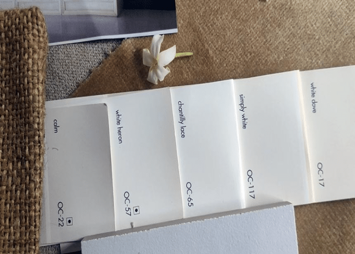
Calm Benjamin Moore OC-22: Shades and Undertones
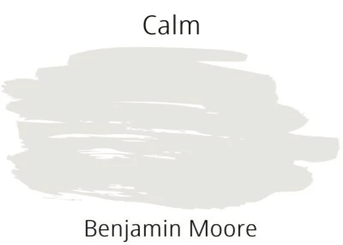
Here comes the mystery reveal we know you all were waiting for! So, judging by the looks of it (which aren’t always real in pictures, hence, we always recommend using paint swatches to check the actual tone on your wall before you paint them), Calm OC-22 may look like the usual off-white color. However, as surprising as it may seem, Calm by Benjamin Moore actually has a plethora of shades and undertones that present a stark difference when used in different walls and rooms!
So what is the hype about the color play in Calm? Well, despite the name suggesting it to be a “cool” color, this color is actually towards a neutral-warm shade of the color temperature wheel. With a gray undertone as the background color, it subtly hides a tinge of brown, contrasting with a lavender shade that may become prominent on some walls and muted on others. Hence, the color OC-22 Calm Benjamin Moore shows up as a unique color by presenting different shades in different spaces.
The Technical Aspects of Calm Benjamin Moore
Coming to the technical aspects of OC-22 Calm Benjamin Moore to help you understand better the complexity of this distinctive color, here are the highlights of the color quality.
Light Reflective Value
This indicates the light-reflecting capacity of a color. It ranges between 0 and 100. The higher it goes, the greater concentration of light it reflects off. That is, the higher the LRV, the lighter the color, and the more well-lit the space is.
The light reflective value of Calm by Benjamin Moore is 75.83. Hence, it lightens up any space that it is used on.
RGB Value
This indicates the proportion of red (R), green (G), and Blue (B) pigments in the color. It helps determine whether the color is warm or cool (with warmer colors having a higher percentage of reds and yellows in them and cool colors having a higher percentage of greens and blues).
Calm Benjamin Moore, being a somewhat neutral color, has close proportions of red, green, and blue, that is, 229, 226, and 220, respectively.
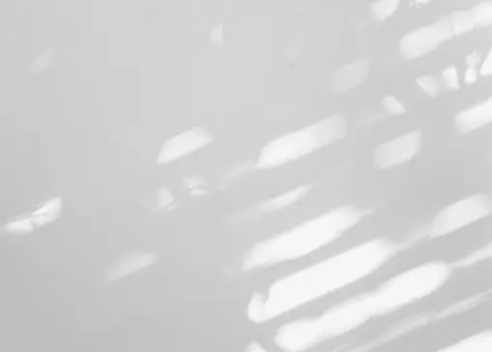
The Effect of Light on OC-22 Calm Benjamin Moore
As for any color, light (natural and artificial) plays a vital role in determining the actual tone. Similarly, for Calm by Benjamin Moore, it is the amount of light in a space that determines how the color will span out to be. This alone can alter the look and even the visible size of your room. Hence, it is important to understand the effect of light on this color.
1. North Facing Rooms
For North facing rooms that receive comparatively low natural light, the cool gray undertone dominates, giving it the typical off-white shade, making it appear to be a cool color. However, the room does not look smaller as it usually does with other cool colors. Instead, Calm Benjamin Moore enhances the visual appearance of a room in terms of its size owing to its inherent warm shade. Thus, we wouldn’t discourage you from using the color in North facing rooms but advise you to do a paint sample test to check if it suits your taste.
2. South and West Facing Rooms
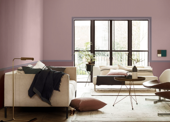
For South and West-facing rooms having ample sunlight, the purplish shade reveals itself. This adds to the warmth of the color, thus making the room look bigger and brighter. In fact, when you paint the walls of a South or West facing room, you would be left confused about how an apparently off-white shade could turn almost pink if you didn’t know this fact! No wonder Calm Benjamin Moore is nicknamed the chameleon of colors!
3. East Facing Rooms
When put on walls of East facing rooms, Calm Benjamin Moore gives off an interesting shade by expressing a brown tinge in its shade. This becomes more prominent during the afternoon, making it look cozy and vibrant.
You can, of course, alter the shade of the color with the help of artificial lights as well. If you want the purplish-pink undertone to predominate for a warm variant, use pendant lights and ceiling lights in the room where you want to paint the walls using OC-22 Calm Benjamin Moore.
Painting Different Spaces Using OC-22 Calm by Benjamin Moore
Here’s a detailed review of OC-22 Calm Benjamin Moore for using it to light up different rooms in your house and the exteriors.
1. Bedrooms
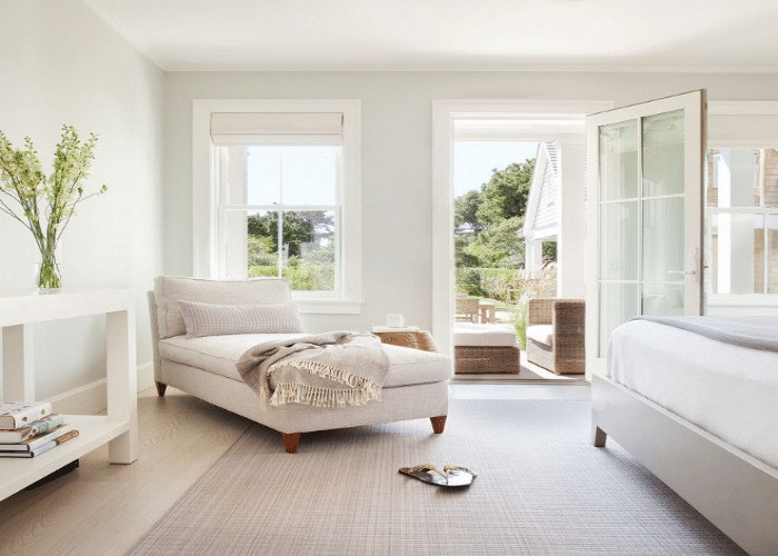
Using OC-22 for painting bedroom walls is a great idea, especially if they are South or West-facing. With bedrooms, you would generally want a hint of cozy and bright – an inviting and cheerful color that speaks interesting and quirky. Calm does exactly that and more. With ample lighting, remarkably the afternoon western light, the lavender pink undertone is revealed, which gives a whole new dimension to the color. Neither too warm nor neutral, you can use this color in the bedrooms of adults, children, and even teenagers. Use artificial lights to suffice for the absence of sunlight in the evening and for North facing rooms.
You can also opt for this paint color if you want your bedroom to look and feel calm. Tweak the lighting quotient to get the color temperature that you want.
For a knock-off decor, use brightly-colored bed sheets to match the vibe of Calm by Benjamin Moore. Hang black or multi-colored wall hangings to accentuate the color and your personal aesthetic style.
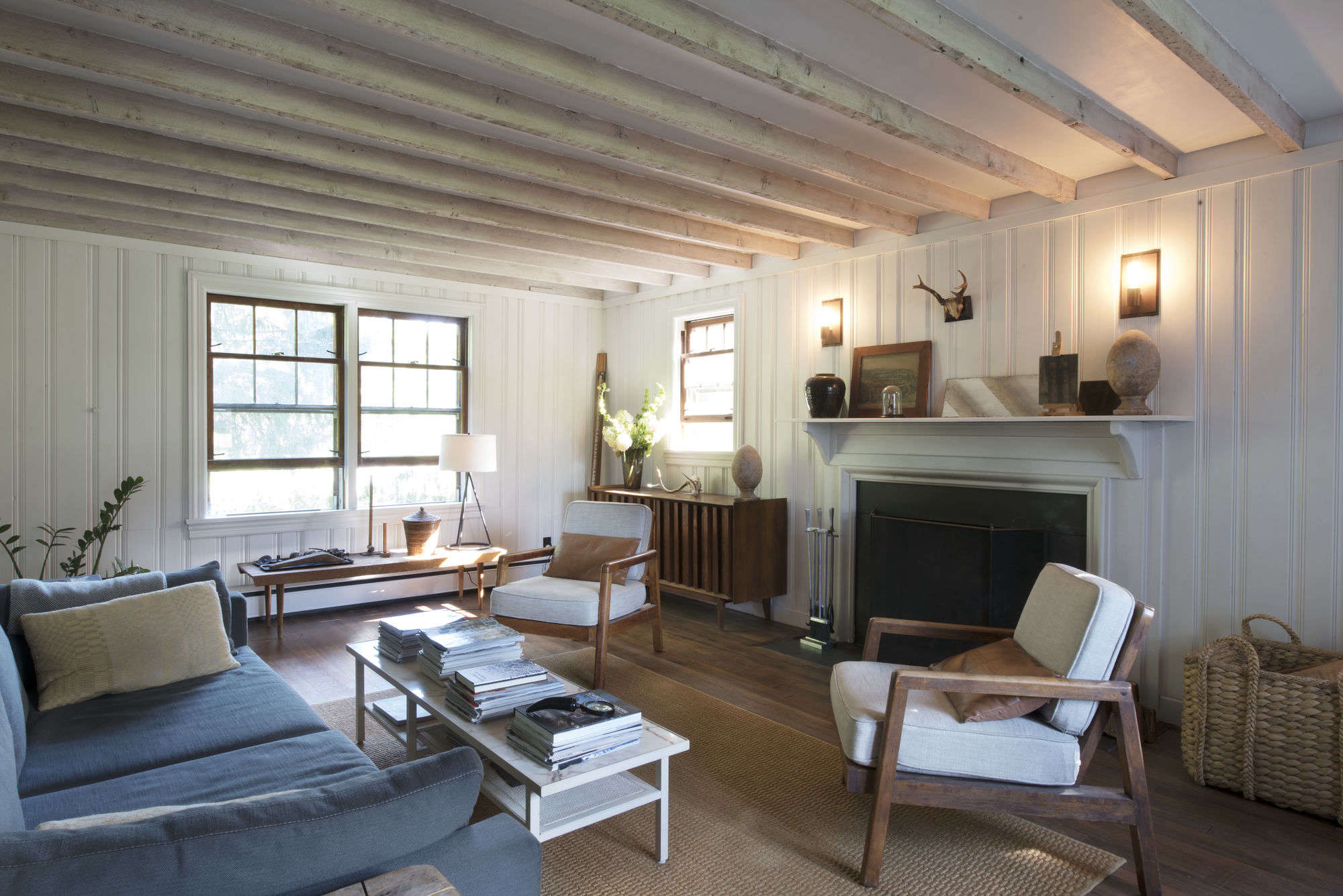
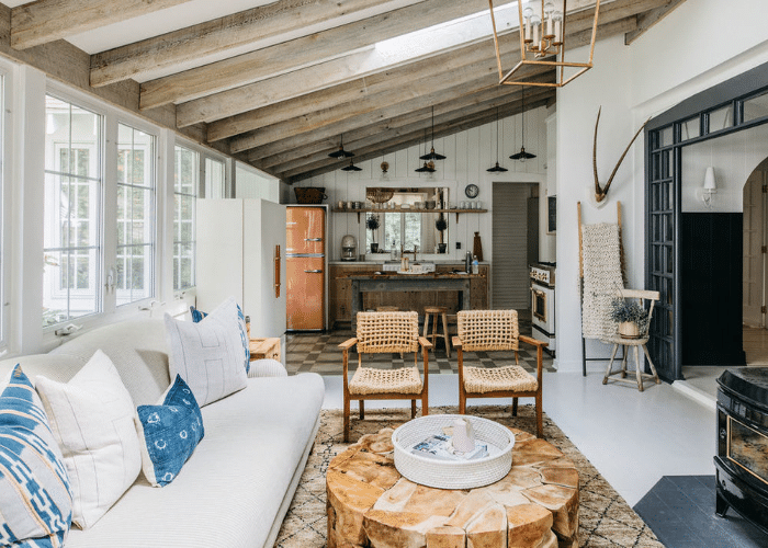
2. Living Rooms
Want a living room style that becomes THE FOCAL POINT of your home? The one that guests find mesmerizing and sophisticated? We bet the OC-22 Calm Benjamin Moore can help you achieve your dream. Of course, you have to check the placement, the lighting, and the suitability of the color with respect to these aspects.
As mentioned earlier that the color has a myriad of undertones; you can paint your living room walls to highlight the play of colors throughout the day. Not only will it serve as an elegant view of attraction, but it will also highlight your taste in home interiors. You can use it on East facing walls that will portray a brown tinge or on walls that will bring out the pinkish-purple shade subtly. Highlight the undertone that complements your furniture color.
You can also use Calm by Benjamin Moore to highlight an accent wall of darker color in the living room.
If you use it in a way that focuses on the cool gray shade of the color, voila, you’ve cracked the cheat sheet of how to visually amplify your living room space if it is not really spacious and airy!
3. Bathrooms
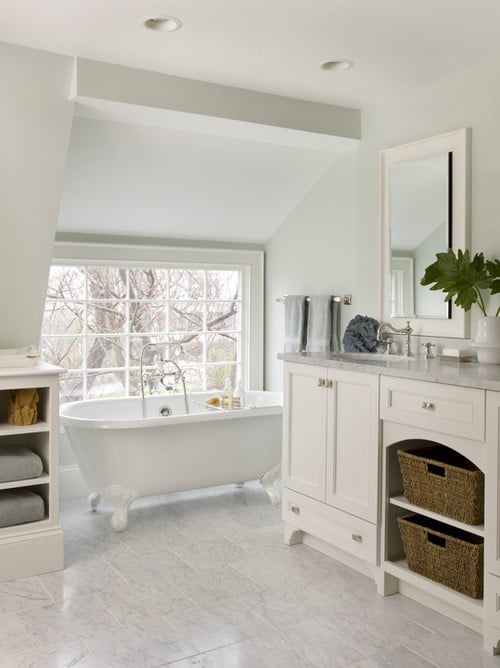
An excellent choice for painting the bathroom, the insinuating gray color imparts grace to the walls. It brings out a relaxing atmosphere in the bathroom, with the off-white shade being perfect for a space that feels better without being flashy. Calm Benjamin Moore, if used in North-facing or dimly lit bathrooms, provides the perfect muted ambiance that one usually prefers when unwinding after a long day. Even with undertones, it never overwhelms the space. For optimizing your bathroom decor, use floor mats of a contrasting or complementary color.
Minimalism is the key to bringing out the best in your bathroom space exclusively for guests, and Calm Benjamin Moore helps you do that without being right in your face! It speaks of elegance very delicately. Decorate your bathroom with long or round mirrors and plants in small glasses or mason jars, as shown in the picture, to maximize the effect of this enigma of color. Create a tranquil retreat in the bathroom with the help of OC-22 Calm Benjamin Moore.
4. Kitchens
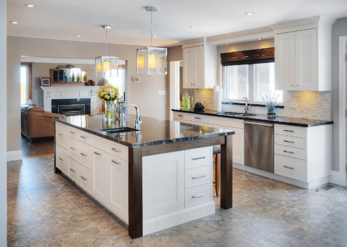
The kitchen deserves all the hype, and for the right reasons. No wonder it is the space you need to put out your paint and art to maximum use. Using Calm Benjamin Moore for painting the kitchen walls is a great idea, provided you can utilize the different layers of the color to the maximum. Matching countertops add to the beautification process of the kitchen.
If you are not too sure about using it in the kitchen because of your varied personal preference, we recommend giving this color a try by painting your kitchen tile backsplash using this color. It gives off the perfect calmness to your kitchen tile backsplash that helps your kitchen walls to draw attention towards themselves. Thus, for a muted, sophisticated affair in your kitchen, Calm by Benjamin Moore can be the perfect addition if paired with the right level of lighting.
And the best part about using this paint color in the kitchen is the versatility it offers. Neither absolutely plain nor too extravagant – exactly what makes it perfect for a sacred space like the kitchen.
5. Exterior
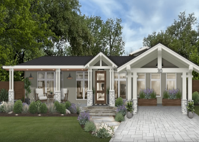
An absolute enigma of color with its brown tinge in a gray background added to a lavender-pink undertone, Calm Benjamin Moore is a smart choice for the exteriors. Providing a serene facade for houses of contemporary styles and for other forms of architecture (Tudor, Gothic, Greek, Federal, etc.), this color is a brilliant choice for painting the exteriors. Yes. It may change color throughout the day, depending upon the percentage of light it receives, and trust us; it is a good thing. Even though the purplish pink undertone predominates when exposed to direct sunlight, it never gets gloomy or pretentious. OC-22 Calm Benjamin Moore always retains a taste of grace in its persona, irrespective of the undertone it manifests at a given time.
During the early morning and afternoon, when the Sun shines a little less bright, the gray tone shows up with renewed vigor, radiating a classic vibe to the house. You can paint the awnings and brackets with matching colors like Nightingale (AF-670), Newburyport Blue (HC-155), or Porcelain (2113-60). You can also paint the exteriors a White Opulence (OC-69) or an American White (2112-70) while painting the brackets using Calm Benjamin Moore.
6. Office Spaces
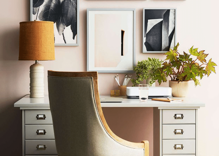
Calm Benjamin Moore provides the absolute nonchalant look to an office space – just what you would expect in a professional setting. When the gray background takes over, this color gives one of the best formal appearances without compromising on aesthetics. Despite the professionalism, however, lies its distinct property of adaptability. This ensures a bold vibe without the office walls looking dull.
But once again, ensure checking out paint samples in the daylight for their positioning and the shade they would radiate. You don’t want the gray to take a backseat in your office space, with the shade of lavender ravaging the entire corporate appearance.
While most veteran entrepreneurs would swear by this color for use in the office, a few may not be willing to use Calm Benjamin Moore for the strict disciplinarian vibe it can exude with ample light. In that case, painting your conference rooms or other meeting halls using the BM OC-22 would be witness to a refined taste in office decor.
Pairing Calm Benjamin Moore
As important as it is to get the right primary shade, it is equally crucial to get the perfect colors to pair with it. How else would you get to experience the innate essence of the color?
To make it easier for you, here’s a guide to using the coordinating colors that pair best with OC-22 Calm Benjamin Moore. These colors not only complement Calm but allow you to fully absorb the finesse of this fascinating color with a plethora of scrupulous yet subtle undertones.
1. BM Calm and BM White Dove
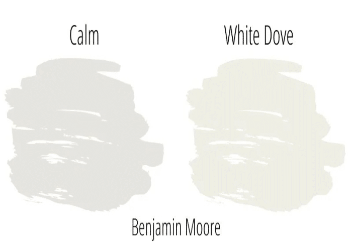
White Dove Benjamin Moore when used as the trim color along with Calm Benjamin Moore as the wall color makes for a breezy and elegant monochromatic color palette. Try out this combination for your workplace, yoga studio, bathroom, or even the exterior (including the front door). Both colors visualize peace and exude a soothing charm.
2. BM Calm and BM Porcelain
Try out this combination for a bold and vibrant experience. Enriched with just the right concoction of hues of lavender and pink, Calm Benjamin Moore in conjunction with Porcelain Benjamin Moore livens up a space. We recommend using this pair for brightening up living rooms, bedrooms, and kitchens.
3. BM Calm and BM Starry Night Blue
Need the right touch of drama for your accent wall? Try pairing Calm Benjamin Moore with Starry Night Blue by Benjamin Moore. Use the latter for highlighting the accent wall and watch Calm tactfully taking a backseat to highlight the display wall by focusing the attention of observers on them.
Benjamin Moore Calm vs. Other Similar Colors
1. Calm Benjamin Moore (OC-22) vs. Classic Gray Benjamin Moore (OC-23)
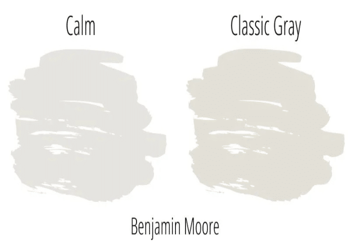
With a slightly lower LRV of 73.67, the Benjamin Moore Classic Gray is a tad bit darker shade than Calm. Owing to its prominent gray undertone, Classic Gray presents a somber tone in dimly lit spaces. This, however, is not the case for Calm which presents a toned-down combination of purple and pink when light exposure is low. These colors can be used in coordination to give a hint of zest and a strong personality both in moderation.
2. Calm Benjamin Moore (OC-22) vs. Pale Oak Benjamin Moore (OC-20)
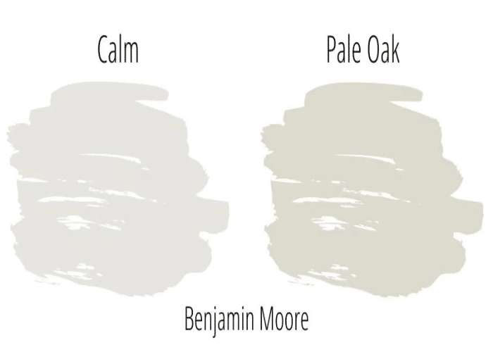
Being inclined towards the warmer neutral color palette, Pale Oak Benjamin Moore brings to the surface a warm gray undertone. It has an LRV of 68.64, thus giving off a subdued shade to the room. It enhances the space of a room as effectively as Calm Benjamin Moore. While Calm leans towards a warm neutral color palette owing to its lavender undertone, Pale Oak by Benjamin Moore is a cool color, with its gray background being the highlight.
3. Calm Benjamin Moore (OC-22) vs. Silver Satin Benjamin Moore (OC-26)
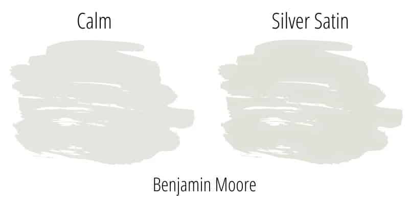
The closest color to Calm Benjamin Moore, Silver Satin OC-26, has an LRV of 74.9. This means it leans towards a warmer shade, though not as warm as Calm. Lavender gray, with a sleek shade of white, describes OC-26 perfectly, in contrast to the predominating lavender gray over a soothing shade of white. Although similar in shades, these two colors bring out different aspects of highlight when used.
The Takeaway
Calm Benjamin Moore is a pretty interesting color with various layers of undertones. You can imagine it to be an onion where the different undertones represent the layers of peels. It depends upon the light setting for one shade to express itself in the eyes of the beholder. Often misrepresented and misinterpreted, Calm Benjamin Moore may come off as a concealing color that does not reveal its true shades until it is already painted on the walls, and there’s no turning back.
This is not true. The only caveat of this color, as mentioned earlier, is the immense significance of light upon it. We hope this article will help clear up some wrong notions about this color as you now know the different shades of the color, and it is far from a simple beige, a simple white, or a simple gray. Instead, it is a most bewildering color, and in a good way. A review of the color pretty well explains the why and the how. Feeling confident enough to try it out? We’d love to hear from you in the comments section how you used this paint color and where you used it.
Frequently Asked Questions
Is Benjamin Moore Calm a Warm or a Cool Color?
Calm Benjamin Moore is pretty much a neutral color, inclined towards a warmer shade. This owes to the subtle combination of pink and purple in perfect balance with the gray background.
Does Benjamin Moore Calm Look Blue?
Absolutely not. The only shades that express themselves in Calm Benjamin Moore in ample light is a tinge of purplish-pink on a gray backdrop. There is no hint of a blue undertone either in dim light or sufficient natural or artificial light.
Which Colors Matches Benjamin Moore Calm the Best?
Neutral whites or beiges match well with Calm Benjamin Moore. Closer shades of cool grays, like the Classic Gray OC-23, also pair pretty well with the color. For curating a bold statement, accent it with Newburyport Blue HC-155.
