
If you’ve ever said, “I just want a simple sage green,” Benjamin Moore would like a word. Actually… they’d like sixteen words. Because apparently sage green is not a color, it’s a whole personality spectrum.
And yes, every single one of these shades can look cute on a swatch and then turn into something deeply suspicious once it hits your walls. (Paint is the flakiest relationship I’ve ever been in, and I’ve had bangs.)
So let’s talk through the Benjamin Moore sage greens people actually use—what they lean toward (warm vs. cool), what kind of rooms they behave in, and how to test them so you don’t end up living with “baby food at dusk” for the next five years.
First: Why “Sage Green” Is So Annoying to Pick
“Sage” usually means a muted green that’s been calmed down with gray, yellow, or brown. Not a bright, happy Shamrock Shake green. More like “cozy sweatshirt” green.
The two things that make sages act like total drama queens:
- Undertones: Warm sages lean olive/yellow. Cool sages lean gray/blue. Put them side by side and it becomes painfully obvious.
- Light (aka the main character): A sage that looks perfect in a sunny south facing room can look like swamp fog in a dim north facing one.
And then there’s LRV (Light Reflectance Value), which is basically how much light the color bounces back:
- LRV 45-60: lighter, airier sages (great when you’re scared of color but trying to grow)
- LRV 30-45: mid tone sages (the sweet spot—reads like a real color without taking over your life)
- Below 30: deep sages (moody, cozy, dramatic… and potentially cave-y if you’re not careful)
Sage Wisdom: The “Perfect Middle Child” Everyone Talks About
Benjamin Moore Sage Wisdom is popular because it’s that rare middle ground sage and a timeless choice for interiors: not too yellow, not too gray, not too loud. It’s got an LRV around 50-ish, so it behaves in a lot of rooms.
It’s basically the “goes with everything” jeans of sage greens.
BUT. And this is a big but (I cannot lie): in the wrong space, that balanced vibe can read a little… meh. If you’ve got warm oak floors or honey cabinets, you might want a sage that leans warmer so it plays nice instead of quietly clashing.
So don’t ask, “Is Sage Wisdom good?” Ask, “Is Sage Wisdom good in my house with my weird lighting and my aggressively warm hardwoods?”
How to Test Sage Greens Without Losing Your Mind
Here’s how I test paint now, after learning the hard way (RIP to the “soft green” that turned minty at night and made my living room feel like a dental office):
- Paint two big samples (at least 12×12, bigger if you can).
- Put one by a window and one on an interior wall.
- Look at them morning/day/evening AND under lamps.
- Hold up white printer paper next to the sample. It’ll snitch on the undertones immediately.
- Live with it for 48 hours. Do not decide at 9 p.m. under one sad lamp.
Quick and dirty lighting help:
- North facing: cool light all day → warm sages usually feel better.
- South facing: warm light → cool sages often look more balanced.
- East facing: bright mornings, cooler later → test, test, test.
- West facing: calmer mornings, golden afternoons → colors can get richer (or weirder) late day.
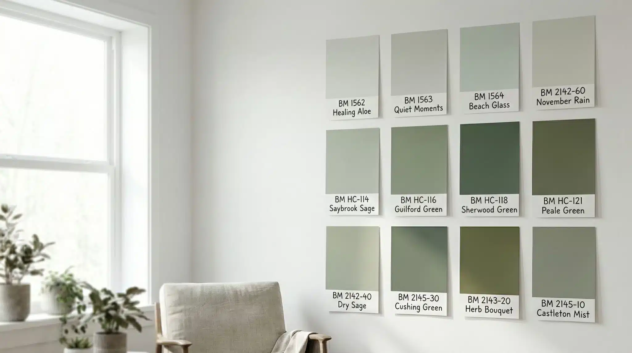
The 16 Benjamin Moore Sage Greens (Grouped Like a Normal Person Would)
I’m not going to make you read sixteen identical descriptions like “soft and calming” (because what does that even mean?). Instead, here are the shades grouped by vibe, with my honest take on where they shine.
Light Sages (aka “Not White, But Make It Interesting”)
October Mist (1495)
LRV: 56
This one is cooler leaning and a little grayed out—in a good way. It reads like a soft neutral with a green whisper. If you want “clean and airy” more than “green room,” start here.
Sage Tint (458)
Warm, gentle sage that tends to play nicer with warm woods. If you’ve got honey oak and everything looks icy or gray green, this one can be a lifesaver.
Silver Sage (506)
Cool/neutral and more gray than green. Gorgeous in bright rooms, but if your space is dim, it can feel washed out (like the color took a nap and never woke up).
Mid Tone Sages (Most People’s “Yes, That’s Sage” Zone)
Saybrook Sage (HC-114)
LRV: around 42
Warm muted, versatile, and honestly one of the easiest “real sage” picks. Great on walls, cabinets, exteriors—this one earns its keep.
Hollingsworth Green (HC-141)
Cooler and calmer—more gray than Saybrook. If you want sage that feels a little more refined and a little less “country craft store,” this is your guy.
Gloucester Sage (HC-100)
Warm olive leaning sage that can go a bit Tuscan in bright light. If you love earthy stone, terracotta, warm metals… this one can be delicious.
Deep Sages (Moody, Cozy, and One Candle Away From a Period Drama)
High Park (467)
LRV: around 24
A deeper sage that’s still muted and grounded. I love this for cabinets, doors, shutters, and accent walls when you want depth without going full black green.
Sherwood Green (HC-118)
Classic, heavier, “forest meets sage.” Powder rooms and libraries eat this up. In a dark room, it will get very cozy very fast—like walls closing in cozy.
Cedar Mountains (706)
Deep olive leaning sage. Earthy and enclosed feeling (in a good way) if you’re going for snug and grounded.
Night Train (1567)
Very deep green that can stop reading “sage” in low light. In a bright room it’s stunning; in a dim room it can go full cave. Proceed with daylight and confidence.
Warm/Olive Sages (For Wood Tones, Brass, and People Who Hate Gray Green)
Texas Sage (1515)
Warm yellow olive sage. If everything else looks too gray in your house, try this. It’s basically sage with a little sunshine in its pockets.
Hillside Green (495)
Dusty, muted, rustic in a good way. Looks especially right with linen, aged leather, and weathered wood.
Louisburg Green (HC-113)
A fresher sage that’s closer to true green (with a bit more blue). If you want calm green without the muddiness, this is a solid contender.
Oil Cloth (CSP-760)
Muted gray green that feels more contemporary and “tailored.” Love it with black accents and clean lines.
Fieldstone (1558)
Quiet, subdued, grayer sage. Perfect when you want your art/furniture to be the main character and your walls to be the supportive friend who brings snacks.
North Shore Green (456)
A clearer green read—less gray than many sages. If you’re afraid sage will look too neutral, this nudges you back toward “yes, this is green.”
What to Try If Sage Wisdom Isn’t “The One”
Paint heartbreak is real. If Sage Wisdom doesn’t work, it’s usually for one of these reasons:
- Feels too gray: try Saybrook Sage, Texas Sage, or Gloucester Sage (more warmth).
- Feels too yellow: try October Mist, Hollingsworth Green, or Silver Sage (cooler, calmer).
- Feels too light: try High Park or Sherwood Green (deeper, moodier).
- Feels too dark: try October Mist or Sage Tint (lighter, softer).
My “Pick This Sage For This Room” Cheat Sheet
Because sometimes you don’t need a dissertation, you need a nudge:
- Barely there sage / “not white” walls: October Mist
- Safe, warm, classic sage for most rooms: Saybrook Sage
- Cooler, more refined sage: Hollingsworth Green
- Dramatic accent wall or cabinet moment: High Park
- Exterior shutters/doors with presence: High Park or Sherwood Green
(And yes, you still have to test. I don’t make the rules. Paint does.)
How to Style Sage Without Making It Weird
Trim + Wood Tones: The Part People Skip (and Then Regret)
Sage is easygoing, but it still has preferences.
- Cool sages tend to look best with crisp whites (think Chantilly Lace or Simply White).
- Warm sages usually want creamier whites (like White Dove or Navajo White).
Mix a cool sage with a super creamy trim (or a warm sage with a stark white) and it can feel subtly “off.” Like when your socks keep sliding down inside your shoe and you can’t focus on anything else.
Wood tones follow the same logic:
- warm woods (oak, walnut, anything honey toned) → warm/olive sages
- cooler finishes (gray washed wood, crisp painted cabinetry) → cooler sages
Accent Colors That Look So Good With Sage
Sage is a team player. I love it with:
- rust and terracotta (warm and earthy)
- blush (soft and pretty without being precious)
- navy (classic contrast)
- mustard (if you like a little spice)
- soft black (modern and grounding)
If you want a no brainer formula: pick your sage, then choose one warm accent and one cool accent. It almost always looks intentional—like you had a plan, even if you absolutely did not.
Couple Quick FAQs (Because You’re Not the Only One Wondering)
What’s Benjamin Moore’s most popular sage?
October Mist got the spotlight as Color of the Year, but Saybrook Sage shows up constantly in real homes because it reads clearly as sage and plays well with a lot of finishes.
October Mist vs. Sage Wisdom?
October Mist is lighter and cooler—more “neutral with a green tint.” Sage Wisdom reads warmer and more obviously green. If you want a whisper, go October Mist. If you want “yes, my walls are sage,” go Sage Wisdom or a mid tone like Saybrook.
Best sage for cabinets?
Saybrook Sage (lighter, classic) and High Park (deeper, moodier) are both great. Cabinets are a commitment—sample like your happiness depends on it.
Is sage green a neutral?
It behaves like one because it pairs with a ton of things and has staying power in decor. But it still brings more personality than beige or gray. Neutral energy… with charm.
Ready to Pick Your Sage?
Here’s your game plan (because staring at sixteen greens will melt your brain):
1) Figure out your room’s light (north/south/east/west).
2) Pick 2-3 sage contenders based on warm vs. cool and how bold you want to go.
3) Sample them properly—two walls, different times of day, 48 hours minimum.
Somewhere between “morning coffee light” and “evening lamps + existential dread,” the right sage will reveal itself. Paint the squares, live with them, and let the winner pick you.