
The LRV Secret That Makes Paint Colors Actually Work (and Saves You From Repainting Rage)
You know that moment when you bring home the “perfect” light gray… and once it’s on the wall your room suddenly feels like a basement from a true crime documentary?
Yeah. Been there. I once painted a “soft neutral” in a north facing bedroom and ended up with a vibe best described as sad cloud in a shoebox. The problem usually isn’t that you picked a bad color it’s that paint names are basically fan fiction. “Whisper”? “Dove”? “Timeless”? Ma’am, this is pigment.
What actually helps is this little number most people ignore: LRV (Light Reflectance Value).
It’s not glamorous. It won’t look cute on a Pinterest mood board. But it will keep you from buying three gallons of regret.
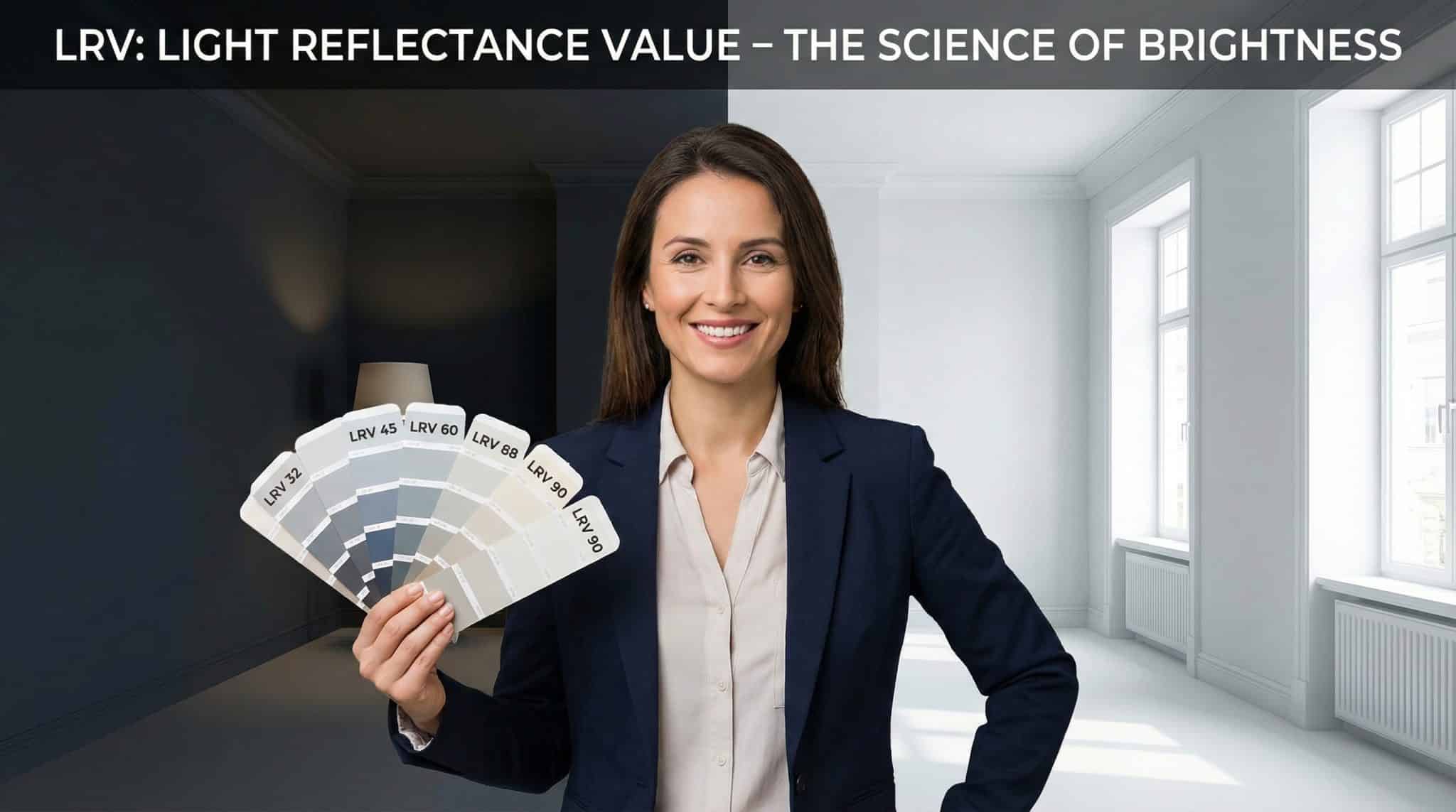
LRV in normal person language
LRV is a number from 0-100 that tells you how much light a paint reflects.
- 0 = theoretical black (light gets swallowed whole)
- 100 = theoretical white (light gets bounced back like a spotlight)
- Real paints usually land around 5 to 94
So if a paint has an LRV of 60, it reflects about 60% of the light that hits it and absorbs the rest. Doesn’t matter if that light is sunshine or your one sad lamp in the corner.
The only “rule” you really need to remember
LRV 50 is the tipping point.
- Above 50: generally feels brighter / more open
- Below 50: generally feels moodier / cozier
And here’s the part that messes with everyone: High LRV doesn’t mean “white.” A bright yellow can have a higher LRV than some off whites. LRV is about light, not color personality.
That’s where undertones come in… aka the reason your “neutral gray” suddenly looks like baby blue at 4pm.
My no drama method for picking paint (using LRV)
1) Figure out what kind of light your room is dealing with
Before you fall in love with a color chip under store lighting (which is basically paint’s version of a dating app filter), look at your room:
- North facing: steady light but cooler and dimmer
- South facing: bright and warm for a good chunk of the day
- East facing: bright mornings, meh afternoons
- West facing: calmer mornings, blazing afternoons
Also don’t skip this turn on your lights at night. Your bulbs are either helping you… or sabotaging you.
2) Pick an LRV “zone” (not a single magic number)
You don’t need to be precious about it. Just choose a range.
Here’s a cheat sheet I actually use to stop colors washing out:
- Dark-ish / low natural light: aim 74+
- Normal rooms with decent light: aim 55-72 (the sweet spot for most homes)
- Very bright rooms (tons of sun): aim 50-65 so your color doesn’t get washed into nothingness
- Want moody drama: go under 50 just know you’re committing to the vibe (and you’ll probably need more lamps)
Windowless rooms tip: super high LRV whites can look weirdly dingy under warm artificial light (because they reflect that yellow cast right back at you). In those cases, I like a gentle mid range (around 40-55) and better lighting. Yes, lighting counts as decorating. Fight me.
3) Then pick undertones (because LRV can’t do everything)
LRV tells you how much light bounces. Undertone tells you what that light feels like.
- Warm undertones (cream, beige, yellow, red) = cozy, softer, tends to “come forward”
- Cool undertones (blue, green, gray, violet) = crisp, cleaner, tends to “pull back”
If your room is north facing and cool, warm undertones usually look more welcoming. If your room is south facing and warm, cooler undertones like a perfect soft green shade can keep things from feeling like a toasted marshmallow.
And if you’re thinking, “But it looked neutral on the chip!” yes. Paint lies. Politely, but consistently.
The trim trick that makes a room look finished (LRV gap!)
Ever paint a room an “off white” and then wonder why your trim basically disappears like it’s in witness protection?
That’s usually because your wall and trim are too close in LRV.
Most white trim is somewhere around LRV 85. For the wall and trim to look like two different surfaces:
- 10 point LRV gap = subtle separation (still pretty)
- 20 point gap = crisp, obvious contrast (very “done” looking)
If your walls are LRV 80 and your trim is LRV 85, that’s a 5 point gap. Translation: “Is this all one color or am I losing my vision?”
Accent wall mini math: if you want a feature wall that actually reads as a feature, aim for about a 30 point gap from the main wall.
Sheen: the sneaky brightness booster (and occasional enemy)
Same color, different sheen = different result.
Higher sheen reflects more light, which can make a color look a little “brighter” and show more wall flaws. (So, you know… choose your battles.)
My general take:
- Flat/matte: forgiving, cozy, less glare
- Eggshell/satin: a touch brighter, easier to clean, still pretty forgiving
- Semi gloss: shiny, bright, shows everything, great for trim (and for people who enjoy seeing every drywall patch they’ve ever made)
Also: if you have heavy texture (orange peel, knockdown), it can scatter light weirdly and make walls feel darker. Smooth walls play nicer with LRV.
Bulbs will absolutely change your paint at night (sorry)
This is where so many people get burned. The paint looks great at noon… and at 8pm it turns into something you’d never choose voluntarily.
Quick and useful:
- Warm bulbs (2700K): make warm paints look great, can make cool paints look muddy/odd
- Cool/daylight bulbs (4000-5000K): make cool paints look crisp, can make warm paints look kind of… dull
Rule I live by: match your paint’s undertone to the lighting you use most at night. You don’t have to change all your bulbs, but you do have to acknowledge them like the powerful little gremlins they are.
Where to find LRV (so you can be insufferably confident in the paint aisle)
Usually:
- On the brand’s website product page / specs
- In the brand’s app
- On the back of the color chip or fan deck page
- If you can’t find it, ask at the paint counter for the data sheet (they have it)
Once you start looking, you’ll see LRV everywhere like when you learn a new word and suddenly it’s in every podcast.
Test it. Yes, you. No, not a tiny chip.
If you do nothing else, do this.
A little 1 inch paint chip is not enough surface area for your brain to understand what’s happening. You need a bigger sample.
My bare minimum:
- 12″ x 12″ sample area (bigger is better)
- Two coats
- Look at it:
- morning
- midday
- late afternoon
- under your evening lights
- Live with it at least 3 days (your first impression is not always your final opinion ask me about the “definitely too pink” beige that I ended up loving)
Pro tip: paint poster board so you can move it around the room (bright wall, shadow corner, next to sofa, next to flooring). Your paint will behave differently depending on what it’s near.
Quick fixes for the most common “why does this look wrong?” moments
- Your white looks dingy: undertone is fighting your bulbs or natural light. Try a warmer/cleaner undertone or adjust bulbs.
- Trim and walls blend together: your LRV gap is too small. Either darken the wall color or use brighter/cleaner trim.
- Color looks different at home than in the store: yes. Store lighting is a chaos goblin. This is why we test.
- Light color disappears in a super sunny room: drop your LRV by 10-15 points so the color has enough pigment to stand up to the glare.
- Color goes dead in dark corners: either raise the LRV or add lighting (I vote lighting lamps are basically emotional support animals for rooms).
One important exterior note (vinyl siding people, come closer)
If you’re painting vinyl siding, you can’t just pick any gorgeous dark color your heart desires.
Many vinyl manufacturers require a minimum LRV (often somewhere around 55-65, but it varies). Darker colors can absorb heat, causing warping/buckling, and you can void your warranty.
So: check your siding manufacturer’s rules/approved color list before you commit. This is not the fun kind of surprise.
The takeaway (so you can walk into the paint store like you own the place)
If you remember nothing else:
- LRV tells you how bright a paint can feel in your space.
- Undertone tells you if that brightness will feel warm, cool, green-ish, pink-ish, etc.
- Test large samples in your actual lighting day and night before you marry the color.
Paint names are cute. Numbers are honest. And I, for one, prefer honest when I’m about to spend my weekend with a roller and an existential crisis.