Hello there. Are you searching for a serene, sophisticated blue that brings tranquility and elegance to your space? Let me introduce you to the captivating Sherwin-Williams 9151 Daphne.
I’ve incorporated this versatile blue-gray in numerous projects, and it consistently delivers a refined atmosphere.
What makes Daphne so special? Its a perfect balance of blue depth with gentle gray undertones creates a soothing presence that enhances your space without overwhelming it.
It pairs beautifully with crisp whites, natural wood tones, and metallic accents. Need a paint that creates a cohesive flow across different rooms? This is it.
Let me help you visualize how Daphne might change your home.
Understanding Paint Color Basics
To make the best paint choices, it’s important to start with the fundamentals.
By grasping the key elements of paint color, you’ll better understand how they will interact in your space.
Color Terminology
| PROPERTY | VALUE |
|---|---|
| LRV (Light Reflectance Value) | 41 |
| Color Category | Considered a mid-tone color (LRV |
| Comparison | Pure white: ~90 LRV, Black: ~0 LRV |
| RGB Value | Red: 164 Green: 177 Blue: 191 |
| Hex Code | #A4B1BF |
Undertones:
- Daphne has cool blue-gray undertones
- It’s a balanced blue with subtle lavender hints
- Not a stark or intense blue, but a versatile cool blue-gray
Psychology of Blue Colors
- Soft blues like Daphne create a sense of calm and serenity
- Blue-gray tones: Offer sophistication and versatility
- Cool neutrals: Evoke tranquility, subtle elegance, and timelessness
- Benefits: More depth than lighter colors, provides visual interest while maintaining a soothing quality, and creates a peaceful backdrop for other design elements.
Why Choose Daphne SW 9151?
Sherwin-Williams Daphne SW 9151 creates a serene, cool, sophisticated atmosphere that balances tranquility with subtle elegance. It is perfect for creating peaceful yet refined spaces.
Key Features
Sherwin-Williams Daphne SW 9151 offers exceptional versatility with fixed elements like marble countertops and natural wood flooring, creating harmonious transitions between spaces.
It provides enough color to feel expressive while maintaining a neutral, timeless quality that won’t quickly date your interior design choices.
Durability
Sherwin-Williams Daphne, particularly in premium finishes like Duration or Emerald, delivers outstanding durability with excellent washability in high-traffic areas.
Its subtle depth and gray undertones help conceal minor imperfections better than lighter blues while maintaining its sophisticated appearance.
This paint resists wear when properly applied and maintains color consistency even in busy living spaces and entryways.
Texture Patterns
Sherwin-Williams Daphne creates a soft, dimensional texture that adds depth to walls without overwhelming the space.
Its blue-gray undertones produce gentle shadow play that enhances natural lighting and adds visual interest to architectural details.
When applied to different finishes, it can highlight trim work while maintaining a consistent, cohesive appearance throughout connected rooms.
Why It Works
Sherwin-Williams Daphne works because it perfectly balances color and neutrality, providing enough presence to feel calming without dominating a space.
Its gray undertones complement warm wooden elements and crisp white features, while its moderate LRV (Light Reflectance Value) ensures that rooms feel bright yet grounded.
This versatile blue-gray adapts beautifully to changing daylight conditions, maintaining its refined character from morning to evening.
Daphne SW 9151 in Interior Design
Daphne infuses interiors with refined coolness and balance. Its soft, blue-gray hue creates serene spaces that feel sophisticated yet welcoming.
This versatile color pairs effortlessly with neutrals and metallics for a timeless, elegant look.
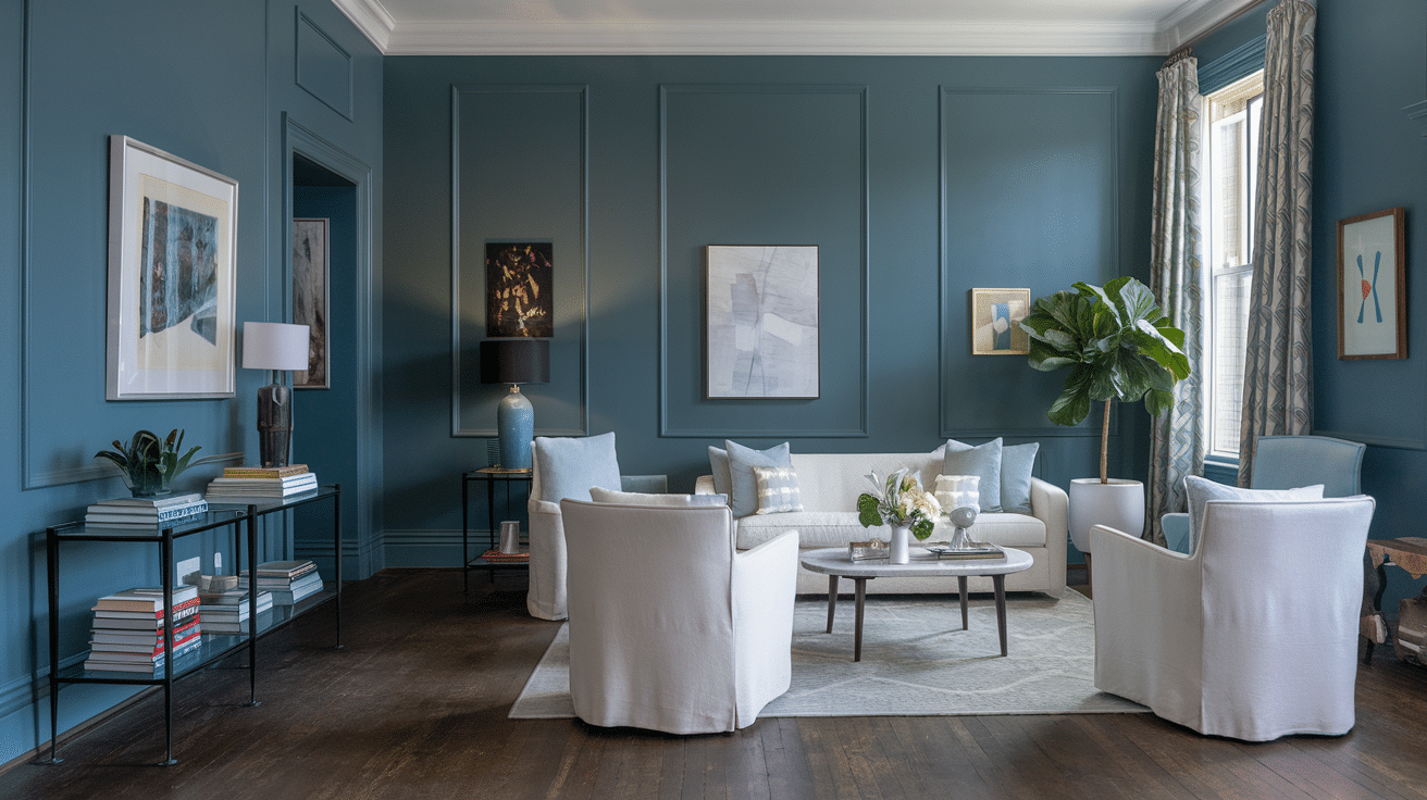
Living Room
- Perfect for creating calming, sophisticated spaces
- Enhances architectural details
- Complements textural elements
- Works with multiple décor styles
Bedroom
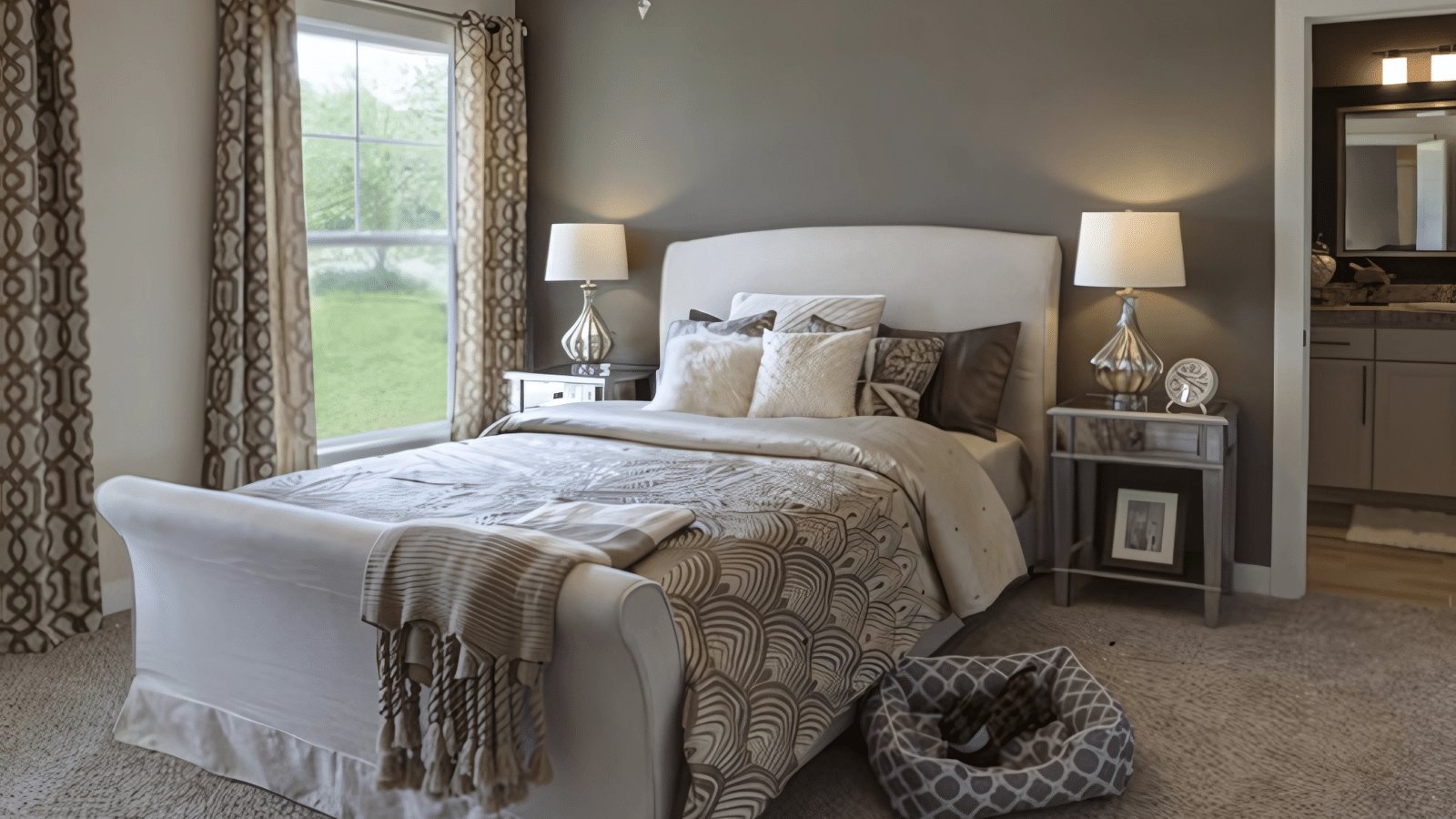
- Promotes restful, peaceful atmosphere
- Evening light enhances its soothing qualities
- Creates a tranquil retreat space
- Adapts to any bedroom dimension
Kitchen & Dining
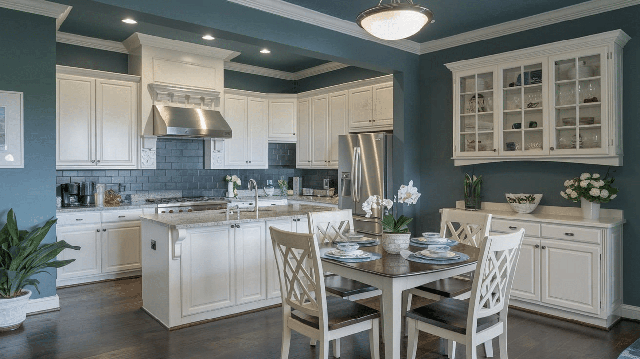
- Offers a refined, elegant appeal
- Complements white cabinetry perfectly
- Provides visual continuity
- Maintains its sophisticated appearance
Bathroom
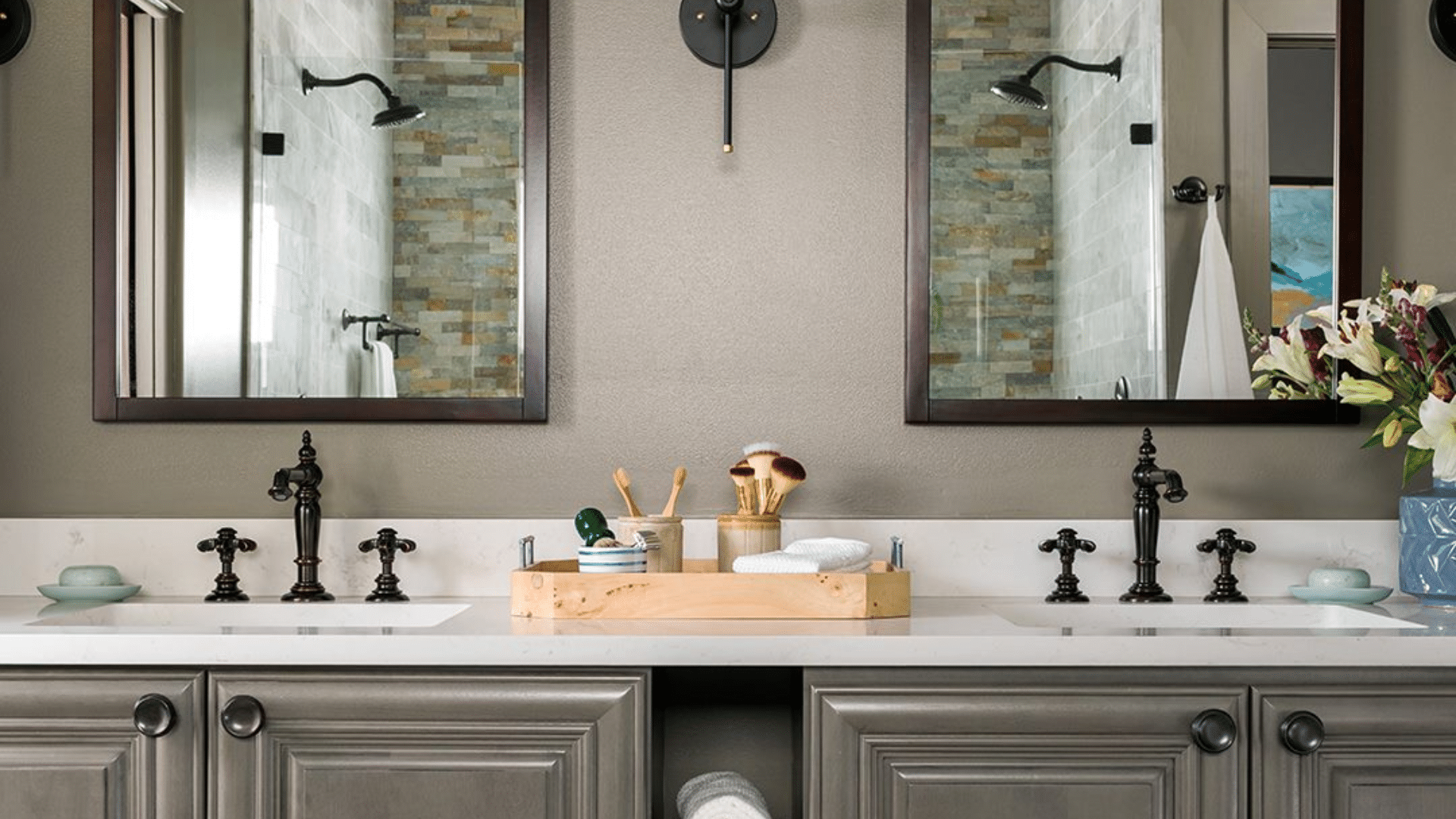
- Creates a spa-like atmosphere
- Adds cool serenity to complement fixtures
- Complements marble, porcelain, and chrome surfaces
- Maintains color integrity in high-humidity environments
Color Pairings and Combinations for Daphne SW 9151
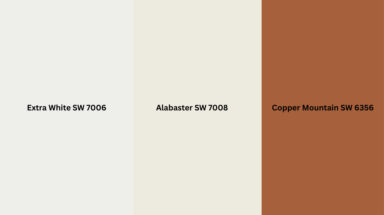
Extra White SW 7006 – A bright, clean white that creates crisp contrast with Daphne while enhancing its cool undertones and sophisticated appeal.
Alabaster SW 7008 – A warm, soft white that gently balances Daphne’s coolness, creating harmony while maintaining its serene character.
Copper Mountain SW 6356 – A warm terracotta that creates a beautiful contrast with Daphne’s cool tones, adding warmth and energy to the color palette.
Creating Cohesive Color Schemes
Daphne SW 9151 is a cool blue-gray with subtle lavender undertones, creating a refined, tranquil feel perfect for sophisticated, peaceful spaces.
Monochromatic Scheme:
- Daphne (SW 9151) for main walls
- Extra White (SW 7006) for trim
- Ceiling Bright White (SW 7007) for ceilings
- Indigo Batik (SW 7602) for accent pieces or adjoining rooms
Warm Contrast Scheme:
- Daphne (SW 9151) for main living areas
- Accessible Beige (SW 7036) for the dining room
- Agreeable Gray (SW 7029) for hallways
- Sea Salt (SW 6204) for bedrooms
Cool Harmony Scheme:
- Daphne (SW 9151) for main walls
- North Star (SW 6246) for bathrooms
- Misty (SW 6232) for bedrooms
- Online (SW 7072) for home office
These colors maintain a cohesive, balanced palette that works beautifully with Daphne as the foundation.
They give you options for warmer and cooler coordinating colors while maintaining a serene, sophisticated atmosphere throughout your home.
Paint Colors: Perfect Alternative to Daphne
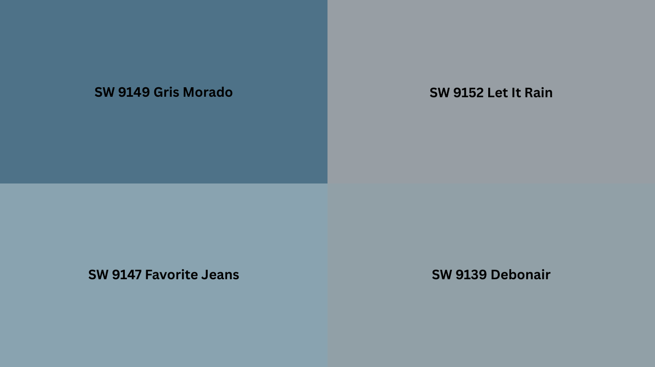
SW 9149 Gris Morado – A lighter blue-gray with similar undertones that creates a softer, airier version of Daphne while maintaining its balanced coolness
SW 9152 Let It Rain – A deeper, more saturated blue-gray that intensifies Daphne’s depth while adding richness to spaces.
SW 9147 Favorite Jeans – A refined denim blue with gray undertones that creates a casual progression from Daphne while complementing its neutral character
SW 9139 Debonair – A balanced gray with slight blue undertones that enhances the sophisticated quality of Daphne while maintaining its versatile, timeless appeal
Wrapping It Up
After using Daphne in client homes for years, I’m continually impressed by its versatility.
If you are creating a peaceful bedroom sanctuary or a sophisticated living space, this refined blue-gray adapts beautifully to every room and design style.
Remember that Daphne’s magic lies in its balanced undertones—cool without being cold. It complements both contemporary and traditional décor while providing the perfect backdrop for your style to shine.
As seasons change and design trends come and go, Daphne remains timeless. It’s not just a color; it’s peace of mind, knowing your walls will look sophisticated for years.
Ready to embrace the perfect blue-gray? Grab a sample of Daphne today, and watch your space recast from ordinary to extraordinary—one serene wall at a time.