Standing in my living room at 3 AM, paintbrush in hand, I had an epiphany: the 17th sample swatch wasn’t the problem; my approach was. That color crisis became a turning point for me. After five years of color-coaching frustrated homeowners, I’ve found the untapped magic of Sherwin-Williams’ understated heroes.
Drowning in a sea of Pinterest boards and conflicting color theories? I’ve been there. The path to serenity isn’t through more options; it’s through strategic elimination.
By assuming the quiet confidence of Sherwin-Williams’ curated neutrals, with precisely placed color moments, I’ve helped change chaotic spaces into serene rooms. Ready to silence the visual static and create a home that whispers rather than shouts?
Let’s decode the minimalist palette together.
What Is Minimalism in Interior Design?
Picture this: You walk into a room with just a perfect sofa, a simple coffee table, and maybe a statement lamp. Nothing extra. Nothing unnecessary. Just space to breathe. That’s minimalism at its core.
Minimalism isn’t about having an empty home; it’s about making every single thing count. Think of it as the “quality over quantity” approach to your living space. Instead of filling every corner, you choose each piece carefully.
The magic of minimalist design boils down to a few simple ideas
- Keep only what matters: If something doesn’t serve a purpose or bring you joy, it doesn’t earn a spot in your home.
- Clean, simple lines: Forget the fancy, ornate furniture. Minimalism favors straightforward shapes and designs that allow your eyes to rest.
- Breathing room: Space isn’t wasted space; it’s actually the secret ingredient that makes everything else look better.
- Thoughtful color choices: This is where Sherwin-Williams shines. A minimalist palette typically features neutral tones as the base, with maybe one or two accent colors that tie everything together.
Sherwin-Williams Minimalist Color Overview
When it comes to finding the perfect minimalist palette, Sherwin-Williams stands out like that one friend who always knows exactly what you need. Their colors hit that sweet spot between trendy and timeless, making them perfect partners for minimalist spaces.
| Color Name | LRV | RGB Value | Color Family | Description |
|---|---|---|---|---|
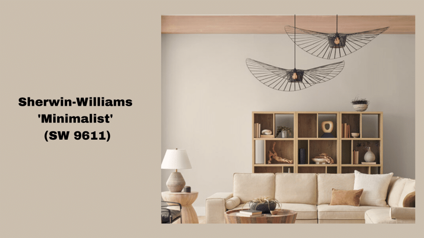
| Minimalist | 52 | 202 / 190 / 173 | Neutral Beige | A warm, soft beige with subtle earthy tones, perfect for creating a calming, neutral backdrop. |
Why This Color Works So Well
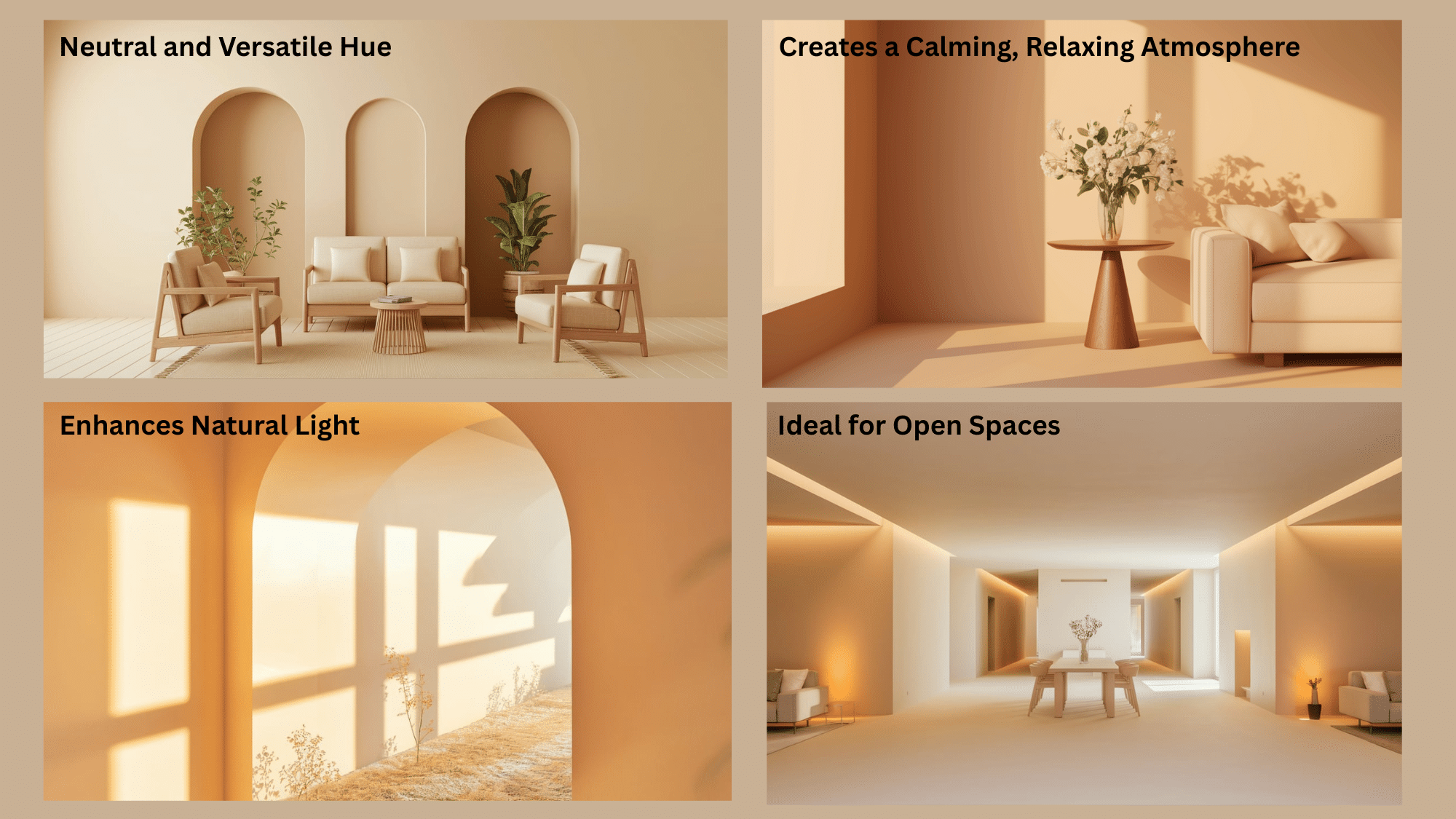
Sherwin-Williams “Minimalist” (SW 9611) works exceptionally well for several reasons, particularly when it comes to minimalist interior design. Here’s why this color is a perfect fit for contemporary and minimalist spaces:
1. Neutral and Versatile Hue
-
Adaptability: Minimalist (SW 9611) is a warm, soft beige with subtle earthy undertones, making it highly adaptable. This neutral tone complements a wide range of design styles, from ultra-modern to traditional, and can be paired with various accent colors (from rich blues and deep greens to soft whites or even natural wood tones).
-
Timeless Quality: Because it’s not too trendy or bold, it has a timeless feel that can work in homes over many years without feeling dated.
2. Creates a Calming, Relaxing Atmosphere
-
Subtle Warmth: The soft warmth of this beige color creates an inviting, cozy atmosphere, which is key to minimalist design’s focus on comfort and tranquility. It allows the space to feel welcoming and calm, making it perfect for living rooms, bedrooms, or other areas meant for relaxation.
-
Reduces Clutter: Minimalist is a color that naturally doesn’t overwhelm the senses. When paired with clean lines and decluttered spaces, it enhances the simplicity of minimalist design, reducing visual noise and allowing the eyes to rest.
3. Enhances Natural Light
-
Moderate LRV (Light Reflectance Value): With an LRV of 52, Minimalist strikes a perfect balance between light and dark. It’s not too dark to absorb too much light, but also not so bright that it feels stark. It reflects natural light in a balanced way, making smaller spaces feel more open, airy, and expansive without being overly reflective.
-
Bright Yet Soothing: The color enhances the natural light in the room, brightening the space without being harsh or glaring, which is perfect for creating peaceful environments.
4. Ideal for Open Spaces
-
Unity Across Rooms: Its neutral nature allows for cohesion in open floor plans. Whether used in a living room, dining area, or hallway, Minimalist ensures that spaces flow together smoothly. It doesn’t feel isolated in one area; instead, it helps unify different parts of the home.
-
Inviting Transitions: As a versatile base color, it enables smooth transitions from one room to another, keeping the overall aesthetic consistent while maintaining a modern look.
Why “Minimalist” Works So Well in Every Room
The beauty of minimalist design is how effortlessly it adapts to every space in your home. Let’s explore why this approach creates such harmony throughout different rooms.
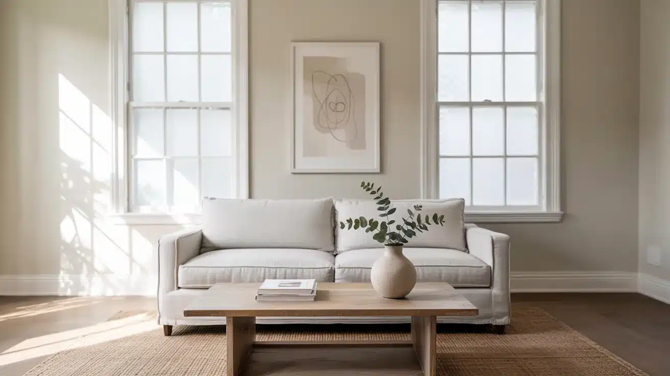
1. Living Room: The Heart of Minimalist Harmony
In the living room, minimalist colors create a canvas that breathes. These soft neutrals expand your visual space, making even modest-sized rooms feel more generous. When sunlight streams through windows, colors like Sherwin-Williams’ Agreeable Gray or Repose Gray don’t just absorb light but bounce a gentle glow throughout the space.
Notice how a minimalist living room invites you to slow down. Without visual clutter or competing colors, your mind naturally relaxes.
The living room becomes a place where conversations happen naturally because nothing is fighting for attention, not the walls, not the decor, not even the carefully selected furniture with its clean lines and thoughtful placement.
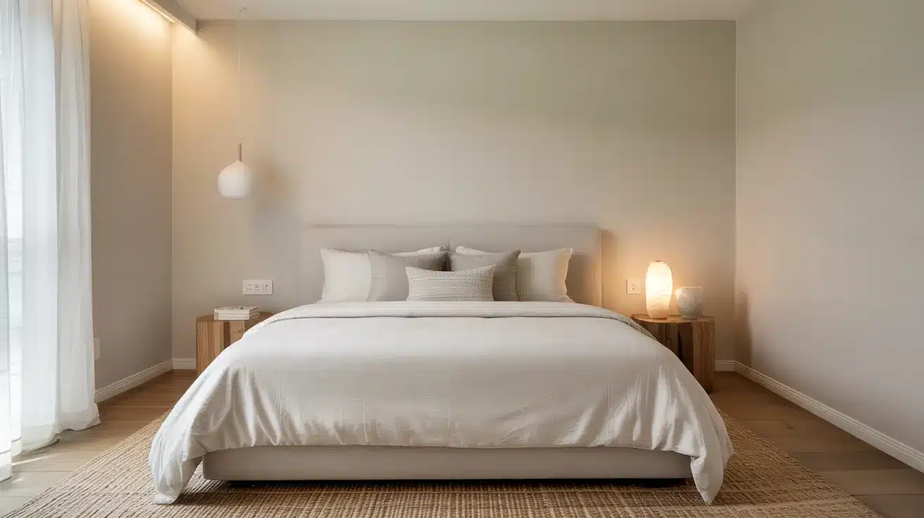
2. Bedroom: Your Sanctuary
The bedroom benefits perhaps most dramatically from minimalist design. Sleep experts have long connected neutral, soft colors with improved sleep quality. Minimalist colors like Sherwin-Williams’ Softened Green or Creamy signal to your brain that it’s time to wind down.
These gentle tones create a cocoon-like effect, especially when paired with simple bedding and minimal decor. Without the visual stimulation of bright colors or busy patterns, your mind can actually begin the process of relaxation before you even close your eyes.
Morning light takes on a special quality in minimalist bedrooms, too filtered and gentle rather than harsh and jarring. This creates smoother transitions between sleep and wakefulness, a small but meaningful improvement to daily life.
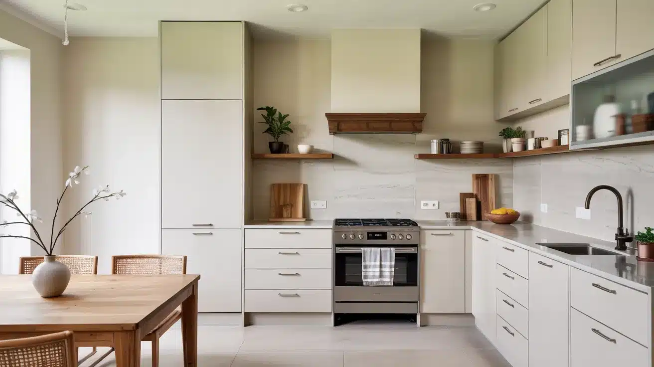
3. Kitchen: Function Meets Beauty
Kitchens thrive under minimalist design for both practical and beautiful reasons. Clean-lined cabinets paired with Sherwin-Williams’ Extra White or Light French Gray create a sense of order in a space that can easily become chaotic.
Food preparation becomes more focused when visual distractions are minimized. The subtle backdrop allows the natural colors of fresh produce and meals to stand out, the deep red of tomatoes, the vibrant green of herbs.
Minimalist kitchens also appear cleaner (even when they might not be perfectly spotless). The simple color palette makes dust and spots less noticeable while creating an overall impression of freshness and hygiene.
4. Bathroom: Your Home Spa Experience
The bathroom transforms into a personal spa under minimalist design principles. Colors like Sherwin-Williams’ Sea Salt or Snowbound create a sense of cleanliness and calm that’s perfectly suited to self-care rituals.
Water itself becomes a design element in minimalist bathrooms, the transparency, the reflections, the simple pleasure of clean, clear water against neutral surroundings. These subtle colors enhance rather than compete with these natural elements.
Morning routines feel less rushed in a space that doesn’t overwhelm the senses. Evening wind-down rituals become more effective when the bathroom environment itself signals tranquility through its restrained color palette and uncluttered surfaces.
Pairing “Minimalist” with Other Elements
The true magic of minimalist colors happens when they interact with other elements in your home. These soft, neutral palettes create the perfect foundation for building a space that feels both thoughtful and effortlessly stylish.
Natural Materials: The Perfect Partners
Minimalist colors and natural materials were made for each other. When walls are painted in Sherwin-Williams neutrals like Alabaster or Repose Gray, natural elements take center stage most beautifully.
Wood: Light oak, walnut, or even reclaimed timber stands out dramatically against minimalist backdrops. The grains and natural patterns become almost artwork-like when not competing with busy wall colors.
Stone: Marble countertops, slate flooring, or even small stone decorative objects develop new depth against minimalist walls. The subtle veining in marble becomes more pronounced when set against Agreeable Gray, creating natural visual interest without additional decorative elements.
Metal: Brass fixtures, matte black hardware, or brushed nickel elements pop against neutral backgrounds. A simple brass lamp against a Snowbound wall creates an elegant focal point without trying too hard. These metal accents add definition and structure to soft, neutral spaces.
Natural Fibers: Linen curtains, cotton throws, jute rugs, and woven baskets bring essential texture to minimalist spaces. Against Light French Gray walls, a chunky knit throw or sisal rug adds warmth and dimension while maintaining the clean, beautiful.
The beauty of this pairing is its timelessness. While trendy colors come and go, the combination of natural materials with minimalist color palettes never feels dated or overdone.
Tips for Using “Minimalist” (SW 9611) in Your Home
This is a versatile and calming color, perfect for creating serene spaces. This table provides simple, room-by-room advice on how to use the color effectively, along with accent color suggestions and minimalistic decor tips for each area of your home.
| Room | Advice | Accent Colors | Decor Tips |
|---|---|---|---|
| Living Room | Use as main wall color with white trim. | White, Soft Gray, Navy | Pair with minimalist furniture and natural wood accents. |
| Bedroom | Soft and calming on walls for relaxation. | Soft Greens, Taupe | Add simple, textured bedding in natural fabrics. |
| Kitchen | Brighten the space with “Minimalist” walls. | Light Gray, White | Keep countertops clean and minimalistic. |
| Bathroom | Use for a serene, spa-like atmosphere. | Soft Blue, White | Pair with sleek fixtures and simple mirrors. |
| Dining Room | Neutral backdrop for bold furniture. | Olive Green, Burgundy | Opt for modern dining chairs and minimal décor. |
Wrapping It Up
The beauty of Sherwin-Williams’ minimalist colors isn’t just about paint on walls, it’s about creating spaces that let you breathe, think, and be. These thoughtful neutral shades work in every room because they respond to your life rather than competing with it.
Remember: quality over quantity applies to color, too. A carefully chosen palette of Sherwin-Williams neutrals with just one or two accent moments creates homes that feel both peaceful and personal.
Ready to start your own minimalist color story?
Pick up some sample swatches of Minimalist (SW 9611), try them in different lighting, and notice how they make you feel. Your walls are waiting to become the perfect backdrop for the life you want to live.
What color will you try first?

