
The Secret to a Perfect Sherwin-Williams Color Match (It’s Not “Better Lighting,” Sorry)
If you’ve ever tried to touch up a scuffed wall and ended up with a very obvious “patch” that screams I tried, welcome. You’re among friends.
Here’s the thing: most Sherwin-Williams color matching “fails” don’t happen because the store’s scanner is trash. They happen because we march in there with a sad little crumb of paint we peeled off the wall with our fingernail, or we try to match a sun faded section that’s been slowly roasting since 2012.
A perfect match is mostly about three things:
- Bringing a decent sample (this is the big one)
- Using the right matching method for your situation
- Testing it like a sane person before you commit to gallons
Let me save you time, money, and the emotional spiral of staring at two almost the same beiges until your eyes cross.
Step One: Bring a Sample That Isn’t… Embarrassing
I say this with love: the scanner can only match what you give it. If you hand over a tiny, dirty chip from a spot that’s been cleaned with a Magic Eraser weekly (aka “sandpaper on a stick”), the machine is going to do its best… and still betray you.
What you want:
- A real, physical paint chip from the wall (not a photo)
- At least quarter sized (bigger is even better)
- Flat and clean
- From a spot that hasn’t been sun faded, scrubbed to death, or patched
Where to steal it from without ruining your life:
- Behind a picture frame
- Behind furniture
- Inside a closet
- Behind curtains (the paint back there is usually living its best, untouched life)
If you can grab a piece that includes the original paint layer (not primer, not drywall paper, not three generations of landlord special), your odds of success go way up.
Okay, But What If You Can’t Cut the Wall?
Totally fair. Not everyone wants to take a blade to their house like a raccoon in a pantry.
Here’s how I decide which tool to use, depending on what you’ve got:
1) If you have the Sherwin-Williams color name or number
Don’t color match at all. Seriously. That’s like looking up directions when you already have the address.
Check:
- Old paint cans (even the crusty ones in the garage)
- Receipts
- Previous homeowners’ notes (if you were blessed with that unicorn)
- Sometimes the store can look up past purchases if you’ve bought there before
2) If you can bring in a clean paint chip
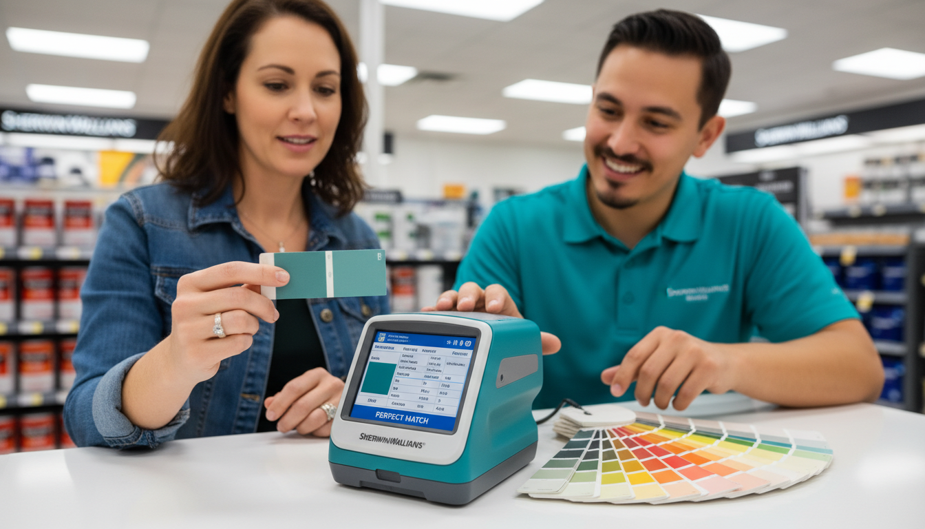
Use the in store spectrophotometer (the scanner). This is the “best case scenario” match.
3) If the surface can’t be removed (tile, fabric, installed stuff)
Use the ColorSnap Match Pro handheld device (ask at the store). It has its own light source, which is a big deal because your kitchen lighting lies constantly.
Pro tip: scan a few times and go with the result that repeats. If one scan says “Sea Salt” and the next says “Dark Night,” something’s off.
4) If you’re just messing around and collecting ideas
The ColorSnap phone app is fine for browsing, but it’s not gospel. Phone cameras auto correct everything like they’re trying to be helpful, and shadows will absolutely bully your results.
Use it to narrow down options like SW 6189 color profile then verify with an actual sample.
What To Do at the Sherwin-Williams Store (So You Don’t Leave With “Close Enough” Regret)
When you get there, don’t be shy. This is not the time to be polite and pretend you love it when you don’t. You’re not naming a baby. You can change your mind.
Here’s my store routine:
- Hand them your chip (the good one, remember?)
- Tell them what you’re painting (wall, trim, cabinets, exterior) and what sheen you need
Sheen matters more than people think. More on that in a second. - Have them scan it and mix it
- Ask for a “drawdown” (a swipe of the mixed paint on card stock)
This is the easiest way to compare, right there, without playing “guess the undertone” in your head. - Look at it by a window
Store fluorescents can make almost anything look acceptable. Daylight is the truth serum. - If it’s off, say it’s off
Use simple words: “too blue,” “too warm,” “too dark,” “a little muddy.” They can tweak formulas all the time. That’s not you being difficult that’s literally part of the process.
This whole thing usually takes 15-20 minutes, and it can save you a second trip (or a third… ask me how I know).
The Three Ways People Accidentally Sabotage Their Own Match
1) Sheen mismatch (the sneakiest villain)
Even if the color is identical, matte vs satin vs semi gloss will make it look different because they reflect light differently.
If you’re touching up, try to match sheen to sheen using primer and sheen basics. Otherwise you’ll get that “why does this spot look darker?” moment… because it’s shinier.
2) Trying to invisibly touch up an older wall
I’m going to be the bearer of bad news: sometimes a perfect match still won’t disappear.
Walls age. They fade weirdly. They get cleaned unevenly. The texture changes. Life happens.
If your paint is more than a couple years old and you want it to look flawless, you may need to repaint the whole wall instead of patching. (I know. I hate it too.)
3) Cross brand matching without a physical sample
If you’re trying to match a Benjamin Moore/Behr/whatever color using only the color code, you’re setting yourself up for disappointment.
Different brands use different pigment systems. Bring a real sample whenever possible.
The “Don’t Skip This” Home Test
Even if the in store match looks perfect, your home lighting can make it look totally different. Lighting is basically a prankster with a dimmer switch.
Before you buy gallons:
- Get a sample in the same sheen you’ll actually use
- Paint a test patch at least 6-8 inches (bigger if you can)
- Do two coats if that’s what you’ll do on the wall
- Let it dry fully (wet paint lies more than a toddler)
Then check it:
- Morning daylight
- Evening light with your normal bulbs
- From different angles (yes, really)
If it’s wrong at home, don’t panic. Take your chip back and tell them what’s happening: “Looks too cool in my room,” “pulling green,” “feels dingy,” “it’s darker than my original.” Tweaking the formula is normal and usually way easier than repainting a whole room because you rushed.
The Real “Secret” to a Perfect Match
It’s not magic. It’s not a special scanner setting. It’s not you needing “better eyes.”
It’s you walking in with a solid sample, using the right tool, and being willing to test and tweak instead of committing to four gallons out of sheer optimism.
Do that, and you’ll go from “eh, it’s close” to “wait… that’s actually it.” And that, my friend, is the kind of home improvement victory I fully support.