
You know what’s wildly rude? When you pick a paint color you love, paint half your life away, step back feeling like a hero… and the wall looks like a totally different shade than the chip.
That’s usually not the color’s fault. That’s sheen doing its little magic trick.
Taupe of the Morning (Sherwin-Williams SW 9590) is one of those “polite neutral” colors with a quiet violet pink undertone. Most of the time it behaves. But change the sheen and suddenly that undertone can whisper… or sing showtunes under a spotlight. (Ask me how I know. Spoiler: I have painted an entire room before realizing I picked the wrong finish. I would like a refund for my own decisions.)
So let’s make this easy: I’m going to tell you what sheen does to Taupe of the Morning, which finish I’d use where, and how to test it without spiraling in the paint aisle.
The Lazy Smart Way to Pick a Sheen (3 Steps, No PhD Required)
Here’s my no drama process. It works because it’s simple, and simple is the only thing my brain can handle once I’ve stared at 47 taupes.
- Pick two sheens to audition (usually eggshell and satin).
- Sample them for 24-48 hours in your actual room light.
- Paint like you mean it so the sheen lays down evenly (especially if you choose satin).
If you want my default setting:
- Eggshell for most walls, most homes, most humans.
- Satin when the room gets abused (kids, dogs, hallways, humidity) and your walls aren’t a lumpy patchwork quilt.
- Flat for ceilings or walls that have… seen things (repairs, texture, questionable drywall history).
- Semi gloss for trim/doors. Not walls. Semi gloss walls are the “white pants on spaghetti night” of paint decisions.
Sampling the right way (so you don’t get tricked):
- Buy two samples: one eggshell, one satin. (Sample pots are cheaper than regret.)
- Paint big squares like 2 feet-ish directly on your wall.
- Look at them in the morning, afternoon, and evening. Taupe of the Morning loves to show its undertone around mid/late afternoon (think 3-4pm).
My personal rule: if it looks good in bright afternoon light (the “truth serum” lighting), it’ll probably look good the rest of the day.
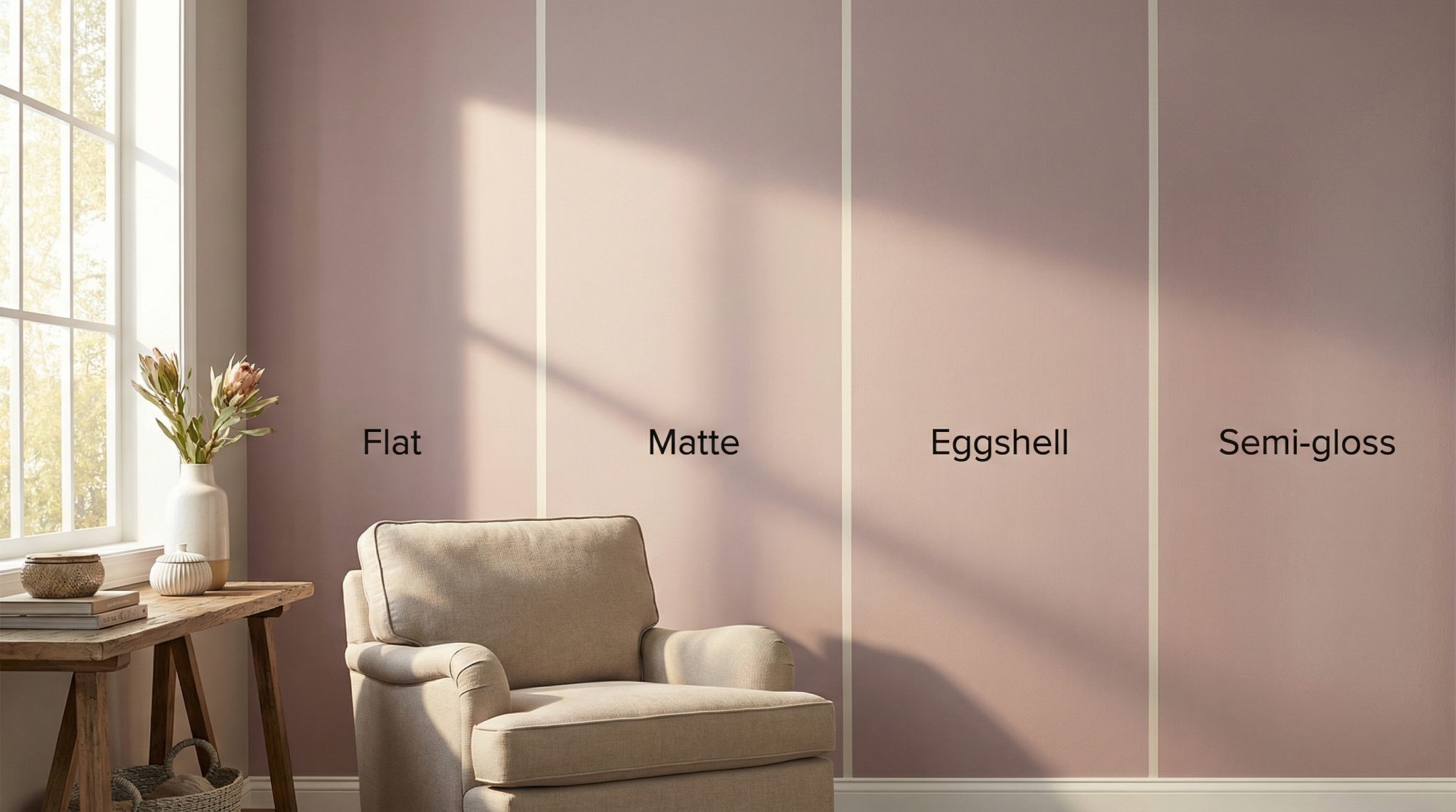
What Sheen Does to Taupe of the Morning (Sheen = Undertone Volume Knob)
Taupe of the Morning has an LRV around 65, so it’s fairly light and it plays nicely with light in my Sherwin Williams SW 9590 review. But the finish you choose changes how much light bounces and that changes what you notice.
Here’s how it tends to behave:
- Flat/matte: looks more grounded and “creamy neutral.” Undertone stays tucked in like it’s shy.
- Eggshell: still pretty subtle, but you’ll catch little shifts warmer in warm light, cooler in cool light.
- Satin: brighter and a bit “pearlier,” and that violet pink undertone is more noticeable.
- Semi gloss: undertone comes out front and center. Some people love it. Some people immediately start rethinking every decision they’ve ever made. Both are valid.
And yes the same color can look 5-10% lighter just because satin reflects more light. If your sample looks “wrong,” check the sheen before you dump the whole color and start over.
My Room by Room Sheen Picks (Screenshot This, Text It to Yourself)
If you want the quick answer and you don’t want to overthink it (respect), here’s what I’d do with Taupe of the Morning:
- Bedrooms + offices: Eggshell. It feels soft, calm, and doesn’t bounce glare all over your Zoom calls.
- Living/family rooms: Eggshell unless your walls regularly get hugged by sticky toddlers or shoulder checked by Labradors. Then go satin.
- Hallways, entryways, kids’ rooms: Satin. These areas get scuffed if you so much as exist near them.
- Kitchens + bathrooms: Satin. Humidity and wiping splatters is just… life. (Use good ventilation too paint isn’t a dehumidifier.)
- Ceilings: Flat. A shiny ceiling looks like it’s perpetually damp. No thank you.
- Trim + doors: Semi gloss (or a similar trim finish). It’s durable and gives a nice crisp contrast.
Before You Pick Satin: Let’s Talk About Your Walls (Because Satin Will Snitch)
Satin looks amazing on smooth walls. On imperfect walls? Satin becomes a high definition documentary about every patch, seam, and “I tried to fix it myself at 11pm” moment.
If you have any of these, I’d be cautious going higher than eggshell:
- visible patching or spackle spots
- tape lines or seams you can catch in side light
- heavy texture (knockdown, orange peel, popcorn adjacent weirdness)
- lots of repairs over the years
Want the quick test? Stand in the room around mid afternoon and look across the wall at an angle. If you can already see ripples and patches, satin will basically put them on a billboard.
If you need durability in a high traffic room but the walls are rough, your best move isn’t “go shinier.” It’s do better prep: sand, skim, prime. (Annoying, yes. But it’s cheaper than hating your walls forever.)
Touch Ups: The Thing You’ll Care About Later (Even If You Don’t Care Right Now)
This is the part nobody wants to think about while they’re daydreaming about their fresh, pretty room. But your future self will either thank you… or glare at you while holding a tiny brush and whispering, “Why did you do this to me?”
- Flat/eggshell: touch ups usually blend the best.
- Satin: touch ups can “flash” (you’ll see the patch) and sometimes stay visible for ages.
- Semi gloss: touch ups are basically a separate art form. Often you repaint the whole section or you live with the scar.
If your walls get dinged a lot (kids, pets, narrow hallway life), eggshell can be the sweet spot: decent durability, easier touch ups, less “why is that spot shiny?” drama.
Paint Like a Person Who Wants It to Look Good (Quick Technique Tips)
Technique matters more as you go shinier. Satin is pretty, but it’s also a little demanding like a houseplant that needs the exact right window and will die out of spite.
- Flat/eggshell: forgiving. Use a quality roller (3/8″ to 1/2″ nap), keep moving, don’t over fuss.
- Satin: use a good microfiber roller (around 1/2″ is common), keep a wet edge, and don’t paint one wall in twelve tiny “I’ll just fix that” sections. That’s how you get lap marks.
- Semi gloss: best left to trim/doors. If you’re using it, prep well and expect it to highlight every speck of dust like it’s doing you a personal favor.
One satin specific tip: don’t stop mid wall for a snack break. Satin will remember.
Okay, Final Answer: Which Sheen Should You Choose?
If you’re stuck, here’s my opinionated little cheat code:
- Start with eggshell.
- Go satin if the room needs frequent cleaning and your walls are smooth enough to handle the honesty.
- Go flat if your walls are imperfect and you want them to keep their secrets.
- Keep semi gloss on trim and doors where it belongs (respectfully).
Grab two sample pots (eggshell + satin), paint big swatches, and watch them through a full day when you are doing an Agreeable Gray comparison guide. If one of them gives you even a tiny “hmm, I don’t know…” feeling, listen to that. That feeling does not get smaller after you paint the whole room. It gets louder. With a megaphone.
Pick your sheen, roll it on, and go make Taupe of the Morning look like the calm, expensive neutral it’s meant to be.