I’m sharing my complete analysis of Sherwin Williams’ Taupe of the Morning, a color that’s been gaining attention in the design world.
As a paint color consultant who’s worked with this shade in countless homes, I’ve watched it transform spaces from basic to beautiful.
After testing it in different lighting conditions, pairing it with various trims, and using it on everything from bedroom walls to kitchen cabinets, I have solid evidence of what makes this color work – and when it might not be your best choice.
Let’s explore why this versatile neutral might be exactly what you’re looking for in your next paint project.
What is Taupe of the Morning?
Taupe of the Morning stands out as a balanced neutral from Sherwin Williams’ Emerald Designer Edition Collection. As a Sherwin Williams taupe, it reads refined and grounded across styles.
I’d describe it as sitting right in the middle between taupe and greige, making it more versatile than standard beige or gray options. That center makes Taupe of the Morning an easy bridge between warm woods and crisp whites.
What makes this color fascinating is its gentle violet-pink undertone. It’s exactly what you want when you’re moving away from basic beige but aren’t ready to commit to a stark gray. As a taupe paint, Taupe of the Morning shows this nuance without drifting purple or gray.
From my experience working with this color, it performs beautifully in both interior and exterior applications. Taupe of the Morning feels cohesive from walls to cabinets in these settings.
Key Characteristics of Taupe of the Morning
This paint color has unique traits that make it stand out from other neutrals. Let me explain what makes it special:
The Light Reflectance Value (LRV) of 65 places it in a sweet spot – not too light, not too dark.
This mid-range LRV means it reflects enough light to keep spaces feeling open while maintaining enough depth to create contrast with white trim. At 65 LRV, Taupe of the Morning also handles open layouts nicely.
Practically, this means it won’t wash out in bright rooms or feel too heavy in darker spaces.
The warmth factor is interesting. While it technically leans warm, it has an adaptable nature. In many homes, Taupe of the Morning flexes warm or softly neutral depending on exposure.
This isn’t just another neutral – it’s a thoughtful blend that brings together the coziness of taupe with the contemporary feel of greige, offering something distinctly different in the neutral paint category.
Understanding the Undertones
The color’s violet-pink undertones make it special. They’re subtle enough to stay sophisticated but present enough to add character. Think of it as a gray taupe with a whisper of violet-pink.
Sometimes, depending on your room’s lighting and what’s nearby (like furniture or artwork), you might notice a slight green cast. This isn’t a flaw – it’s just part of how this complex neutral interacts with its surroundings.
How Lighting Changes This Color
Different light exposures bring out unique qualities in this paint color:
- South-facing rooms make this color shine by bringing out its natural warmth without making it feel too intense. I often recommend it for these spaces because it stays balanced even in strong sunlight. Taupe of the Morning remains inviting here.
- North-facing rooms benefit from this color, which adds just enough warmth to offset cooler light. It’s particularly effective here because it doesn’t fight against the natural light – instead, it creates harmony.
- East-facing spaces show the color beautifully in the morning light, though it might lose some dimension in afternoon hours.
- West-facing rooms see this color shift throughout the day – starting cooler in the morning light but warming up nicely as the sun moves west.
How It Compares to Similar Colors
| Comparison | Taupe of the Morning | Other Colors |
|---|---|---|
| Compared to Agreeable Gray | Brings more warmth and maintains its base color consistently. | Agreeable Gray is more balanced but less warm, with a softer undertone. |
| Next to Edgecomb Gray | More warmth and subtle violet-pink undertones. | Edgecomb Gray has more gray influence and distinct undertones. |
| Against Modern Gray | Appears lighter with a more neutral overall temperature. | Modern Gray is lighter but tends to have a cooler, less neutral feel. |
Taupe of the Morning: Trims & Color Pairings
Best White Trim Pairings
Through testing different combinations, I’ve found these whites work exceptionally well:
| White Trim Color | Taupe of the Morning Comparison |
|---|---|
| SW Pure White | Creates a clean contrast without any yellow influence, which is ideal for modern spaces. |
| SW Snowbound | Offers a softer look with subtle gray undertones, making transitions between colors smoother. |
| BM Chantilly Lace | Provides a bright, clear contrast that works particularly well in contemporary settings. |
Colors That Work Well Together
From my experience with Taupe of the Morning, these color combinations create beautiful results:
Deep blues make fantastic accent colors. SW Naval and SW Storm Cloud create striking contrasts while maintaining sophistication. For a softer approach, SW Pewter Green and SW Retreat add subtle depth without overwhelming the space.
For a cohesive look, try building around similar tones: Use Taupe of the Morning as the anchor, then layer these.
1. Lighter option SW Windfresh White adds brightness beside Taupe of the Morning
2. Darker option SW Shiitake creates depth
3. Middle-ground choices Accessible Beige, Dovetail, and Grizzle Gray blend seamlessly around Taupe of the Morning
Taupe of the Morning Room-by-Room Guide
1. Living Rooms
The color creates a welcoming atmosphere. It looks particularly good with oak furniture and white upholstery. It transforms spaces when paired with natural textures and crisp white accents. Taupe of the Morning also unifies open seating areas.
2. Bedrooms
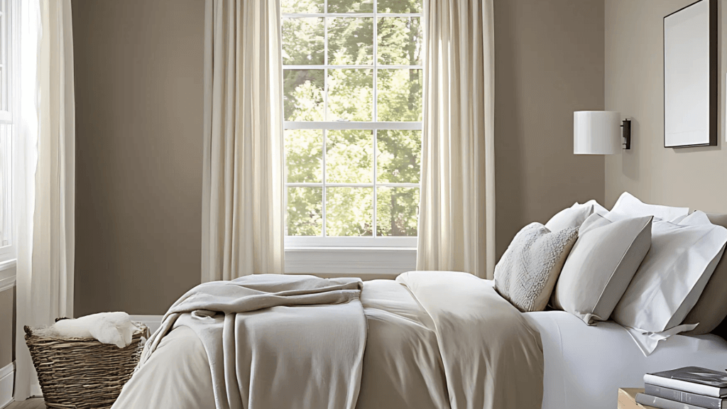
This color creates a restful environment. It provides enough color to feel cozy without becoming too intense. With a 65 LRV, Taupe of the Morning keeps bedrooms airy yet snug.
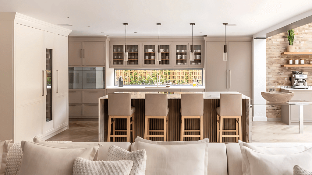
3. Kitchens
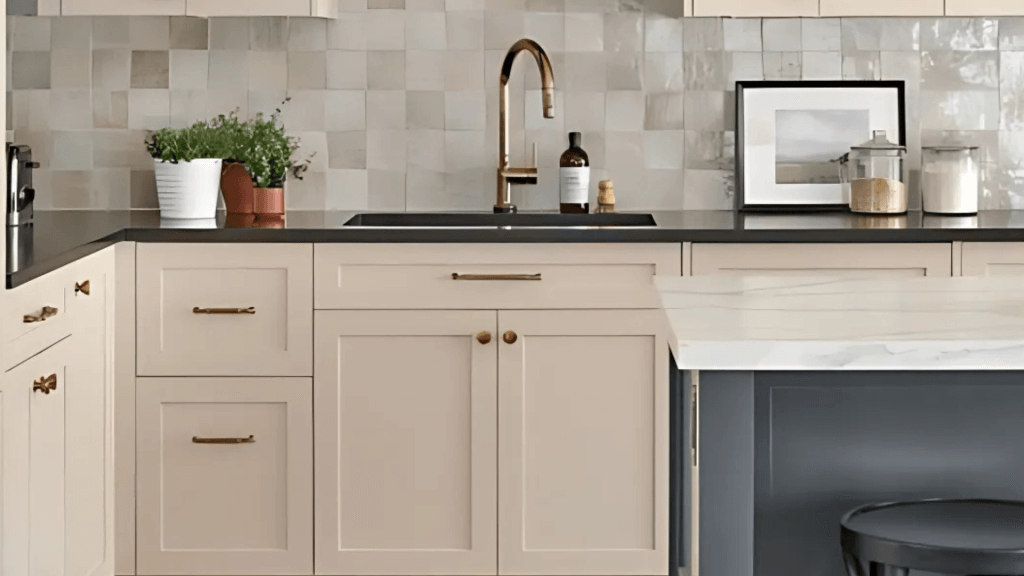
On cabinets, it creates a modern yet timeless look. When paired with white marble or quartz countertops, it really shines. Taupe of the Morning works on both walls and cabinetry for a streamlined look.
4. Exterior Applications
The color softens naturally in outdoor light. Just keep in mind that intense direct sunlight might make it appear lighter than expected. Taupe of the Morning pairs well with the whites listed above outdoors too.
The Good and Not-So-Good About Taupe of the Morning
Positive Points
- It works equally well with warm and cool decor elements.
- Maintains perfect balance between warm and cool tones.
- It makes an excellent choice for connecting multiple rooms.
Points to Consider
- Color can look different based on lighting and surrounding elements.
- It might need additional lighting in darker spaces to maintain its depth.
Conclusion
After spending significant time with Taupe of the Morning, I can say it’s a thoughtful addition to Sherwin Williams’ color lineup. This isn’t just another neutral – it’s a carefully crafted shade that fills the gap between traditional taupes and modern greiges.
Based on hundreds of real-home applications, I’ve seen it succeed in spaces where other neutrals fall short. While it needs proper lighting to truly shine and can be sensitive to surrounding colors, its flexibility and balanced undertones make it worth considering.
If you’re planning to test this color, I recommend painting a large sample board and viewing it throughout the day in your space. This extra step will help you understand exactly how this sophisticated neutral will perform in your home. Do this with Taupe of the Morning on any walls or cabinets you’re considering.
