
If you’ve ever stood in the paint aisle holding two nearly identical greige swatches and suddenly forgotten your own name… hi. Welcome. You’re in greige purgatory: two little rectangles of “meh,” one cart full of optimism, and somehow it feels like your entire personality hinges on the decision.
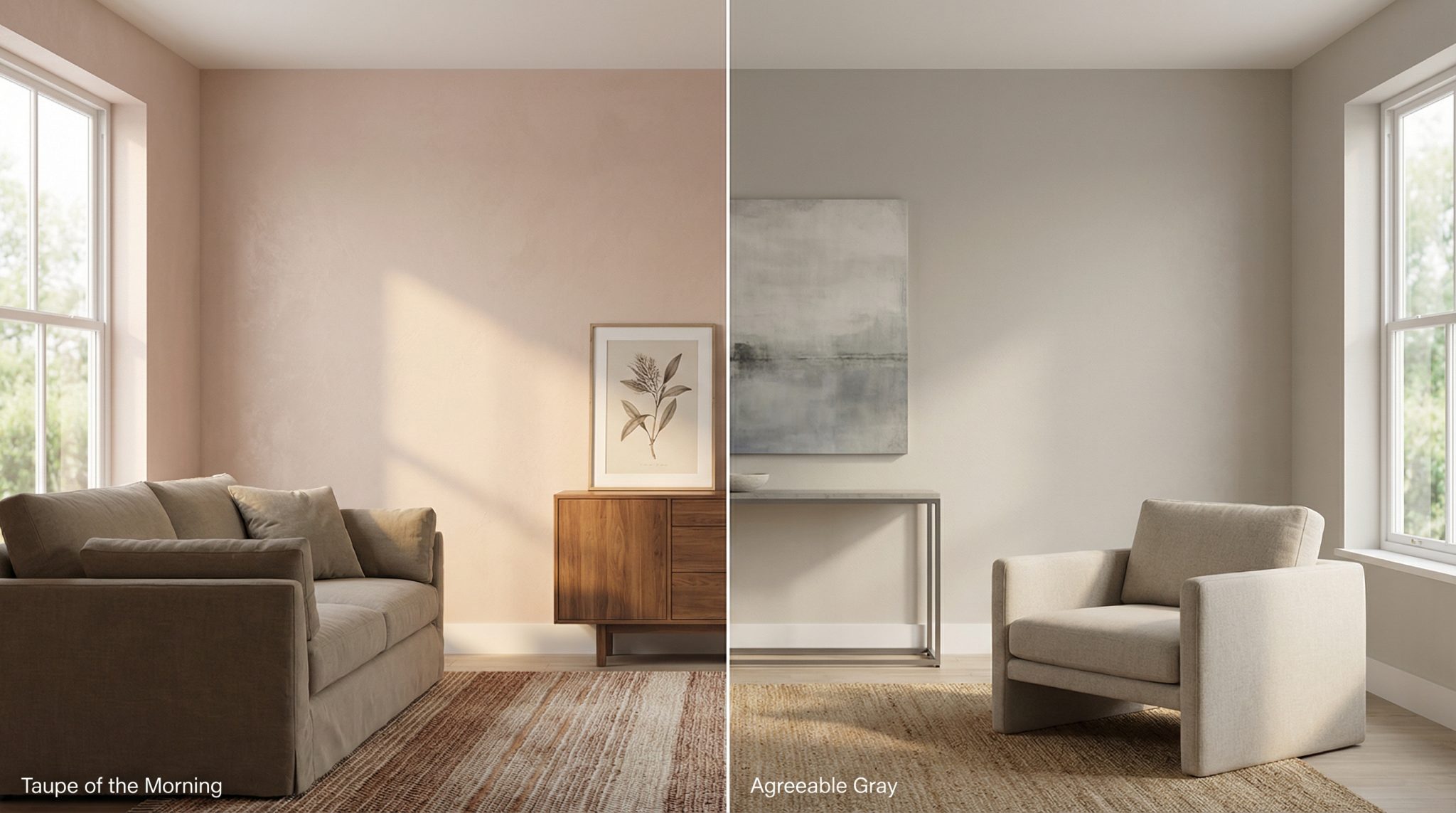
Sherwin-Williams Taupe of the Morning and Agreeable Gray are both in that “neutral, goes with everything, won’t scare the neighbors” category. But they behave very differently once they’re actually on your walls. One is stable and predictable. The other is a bit of a vibe sponge.
Let me save you from repainting on a Saturday (a fate I would not wish on my enemies).
The “Talk Me Off the Ledge” Quick Pick
If you don’t want a deep dive and you’re already 47 tabs into a paint spiral, here’s the quick filter:
- Choose Taupe of the Morning if… you have decent warm light (south/west exposure or warm bulbs), warm woods/metals, and you want the color to stay pretty consistent from room to room.
- Choose Agreeable Gray if… your room is dim/north facing/windowlessish, your lighting runs cooler (hello bathroom LEDs), or you want a safe neutral that won’t go murky in low light.
And yes: you still need to test. I know. I hate it too. But paint is like dating—things can look great in the app (aka the swatch) and then show up totally different in real life.
The Real Difference: “Steady Eddie” vs. “Mood Ring”
These two are close cousins in the greige family, but here’s the big personality split:
Taupe of the Morning has a built-in pink violet undertone and it’s pretty fixed. What you see is mostly what you get. It’s the reliable friend who shows up on time, doesn’t text “LOL nvm,” and doesn’t change identities depending on who’s in the room.
Agreeable Gray is more of a chameleon. It picks up whatever’s around it—warm woods, brass, a red rug, your giant moody painting—and it can shift warmer, cooler, slightly pinkish, slightly beige… basically it “matches the vibe” whether you asked it to or not.
That’s why Agreeable Gray is so wildly popular…and also why some people paint it and go, “Why does this look different than literally every photo on Pinterest?” (Because Pinterest doesn’t live in your house. Pinterest does not have your camel colored sofa.)
Okay, But Which One Is Lighter?
This is where we talk LRV (Light Reflectance Value), which is just a fancy way of saying how much light the color bounces back.
- Taupe of the Morning LRV: 65
- Agreeable Gray LRV: 60
That 5 point difference is noticeable, especially in smaller rooms or spaces that don’t get much natural light. Taupe of the Morning is a touch brighter. But (and this is the annoying part) undertones and lighting can matter even more than “lighter vs darker.”
Paint doesn’t lie—light lies.
Lighting: The Part Everyone Wants to Skip (But Can’t)
If you only read one section, read this one. Lighting is the boss fight.
My very unscientific but extremely useful rule
If your room gets less than about 4 hours of decent natural light a day, Agreeable Gray is usually the safer bet.
Taupe of the Morning likes light. In a bright, warm room it looks soft and calm and pretty. In a dim room, that violet undertone can go from “subtle and sophisticated” to “why do my walls look… bruised?”
Room exposure, in real-person terms
- South/west facing rooms: Warmer light. Taupe of the Morning usually looks great and stays balanced. Agreeable Gray can still work, but it may warm up more than you expected.
- North facing rooms: Cooler, flatter light. Agreeable Gray tends to hold itself together better. Taupe of the Morning can look kind of dull unless you warm up your bulbs.
- Windowless spaces (powder rooms, basements): This is where Taupe can get weird fast, especially under cool lighting. Agreeable Gray generally behaves better here.
Light bulbs matter more than your opinion (sorry)
- Warm bulbs (2700K-3000K): Taupe of the Morning gets warmer and the violet calms down. Agreeable Gray also warms up (sometimes in a nice way, sometimes in a “why is this tan now?” way).
- Cool bulbs (4000K-5000K): Taupe can lean more purple. Agreeable Gray tends to stay more neutral.
If you’re painting a bathroom with those cool “surgical procedure” vanity lights, Agreeable Gray is usually the path of least regret.
Where Each Color Gets… Problematic
Every paint color has a nemesis. Here are the situations where each one tends to throw a tantrum.
Taupe of the Morning can struggle if:
- Your room is north facing and you’re not adding warm lighting
- It’s windowless (powder room/basement vibes)
- You have very yellow/orange wood (some oak floors are truly out here doing the most)
Agreeable Gray can struggle if:
- You’ve got a lot of red/burgundy nearby (it can nudge pink)
- You have strong gold/mustard tones (it can skew kind of yellow gray)
- You want it to look identical in every room regardless of exposure (it probably won’t)
Agreeable Gray is “agreeable” the way a people pleaser is agreeable. It will try to get along with everyone…and sometimes that means it forgets who it is.
What About Wood Tones + Hardware?
Your floors and fixtures get a vote. A loud vote.
- Brass / gold / bronze: Taupe of the Morning usually looks amazing and intentional. Agreeable Gray can look a little blah next to warm metals.
- Chrome / stainless / nickel: Agreeable Gray feels right at home with cooler metals.
Wood tones are where I see people get blindsided. Warm honey floors can work with either. But if your floors are very orange or very yellow, Taupe of the Morning’s undertone can clash in a way that’s hard to unsee once you see it. (And no, putting a jute rug over it doesn’t make it stop being orange oak. Ask me how I know.)
Trim + Accent Colors (Because Trim Can Ruin Everything)
Trim is where “this is fine” becomes “why does it look weird?” fast.
Both colors play nicely with clean whites like SW Pure White or BM Chantilly Lace.
If you’re using Taupe of the Morning, I personally wouldn’t go too creamy on the trim. SW Greek Villa is about as warm as I’d push it. Go creamier than that and Taupe can start whispering “nursery” when you wanted “classic grown-up neutral.”
Agreeable Gray is less fussy about trim whites because it doesn’t have one single dominant undertone… it’s already busy reflecting everyone else.
Accent colors I love:
- With Taupe of the Morning: deep teal, forest green, warm earthy tones, navy
- With Agreeable Gray: charcoal, slate, crisp navy (SW Naval is a classic), cooler modern palettes
My (Strong) Opinion on Testing Paint
Yes, you have to test. Even if you’re “pretty sure.” Especially if you’re pretty sure.
Here’s the method plus a wall paint sheen guide that saves you from repainting rage:
- Go bigger than you think: at least 12″x12″ (bigger is better)
- Test for a few days: 3-5 if you can
- Look at it: morning, midday, and night with your real lamps on
- My success rule: if you like it at least ~70% of the time you glance at it, you’re probably good
And please, for the love of your sanity, don’t pick based on online photos. Cameras and screens are liars with excellent marketing.
So… Who Wins?
If you want a neutral that stays consistent and you’ve got decent warm light: Taupe of the Morning is the steady, predictable choice with a detailed paint review.
If your room is darker, north facing, or you’re dealing with cooler lighting (bathrooms, basements, sad little hallways): Agreeable Gray is usually the safer pick.
Either way, paint a big sample, live with it for a few days, and trust what it does in your house—not the store, not Pinterest, not your neighbor’s “it looked great in my living room!” situation.
Your walls, your light, your rules.