
Accessible Beige is one of the most versatile neutrals in the design world, but its true power emerges when paired with the right complementary colors.
This chameleon-like shade transforms spaces from ordinary to extraordinary with thoughtful color partnerships.
While some neutrals limit your design options, Accessible Beige opens doors to countless palettes.
From bold statements to subtle sophistication, the complementary colors you choose determine the entire mood of your space.
Today, we’re revealing the top color combinations that turn Accessible Beige from a background player to a design superstar.
These proven pairings will transform your walls, furniture, and accessories into a cohesive look that feels both timeless and fresh.
Understanding Accessible Beige
Color Profile
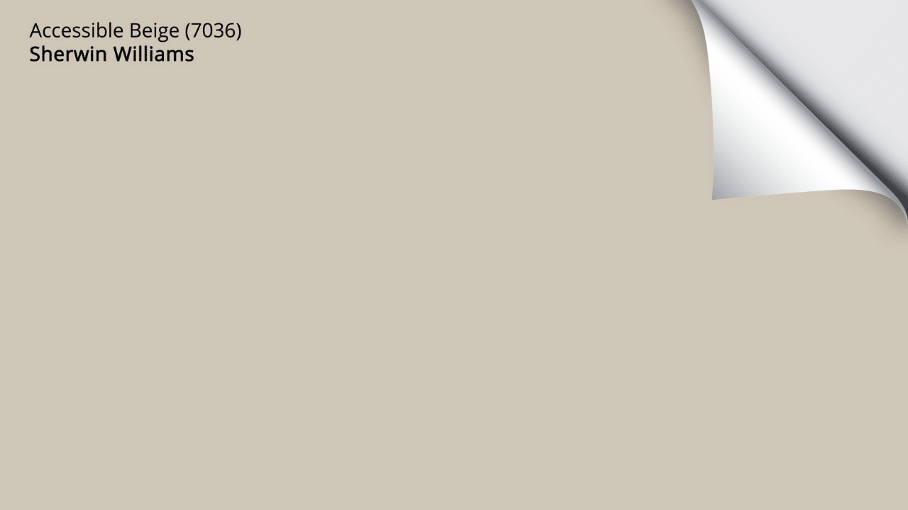
SW Accessible Beige (SW 7036) is a warm tan beige with subtle gray undertones that creates a soft, inviting appearance.
It sits comfortably between beige and greige on the color spectrum, leaning slightly more toward the warm side.
This versatile neutral has enough warmth to feel cozy and welcoming without the yellow undertones that can make some beige paint appear dated.
Its muted quality gives it a sophisticated edge that works in both traditional and contemporary spaces.
| Characteristic | Description |
|---|---|
| Color Family | Neutral/Beige |
| Undertones | Subtle gray with warm tan base |
| LRV (Light Reflectance Value) | 58 – Medium light range |
| Finish Options | Matte, eggshell, satin, semi-gloss |
| Best Paired With | Crisp whites, navy blue, olive green, black accents |
| Season Feel | Year-round neutral (adjusts with seasonal décor) |
Undertones and Lighting
Lighting conditions dramatically influence how Accessible Beige appears in a space. The paint color transforms notably based on exposure and time of day.
| Lighting Condition | How Accessible Beige Appears |
|---|---|
| North-Facing Rooms | Gray tones become more prominent, cooler appearance |
| South-Facing Rooms | Warm undertones emerge, creating a cozier effect |
| East-Facing Rooms | Appears more neutral in morning, warmer in afternoon |
| West-Facing Rooms | Cooler in morning, golden-warm in evening light |
| Artificial Light: Incandescent | Enhances warmth, brings out tan qualities |
| Artificial Light: Cool LED/Fluorescent | Draws out gray undertones, appears more greige |
| Artificial Light: Warm LED | Similar to natural light, balanced appearance |
This responsiveness to light makes Accessible Beige particularly versatile but also means it’s crucial to test samples in your specific space throughout different times of day before committing to the wall color.
The Color Wheel and Complementary Colors

Complementary colors sit opposite each other on the color wheel.
When placed side by side, they create maximum contrast and make each other appear more vibrant. This pairing creates visual balance and energy in a space.
The basic color wheel includes:
- Primary colors: red, blue, yellow
- Secondary colors: green, orange, purple
- Tertiary colors: combinations of primary and secondary colors
Complementary pairs include:
- Red and green
- Blue and orange
- Yellow and purple
Accessible Beige’s Position
Accessible Beige falls in the yellow-orange family on the color wheel but in a very muted form.
Its undertones place it as a warm neutral with hints of yellow and brown.
| Color Wheel Position | Complementary Direction |
|---|---|
| Warm neutral (yellow-orange family) | Blue to blue-violet spectrum |
| Contains subtle gray | Works well with both cool and warm colors |
| Muted tone | Pairs with both muted and vibrant complements |
Complementary Color Options for Accessible Beige

Soft Muted Tones
These colors create gentle harmony with Accessible Beige:
- DustBlu SW 9161: Soft blue-grays like “Misty” or “Atmospheric” provide subtle contrast
- Clary Sage Sw 6178: Muted greens like “Sea Salt” or “Clary Sage” enhance the natural feel
- Light Grays Family: Pale grays like “Passive” or “Drift of Mist” add subtle dimension
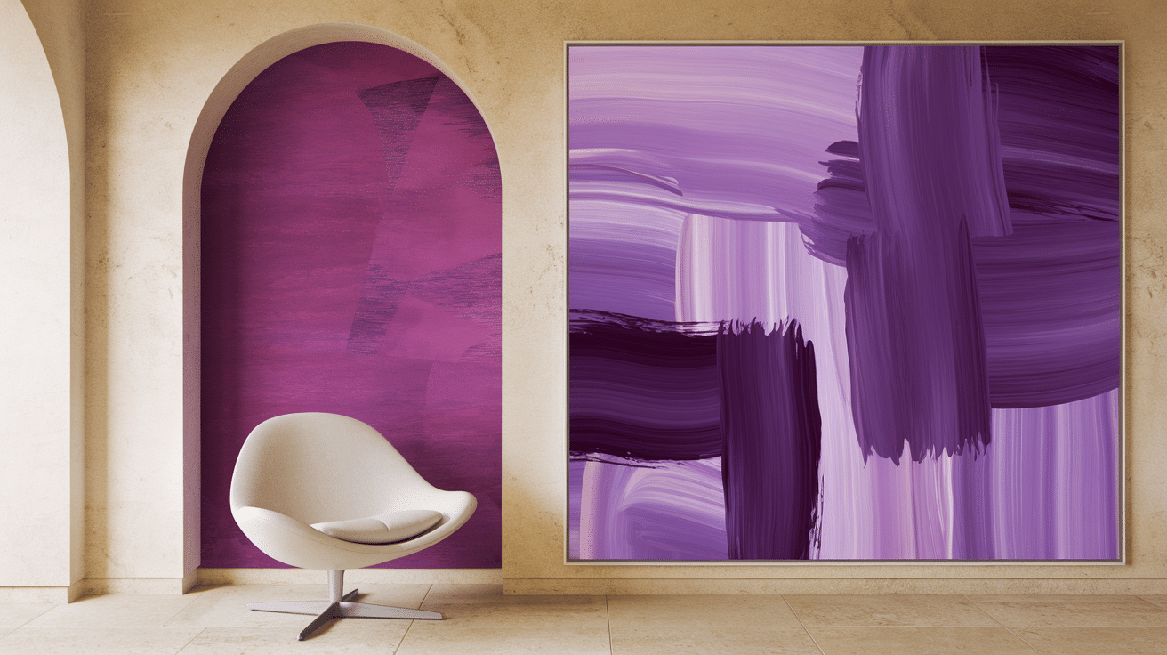
- Lavender SW 9688: Soft purples like “Touch of Lilac” create gentle contrast
Bold Contrasts
For more impact, pair Accessible Beige with:
- Naval SW 6244: Deep blues like “Naval” or “Indigo Batik” create striking contrast
- Forest Green 2047: Rich greens like “Rookwood Green” or “Billiard Green” add depth
- Terracotta SW 2803: Warm, earthy reds like “Terra Cotta” or “Fired Brick” provide warmth
- Charcoal HC 178: Dark grays like “Iron Ore” or “Tricorn Black” create dramatic accents
Neutral Pairings
Keep it simple with these neutral companions:
- Creamy Whites: Warm whites like “Greek Villa” or “Alabaster” maintain a soft look
- Off-Whites: Whites with subtle undertones like “Snowbound” add brightness
- Mega Greige: Darker greige tones like “Mega Greige” create depth within the same family
- Taupe: Deeper neutrals like “Keystone Gray” or “Tony Taupe” provide subtle contrast
| Pairing Type | Best Used For |
|---|---|
| Soft Muted | Bedrooms, living rooms, spaces needing calm |
| Bold Contrasts | Accent walls, furnishings, spaces needing energy |
| Neutral Pairings | Whole-home color schemes, minimalist spaces |
Implementing Complementary Colors in Design
Walls and Trim
Accessible Beige walls can gain depth and character with the right trim colors:
- White Trim: Crisp whites like “Pure White” or “Extra White” create classic contrast
- Off-White Trim: Softer whites like “Alabaster” offer subtle definition
- Dark Trim: Navy or black trim makes a bold statement against Accessible Beige
- Tonal Trim: Using a darker beige or greige for trim creates a sophisticated monochromatic look
Doors painted in complementary colors can serve as unexpected color statements while keeping walls neutral.
Furniture and Decor
Add complementary colors through:
- Larger Pieces: Sofas or beds in navy blue, sage green, or charcoal gray
- Accent Chairs: Smaller furniture in bolder colors like terracotta or deep teal
- Textiles: Pillows, throws, and curtains in complementary hues
- Rugs: Area rugs that incorporate both Accessible Beige and complementary colors
- Art: Wall art featuring complementary colors ties the room together
- Small Decor: Vases, lamps, and decorative objects in complementary colors add pops of interest
Accent Walls
Feature walls in complementary colors create focal points:
- Navy blue accent walls behind neutral furniture create drama
- Dusty blue accent walls offer subtle contrast in bedrooms
- Deep green accent walls in dining rooms add richness
- Terra cotta accent walls add warmth in living spaces
Paint inside built-in shelving with complementary colors for a designer touch while keeping the rest of the room in Accessible Beige.
Residential Spaces
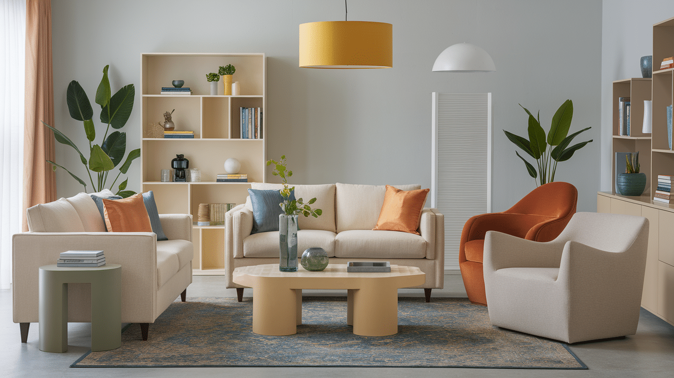
- Living Room: Accessible Beige walls with navy blue sofa, brass accents, and cream curtains create a balanced, inviting space.
- Kitchen: Accessible Beige walls paired with white cabinets, black hardware, and wood accents create timeless appeal.
- Bedroom: Accessible Beige with dusty blue bedding, cream curtains, and natural wood furniture creates a restful retreat.
- Bathroom: Accessible Beige walls with white fixtures, matte black hardware, and green plants add spa-like tranquility.
Tips for Choosing the Right Complementary Color Palette

Consider Room Function
Match colors to room purpose:
- Bedrooms: Soft blues and greens promote rest and relaxation
- Home Offices: Navy and forest green support focus and productivity
- Kitchens: Whites and soft greens create clean, fresh environments
- Living Rooms: Terracotta and navy add warmth and encourage conversation
- Bathrooms: Blues and greens create a spa-like calm
Consider natural light levels when selecting complementary colors.
Test Samples
Always test colors before committing:
- Paint large swatches (at least 2 feet square) on multiple walls
- Check colors at different times of day as light changes
- View colors under both natural and artificial lighting
- Place sample boards near existing furnishings to ensure harmony
- Live with samples for at least 48 hours before deciding
Consult Color Professionals
Get expert help when needed:
- Interior designers can create custom color schemes
- Paint store color consultants often offer free or low-cost advice
- Online color tools can suggest complementary palettes
- Social media and home design websites offer visual inspiration
- Paint manufacturers provide curated color collections that work with Accessible Beige
When working with professionals, bring fabric samples, floor colors, and photos of your space for the most accurate recommendations.
Color Palettes for Every Style
Whether you prefer modern minimalism or traditional elegance, beige coordinating colors can enhance your design vision. Sherwin Williams offers extensive paint colors that complement Accessible Beige, from soft neutrals to bold accent shades. Understanding color codes helps ensure perfect matches when shopping for coordinating colors across different brands. For exterior applications, consider how natural light affects your chosen color palette throughout the day.
Wrapping Up
Accessible Beige proves itself as the ultimate foundation color that works seamlessly with a spectrum of complementary shades.
By strategically incorporating blues for tranquility, greens for natural balance, or bold accents for drama, you’ve gained the tools to transform any room with confidence.
The beauty of Accessible Beige lies in its adaptability – it creates the perfect backdrop that allows your chosen complementary colors to shine while maintaining visual harmony throughout your space.
Remember that lighting dramatically affects how these combinations appear, so always test your pairings in your specific environment before committing.
What complementary color would you pair with Accessible Beige in your home?
Share your ideas in the comments below, or tag us in your before-and-after photos to showcase your design transformation!