What Makes Accessible Beige a Popular Choice?
Paint color choices often keep me at night – especially when clients ask about versatile neutrals that won’t feel bland or dated. Sherwin Williams Accessible Beige rises to this challenge, becoming a go-to choice for my design projects. I’ll help you understand why this color stands out in today’s sea of paint options. When you finish reading this post, you’ll know exactly what makes this shade special – from its subtle undertones to how it shifts in different lighting. In this guide, I’ll walk you through: The qualities that make Accessible Beige unique Key things to consider before choosing this color Real examples of where it shines in homes What is SW Accessible Beige? Think of Accessible Beige as that
Sherwin Williams Snowbound vs Pure White Paint Guide
White paint can make or break a room’s look. With countless shades available, choosing between Snowbound and Pure White feels like finding a needle in a haystack. Many homeowners don’t know that these popular white paint shades have distinct qualities that set them apart – from their undertones to how they react in different lighting conditions. The right white shade can brighten your space, create a cozy atmosphere, and complement your existing decor. The wrong one might leave your room feeling cold or mismatched. Read on to learn the key differences between Snowbound and Pure White, and find out which shade will work best for your home. We’ll help you make the perfect choice for your white walls. Snowbound vs.
Dark Academia Paint Colors: A Guide to Moody Interiors

Picture walking into a room that feels like stepping into an old library, where shadows dance on walls painted in rich, scholarly tones. However, picking the right paint colors can feel overwhelming. If you get one wrong shade, your space might feel gloomy instead of sophisticated. I’m here to share my favorite paint combinations, which capture the perfect balance of moody and inviting—think less “haunted house” and more “historic study.” Understanding Dark Academia Picture an old university library at dusk – that’s the heart of dark academia style. It’s not just about paint colors; it’s about creating a space that whispers stories of vintage books, late-night studies, and timeless knowledge. What Makes It Special? Dark academia blends scholarly charm with
Shoji White vs Alabaster: Choosing the Right White Paint
What’s with all the white paint choices making decisions so hard? Picking the right white paint feels like solving a puzzle – staring at dozens of seemingly identical swatches, second-guessing every choice. I’ve been there, too, watching clients pull their hair out, trying to tell the difference between Shoji White and Alabaster. But here’s something most people don’t know: These two popular whites have distinct personalities that can make or break a room’s atmosphere. I’ll show you the key details that set them apart so you can confidently make your choice. After reading this guide, you’ll know exactly which white paint will give your space the perfect look you want. Quick Comparison: Shoji White vs. Alabaster Looking at these two
Green Cabinets with Butcher Block: Best Pairings & Tips
I’m sharing my top picks for pairing green cabinets with butcher block countertops in today’s post. As someone who spent months researching kitchen designs before my own renovation, I can tell you firsthand that these materials create a natural balance between wood tones and calming green shades. After trying different combinations in my design studio and helping clients update over 50 kitchens last year, I’ve put together tested tips that really work. From paint selection to wood types that go well together, you’ll learn what you need to know about creating your own green cabinet and butcher block kitchen. Ready to explore these kitchen ideas? Let’s begin. Why Choose Green Cabinets with Butcher Block? I love this combination for several
Taupe of the Morning by Sherwin Williams: A Designer’s Take

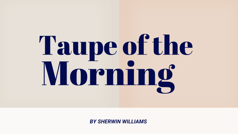
I’m sharing my complete analysis of Sherwin Williams’ Taupe of the Morning, a color that’s been gaining attention in the design world. As a paint color consultant who’s worked with this shade in countless homes, I’ve watched it transform spaces from basic to beautiful. After testing it in different lighting conditions, pairing it with various trims, and using it on everything from bedroom walls to kitchen cabinets, I have solid evidence of what makes this color work – and when it might not be your best choice. Let’s explore why this versatile neutral might be exactly what you’re looking for in your next paint project. What is Taupe of the Morning? Taupe of the Morning stands out as a balanced
Classic Gray vs White Dove: Pick Your Perfect Paint
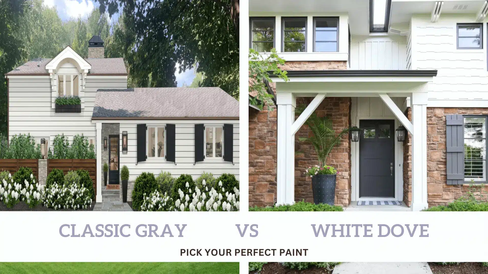
Can’t decide between Classic Gray and White Dove for your walls? It’s a common problem. These two colors look so close on those tiny paint samples, yet they can make your room look completely different. Most people don’t know that these colors change throughout the day as the light shifts. What looks perfect in the morning might not be what you want by evening. The good news is that both colors have their strong points – Classic Gray adds softness to your rooms, while White Dove brings brightness. Want to know which color will work best in your home? Let’s look at how these two popular paint colors are different and help you pick the right one for your space.
Best Color Matches for Sherwin Williams Swiss Coffee

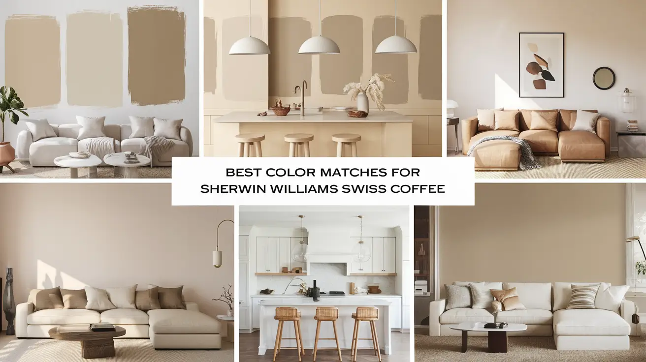
When it comes to white paint colors, Swiss Coffee has become a go-to choice for many. Its gentle warmth and versatility make it a favorite for walls, trim, and cabinets alike. While everyone loves this shade, finding the right colors to pair with it can be challenging. The good news is that creating beautiful color combinations with Swiss Coffee doesn’t have to be complicated. The right pairings can bring out its subtle warmth while creating a balanced look in any room. This guide will walk you through five perfect Sherwin-Williams color matches for Swiss Coffee, complete with real-world examples and room-by-room suggestions. Top Color Matches for Swiss Coffee Let’s explore five Sherwin-Williams colors that work wonderfully with Swiss Coffee. Each
White Dove or Snowbound? Picking the Perfect White Paint
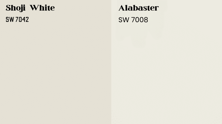
Choosing the perfect white paint for your home might seem simple, but the subtle differences between shades can make or break a space. White paint isn’t just “white”—it carries undertones that can transform a room’s mood, lighting, and overall aesthetic.
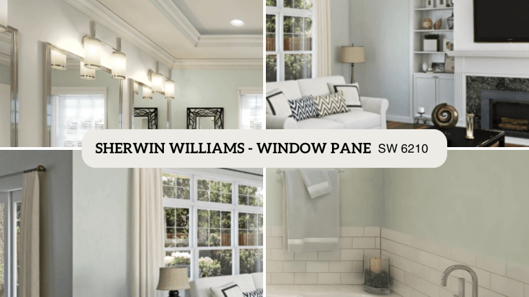
 Two popular options, White Dove by Benjamin Moore and Snowbound by Sherwin-Williams, are often compared for their versatility and timeless appeal. While White Dove leans warm with soft, inviting undertones, Snowbound offers a crisp, modern feel with cooler hints of gray. This blog examines the differences between these whites to help you select the ideal option for your home. The right white enhances your space, whether you prefer warmth or minimalism. Understanding White Paint Undertones White paint isn’t just “white”—it
Pewter Green Cabinets: The Color Trend You Need Now
Green makes kitchens feel alive, yet many choose white or beige as their cabinet colors. You’ve browsed hundreds of kitchen photos online but can’t find a fresh color without being too bold. The standard options leave your space feeling flat and uninspired. Does this sound familiar? Here’s something that might surprise you: Pewter green cabinets blend the comfort of neutral tones with just the right pop of nature-inspired color. This gentle, sophisticated hue adds character to your kitchen without overwhelming the space. Let me show you why this shade deserves a spot in your home and how it can transform your cooking space into something special. Pewter Green- A Closer Look at This Trendy Hue Description of Pewter Green Pewter