

Picking the right white paint feels harder than it should be. You stand in the paint aisle staring at dozens of white samples that all look the same.
But when you get them home, they create totally different moods on your walls.
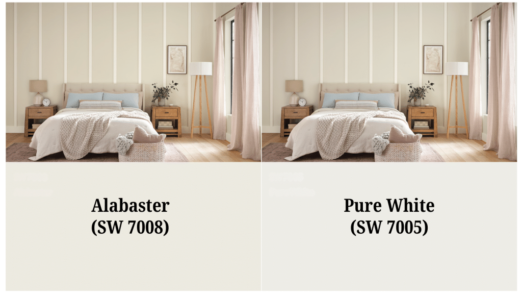
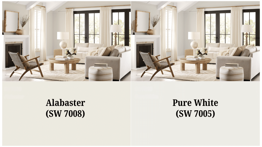
Sherwin-Williams Alabaster and Pure White are two of the most popular white paints out there.
They might look similar on those tiny paint chips, but they work very differently in real rooms. One leans warm and cozy, while the other stays clean and bright.
This guide breaks down everything you need to know about both paints. You’ll learn which spaces they work best in and how to pick the right one for your home.
Getting to Know Sherwin-Williams Alabaster (SW 7008)

Alabaster is like that friend who makes everyone feel comfortable. It’s a warm, creamy white that has just enough yellow in it to feel inviting.
This paint was Sherwin-Williams’ Color of the Year back in 2016, and it’s still flying off the shelves.
The secret to Alabaster is its balance. Yes, it has yellow undertones, but they’re soft and muted. It won’t make your walls look like butter or old teeth. Instead, it gives rooms a gentle warmth that feels like a cozy hug.
This paint has an LRV (Light Reflectance Value) of 82. That means it reflects most of the light that hits it without being too bright.
It’s perfect for rooms that don’t get tons of natural light because it brightens things up without looking harsh.
Where Alabaster Works Best
Here are the spaces where this warm white really shines.
- Kitchen Cabinets: This paint looks great on kitchen cabinets, especially when paired with granite or quartz countertops. It works well with warm metals like brass and copper, too.
- Low-Light Spaces: Got a north-facing room that feels dark and gloomy? Alabaster can help. It brightens up dim spaces without looking cold or sterile.
- Exteriors: If your house sits under lots of trees or in a shady spot, Alabaster is a great choice. It stays warm and welcoming even when it’s not getting direct sunlight.
All About Sherwin-Williams Pure White (SW 7005)

Pure White is the clean, crisp option in this matchup. It’s still warm enough to feel friendly, but it leans more toward that fresh, modern look.
Think of it as the difference between cream and whole milk – both are white, but one is definitely cleaner looking.
This paint has an LRV of 84, making it slightly brighter than Alabaster. It has subtle warm undertones that keep it from looking cold or clinical. Pure White is the paint you choose when you want clean lines and fresh vibes.
The best thing about Pure White is how consistent it looks. It doesn’t change dramatically in different lighting like some whites do.
What you see is pretty much what you get, which makes it easier to work with.
When to Choose Pure White
Here’s when this clean, crisp white is your best choice.
- Trim and Molding: Pure White makes excellent trim paint. It gives you that crisp, clean edge that makes everything look finished and professional.
- Modern Spaces: If your style leans contemporary or minimalist, Pure White is your friend. It gives you that clean backdrop without being stark or cold.
- Bright Rooms: Rooms with lots of natural light can handle Pure White beautifully. It stays crisp and fresh even when the sun is streaming in.
Side-by-Side: How They Compare
Let’s get practical about the differences between these two paints. When you put them next to each other, here’s what you’ll notice.
| Feature | Alabaster (SW 7008) | Pure White (SW 7005) |
|---|---|---|
| Warmth Level | Feels warmer and more inviting, has more personality | Feels cleaner and more neutral, neither cold nor warm |
| Brightness | LRV of 82, slightly less bright | LRV of 84, slightly brighter but barely noticeable |
| Versatility | Better for whole-house color schemes | Excels as an accent color for trim and cabinets |
Understanding Undertones and Lighting
Here’s where things get interesting. Both paints have undertones, but they show up differently depending on your lighting.
Alabaster’s Undertones
This paint has yellow undertones mixed with a touch of gray that keeps it balanced. In bright sunlight, the yellow might come out more and feel warmer.
In low light, it stays soft and welcoming without looking dingy. The gray undertones are what keep Alabaster from looking too buttery or overwhelming in any space.
Pure White’s Undertones
Pure White keeps its undertones much more subtle and consistent throughout the day. It has just a whisper of warmth that prevents it from looking cold or sterile.
This paint stays pretty much the same, no matter what kind of light you have. You won’t see dramatic shifts like you might with other whites that have stronger undertones.
Always test the paint in your actual room before making any final decisions. Colors look completely different under fluorescent lights versus natural sunlight and warm LED bulbs.
Perfect Color Combinations
The right color pairings can make your white paint choice look even better. Here are the colors that work best with each paint to create beautiful spaces.
What Works with Alabaster
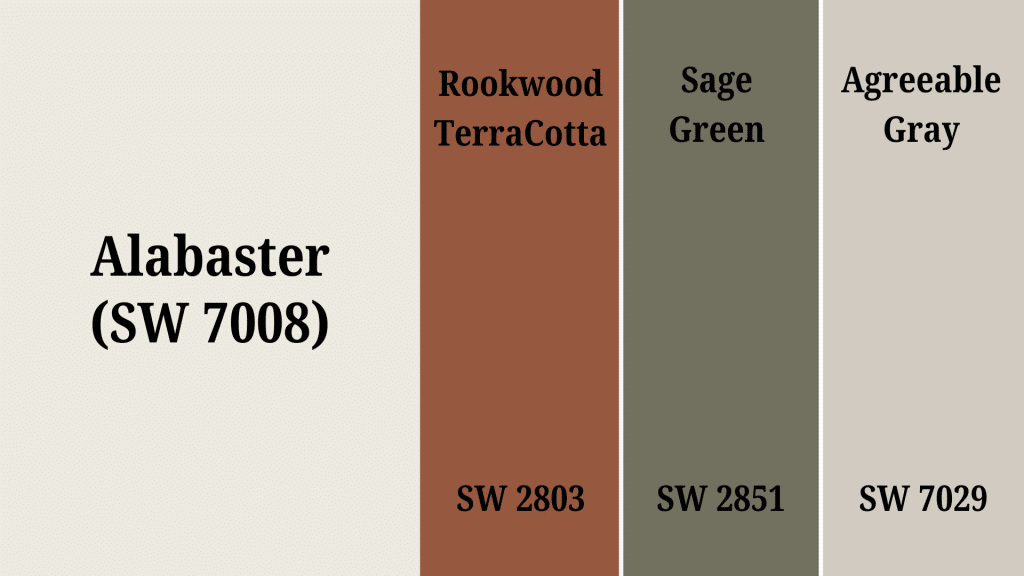
This warm white pairs beautifully with other warm colors that complement its cozy nature. Think soft grays like Agreeable Gray, warm beiges, and rich earthy tones like sage green or terracotta.
It also looks great with natural materials like honey oak wood and natural stone. Brass and copper hardware add the perfect finishing touch to Alabaster’s warm personality.
What Complements Pure White
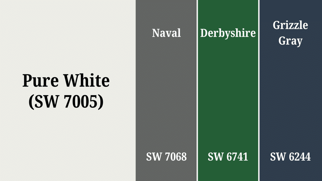
This cleaner white works well with both warm and cool colors because of its neutral base. Try it with soft pastels like blush pink or powder blue for a fresh look.
It pairs nicely with crisp grays, navy blues, or even bold accent colors like emerald green. Pure White is neutral enough to let other colors be the star of the show.
Mixing the Two Together: Here’s a pro tip that many designers use – you can combine both paints in the same space. Try Alabaster on the walls and Pure White on the trim for a classic look with depth.
Room-by-Room Applications
Different rooms have different needs when it comes to white paint. Here’s how Alabaster and Pure White perform in the most common spaces.
1. Kitchens
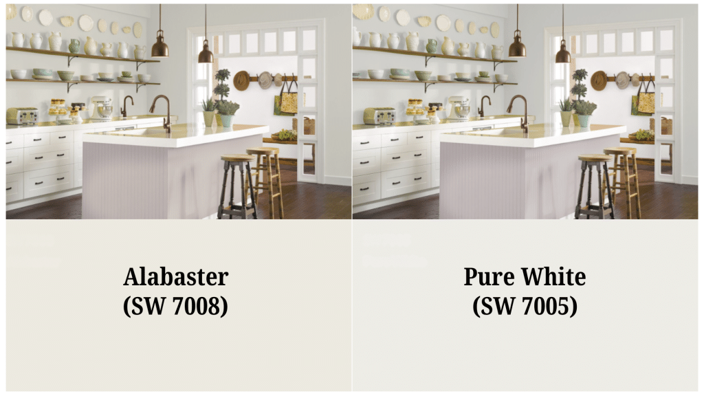
Alabaster cabinets feel classic and warm, especially when paired with granite or quartz countertops. Pure White cabinets look clean and modern, perfect for contemporary kitchen designs.
Both work great with different hardware finishes. Consider your overall kitchen style when choosing between the two.
2. Bathrooms
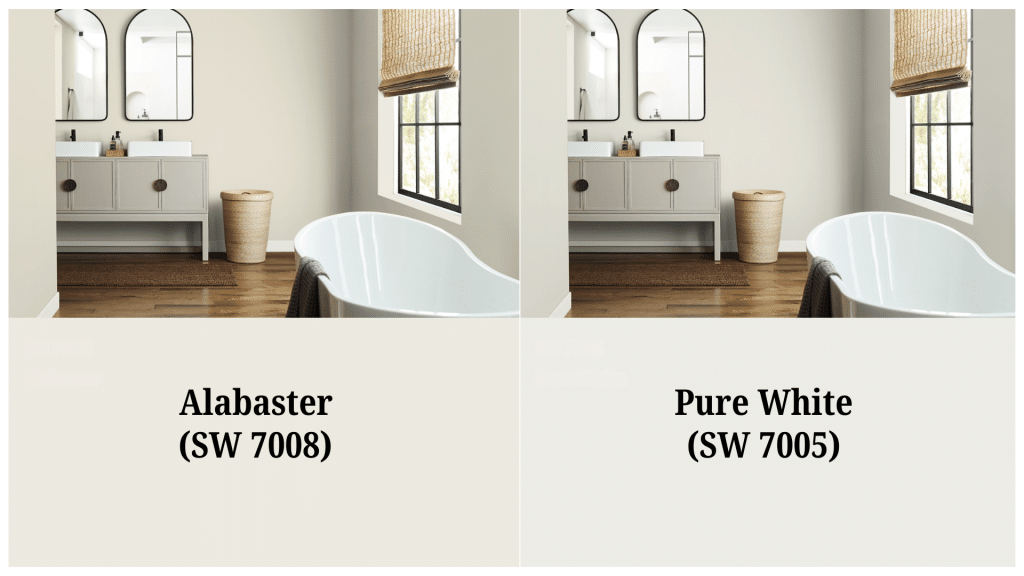
Alabaster creates a spa-like warmth that makes bathrooms feel cozy and inviting. Pure White keeps things bright and clean, ideal for smaller bathrooms that need extra light.
Consider your bathroom’s natural light and size when making your choice. Both paints handle moisture well when properly primed.
3. Bedrooms
Alabaster wins in bedrooms because of its cozy, restful factor that makes rooms feel like a retreat. The warm undertones create a peaceful atmosphere perfect for winding down.
Pure White works too, especially in modern or minimalist bedrooms with lots of natural light. Think about whether you want energizing brightness or calming warmth.
4. Living Areas
Both paints work in living rooms but consider your furniture and decor style. Alabaster works better with traditional, farmhouse, or eclectic styles that benefit from warmth.
Pure White suits modern, contemporary, or Scandinavian looks that need clean backdrops. Your existing furniture colors should help guide your decision.
Testing Before You Commit
Don’t skip this step – testing paint samples is crucial. Those tiny paint chips at the store don’t tell the whole story.
- Get Large Samples: Use peel-and-stick samples or paint large poster boards. You need to see how the color looks on a bigger surface.
- Check Different Times of Day: Look at your samples in morning light, afternoon sun, and evening artificial light. Colors can look completely different at different times.
- Live with Them: Keep your samples up for at least a few days. You’ll start to notice things you didn’t see right away.
- Test on Multiple Walls: Paint samples on walls that get different amounts of light. North-facing walls show colors differently from south-facing ones.
- View from Different Angles: Walk around the room and look at your samples from various spots. Colors can shift depending on where you stand.
- Compare Side by Side: Put both paint samples next to each other to see the real differences. This makes undertones much more obvious.
Alternatives to Consider
If neither Alabaster nor Pure White feels quite right, here are some other great whites to consider.
| Paint Color | LRV | Undertones | Best For |
|---|---|---|---|
| Benjamin Moore White Dove | 83 | Soft, warm white, more neutral | Whole house color, similar warmth to Alabaster |
| Sherwin-Williams Greek Villa | 84 | Slight greige undertones | Brighter rooms, cleaner than Alabaster |
| Benjamin Moore Cloud White | 85 | Subtle gray undertones | Modern spaces, sophisticated look |
| Benjamin Moore Swiss Coffee | 82 | Warm with subtle green hints | Traditional homes, warmer than Alabaster |
| Sherwin-Williams Extra White | 86 | Cool, crisp white | Trim work, modern interiors needing brightness |
What Real People Are Saying: Expert and Homeowner Reviews
Alabaster gets praise for its warmth and charm, especially in low-light rooms and traditional spaces. Homeowners love how it makes rooms feel cozy without being too dark or dingy.
Pure White is loved for its versatility, particularly as trim paint or in modern, bright interiors. People appreciate how clean and crisp it looks without being harsh.
Professionals really like how both whites stay true to their color across different lighting conditions when you test them properly.
Both colors consistently rank among Sherwin-Williams’ top-selling and most recommended whites, which shows they work for lots of different homes and styles.
Many homeowners say Alabaster saved their north-facing rooms from looking cold and unwelcoming.
They mention how it brightens up dark hallways and basements better than stark whites.
Making Your Final Decision
Choose Alabaster if you want a warm, cozy white that makes spaces feel inviting. It’s perfect for traditional homes, rooms with limited natural light, and anywhere you want that “hug in a paint can” feeling.
Go with Pure White if you prefer clean, crisp lines and a more modern look. It’s ideal for trim, cabinets, and bright spaces where you want freshness without coldness.
Remember, there’s no wrong choice here. Both are beautiful, high-quality paints that will look great in your home. The key is picking the one that matches your style and your space’s needs.
Test both paints in your actual rooms with your actual lighting. Take your time with the decision. The right white paint will make your home feel exactly the way you want it to feel for years to come.