


Choosing the perfect white paint for your home might seem simple, but the subtle differences between shades can make or break a space.
White paint isn’t just “white”—it carries undertones that can transform a room’s mood, lighting, and overall aesthetic.
Two popular options, White Dove by Benjamin Moore and Snowbound by Sherwin-Williams, are often compared for their versatility and timeless appeal.
While White Dove leans warm with soft, inviting undertones, Snowbound offers a crisp, modern feel with cooler hints of gray.
This blog examines the differences between these whites to help you select the ideal option for your home.
The right white enhances your space, whether you prefer warmth or minimalism.
Understanding White Paint Undertones
White paint isn’t just “white”—it has hidden tones that change how it looks.
- Warm whites have hints of yellow or beige, making spaces feel cozy.
- Cool whites have touches of gray or blue, giving a crisp, clean feel.
- Neutral whites sit in between.
These undertones affect the paint’s appearance in different lights and with your furniture.
Knowing this helps you pick the right white for your home.
Why Undertones Matter
- Impact on Mood: Warm undertones create a cozy, welcoming feel, while cool undertones evoke a crisp, modern vibe.
- Lighting Influence: Undertones can shift dramatically depending on the type of light in a room (natural, warm artificial, or cool artificial).
- Cohesion with Decor: The right undertone ensures your white paint complements your furniture, flooring, and other design elements.
White Dove (OC-17) by Benjamin Moore
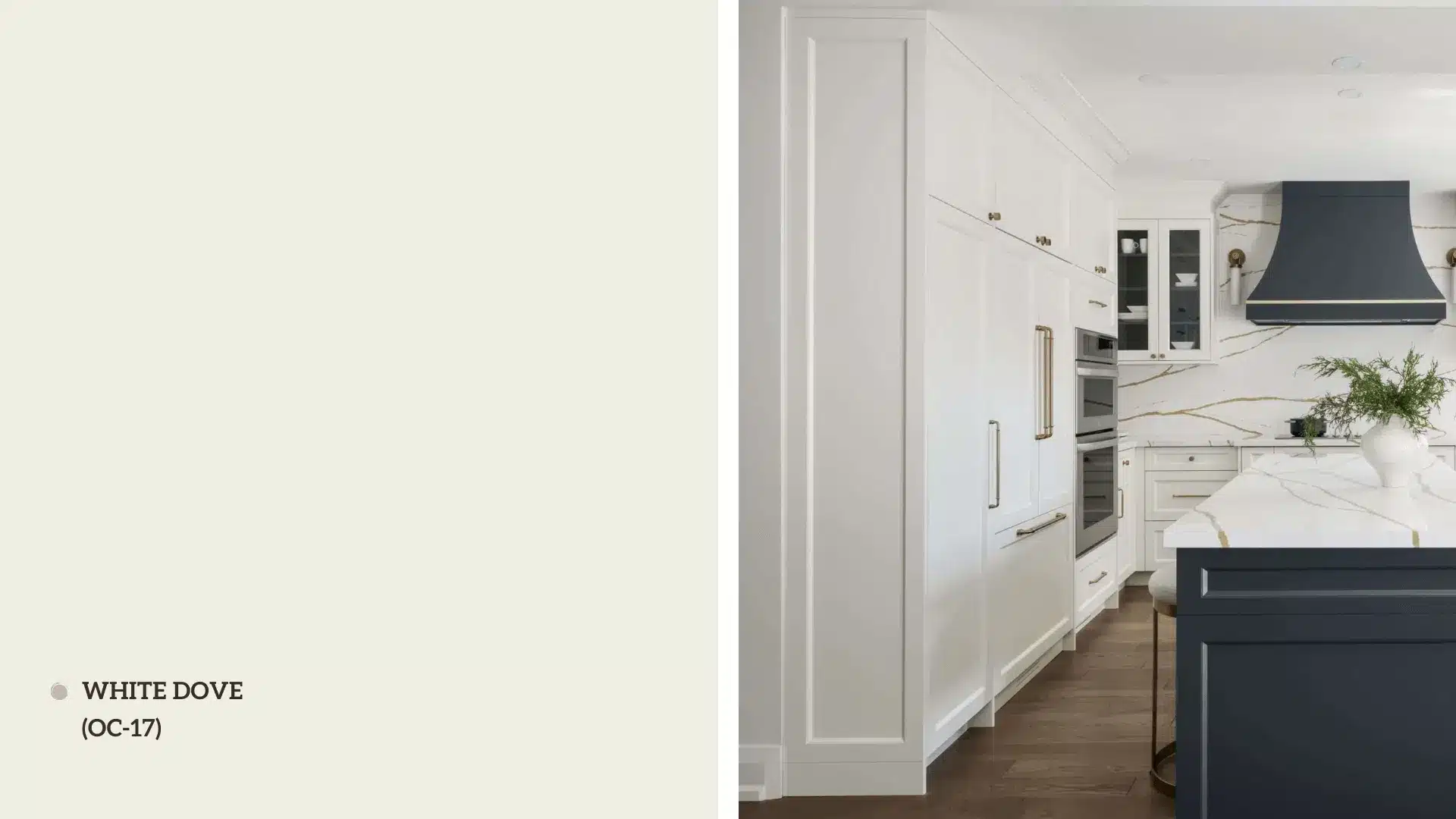
White Dove by Benjamin Moore is among the most popular white paint colors.
It’s a soft, warm white that strikes the perfect balance between being bright enough to open a space and warm enough to avoid feeling stark or clinical.
Whether you’re painting walls, trim, cabinets, or ceilings, White Dove adapts effortlessly to different surfaces and styles.
Its subtle warmth makes it feel inviting, while its neutrality ensures it pairs well with various colors and materials.
White Dove is a leading choice for a white that embodies timelessness and elegance while being easy to apply.
Best Applications

White Dove is incredibly versatile and works well in almost any room.
Here are some of the best ways to use it:
- Walls: Perfect for creating a neutral backdrop that allows other elements in the room to shine.
- Trim and Moldings: Its soft warmth pairs beautifully with both light and dark wall colors.
- Cabinets: A popular choice for kitchen cabinets, giving a clean yet warm look.
- Ceilings: Helps brighten a room without feeling too stark.
It’s especially well-suited for spaces where you want a cozy, lived-in feel, such as living rooms, bedrooms, and dining areas.
It also pairs beautifully with natural materials like wood, stone, and linen, making it a great choice for both modern and traditional interiors.
Pros and Cons of White Dove
Pros
- Versatile and timeless, working in almost any space.
- Warm undertones create a cozy, inviting feel.
- It pairs well with a wide range of colors and materials.
- Performs well in both natural and artificial light.
Cons
- It can appear warmer than intended in rooms with strong yellow or orange lighting.
- It may not be the best choice if you’re looking for a crisp, cool white.
White Dove is a reliable and elegant choice for anyone seeking a warm, neutral white that adapts to various styles and lighting conditions.
Snowbound (SW 7004) by Sherwin-Williams
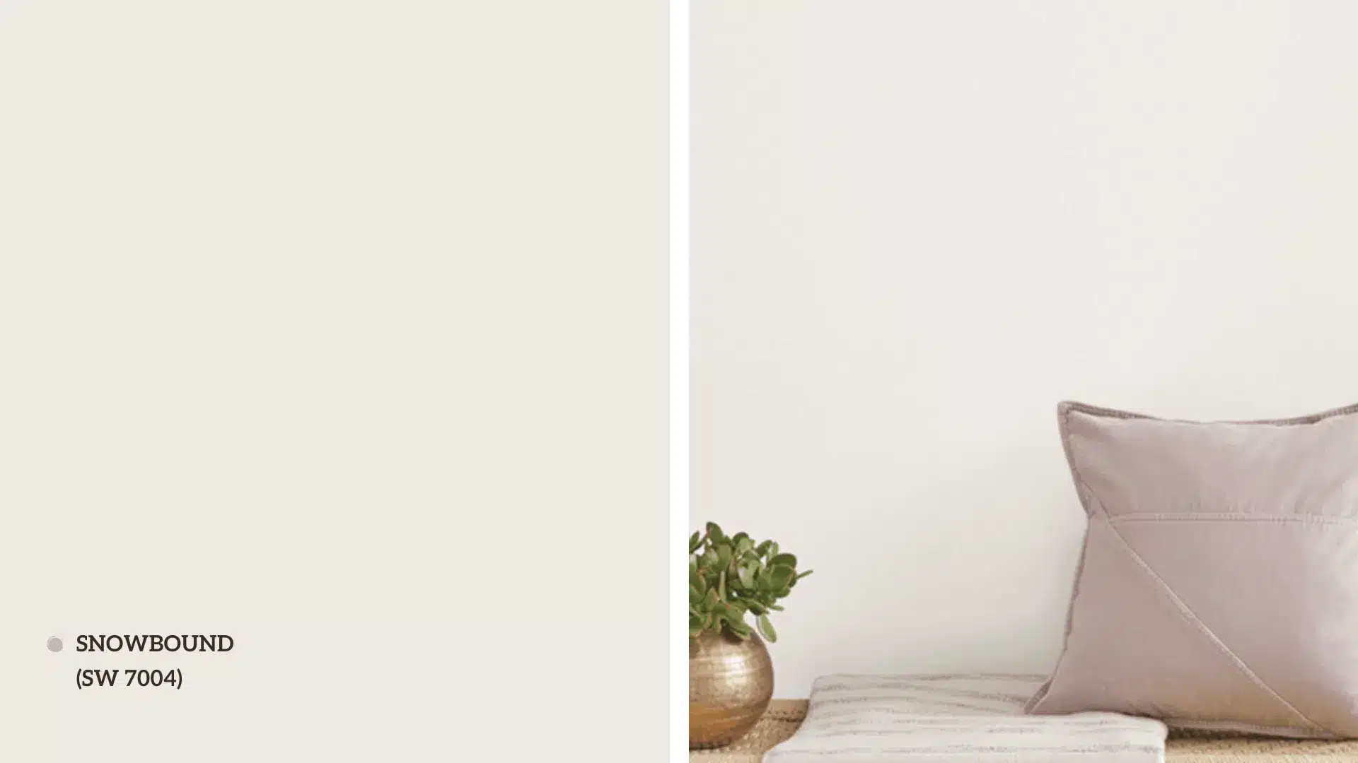
Snowbound by Sherwin-Williams is a crisp, clean white with a modern edge.
This shade, part of the brand’s Whites and Pastels Collection, is known for its cool undertones and ability to create a fresh, airy feel in any space.
Unlike warmer whites, Snowbound has a slightly cooler, more contemporary vibe, making it a favorite for minimalist and modern designs.
It’s a versatile white that works well on walls, trim, and even exteriors, offering a bright and polished look without feeling too stark.
If you want to achieve a sleek and refined aesthetic, Snowbound would be a fantastic choice!
Best Applications

Snowbound shines in a variety of applications, particularly in spaces where you want a bright, clean look:
- Walls: Ideal for creating a fresh, open feel in living rooms, kitchens, and bathrooms.
- Trim and Moldings: Pairs beautifully with both light and dark wall colors, adding contrast without being too harsh.
- Exteriors: A popular choice for modern home exteriors, offering a crisp and polished appearance.
- Accent Walls: Works well as a backdrop for bold artwork or colorful furniture.
It’s especially well-suited for contemporary or minimalist interiors, where its cool undertones can enhance the overall aesthetic.
Pros and Cons of Snowbound
Pros
- It creates a bright, airy, and modern feel.
- Cool undertones work well in well-lit spaces.
- Versatile for walls, trim, and exteriors.
- Complements cool color palettes and minimalist designs.
Cons
- It can feel too stark or cold in rooms with warm lighting or limited natural light.
- It may not be the best choice for cozy, traditional spaces.
Snowbound is a fantastic option for those seeking a crisp, contemporary white that brings a fresh and polished look to their home.
Comparison Between White Dove vs Snowbound
| Aspect | White Dove | Snowbound |
|---|---|---|
| Undertones | Warm undertones (hints of beige and gray) | Cool undertones (hint of gray) |
| Lighting Impact | It looks bright yet warm in natural and artificial light; it is cozier in warm lighting. | Appears fresh and bright in natural light; can feel cool or stark in warm/low light. |
| Room Size & Style | Ideal for smaller, cozier spaces; works in traditional, transitional, or warm modern designs. | Best for larger, well-lit rooms; suits contemporary, minimalist, or cool-toned interiors. |
| Pairing with Colors | Pairs well with warm neutrals, earthy tones, and natural materials like wood and stone. | Complements cool tones (blues, grays, greens) and bold, modern accents. |
How to Choose Between White Dove and Snowbound?
Choosing between White Dove and Snowbound ultimately comes down to your personal style, the lighting in your space, and the overall mood you want to create.
Here’s a step-by-step guide to help you decide:
1. Consider Your Lighting
-
Natural Light: Both whites will work well if your room gets plenty of natural light. White Dove will feel warm and inviting, while Snowbound will feel crisp and fresh.
-
Artificial Light: White Dove will enhance the coziness in rooms with warm or yellow-toned lighting, while Snowbound might feel cooler.
-
Low Light: White Dove’s warmth for darker rooms can make the space more inviting, whereas Snowbound might feel too stark.
2. Consider Your Style
-
Warm and Cozy: If you prefer a traditional, cozy, or earthy aesthetic, White Dove is the better choice.
-
Modern and Crisp: If you lean toward a minimalist, contemporary, or cool-toned design, Snowbound is the way to go.
Conclusion
Choosing between White Dove and Snowbound depends on the mood and style you want for your space.
White Dove’s warm undertones create a cozy, inviting atmosphere, perfect for traditional or earthy designs.
Snowbound, with its cool, crisp feel, is ideal for modern, minimalist spaces.
Both whites are versatile and timeless, but the choice depends on your lighting, decor, and preference.
Before committing, test samples in your home to see how they look throughout the day.
Ready to transform your space?
Grab some paint samples and start experimenting today!