
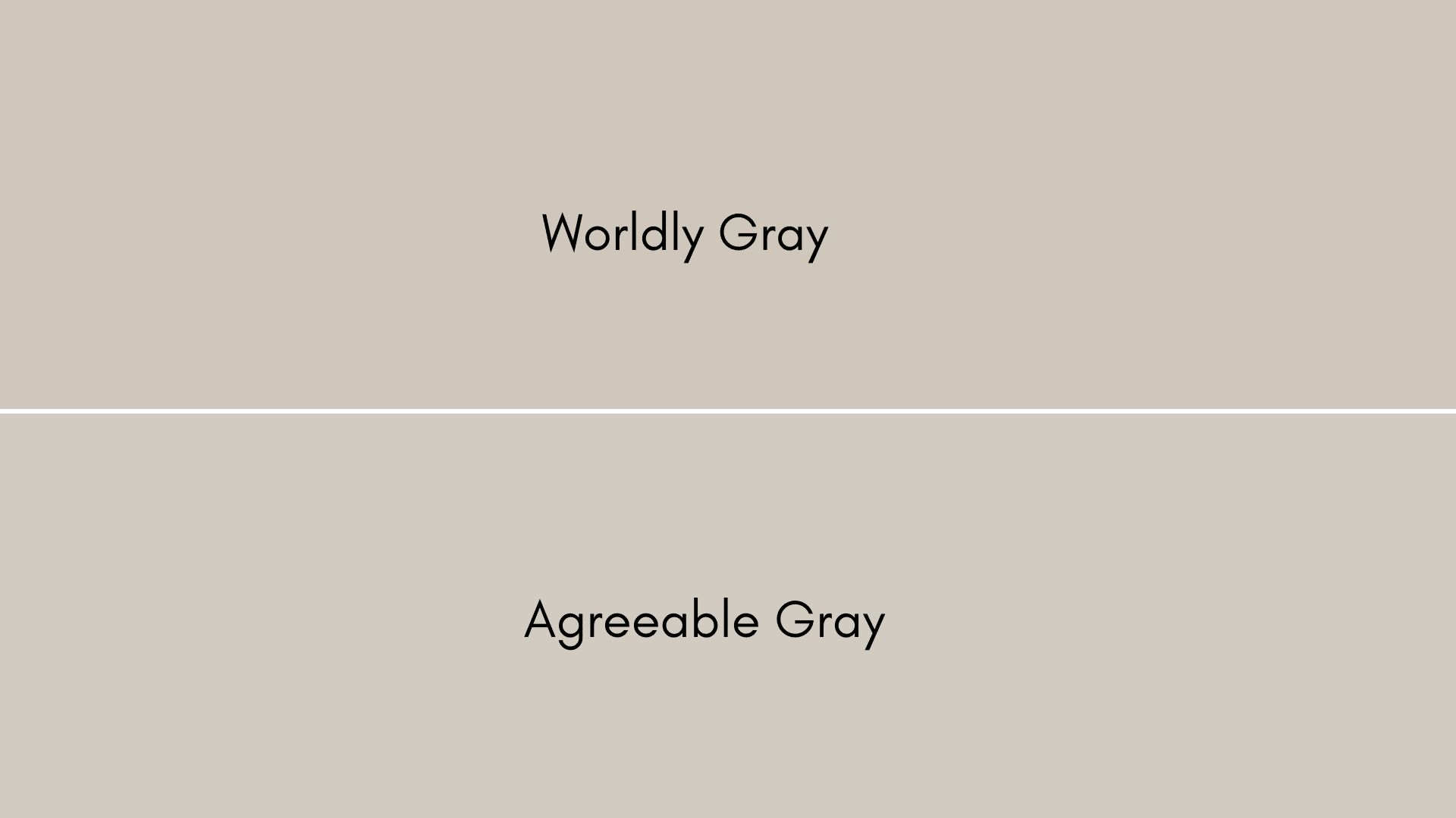
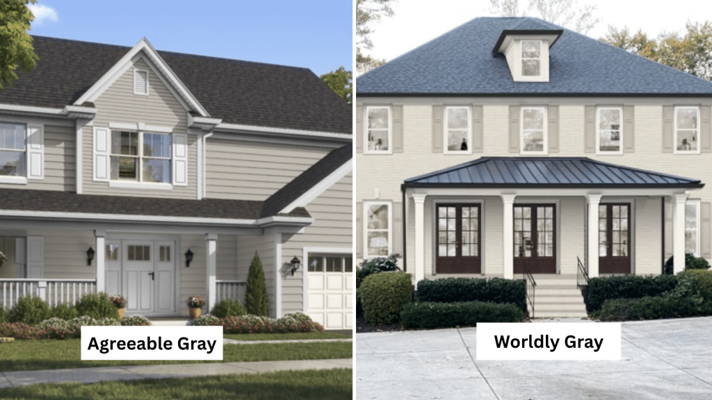
When it comes to choosing the perfect greige paint color, two Sherwin Williams favorites consistently top designers’ lists
Both colors masterfully blend gray and beige elements, but they each bring distinct personalities to your space.
Agreeable Gray offers warmer, more approachable undertones that create inviting, cozy atmospheres, while Worldly Gray presents a more finished, complex blend with subtle green and brown hints that add depth and richness.
Understanding the nuances between both is essential for selecting the greige that best suits your design style, lighting conditions, and personal goals.
This comparison compares their undertones, room applications, and coordination potential to help you determine which greige reigns supreme for your home.
What Is Worldly Gray
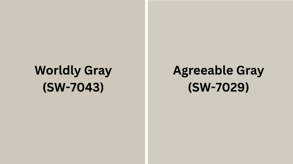
Worldly Gray (SW 7043) is a warm gray paint color from Sherwin-Williams that strikes the perfect balance between contemporary .
This adaptable hue features subtle beige undertones that prevent it from feeling cold or sterile.
With an LRV (Light Reflectance Value) of 57, it’s a medium-toned gray that works beautifully in both well-lit and darker spaces.
This pairs effortlessly with whites, creams, and bold accent colors, making it ideal for living rooms, bedrooms, and open-concept areas where you want a calming yet refined atmosphere.
What Is Agreeable Gray
Agreeable Gray (SW 7029)is Sherwin-Williams’ most popular paint color, known for its incredible adaptability and warm undertones.
This greige (gray-beige blend) features subtle violet and beige notes that adapt beautifully to different lighting conditions throughout the day.
With an LRV of 60, it’s slightly lighter than other one and works as an excellent neutral backdrop.
This complements both warm and cool color schemes, making it perfect for whole-home applications.
Its chameleon-like quality allows it to appear more gray or beige depending on surrounding décor and natural light.
Key Differences Between Worldly Gray vs Agreeable Gray
Choosing between both can be challenging since both are popular warm gray paint colors.
Understanding their key differences in brightness, undertones, and color depth will help you select the perfect shade for your space.
| Feature | Worldly Gray (SW 7043) | Agreeable Gray (SW 7029) |
|---|---|---|
| Light Reflectance Value | 57 (medium brightness) | 60 (brighter, more reflective) |
| Undertone | Warm beige/brown, taupe, orange | Warm beige, subtle greige, can show green/violet hints |
| Color Depth | Darker, richer, earthier | Lighter, softer, more adaptable |
Choose the first gray for richer depth and warmth, or another for maximum adaptability and brightness. Consider your room’s lighting when making your final decision.
What Colors Pair Well with Worldly Gray?
Worldly Gray’s warm beige undertones with subtle green hints create adaptable color coordination opportunities. The right pairings increases its earthy character.
White and Neutral Combinations
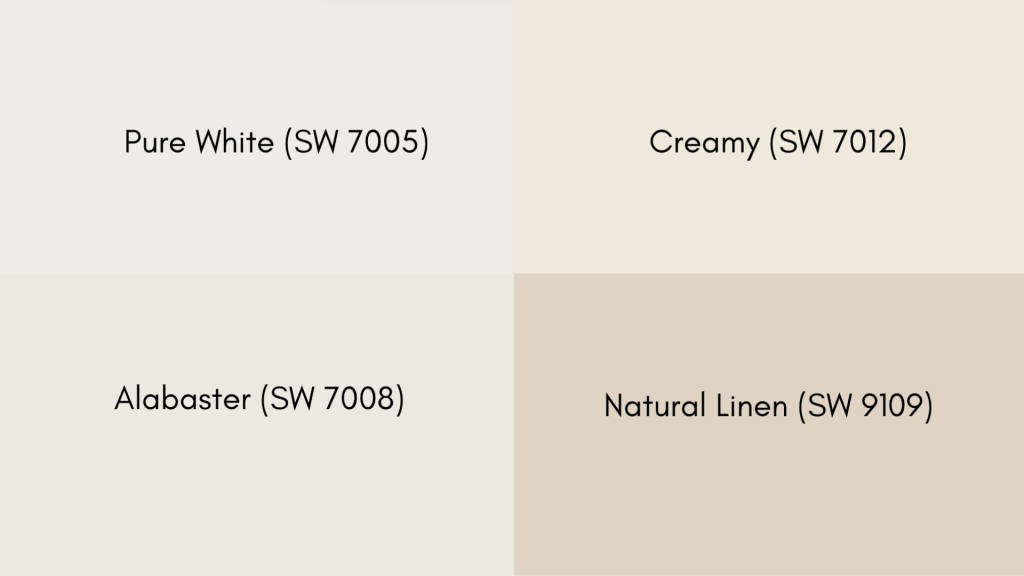
- Pure White (SW 7005) creates fresh, clean contrasts.
- Alabaster (SW 7008) offers crisp definition.
- Creamy (SW 7012) increases warm undertones.
- Natural Linen (SW 9109) provides finished flow.
These color combinations highlight it’s warmth. Choose neutrals for bold colors for drama, or pastels for serene, spa-like atmospheres.
What Colors Pair Well with Agreeable Gray?
It’s neutral greige nature makes it incredibly adaptable for color coordination. Its balanced undertones work beautifully with both warm and cool palettes.
Classic White Combinations
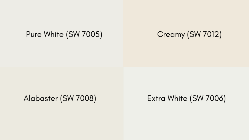
- Pure White (SW 7005) provides crisp definition
- Alabaster (SW 7008) creates finished flow
- Extra White (SW 7006) offers bright contrast
- Creamy (SW 7012) adds warmth
This Gray’s adaptability works perfectly with any color scheme. This adaptable gray creates cohesive, beautiful spaces with whites, bold accents, or soft neutrals.
Room-by-Room Comparison
Choosing between Both the gray depends on the specific room’s function and lighting conditions. Each space has unique requirements that influence how these colors perform.
Living Room
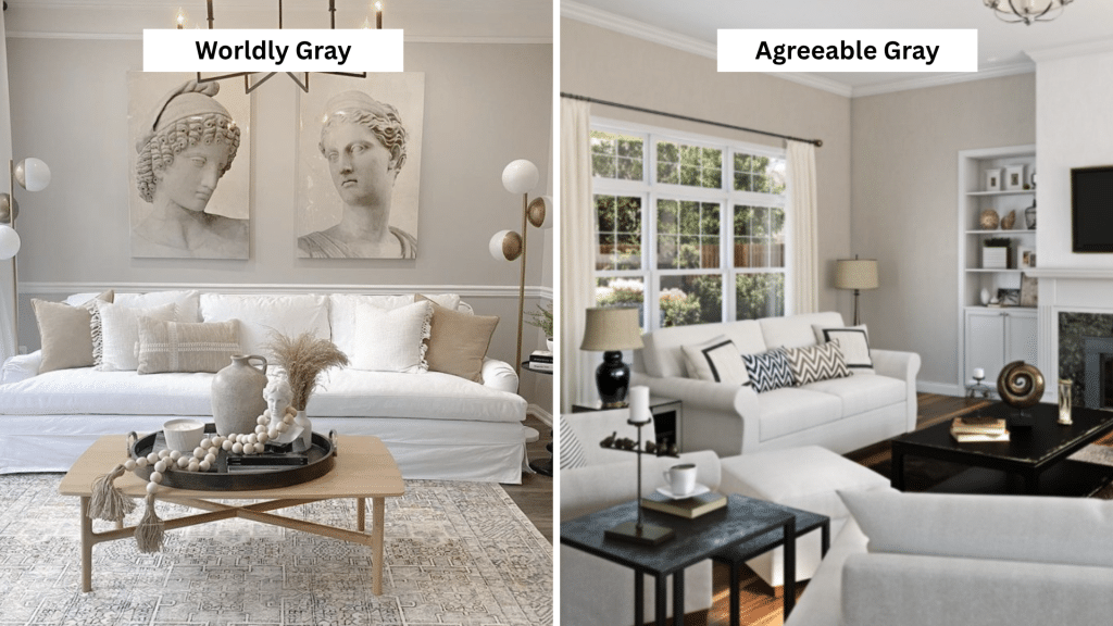
The first one Creates a cozy atmosphere perfect for gathering spaces. Its deeper tone adds warmth and intimacy, working beautifully with natural wood furniture and warm lighting.
Second one offers adaptability for various decor styles and lighting changes throughout the day. Its lighter tone makes spaces feel larger and airier, ideal for smaller living rooms or open-concept areas.
Bedroom
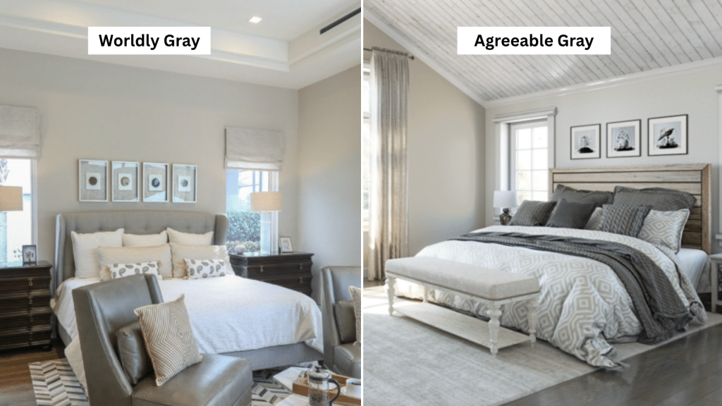
First one Provides a serene, cocoon-like environment that promotes relaxation. Its warm undertones create a calming backdrop perfect for restful sleep and intimate spaces.
Second one works excellently in bedrooms with limited natural light, reflecting available light to prevent the space from feeling too dark or enclosed while maintaining tranquility.
Kitchen
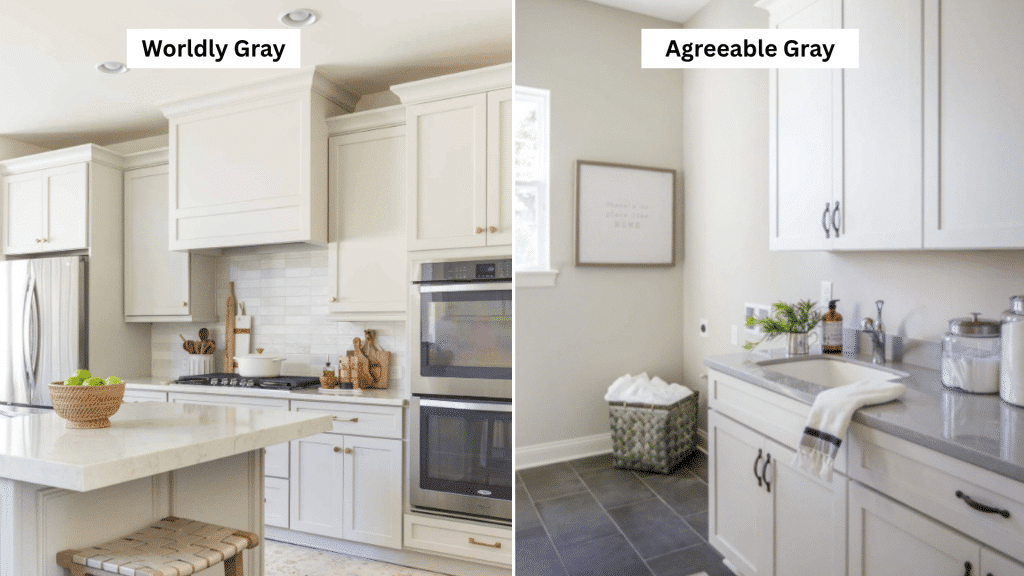
First one pairs beautifully with white cabinetry and natural materials, creating a culinary space. Its earthy undertones complement wood accents and warm metals like brass or copper.
Second one offers maximum flexibility for changing cabinet colors and backsplashes over time. Its neutral nature works with both warm and cool kitchen finishes and appliances.
How Lighting Affects Both The Colors
Lighting dramatically impacts how both appear in your space. Understanding these effects helps you determine which warm gray works best for your room’s specific lighting conditions.
Worldly Gray
Natural light varies by room orientation – north-facing rooms make this color appear cooler and muted, while south-facing rooms increases its warm beige undertones.
Artificial lighting creates different effects: warm LED and incandescent lighting bring out beige undertones, making it richer and golden, while cool LED makes it appear flatter and grayer.
Agreeable Gray
Natural light exposure shows it’s adaptability – it maintains warmth better in north-facing rooms and increases beautifully in south-facing spaces.
Artificial lighting reveals its adaptability: warm LED and incandescent lighting make it appear creamier and more inviting, while cool LED and fluorescent lighting allows it to maintain better color consistency due to its balanced greige undertones.
How to Choose the Right Gray for Your Space
Selecting between both requires proper testing and careful evaluation. The right approach ensures you choose the perfect gray for your space.
Sampling Techniques for Accurate Color Selection
- Test both colors using large sample cards (at least 12×12 inches)
- Paint samples directly on your walls in multiple locations
- Observe colors at various times: morning, afternoon, and evening light
- Compare samples against existing furniture, flooring, and decor elements
- Live with samples for at least a week
- Note how each gray makes you feel in the space
- Watch how colors interact with daily lighting patterns
Factors to Consider Before Making Your Final Choice
Before picking the perfect gray, weigh these important factors to ensure it suits your space and style.
Room Function: Consider if you want cozy intimacy (Worldly Gray) or another gray for adaptable adaptability.
Lighting Conditions: North-facing rooms favor warmer grays like Agreeable Gray; south-facing rooms increases both options.
Existing Decor: Match undertones with current furniture, flooring, and fixture finishes.
Room Size: A lighter gray tone makes small spaces feel larger and airier.
Future Flexibility: A more neutral gray adapts better to changing decor styles and color schemes.
Personal Preference: Choose depth and character (Worldly Gray) vs. another gray for maximum adaptability.
Proper sampling and evaluation will guide you to the perfect gray choice. Take time to test both options thoroughly in your specific space.
Key Takeaways
Both Gray offers exceptional adaptability appeal for different design needs.
Worldly Gray excels when you desire depth, warmth, and coziness, while second gray shines as the ultimate adaptable neutral for maximum flexibility.
Success with either color depends on proper sampling, understanding your space’s lighting characteristics, and considering long-term design goals.
Take time to test both options in your specific environment and choose the gray that best supports your vision for a beautiful, harmonious home.
Ready to refresh your space? Test samples, trust your eye, and choose the gray that feels just right for your space!