

Selecting the perfect paint color for your home can feel overwhelming with countless options available. Many homeowners struggle to find a neutral shade that works across various spaces and design styles without looking too stark or boring.
Sherwin-Williams Pearl Gray (SW 0052) solves this common challenge by offering a balanced neutral that brings subtle suave to any room. This classic shade has become increasingly popular in both contemporary and traditional homes for good reason. It is easy to match with existing finishes, from hardware to flooring.
In this comprehensive guide, we’ll examine everything you need to know about Pearl Gray: its specific tone and characteristics, ideal uses throughout your home, complementary color pairings, and practical tips for testing before you commit.
By the end, you’ll understand why this versatile neutral might be the perfect choice for your next painting project.
Understanding Sherwin-Williams Pearl Gray
Sherwin-Williams Pearl Gray (SW 0052) stands out as a light, clean neutral with subtle complexity.
This polished shade has a balanced profile with very faint cool undertones that lean slightly toward blue in certain lighting conditions while maintaining an overall neutral appearance.
| Property | Details |
|---|---|
| Light Reflectance Value | 61 |
| HEX Code | #CBCEC5 |
| RGB Values | (203, 206, 197) |
| Color Family | Green |
What makes Pearl Gray special in the Sherwin-Williams lineup is its exceptional versatility.
While many grays lean distinctly warm or cool, Pearl Gray stays remarkably neutral.
This balanced quality allows it to work with other colors without clashing, making it more adaptable than similar options like Agreeable Gray (with its beige undertones) or Repose Gray (which can read as taupe in some lighting).
This balanced nature makes Pearl Gray an ideal base color for virtually any space, inside or out.
Pros and Cons of Choosing Pearl Gray
Pros
- Long-lasting color choice – Unlike short-term trends that quickly become outdated, Pearl Gray will remain attractive for many years.
- Fits with many interior designs – From older to current styles, this useful color works with numerous looks.
- Peaceful and balanced without seeming chilly – Makes a room feel serene without giving off the cold feeling of other gray shades.
- Covers wall surface issues – The mid-light shade helps hide small wall flaws.
- Goes with most home items – No need to buy new furniture when picking this flexible color option.
Cons
- Might seem dull in poor lighting – May require extra lamps in rooms facing north or areas with few windows.
- Requires added colors for depth – Needs well-chosen items or borders to avoid looking plain.
- Changes look throughout the day – Wall color may appear different from morning to night, so test it at various times.
- Often needs extra paint layers. Light shades typically require more applications when covering darker colors.
- Not bold for main walls – If you want strong visual impact, consider other options or add vivid touches.
Where to Use Pearl Gray in Your Home
Pearl Gray works wonderfully in multiple areas of your home, adapting to each space’s unique qualities and lighting conditions.
Living Room
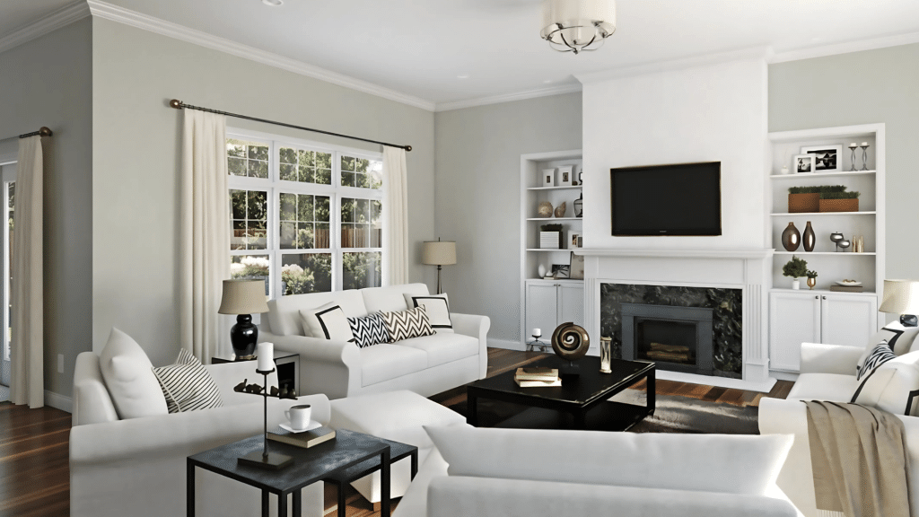
This gentle shade creates a peaceful, neutral foundation that allows your furniture and décor to stand out.
It pairs beautifully with both light and dark woods, making your existing pieces look intentional. The neutral backdrop lets you change accent colors seasonally without repainting.
Key Consideration:
- Pay attention to the room’s exposure—south-facing rooms make Pearl Gray appear warmer
- North-facing rooms may enhance its cooler undertones
- Test the color at different times of day to ensure you like it in all lighting conditions
- Consider how it coordinates with your largest furniture pieces
Bedroom
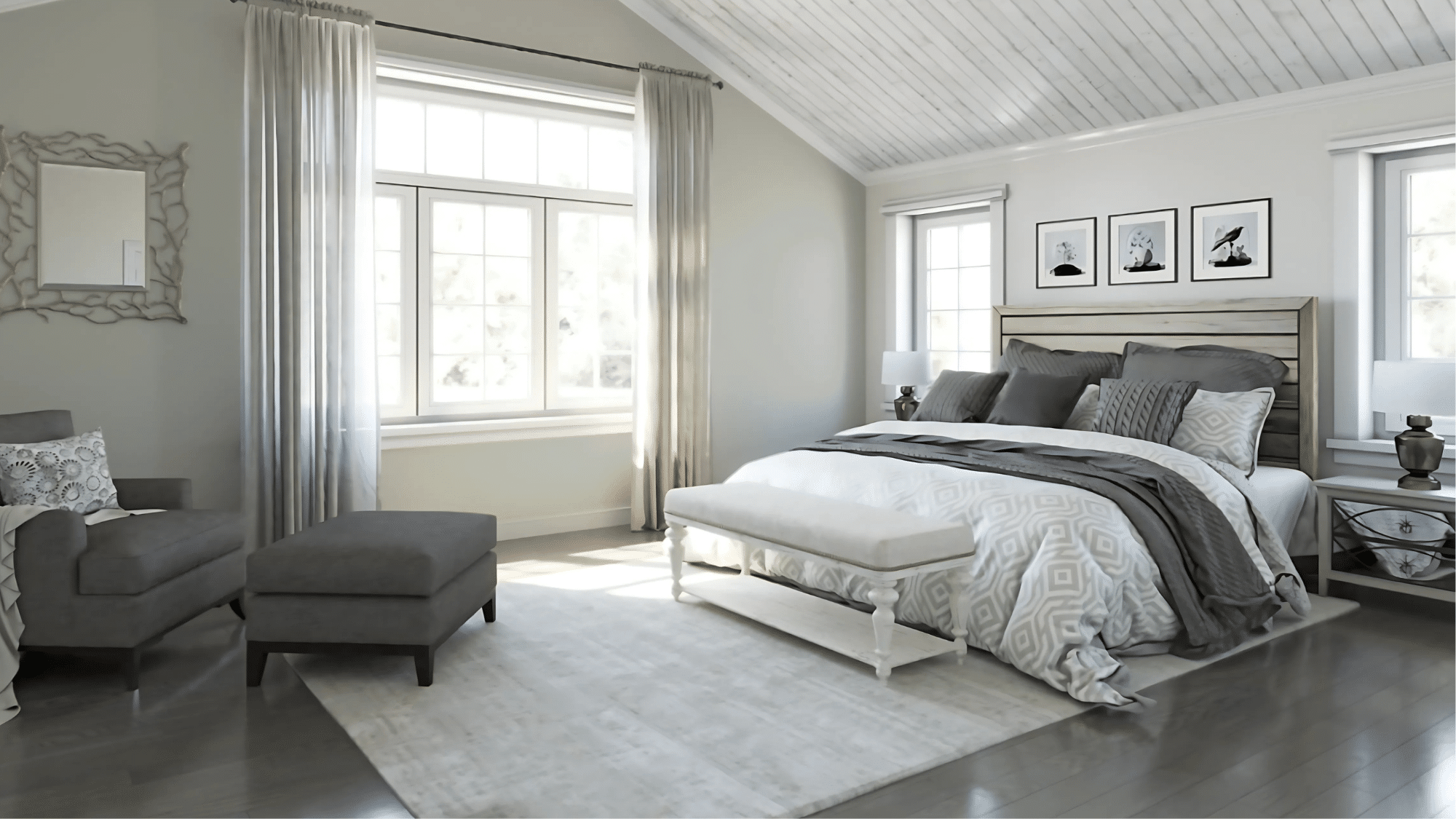
Pearl Gray promotes a tranquil atmosphere ideal for rest. Its soft presence creates a cozy retreat that feels both current and timeless.
This shade works especially well with layered bedding in various textures and complementary tones.
Key Consideration:
- Evaluate how it looks under your bedroom lamps for evening ambiance
- Think about the mood you want to create—Pearl Gray can be either calming or refreshing
- Consider pairing with soft fabrics to enhance the restful quality
- Use with warmer accent colors if the room lacks natural light
Kitchen
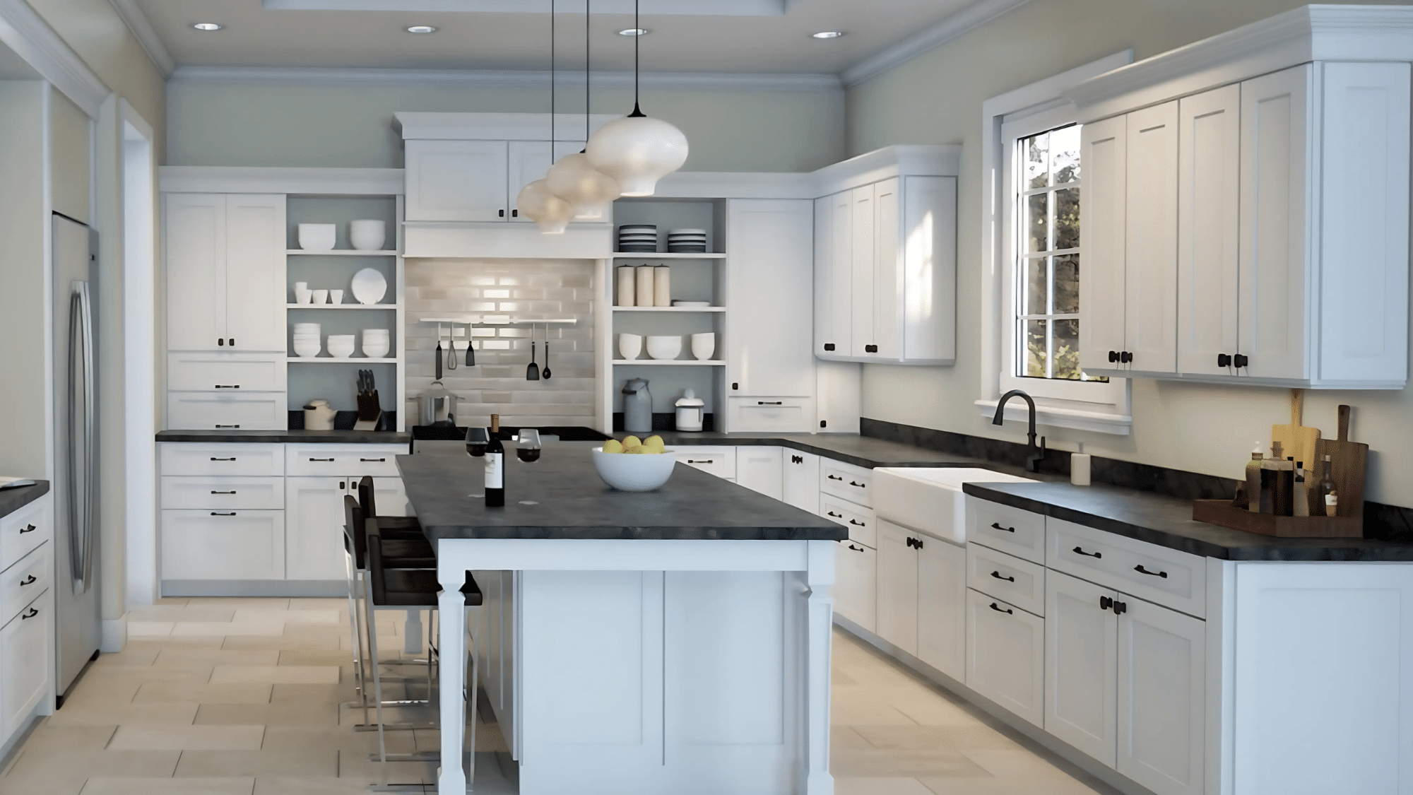
When combined with white cabinetry, Pearl Gray walls create a fresh, clean look. The subtle contrast brings depth without overwhelming the space. It also complements stainless steel appliances and natural stone countertops beautifully.
Key Consideration:
- Assess how it coordinates with your cabinet color and countertop materials
- Remember that kitchens often have limited wall space visible
- Check if it complements your backsplash and flooring
- Consider how it looks with your appliance finishes
Bathroom
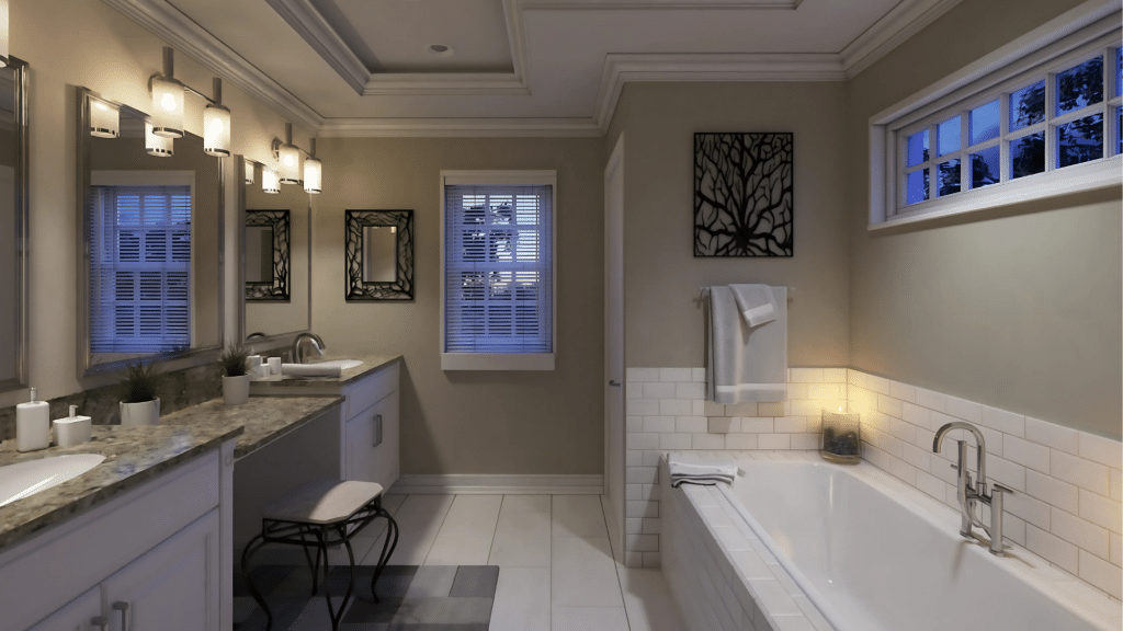
This shade contributes to a refreshing, spa-like environment, particularly in spaces with good natural light. It pairs wonderfully with white fixtures and marble surfaces for a classic look that won’t quickly date.
Key Consideration:
- Use quality paint with mildew resistance for bathroom conditions
- Ensure proper ventilation to maintain the color’s appearance over time
- Test how it looks with your specific bathroom lighting
- Consider the tile and fixture colors it needs to complement
Exterior
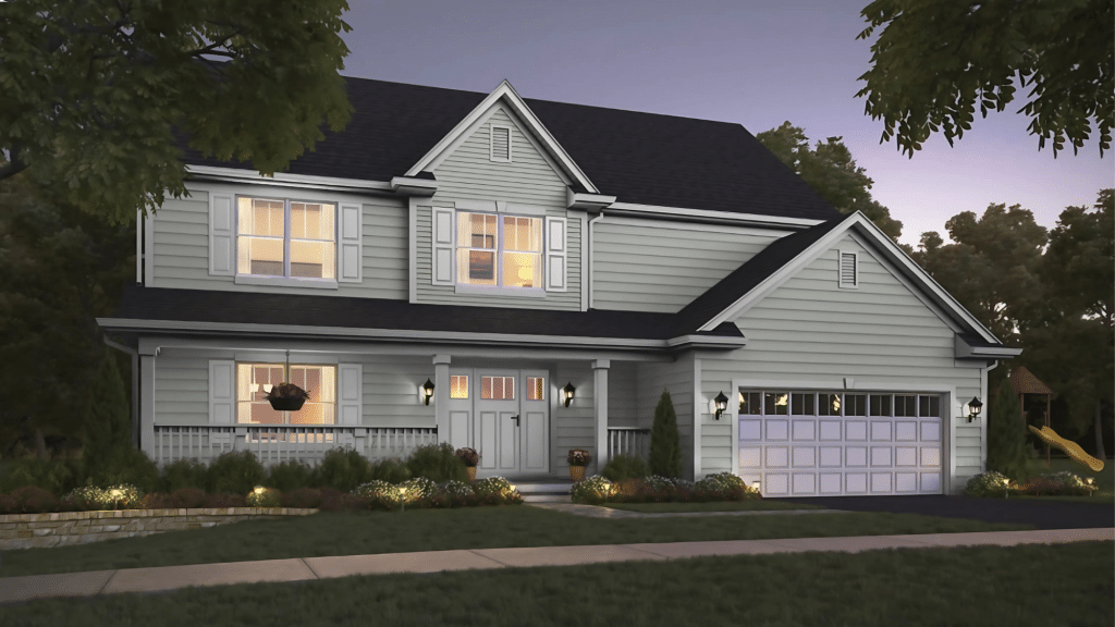
As an exterior color choice, Pearl Gray offers understated elegance that works with multiple architectural styles and building materials. It provides a refined neutral that lets architectural details truly shine.
Key Consideration:
- Test on different sides of your home, as it will appear differently based on exposure
- Consider your climate—Pearl Gray can look different in cloudy versus sunny regions.
- Think about complementary trim and accent colors.
- Account for surrounding landscape elements and how they’ll interact with the color
Color Pairing Ideas with Pearl Gray
Pearl Gray offers fantastic flexibility in color combinations. Its balanced nature makes it an ideal partner for numerous other shades in your home.
Best trim colors
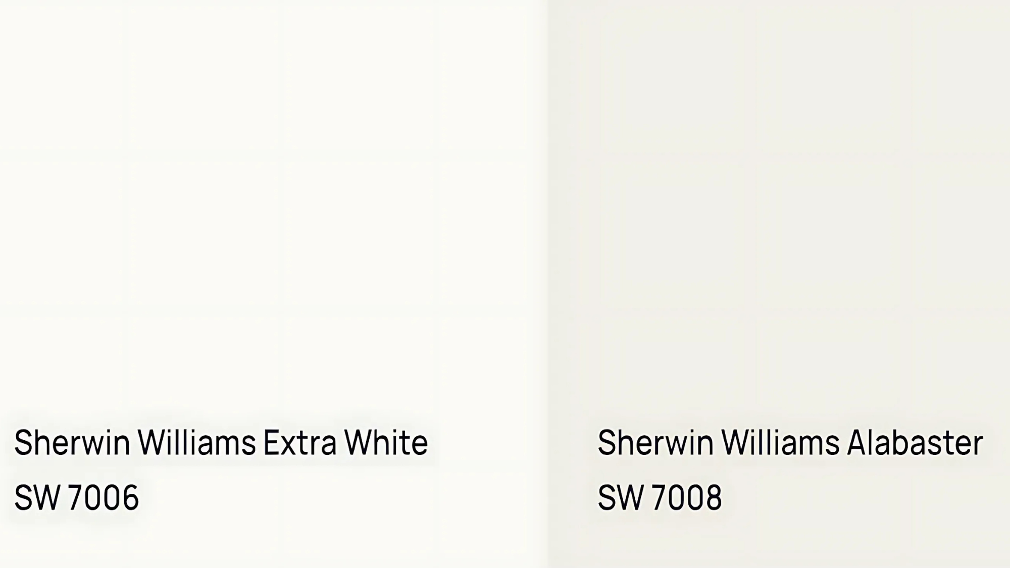
- For a classic, clean look, pair Pearl Gray with crisp white trim like Extra White (SW 7006).
- For a softer transition, consider warm whites such as Alabaster (SW 7008)
- Soft ivory tones create a more subtle contrast while maintaining visual interest. A finishing touch for transitional rooms.
Coordinating shades
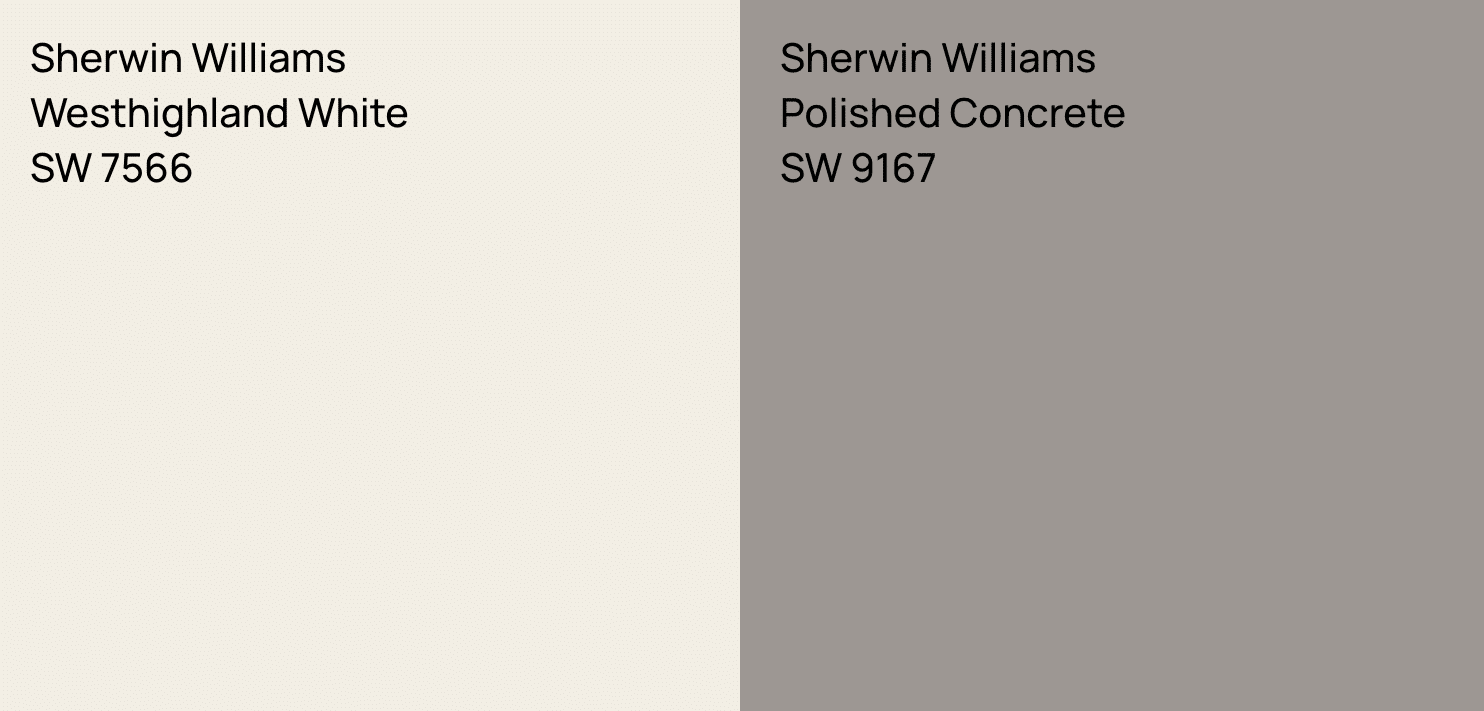
- Westhighland White (SW 7566) creates a soft, harmonious look when used alongside Pearl Gray in adjacent spaces.
- Polished Concrete (SW 9167) makes an excellent accent wall color or secondary shade for creating depth in open floor plans.
Color scheme suggestions
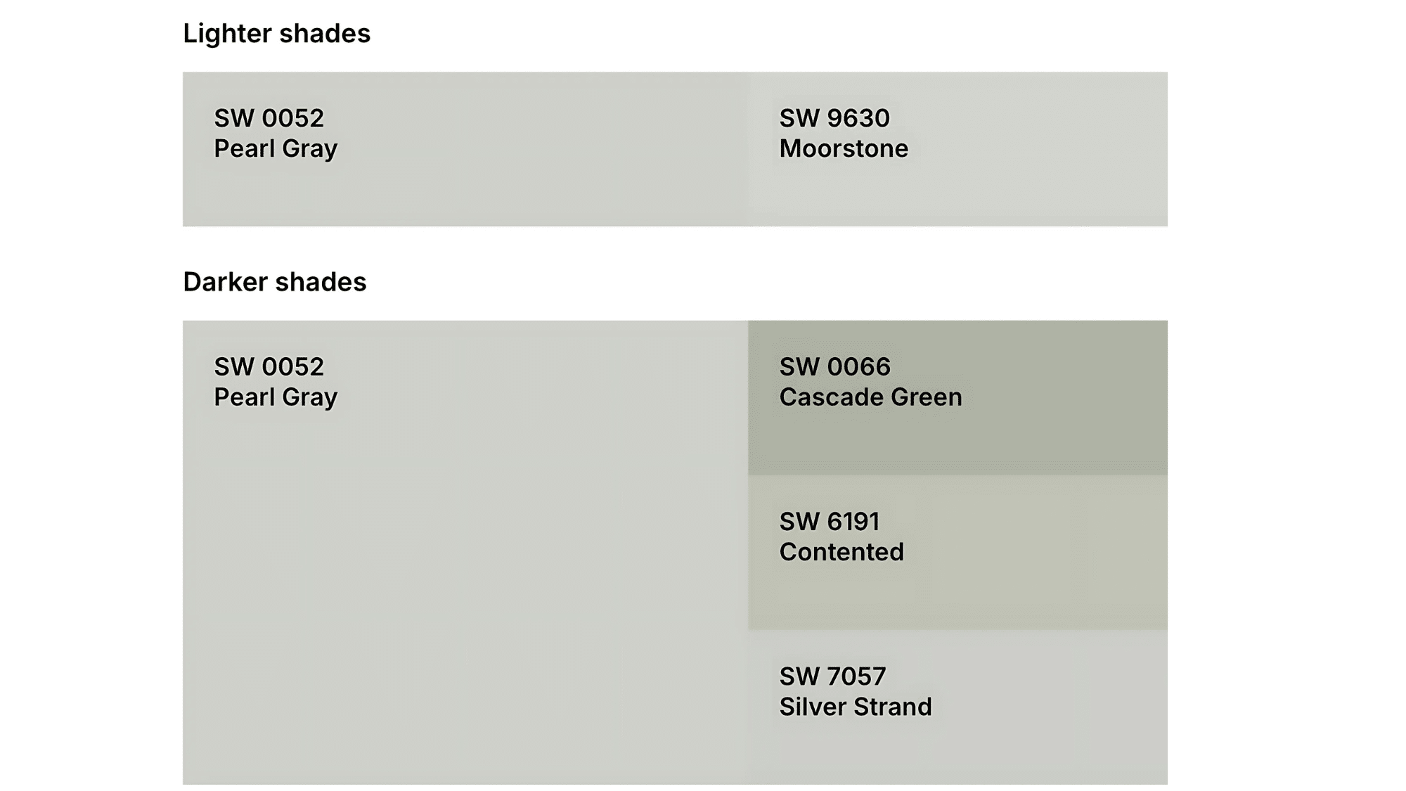
- For a calm, cohesive look, combine Pearl Gray with other soft gray tones in slightly lighter or darker values.
- Add visual interest with complementary colors like subtle blush tones, navy accents, or muted sage green for a balanced palette that feels current yet enduring.
Style-based palettes
Pearl Gray adapts beautifully to various design aesthetics:
- Modern minimal spaces benefit from its clean profile paired with blacks and whites
- Cozy farmhouse styles work well with Pearl Gray alongside warm woods and cream accents
- Coastal interiors shine when Pearl Gray is combined with soft blues and natural textures
Budget-Friendly Tips for Trying Pearl Gray
Testing paint colors before committing to an entire room is always wise, especially with nuanced shades like Pearl Gray. Here are some cost-effective approaches to ensure you love this color in your specific space:
-
Use paint samples or swatches before fully committing: Purchase a small sample pot (usually under $10) and apply it to multiple walls. Check how the color looks throughout the day as lighting changes. This small investment can save hundreds in potential repainting costs.
-
Try peel-and-stick color decals to visualize the shade: Several companies offer removable paint swatches you can place on different walls without making any permanent marks. These allow you to test Pearl Gray in various locations without opening a paint can.
-
Always test in natural daylight and artificial lighting: What looks perfect during sunny mornings might appear different under evening lamps. Apply your sample near windows and in darker corners to understand the full range of how Pearl Gray will look in your space.
-
Consider a smaller project first: Before painting an entire open-concept area, try Pearl Gray in a bathroom, hallway, or accent wall. This gives you time to live with the color before expanding to larger spaces.
-
Ask for remnant paint from local stores: Some paint stores offer discounted “oops” paints (custom colors that weren’t picked up). While you won’t find Pearl Gray specifically, you might find something very similar for testing purposes.
Conclusion
Pearl Gray by Sherwin-Williams stands as a practical, state-of-the-art, and flexible choice for virtually any area in your home.
This well-balanced neutral provides the versatility homeowners need while maintaining a refined appearance.
Throughout this guide, we’ve seen how Pearl Gray works across different spaces, pairs with various colors, and adapts to multiple design styles. Its subtle beauty offers lasting appeal without becoming tied to passing trends.
Before committing to Pearl Gray, take two simple steps.
First, buy a small sample to test on your walls at different times of day.
Second, talk to a Sherwin-Williams staff member who can give you practical tips based on your specific home conditions. These quick actions will help ensure you’re fully satisfied with your final paint choice. You can also visit a local Sherwin Williams store for in-person guidance.
How will Pearl Gray fit into your next home project? This timeless color offers the perfect combination of flexibility and quiet sophistication, making any space feel both current and classic.